

CSS三角图标(二)
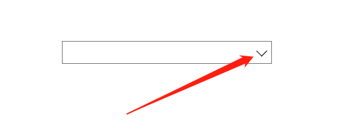
效果
代码如下
 <style>
        div {
            position: relative;
            width: 199px;
            height: 20px;
            border: 1px solid gray;
        }

        div::after {
            content: '';
            position: absolute;
            top: 5px;
            right: 5px;
            width: 6px;
            height: 6px;
            border-bottom: 1px solid black;
            border-right: 1px solid black;
            transform: rotate(45deg);
        }

    </style>

  <body>
    <div></div>
 </body>

 浙公网安备 33010602011771号