
学习使用 pyecharts 制作动态柱状图
使用 csv 模块进行 csv 数据文件处理
import csv
from pyecharts.charts import Bar, Timeline
from pyecharts.options import *
from pyecharts.globals import ThemeType
def dealCSVFile():
"""
读取处理 csv 数据文件
:return: 字典对象
"""
csv_data_dict = {}
# 打开目标csv文件
file = open(r"C:\Users\Admin\Desktop\API_NY.GDP.DEFL.KD.ZG.AD_DS2_zh_csv_v2_60257\source_data2.csv",
mode="r", encoding="GB2312")
# 返回的是一个读取器的对象
content = csv.reader(file)
# 读取第一行标题信息
year = next(content)[1:]
for con in content:
country = con[0]
for y in range(len(year)):
GDP = con[1:][y]
try:
csv_data_dict[year[y]].append([country, GDP])
except KeyError:
csv_data_dict[year[y]] = []
csv_data_dict[year[y]].append([country, GDP])
return csv_data_dict
def makeCharts():
dict_data = dealCSVFile()
# 创建时间线对象
# 设置主题颜色
# from pyecharts.globals import ThemeType
timeline = Timeline({"theme": ThemeType.LIGHT})
# 对字典中的年份 key 进行排序
key_year = sorted(dict_data.keys())
for year in key_year:
# 对GDP值进行排序,默认False升序,这里用降序True
dict_data[year].sort(key=lambda element: float(element[1]), reverse=True)
# print(dict_data[year])
# 取出GDP排名前8的国家
gdp_country = dict_data[year][0:8]
# x:country ; y:gdp
x_data, y_data = [], []
# 获取 x 轴和 y 轴的数据
for gdp_data in gdp_country:
x_data.append(gdp_data[0])
y_data.append(gdp_data[1])
# 构建图表对象
bar = Bar()
x_data.reverse()
y_data.reverse()
bar.add_xaxis(x_data)
bar.add_yaxis("GDP增长率(%)", y_data, label_opts=LabelOpts(position="right"))
# 反转 x,y 轴
bar.reversal_axis()
# 设置每一个 bar 的标题
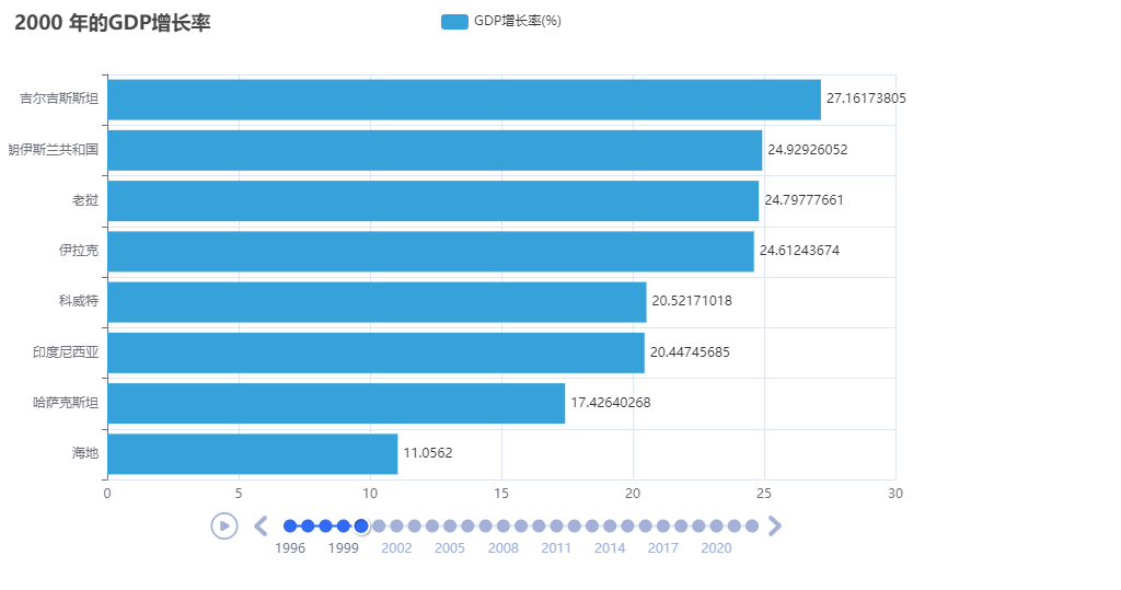
bar.set_global_opts(title_opts=TitleOpts(title=f"{year} 年的GDP增长率"))
# add bar to timeline
# str(year) 参数是时间线的标识
timeline.add(bar, str(year))
# 设置自动播放
timeline.add_schema(play_interval=1000,
is_timeline_show=True,
is_loop_play=True,
is_auto_play=True)
timeline.render("GDP增长率.html")
if __name__ == '__main__':
makeCharts()
以上内容仅为个人学习记录使用。
如有转载,请附有原文出处链接。

 浙公网安备 33010602011771号