css基础
css指层叠样式表(cascading style sheets),主要用于设置HTML页面中的文本内容(字体、大小、对齐方式的等)、图片的外形(宽高、边框样式、边距等)以及版面的布局等外观显示样式。
总的来说:
HTML是从语义的角度搭建页面结构,
css负责从审美的角度美化页面,
js则是从交互的角度提升用户体验。
CSS 规则由两个主要的部分构成:选择器,以及一条或多条声明。
selector {
             property: value;
             property: value;
             ...  property: value

}
css选择器
分为基本选择器与组合选择器。
基本选择器有四种:标签选择器,id选择器,类选择器和通配选择器。


/*标签选择器*/
    div{
        font-size:50px;
        color: green;
        background-color:rgba(0,0,0,0.5);
        width:300px;
        height:200px;
    }
    p{
        color: rgba(102,217,239,0.5);
        font-size: 60px;
    }
<head>
    <meta charset="UTF-8">
    <title>Document</title>
    <style type="text/css">
        .box{
            font-size:40px;
            color: #ff0000;
            width: 400px;
            height: 300px;
            background-color:#999;
        }
        .miss{
            text-indent:2em;
            /*text-align: right;*/
        }

    </style>
</head>
<!DOCTYPE html>
<html lang="en">
<head>
    <meta charset="UTF-8">
    <title>Document</title>
    <style type="text/css">
        .G{
            font-size: 200px;
            color: #000099;
        }
        .o1{
            font-size: 200px;
            color: #990000;
        }
        .o2{
            font-size: 200px;
            color: orange;
        }
        .g1{
            font-size: 200px;
            color: #000099;
        }
        .l{
            font-size: 200px;
            color: #009900;
        }
        .e{
            font-size: 200px;
            color: #990000;
        }
    </style>
</head>
<body>
    <span class="G">G</span>
    <span class="o1">o</span>
    <span class="o2">o</span>
    <span class="g1">g</span>
    <span class="l">l</span>
    <span class="e">e</span>
</body>
</html>
<head>
    <meta charset="UTF-8">
    <title>Document</title>
    <style type="text/css">
        *{
            font-size: 100px;
            color: red;
        }
    </style>
</head>
<!DOCTYPE html>
<html lang="en">
<head>
    <meta charset="UTF-8">
    <title>Document</title>
    <style type="text/css">
        #box{
            font-size: 40px;
            color:rgb(0,0,255);
            background-color: rgb(255,255,0);

        }
        #miss{
            text-align: center;
        }
        .box{
            text-indent: 2em;
        }
    </style>
</head>
<body>
    <div id="box" class="box">威武</div>
    <div >霸气</div>
    <p>无敌</p>
    <p>寂寞</p>
</body>
</html>
组合选择器
<!DOCTYPE html>
<html lang="en">
<head>
    <meta charset="UTF-8">
    <title>Document</title>
    <style type="text/css">
        .box{
            font-size:50px;
        }
        div.box{
            color:red;
        }
        div#miss{
            width: 400px;
            height: 300px;
            background-color:yellow;
        }
    </style>
</head>
<body>
    <div class="box">威武</div>
    <p class="box">霸气</p>
    <div id="miss">万岁</div>
</body>
</html>
<!DOCTYPE html>
<html lang="en">
<head>
    <meta charset="UTF-8">
    <title>Document</title>
    <style type="text/css">
        /*.box{
            font-size:40px;
            color:red;
        }
     div span{
         font-size: 50px;
     }*/
     /*.box span{
         background-color: blue;
     }*/
    /* .box .miss{
         color:red;
     }*/
     .box span{
         color:red;
     }
    </style>
</head>
<body>
    <div class="box">
        <p><span class="miss">威武</span>
           <span>好人</span>
        </p>
    </div>
    <div class="box"><span>霸气</span></div>
</body>
</html>
<!DOCTYPE html>
<html lang="en">
<head>
    <meta charset="UTF-8">
    <title>Document</title>
    <style type="text/css">
    div>span{
            color:red;
            font-size:40px;
        }
    p>span{
        color:green;
        font-size:60px;
    }

    </style>
</head>
<body>
    <div>
        <p><span>威武</span></p>
        <span>霸气</span>
    </div>
</body>
</html>
<!DOCTYPE html>
<html lang="en">
<head>
    <meta charset="UTF-8">
    <title>Document</title>
    <style type="text/css">
    .box,#miss,span,h1{
        font-size:100px;
        color: #fff;
        background-color: green;
    }
    </style>
</head>
<body>
    <div class="box">威武</div>
    <p id="miss">霸气</p>
    <span>帅气</span>
    <h1>漂亮</h1>
</body>
</html>
除此以外还有毗邻元素选择器(E+F),匹配所有紧随E元素之后的同级元素F,普通兄弟选择器(E~F)。
注:一般,块级元素可以包含内联元素或某些块级元素,但内联元素不能包含块级元素,它只能包含其它内联元素。需要注意的是,p标签不能包含块级标签。
E[att]          匹配所有具有att属性的E元素,不考虑它的值。(注意:E在此处可以省略。
                比如“[cheacked]”。以下同。)   p[title] { color:#f00; }


E[att=val]      匹配所有att属性等于“val”的E元素   div[class=”error”] { color:#f00; }


E[att~=val]     匹配所有att属性具有多个空格分隔的值、其中一个值等于“val”的E元素
                td[class~=”name”] { color:#f00; }

E[attr^=val]    匹配属性值以指定值开头的每个元素
                div[class^="test"]{background:#ffff00;}

E[attr$=val]    匹配属性值以指定值结尾的每个元素    div[class$="test"]{background:#ffff00;}

E[attr*=val]    匹配属性值中包含指定值的每个元素    div[class*="test"]{background:#ffff00;}
a:link(没有接触过的链接),用于定义了链接的常规状态。

a:hover(鼠标放在链接上的状态),用于产生视觉效果。

a:visited(访问过的链接),用于阅读文章,能清楚的判断已经访问过的链接。

a:active(在链接上按下鼠标时的状态),用于表现鼠标按下时的链接状态。

伪类选择器 : 伪类指的是标签的不同状态:

         a ==> 点过状态 没有点过的状态 鼠标悬浮状态 激活状态

a:link {color: #FF0000} /* 未访问的链接 */

a:visited {color: #00FF00} /* 已访问的链接 */

a:hover {color: #FF00FF} /* 鼠标移动到链接上 */
a:active {color: #0000FF} /* 选定的链接 */ 格式: 标签:伪类名称{ css代码; }
<!DOCTYPE html>
<html lang="en">
<head>
    <meta charset="UTF-8">
    <title>Title</title>

    <style>

       .top{
           background-color: rebeccapurple;
           width: 100px;
           height: 100px;
       }
        .bottom{
            background-color: green;
            width: 100px;
            height: 100px;
        }

        .outer:hover .bottom{
            background-color: yellow;
        }

        注意:一定是outer:hover  控制outer里某一个标签,否则无效

        .top:hover .bottom{
            background-color: yellow;
        }
    </style>
</head>
<body>


<div class="outer">
    <div class="top">top</div>
    <div class="bottom">bottom</div>
</div>
</body>
</html>
 :before    p:before       在每个<p>元素之前插入内容
 :after     p:after        在每个<p>元素之后插入内容

例:p:before{content:"hello";color:red;display: block;}
<!DOCTYPE html>
<html lang="en">
<head>
    <meta charset="UTF-8">
    <title>Document</title>
    <style type="text/css">
        /*a:link{
            color: red;
        }*/
        /*链接默认状态*/
        a{
            color: red;
            text-decoration: none;
        }
        /*链接访问之后的状态*/
        a:visited{
            color: green;
        }
        /*鼠标放到链接上显示的状态*/
        a:hover{
            color: blue;
            text-decoration: line-through;
        }
        /*链接激活的状态*/
        a:active{
            color: pink;
        }
    </style>
</head>
<body>
    <a href="#">霸气</a>
</body>
</html>
注:一个标签可以调用多个类选择器,多个标签可以调用同一个类选择器。一个id选择器在一个页面只能调用一次,使用多次时js调用会出问题。一个标签可以同时调用类选择器和id选择器。
<!DOCTYPE html>
<html lang="en">
<head>
    <meta charset="UTF-8">
    <title>Document</title>
    <style type="text/css">
    .nav{
        height: 60px;
        background-color: #aaa;
        text-align: center;
    }
    a{
        display: inline-block;
        width: 100px;
        height: 60px;
        text-decoration: none;
        color:#000;
        font-weight: 700;
    }
    a.public{
        color: #F14400;
    }
    a:hover{
        background-color: #eee;
        text-decoration: underline;
        color: #F14400;
    }
    </style>
</head>
<body>
    <div class="nav">
        <a href="#" class="public">天猫</a>
        <a href="#" class="public">聚划算</a>
        <a href="#" class="public">超市</a>
        <a href="#" class="public">头条</a>
        <a href="#">阿里旅行</a>
        <a href="#">电器城</a>
        <a href="#">淘抢购</a>
        <a href="#">苏宁易购</a>
        <a href="#">智能生活</a>
    </div>
</body>
</html>
css的四种引入方式
1.行内式
<p style="background-color: rebeccapurple">hello yuan</p>
优先级比较高,一般很少使用
2.嵌入式
嵌入式是将CSS样式集中写在网页的<head></head>标签对的<style></style>标签对中。一般上课时为了便于讲解会使用的格式。
<head>
    <meta charset="UTF-8">
    <title>Title</title>
    <style>
        p{
            background-color: #2b99ff;
        }
    </style>
</head>
3.链接式
是最为常用的方式,将一个css文件引入到html中。真正实现结构表现分离。
<link href="mystyle.css" rel="stylesheet" type="text/css"/>
4.导入式
将一个独立的.css文件引入HTML文件中,导入式使用CSS规则引入外部CSS文件,<style>标记也是写在<head>标记中。
<style type="text/css">
          @import"mystyle.css"; 此处要注意.css文件的路径
</style>
看似这种方法与链接式有些相同,实则不然,导入式会在整个网页装载完后再装载CSS文件,因此这就导致了一个问题,如果网页比较大则会儿出现先显示无样式的页面,闪烁一下之后,再出现网页的样式。这是导入式固有的一个缺陷。使用链接式时与导入式不同的是它会以网页文件主体装载前装载CSS文件,因此显示出来的网页从一开始就是带样式的效果的,它不会象导入式那样先显示无样式的网页,然后再显示有样式的网页,这是链接式的优点。
选择器内属性:
|
属性 |
解释 |
|
Width:20px; |
宽 |
|
Height:20px; |
高 |
|
Background-color:red; |
背景颜色 |
|
font-size:24px; |
文字大小 |
|
text-align:left | center| right |
内容的水平对齐方式 |
|
text-indent:2em; |
首行缩进 |
|
Color:red; |
文字颜色 |
关于css的颜色显示的多种写法:
1.直接写颜色名称:red。
2.使用16进制显示颜色:#000000 前两位代表红色,中间两位代表绿色,后边两位代表蓝色。
3.rgb():color:rgb(120,120,120);
4.rgba,a代表alpha不透明度 值为0-1:color:rgb(120,120,120,0.5)。
文本元素
font-size:16px; 文字大小
font-weight: 700 ; 值从100-900,文字粗细,不推荐使用font-weight:bold;
font-family:微软雅黑; 文本的字体
font-style: normal | italic; normal 默认值 italic 斜体
line-height: 行高
文本属性连写:font: font-style font-weight font-size/line-height font-family;
注:属性值一定要按顺序写,文字大小和字体必须写。
<!DOCTYPE html>
<html lang="en">
<head>
    <meta charset="UTF-8">
    <title>Document</title>
    <style type="text/css">
        div{
            font-size:16px;
            font-weight:700;
            font-family:微软雅黑;
            font-style:italic;
            line-height: 40px;
            /*文字属性连写*/
            font:  italic 700 16px/40px 微软雅黑;
        }

    </style>
</head>
<body>
    <div>威武<br>
    威武
    </div>
</body>
</html>
<!DOCTYPE html> <html lang="en"> <head> <meta charset="UTF-8"> <title>Document</title> <style type="text/css"> .content{ width:800px; margin: 0 auto; } .content h1{ font: 28px microsoft yahei; text-align: center; } .content .box{ text-align: center; } .time,.news{ font-size:14px; } .time{ color: rgb(190,190,190); } .news{ color: #990000; } /*属性选择器*/ .box input[type=text]{ color:red; } .box input[type=button]{ color: green; font-weight: 700; } .content p{ text-indent: 2em; line-height: 24px; } .content p span{ color: blue; } </style> </head> <body> <div class="content"> <h1>中乙队赛前突然换帅仍胜毅腾 高原黑马欲阻击舜天</h1> <div class="box"><span class="time">2014年07月16日20:11</span> <span class="news">新浪体育 评论中大奖(11人参与)</span> <a href="#">收藏本文</a> <input type="text" value="请输入查询条件"> <input type="button" value="搜索"></div> <hr> <p>新浪体育讯 7月16日是燕京啤酒<span>[微博]</span>2014中国足协杯第三轮比赛,丽江嘉云昊队主场迎战哈尔滨毅腾队的比赛日。然而就在比赛日中午,丽江嘉云昊队主帅李虎和另外两名成员悄然向俱乐部提出了辞呈,并且收拾行囊准备离开。在这样的情况下,丽江嘉云昊队不得不由此前的教练员杨贵东代理指挥了本场比赛。</p> <p>在昨日丽江嘉云昊队主帅李虎就缺席了赛前的新闻发布会,当时俱乐部给出的解释是李虎由于身体欠佳,去医院接受治疗。然而今日李虎出现在俱乐部时,向记者否认了这一说法,并且坦言已经向俱乐部提出了辞呈。</p> <p>据记者多方了解的情况,李虎<span>[微博]</span>极其教练组近来在执教成绩上承受了不小的压力,在联赛间歇期期间,教练组曾向俱乐部提出能够多引进有实力的球员补强球队,然而由于和俱乐部在投入以及成绩指标上的分歧,李虎最终和教练组一起在比赛日辞职。</p> <p>这样的情况并没有影响到丽江嘉云昊队<span>[微博]</span>的队员,在比赛中丽江队在主场拼的非常凶,在暴雨之中仍然发挥出了体能充沛的优势,最终凭借点球击败了中超球队哈尔滨毅腾,顺利晋级下一轮比赛。<strong>根据中国足协杯的赛程,丽江嘉云昊队将在本月23日迎战江苏舜天队。</strong></p> </div> </body> </html>
标签分类
块元素:div,hn,p,ul等。特点为独占一行,可设置宽高,嵌套下子块元素与父块元素宽度默认一致。
<!DOCTYPE html>
<html lang="en">
<head>
    <meta charset="UTF-8">
    <title>Document</title>
    <style type="text/css">
     .box{
         width: 300px;
         height: 100px;
         background-color: #888;
     }
     .box p{
         height: 50px;#必须要设置高度,高度不会继承
         background-color: red;
     }

    </style>
</head>
<body>

    <div class="box">
     <p></p>
    </div>
</body>
</html>
行内元素:span,a,strong,em,del,ins等。特点在一行显示,不能设置宽高,元素的宽高是内容撑开的。
<!DOCTYPE html>
<html lang="en">
<head>
    <meta charset="UTF-8">
    <title>Document</title>
    <style type="text/css">
     .box{
         width: 300px;
         height: 100px;
         background-color: #888;
     }
     .box span{
         height: 50px;
         background-color: red;
     }
    </style>
</head>
<body>

    <div class="box">
     <span>111</span>#此处撑开
    </div>
</body>
</html>
行内块元素:input,img。特点是在一行显示而且可以设置宽高。
<!DOCTYPE html>
<html lang="en">
<head>
    <meta charset="UTF-8">
    <title>Document</title>
    <style type="text/css">
    img{
        width:300px;
    }
    input{
        width: 300px;
        height: 200px;
        background-color: blue;
    }#在一行内显示
    </style>
</head>
<body>
    <img src="top.jpg" > <input type="text">
</body>
</html>
可使用display进行角色切换,使用inline将块元素转换成行内元素,block将行内元素转换成块元素,inline-block将块与行内元素转行内块元素。
<!DOCTYPE html>
<html lang="en">
<head>
    <meta charset="UTF-8">
    <title>Document</title>
    <style type="text/css">

        /*块元素转换为行内元素*/
        /*div,p{
            display: inline;

        }*/

        /*行内转块*/
        span{
            display: block;
        }
    </style>
</head>
<body>
<span>威武</span>
<span>霸气</span>
</body>
</html>
<!DOCTYPE html>
<html lang="en">
<head>
    <meta charset="UTF-8">
    <title>Document</title>
    <style type="text/css">

        /*块和行内元素转行内块元素*/
        div,a,span,strong{
            display: inline-block;
            width:200px;
            height: 200px;
            background-color: yellow;
            text-align:center;
        }
    </style>
</head>
<body>
    <div>威武</div><a href="#">高薪</a><span>霸气</span><strong>无敌   </strong>
</body>
</html>
css三大特性
层叠性:当多个样式作用于同一个(同一类)标签时,样式发生了冲突,总是执行后边的代码(后边代码层叠前边的代码)。和标签调用选择器的顺序没有关系。
<!DOCTYPE html>
<html lang="en">
<head>
    <meta charset="UTF-8">
    <title>Document</title>
    <style type="text/css">
        .box2{
            font-size: 200px;
            color: blue;
        }
        .box{
            font-size: 60px;
            color: red;
        }#它生效
    </style>
</head>
<body>
    <div class="box box2 ">威武</div>
</body>
</html>
继承性:继承的前提是有嵌套关系。文字颜色、大小,字体及字体粗细、风格可以继承。行高也可以继承。
特殊情况:hn不能继承文字的大小,a标签不能继承文字颜色。
<!DOCTYPE html>
<html lang="en">
<head>
    <meta charset="UTF-8">
    <title>Document</title>
    <style type="text/css">
        /*.father{
            color:red;
            font: italic 700 40px microsoft yahei;
        }*/
        .box{
            font-size: 30px;
            color:yellow;
        }
    </style>
</head>
<body>
    <!-- <div class="father">
        <p>威武</p>
    </div> -->
    <!-- <div class="box">
        <h1>威武</h1>
        <h2>威武</h2>

        <p>霸气</p>
    </div> -->
    <div class="box">
        <a href="#">高薪</a>
    </div>
</body>
</html>
优先级:默认样式<标签选择器<类选择器<id选择器<行内样式<!important。继承的权重为0,权重会叠加。
<!DOCTYPE html>
<html lang="en">
<head>
    <meta charset="UTF-8">
    <title>Document</title>
    <style type="text/css">
    #con{
            color: pink;
            font-size:100px;
        }

    .box{
            color:green;
            font-size: 60px;
        }

        div{
            color:red !important;
            font-size:60px !important;
        }

    </style>
</head>
<body>
    <div class="box" id="con" style="font-size:12px; color:yellow;">威武</div>
</body>
</html>
<!DOCTYPE html>
<html lang="en">
<head>
    <meta charset="UTF-8">
    <title>Document</title>
    <style type="text/css">

        .father{
            font-size:60px;
            color:red;
        }
        p{
            font-size:20px;
            color:yellow;
        }
        #box{
            color: green;
            font-size:500px;
        }
    </style>
</head>
<body>
    <div class="father" id="box">
        <p>威武</p>
    </div>
</body>
</html>
<!DOCTYPE html>
<html lang="en">
<head>
    <meta charset="UTF-8">
    <title>Document</title>
    <style type="text/css">
       p.son{
            font-size: 120px;
            color: yellow;
        }
        p{
            font-size:30px;
            color:red;
        }
        .father .son{
            font-size:500px;
            color: pink;
        }
        .son{
            font-size: 60px;
            color: blue;
        }
        .father #baby{
            font-size:12px;
            color: orange;
        }
    </style>
</head>
<body>
    <div class="father">
        <p class="son" id="baby">威武</p>
    </div>
</body>
</html>
背景属性
背景属性有:background-color 背景颜色,background-image 背景图片,Background-repeat repeat(默认) | no-repeat | repeat-x | repeat-y 背景平铺,Background-position left | right | center | top | bottom 背景定位。
方位值只写一个的时候,另外一个值默认居中。
写2个具体值的时候,第一个值代表水平方向,第二个值代表垂直方向。
背景属性可以连写,连写的时候没有顺序要求,但是url为必写项。
<html lang="en">
<head>
    <meta charset="UTF-8">
    <title>Document</title>
    <style type="text/css">
    /*body{
        background-color: red;
    }*/
        .box{
            width:400px;
            height:500px;
            /*background-color: #999;
            background-image:url("1.png");
            background-repeat: no-repeat;
            background-position:bottom;
            background-attachment:scroll;*/

            /*背景属性连写*/
            background:red url("1.png") no-repeat 30px 40px scroll;
        }

    </style>
</head>
<body>
    <div class="box">
    </div>
</body>
</html>
<!DOCTYPE html> <html lang="en"> <head> <meta charset="utf-8"> <style> ul{ list-style:none; } ul li{ background:url(li.gif) no-repeat left 22px; } li a{ text-decoration: none; padding:15px; line-height:50px; } a:hover{ color: #9E7878; text-decoration: underline; } </style> </head> <body> <ul> <li><a href="#"> 大明星:姜潮魔性拜年道晚安</a></li> <li><a href="#"> 软萌正太徐浩演绎《小幸运》</a></li> <li><a href="#"> 漫威绝逼好看的电影镜头合集</a></li> <li><a href="#"> 从没见过这么搞笑的祖孙组合</a></li> <li><a href="#"> 史上最容易挨揍的自助餐吃法</a></li> </ul> </body> </html>
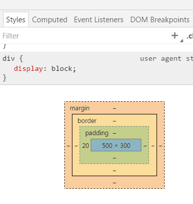
盒子模型
边框border的属性有:Border-top-style: solid(实线),dotted(点线),dashed(虚线)。Border-top-color 边框颜色。Border-top-width 边框粗细。border-collapse:collapse 边框合并。
边框属性可连写,线型必须要写。
<!DOCTYPE html>
<html lang="en">
<head>
    <meta charset="UTF-8">
    <title>Document</title>
    <style type="text/css">
    .box{
        width: 300px;
        height: 390px;
        background: #999;
        /*border-top-style: solid;   /*线型*/
        /*border-top-color: red; */    /*边框颜色*/
        /*border-top-width: 5px;*/

        /*边框属性连写*/
        /*border-top: red solid 5px;

*/       /*四个边框值相同的写法*/
         /*border:12px solid red;*/
        border-left: 5px dashed green;
        border-right: 12px dotted pink;
    }
    </style>
</head>
<body>
    <div class="box">14期威武</div>
</body>
</html>
<!DOCTYPE html>
<html lang="en">
<head>
    <meta charset="UTF-8">
    <title>Document</title>
    <style type="text/css">
    table{
        width: 300px;
        height: 500px;
        border:1px solid red;
        border-collapse:collapse;
    }
    td{
        border:1px solid red;
    }
    </style>
</head>
<body>
    <table cellspacing="0">
        <tr>
            <td></td>
            <td></td>
            <td></td>
        </tr>
        <tr>
            <td></td>
            <td></td>
            <td></td>
        </tr>
        <tr>
            <td></td>
            <td></td>
            <td></td>
        </tr>
    </table>
</body>
</html>
border: 0 none;去掉边框,outline-style: none;去掉轮廓线。
label for id 获取光标焦点
<!DOCTYPE html>
<html lang="en">
<head>
    <meta charset="UTF-8">
    <title>Document</title>
    <style type="text/css">
    .username{
        border: 0 none;       /*去掉边框*/
        outline-style: none;  /*去掉轮廓线*/
        background:#ccc;
        border:1px dashed green;
    }
    .username:focus{
        background:red;
    }
    .email{
        border: 0 none;
        outline-style: none;
        border-bottom: 1px dotted red;
    }
    .search{
        border: 0 none;

        border:1px solid #999;
        background: url("../04-案例/search.png") no-repeat right;
    }
    </style>
</head>
<body>

    <label for="username">用户名:</label><input type="text" class="username" id="username"><br><br>

    邮箱:<input type="text" class="email"><br><br>
    搜索一下:<input type="text" class="search">
</body>
</html>
内边距:Padding-left | right | top | bottom。padding连写:Padding: 20px; 上右下左内边距都是20px,Padding: 20px 30px; 上下20px 左右30px;Padding: 20px 30px 40px; 上内边距为20px 左右内边距为30px 下内边距为40px;Padding: 20px 30px 40px 50px; 上20px 右30px 下40px 左 50px。
<!DOCTYPE html>
<html lang="en">
<head>
    <meta charset="UTF-8">
    <title>Document</title>
    <style type="text/css">
        .box{
            /*padding-left:20px;
            padding-right:30px;
            padding-top:40px;
            padding-bottom: 50px;*/
            padding:20px 30px 40px 50px;
            width: 500px;
            height: 300px;
            background: red;
        }
    </style>
</head>
<body>
    <div class="box">威武</div>
</body>
</html>
内边距会撑大盒子,内边距和边框都会影响盒子的宽度。盒子的宽度=定义的宽度+边框宽度+左右内边距。
<!DOCTYPE html>
<html lang="en">
<head>
    <meta charset="UTF-8">
    <title>Document</title>
    <style type="text/css">
        .box{
            width:180px;
            height: 180px;
            background: green;
            padding-left:150px;
            padding-right: 150px;
            padding-top:100px;
            padding-bottom:100px;
            border: 10px solid red;
    </style>
</head>
<body>
    <div class="box"><img src="1.jpg" ></div>
</body>
</html>
<!DOCTYPE html>
<html lang="en">
<head>
    <meta charset="UTF-8">
    <title>Document</title>
    <style type="text/css">
        .box{
            width: 300px;
            height: 150px;
            background: pink;
            padding: 75px 100px;

        }
        .smallbox{
            width:300px;
            height: 150px;
            background: red;
        }
    </style>
</head>
<body>
    <div class="box">
        <div class="smallbox"></div>
    </div>
</body>
</html>
<!DOCTYPE html>
<html lang="en">
<head>
    <meta charset="UTF-8">
    <title>Document</title>
    <style type="text/css">
        .box{
            width: 300px;
            height: 150px;
            background: pink;
            padding: 75px 100px;
        }
        .smallbox{
            width:300px;
            height: 150px;
            background: red;
        }
    </style>
</head>
<body>
    <div class="box">
        <div class="smallbox"></div>
    </div>
</body>
</html>
<!DOCTYPE html>
<html lang="en">
<head>
    <meta charset="UTF-8">
    <title>Document</title>
    <style type="text/css">
        .father{
            width: 500px;
            height: 300px;
            background: #ccc;
        }
        .son{
            padding: 10px 0;
            background: green;
        }
    </style>
</head>
<body>
    <div class="father">
        <div class="son"></div>
    </div>
</body>
</html>
<!DOCTYPE html>
<html lang="en">
<head>
    <meta charset="UTF-8">
    <title>Document</title>
    <style type="text/css">
        .nav{
            height: 40px;
            background: #eee;
            border-top:3px solid orange;
            border-bottom: 1px solid #aaa;
        }
        .nav-con{
            width: 1000px;
            height: 40px;
            margin: 0 auto;
            text-align:center;
        }
        a{

            font: 12px/40px 微软雅黑;
            line-height: 40px;
            color: #333;
            display: inline-block;
            height: 40px;
            text-decoration: none;
            padding:0 12px;
        }
        a:hover{
            background: #999;
            text-decoration:underline;
        }
    </style>
</head>
<body>
    <div class="nav">
        <div class="nav-con">
            <a href="#">设为首页</a>
            <a href="#">手机新浪网</a>
            <a href="#">移动客户端</a>
        </div>
    </div>
</body>
</html>
外边距:Margin: left | right | top |bottom,外边距连写参照内边距。
<!DOCTYPE html>
<html lang="en">
<head>
    <meta charset="UTF-8">
    <title>Document</title>
    <style type="text/css">
        .box{
            width:300px;
            height: 300px;
            background: #eee;
            margin-left: 20px;
            margin-right: 30px;
            margin-top: 40px;
            margin-bottom: 50px;
            /*外边距连写*/
            margin:20px 30px 40px 50px;
        }
    </style>
</head>
<body>
    <div class="box"></div>
</body>
</html>
<!DOCTYPE html>
<html lang="en">
<head>
    <meta charset="UTF-8">
    <title>Document</title>
    <style type="text/css">
        .box1,.box2{
            width: 200px;
            height: 200px;
            background-color: yellow;
        }
        .box1{
            margin-bottom: 50px;
        }
        .box2{
            margin-top: 100px;
        }
    </style>
</head>
<body>
    <div class="box1"></div>
    <div class="box2"></div>
</body>
</html>
外边距塌陷解决方法:给父盒子加border,或者加overflow:hidden;
<!DOCTYPE html>
<html lang="en">
<head>
    <meta charset="UTF-8">
    <title>Document</title>
    <style type="text/css">
        .father{
            width: 500px;
            height: 300px;
            background: #eee;
            overflow: hidden;
        }
        .son{
            width: 100px;
            height: 100px;
            background: red;
            margin-top:50px;
    </style>
</head>
<body>
    <div class="father">
        <div class="son">
        </div>
    </div>
</body>
</html>
<!DOCTYPE html>
<html lang="en">
<head>
    <meta charset="UTF-8">
    <title>Document</title>
    <style type="text/css">
     .news{
         width: 238px;
         height: 166px;
         border:1px solid #D9E0EE;
         border-top: 3px solid #FF8400;
         margin: 0 auto;/*居中*/

     }
     .news-title{
         height: 35px;
         border-bottom: 1px solid #D9E0EE;
         line-height: 35px;
         padding-left: 12px;
     }
     ul,li{
         list-style:none;
         margin: 0;
         padding: 0;

     }
     ul{
         margin-top: 12px;
     }
     li{
         padding-left:19px;
         height: 23px;
         background: url("li_bg.jpg") no-repeat 9px 7px;
         font-size:14px;
     }
    </style>
</head>
<body>
    <div class="news">
        <div class="news-title">行业动态</div>
        <ul>
            <li>气质不错气质不错</li>
            <li>气质不错气质不错</li>
            <li>气质不错气质不错</li>
            <li>气质不错气质不错</li>
            <li>气质不错气质不错</li>
        </ul>
    </div>
</body>
</html>
浮动布局
先来了解文档流,指的是元素排版布局过程中,元素会自动从左往右,从上往下的流式排列。脱离文档流指的是将元素从普通的布局排版中拿走,其他盒子在定位的时候,会当做脱离文档流的元素不存在而进行定位。
<!DOCTYPE html>
<html lang="en">
<head>
    <meta charset="UTF-8">
    <title>Document</title>
    <style type="text/css">
    body{
        margin:0 ;
    }
        .red,.green,.blue{
            width: 200px;
            height: 200px;
        }
        .red{
            background: red;
            float:left;
        }
        .green{
            background: green;
            float:left;
        }
        .blue{
            background: blue;
            float:right;
        }
        span{
            float: left;
            background: pink;
            width:100px;
            height: 200px;
        }
    </style>
</head>
<body>
    <div class="red"></div>
    <div class="green"></div>
    <div class="blue"></div>
    <span></span>
</body>
</html>
浮动布局的特点:元素浮动之后不占据原来的位置(脱标),浮动的盒子在一行上显示,行内元素浮动之后转换为行内块元素。(不推荐使用,转行内元素最好使用display: inline-block;)
浮动的应用:文本绕图,制作导航,网页布局。
假如某个div元素A是浮动的,如果A元素上一个元素也是浮动的,那么A元素会跟随在上一个元素的后边(如果一行放不下这两个元素,那么A元素会被挤到下一行);如果A元素上一个元素是标准流中的元素,那么A的相对垂直位置不会改变,也就是说A的顶部总是和上一个元素的底部对齐。此外,浮动的框之后的block元素元素会认为这个框不存在,但其中的文本依然会为这个元素让出位置。 浮动的框之后的inline元素,会为这个框空出位置,然后按顺序排列。
<!DOCTYPE html>
<html lang="en">
<head>
    <meta charset="UTF-8">
    <title>Title</title>
    <style>
        *{
            margin: 0;
        }
        .r1{
            width: 300px;
            height: 100px;
            background-color: #7A77C8;
            float: left;
        }
        .r2{
            width: 200px;
            height: 200px;
            background-color: wheat;
            /*float: left;*/

        }
        .r3{
            width: 100px;
            height: 200px;
            background-color: darkgreen;
            float: left;
        }
    </style>
</head>
<body>
<div class="r1"></div>
<div class="r2"></div>
<div class="r3"></div>
</body>
</html>
左右结构div盒子重叠现象,一般是由于相邻两个DIV一个使用浮动一个没有使用浮动。一个使用浮动一个没有导致DIV不是在同个“平面”上,但内容(文字)不会造成覆盖现象,只有DIV形成覆盖现象。
<!DOCTYPE html>
<html lang="en">
<head>
    <meta charset="UTF-8">
    <title>Title</title>
    <style>
        *{
            margin: 0;
        }
        .r1{
            width: 100px;
            height: 100px;
            background-color: #7A77C8;
            float: left;
        }
        .r2{
            width: 200px;
            height: 200px;
            background-color: wheat;
        }
    </style>
</head>
<body>
<div class="r1"></div>
<div class="r2">region2</div>
</body>
</html>
浮动导致的父级坍塌现象
<!DOCTYPE html>
<html lang="en">
<head>
    <meta charset="UTF-8">
    <title>Title</title>
<style type="text/css">
         * {
             margin:0;padding:0;
         }
        .container{
            border:1px solid red;width:300px;
        }
        #box1{
            background-color:green;float:left;width:100px;height:100px;
        }
        #box2{
            background-color:deeppink; float:right;width:100px;height:100px;
        }
         #box3{
             background-color:pink;height:40px;
         }
</style>
</head>
<body>
        <div class="container">
                <div id="box1">box1 向左浮动</div>
                <div id="box2">box2 向右浮动</div>
        </div>
        <div id="box3">box3</div>
</body>
</body>
</html>
在这个示例中,:.container和box3的布局是上下结构,上图发现box3跑到了上面,与.container产生了重叠,但文本内容没有发生覆盖,只有div发生覆盖现象。这个原因是因为第一个大盒子里的子元素使用了浮动,脱离了文档流,导致.container没有被撑开。box3认为.container没有高度(未被撑开),因此跑上去了。
对于父级坍塌的解决方案:1.固定高度:
给.container设置固定高度,一般情况下文字内容不确定多少就不能设置固定高度,所以一般不能设置(谁也不知道文本到底有多少)“.container”高度(当然能确定内容多高,这种情况下“.container是可以设置一个高度即可解决覆盖问题。或者给.container加一个固定高度的子div(使得页面操作很不灵活):
<div class="container">
                <div id="box1">box1 向左浮动</div>
                <div id="box2">box2 向右浮动</div>
                <div id="empty" style="height: 100px"></div>
</div>
<div id="box3">box3</div>
2.清除浮动:clear : none | left | right | both
none : 默认值。允许两边都可以有浮动对象
left : 不允许左边有浮动对象
right : 不允许右边有浮动对象
both : 不允许有浮动对象。
注:clear属性只会对自身起作用,而不会影响其他元素。
<!DOCTYPE html>
<html lang="en">
<head>
    <meta charset="UTF-8">
    <title>Title</title>
    <style>
        *{
            margin: 0;
        }
        .r1{
            width: 300px;
            height: 100px;
            background-color: #7A77C8;
            float: left;
        }
        .r2{
            width: 200px;
            height: 200px;
            background-color: wheat;
            float: left;
            clear: left;
        }
        .r3{
            width: 100px;
            height: 200px;
            background-color: darkgreen;
            float: left;
        }
    </style>
</head>
<body>
<div class="r1"></div>
<div class="r2"></div>
<div class="r3"></div>
</body>
</html>
clear对自身起作用,一旦左边有浮动元素,即切换到下一行来保证左边元素不是浮动的,依据这一点解决父级塌陷问题。
<!DOCTYPE html>
<html lang="en">
<head>
    <meta charset="UTF-8">
    <title>Title</title>
    <style>
        *{
            margin: 0;
        }
        .r1{
            width: 300px;
            height: 100px;
            background-color: #7A77C8;
            float: left;
        }
        .r2{
            width: 200px;
            height: 200px;
            background-color: wheat;
            float: left;
            clear: both;
        }
        .r3{
            width: 100px;
            height: 200px;
            background-color: darkgreen;
            float: left;
        }
    </style>
</head>
<body>
<div class="r1"></div>
<div class="r2"></div>
<div class="r3"></div>
</body>
</html>
 .clearfix:after {             <----在类名为“clearfix”的元素内最后面加入内容;
    content: ".";                 <----内容为“.”就是一个英文的句号而已。也可以不写。
    display: block;               <----加入的这个元素转换为块级元素。
    clear: both;                  <----清除左右两边浮动。
    visibility: hidden;           <----可见度设为隐藏。注意它和display:none;是有区别的。
                                       visibility:hidden;仍然占据空间,只是看不到而已;
    line-height: 0;               <----行高为0;
    height: 0;                    <----高度为0;
    font-size:0;                  <----字体大小为0;
    }

    .clearfix { *zoom:1;}         <----这是针对于IE6的,因为IE6不支持:after伪类,这个神
                                       奇的zoom:1让IE6的元素可以清除浮动来包裹内部元素。


整段代码就相当于在浮动元素后面跟了个宽高为0的空div,然后设定它clear:both来达到清除浮动的效果。
之所以用它,是因为,你不必在html文件中写入大量无意义的空标签,又能清除浮动。
<div class="head clearfix"></div>
overflow参数:
overflow:visible 默认值,内容不会被修剪,会呈现在元素框之外。
overflow:hidden 内容会被修剪,并且其余内容不可见
overflow:scroll 内容会被修剪,但是浏览器会显示滚动条以便查看其余的内容。
overflow:auto 如果内容修剪,则浏览器会显示滚动条以便查看其余的内容。
<!DOCTYPE html>
<html lang="en">
<head>
    <meta charset="UTF-8">
    <title>Document</title>
    <style type="text/css">
        body,ul,li{
            margin: 0;
            padding: 0;
        }
        li{
            list-style: none;

        }
        .nav{
            height: 55px;
            background: url("head_bg.jpg");
            margin-top: 30px;
            border-top: 1px solid #666;
        }
        .nav-con{
            width: 1000px;
            margin:0 auto;
            height: 55px;
            position: relative;
        }
        .nav-con ul li{
            float: left;
            background: url("li_bg.png") no-repeat right;
            height: 55px;
            padding:0 30px;

        }
        .nav-con ul li a{
            display: inline-block;
            height: 55px;
            font:18px/55px 微软雅黑;
            text-decoration: none;
            color: #000;

        }
        .nav-con ul li a:hover{
            color:green;
        }
        .news{
            position: absolute;
            left: 30px;
            bottom:40px;
        }

    </style>
</head>
<body>
    <div class="nav">
        <div class="nav-con">
            <ul>
                <li><a href="#">智能手机</a></li>
                <li><a href="#">平板电脑</a></li>
                <li><a href="#">百度</a></li>
                <li><a href="#">么么么哒</a></li>
            </ul>
            <div class="news"><img src="new.png"></div>
        </div>
    </div>
</body>
</html>
<!DOCTYPE html>
<html lang="en">
<head>
    <meta charset="UTF-8">
    <title>Document</title>
    <style type="text/css">
        .header,.main,.footer{
            width: 500px;
        }
        .header,.footer{
            height: 100px;
            background: pink;
        }
        .main{
            background: blue;
        }
        .left,.right{
            width: 100px;
            height: 300px;
        }
        .left{
            background: orange;
            float: left;
        }
        .content{
            width: 300px;
            height: 300px;
            background: yellow;
            float: left;
        }
        .right{
            background: green;
            float: right;
        }
        .content-top,.content-bot{

            height: 150px;
        }
        .content-top{
            background: #660000;
        }
        .content-bot{
            background: #000066;
        }
        .clearfix:after{
            content:".";
            display: block;
            height: 0;
            line-height: 0;
            visibility: hidden;
            clear:both;
        }
        /*兼容ie浏览器*/
        .clearfix{
            zoom:1;
        }
    </style>
</head>
<body>
    <div class="header"></div>
    <div class="main clearfix">
     <div class="left"></div>
     <div class="content">
         <div class="content-top"></div>
         <div class="content-bot"></div>
     </div>
     <div class="right"></div>
    </div>
    <div class="footer"></div>
</body>
</html>
<!DOCTYPE html>
<html lang="en">
<head>
    <meta charset="UTF-8">
    <title>Document</title>
    <style type="text/css">
        .box{
            width: 300px;
            height: 300px;
            background: #eee;
            overflow:auto;
        }
    </style>
</head>
<body>
    <div class="box">
    <img src="1.jpg" alt="">
    <p>14期威武</p>
    <p>14期威武</p>
    <p>14期威武</p>
    <p>14期威武</p>
    <p>14期威武</p>
    <p>14期威武</p>
    <p>14期威武</p>
    <p>14期威武</p>
    <p>14期威武</p>
    <p>14期威武</p>
    <p>14期威武</p>
    <p>14期威武</p>
    <p>14期威武</p>
    <p>14期威武</p>
    <p>14期威武</p>
    <p>14期威武</p>
    <p>14期威武</p>
    <p>14期威武</p>
    </div>
</body>
</html>
position(定位)
定位方向:left | right | top| botton 。
静态定位:position:static。默认值,就是文档流。无定位,不能当作绝对定位的参照物,并且设置标签对象的left、top等值是不起作用的的。
position: relative/absolute,
absolute: 绝对定位,设置为绝对定位的元素框从文档流完全删除,并相对于最近的已定位祖先元素定位,如果元素没有已定位的祖先元素,那么它的位置相对于最初的包含块(即body元素)。元素原先在正常文档流中所占的空间会关闭,就好像该元素原来不存在一样。元素定位后生成一个块级框,而不论原来它在正常流中生成何种类型的框。
如果父级设置了position属性,例如position:relative;,那么子元素就会以父级的左上角为原始点进行定位。这样能很好的解决自适应网站的标签偏离问题,即父级为自适应的,那我子元素就设置position:absolute;父元素设置position:relative;,然后Top、Right、Bottom、Left用百分比宽度表示。对象脱离正常文档流,使用top,right,bottom,left等属性进行绝对定位。而其层叠通过z-index属性定义。
简而言之,绝对定位的特点就是:元素使用绝对定位之后不占据原来的位置(脱标),元素使用绝对定位,位置是从浏览器出发。嵌套的盒子,父盒子没有使用定位,子盒子绝对定位,子盒子位置是从浏览器出发。嵌套的盒子,父盒子使用定位,子盒子绝对定位,子盒子位置是从父元素位置出发。给行内元素使用绝对定位之后,转换为行内块。(不推荐使用,推荐使用display:inline-block;)
relative: 相对定位,相对定位是相对于该元素在文档流中的原始位置,即以自己原始位置为参照物。有趣的是,即使设定了元素的相对定位以及偏移值,元素还占有着原来的位置,即占据文档流空间。对象遵循正常文档流,但将依据top,right,bottom,left等属性在正常文档流中偏移位置。而其层叠通过z-index属性定义。
相对定位的特点:使用相对定位,位置从自身出发。还占据原来的位置。行内元素使用相对定位不能转行内块,固定定位。参照物用相对定位,子元素用绝对定位,并且保证相对定位参照物不会偏移即可。
<!DOCTYPE html>
<html lang="en">
<head>
    <meta charset="UTF-8">
    <title>Title</title>
    <style>
        *{
            margin: 0;
        }
        .outet{
            /*position: relative;*/
        }
        .item{
            width: 200px;
            height:200px ;
        }
        .r1{
            background-color: #7A77C8;
        }
        .r2{
            background-color: wheat;
            /*position: relative;*/
            position: absolute;
            top: 200px;
            left: 200px;
        }
        .r3{
            background-color: darkgreen;
        }
    </style>
</head>
<body>
<div class="item r1">1</div>
<div class="outet">
    <div class="item r2">2</div>
    <div class="item r3">3</div>
</div>
</body>
</html>
fixed:对象脱离正常文档流,使用top,right,bottom,left等属性以窗口为参考点进行定位,当出现滚动条时,对象不会随着滚动。而其层叠通过z-index属性 定义。 注意点: 一个元素若设置了 position:absolute | fixed; 则该元素就不能设置float。这 是一个常识性的知识点,因为这是两个不同的流,一个是浮动流,另一个是“定位流”。但是 relative 却可以。因为它原本所占的空间仍然占据文档流。在理论上,被设置为fixed的元素会被定位于浏览器窗口的一个指定坐标,不论窗口是否滚动,它都会固定在这个位置。
<!DOCTYPE html>
<html lang="en">
<head>
    <meta charset="UTF-8">
    <title>Document</title>
    <style type="text/css">
    .father{
        width: 500px;
        height: 500px;
        position: relative;
        background: red;
    }
    .box{
        width: 400px;
        height: 400px;
        background: green;
        position: absolute;
    }
    .son{
        width: 300px;
        height: 300px;
        background: pink;
        position: relative;
    }
    .sunzhi{
        width: 200px;
        height: 200px;
        background: orange;
        position: absolute;
        right:20px;
    }
    </style>
</head>
<body>
    <div class="father">
        <div class="box">
            <div class="son">
                <div class="sunzhi">最小的</div>
            </div>
        </div>
    </div>
</body>
</html>
<!DOCTYPE html>
<html lang="en">
<head>
    <meta charset="UTF-8">
    <title>Title</title>
    <style>
        *{
            margin: 0;
        }
        .back{
            background-color: wheat;
            width: 100%;
            height: 1200px;
        }
        span{
            display: inline-block;
            width: 80px;
            height: 50px;
            position: fixed;
            bottom: 20px;
            right: 20px;
            background-color: rebeccapurple;
            color: white;
            text-align: center;
            line-height: 50px;
        }
    </style>
</head>
<body>
<div class="back">
    <span>返回顶部</span>
</div>
</body>
</html>
<!DOCTYPE html>
<html lang="en">
    <head>
        <meta charset="utf-8">
        <style>
            div{
                width:1226px;
                height:460px;
                margin:0 auto;
            }
            .left,.right{
                width:43px;
                height:69px;
            }
            .left{
                position:absolute;
                left:300px;
                top:200px;
            }
            .right{
                position:absolute;
                right:100px;
                top:200px;
            }
        </style>
    </head>
    <body>
       <div>
            <div class="left">
                   <img src="left.png">
            </div>
            <img src="1.jpg" alt="">
              <div class="right">
                  <img src="right.png">
           </div>
       </div>
    </body>
</html>
<!DOCTYPE html>
<html lang="en">
<head>
    <meta charset="UTF-8">
    <title>Document</title>
    <style type="text/css">
    body{
        margin:0;
        padding:0;
    }
    .box{
        text-align: center;
        margin-top:43px;
    }
    .nav{
        position: fixed;
        top:0;
    }
    .ad1{
        position: fixed;
        left:0;
        top:65px;
    }
    .ad2{
        position: fixed;
        right:0;
        top:65px;
    }
    </style>
</head>
<body>
    <div class="content">
    <div class="nav"><img src="r1_c1.png" alt=""></div>
    <div class="box"><img src="box.png" alt=""></div>
    <div class="ad1"><img src="r2_c1.png" alt=""></div>
    <div class="ad2"><img src="r2_c2.png" alt=""></div>
    </div>
</body>
</html>
注意事项
margin:0 auto; 只能让标准流的盒子居中对齐。
定位的盒子居中:先左右走父元素盒子的一半50%,在向左走子盒子的一半(margin-left:负值。)
<!DOCTYPE html>
<html lang="en">
<head>
    <meta charset="UTF-8">
    <title>Document</title>
    <style type="text/css">
        body{
            margin:0;
            padding:0;
        }
        .box{
            height: 500px;
            background: #aaa;
            position: relative;
        }
        .nav{
            width: 960px;
            height: 60px;
            background:#666;
            position: absolute;
            bottom:0;
            left:50%;
            margin-left:-480px;
        }
    </style>
</head>
<body>
    <div class="box">
        <div class="nav"></div>
    </div>

</body>
</html>
标签包规范:div可以包含所有的标签。p标签不能包含div h1等标签。h1可以包含p,div等标签。行内元素尽量包含行内元素,行内元素不要包含块元素。
尽量使用标准流。标准流解决不了的使用浮动。浮动解决不了的使用定位。
<!DOCTYPE html>
<html lang="en">
<head>
    <meta charset="UTF-8">
    <title>Document</title>
    <style type="text/css">
        body,ul,li{
            margin:0;
            padding: 0;
        }
        ul,li{
            list-style: none;
        }
        .banner{
            width: 1259px;
            height: 472px;
            margin: 0 auto;
            position: relative;
        }
        .search{
            width: 960px;
            height: 60px;
            background: #333;
            position: absolute;
            bottom:0;
            left:50%;
            margin-left:-480px;
        }
        .search ul li{
            float: left;
        }
        .search ul li a{
            display: inline-block;
            width: 160px;
            height: 60px;
            line-height: 60px;
            text-align: center;
            color:#fff;
        }
        .search ul li a:hover{
            background: #fff;
            color:#000;
        }
        .search ul li a.one:hover{
            background: #333;
            color:#fff;

        }
        .login{
            position: absolute;
            left:150px;
            bottom: 57px;
        }
        .sj{
            position: absolute;
            left:220px;
            bottom:48px;
            z-index: 10;
        }
    </style>
</head>
<body>
    <div class="banner">
        <div class="pic"><img src="sf.png" alt=""></div>
        <div class="search">
            <ul>
                <li><a href="#" class="one">运单查询</a></li>
                <li><a href="#">运费查询</a></li>
                <li><a href="#">时效查询</a></li>
                <li><a href="#">服务网点查询</a></li>
                <li><a href="#">收送范围查询</a></li>
                <li><a href="#">客户专区</a></li>
            </ul>
        </div>
        <div class="sj"><img src="4.png" alt=""></div>
        <div class="login"><img src="3.png" alt=""></div>
    </div>
</body>
</html>
<!DOCTYPE html>
<html lang="en">
<head>
    <meta charset="UTF-8">
    <title>Document</title>
    <style type="text/css">
        img{
            /*图片和文字垂直居中对齐*/
            vertical-align:middle;
        }
    </style>
</head>
<body>
    <div class="box">
    <img src="1.png" alt="">天太热了!
    </div>
</body>
</html>
<!DOCTYPE html>
<html lang="en">
    <head>
        <meta charset="utf-8">
        <style>
              .one{
                   width:10px;
                   height:100px;
                   background-image:url(l.png);

                   float:left;
              }
              .tree{
                   width:10px;
                   height:100px;
                   background-image:url(r.png);
                   float:left;
              }
              .two{

                   height:100px;
                   background-image:url(m.png);
                   background-repeat:repeat-x;
                   float:left;

                 line-height: 100px;
              }
        </style>
    </head>
    <body>
          <div class="one"></div>
          <div class="two">asdfaasdfasdfasdfs</div>
          <div class="tree"></div>
</body>
</html>

 浙公网安备 33010602011771号