CSS:CSS3 - 背景 & 过渡动画
1 背景
背景位置
background-origin:指定了背景图像的位置区域
border-box : 背景贴边框的边
padding-box : 背景贴内边框的边
content-box : 背景贴内容的边
<style>
div {
background: url("img/1.jpg") no-repeat;
width: 200px;
height: 80px;
margin: 20px;
border: 10px dashed black;
padding: 20px;
}
.a {
background-origin: border-box;
}
.b {
background-origin: padding-box;
}
.c {
background-origin: content-box;
}
</style>
<body>
<div class="a"></div>
<div class="b"></div>
<div class="c"></div>
</body>
背景裁切
background-clip:
border-box 边框开切
padding-box 内边距开切
content-box 内容开切
<style>
div {
width: 200px;
height: 80px;
border: 10px dashed red;
background-color: darkcyan;
margin: 20px;
padding: 20px;
}
.a {
background-clip: border-box;
}
.b {
background-clip: padding-box;
}
.c {
background-clip: content-box;
}
</style>
<body>
<div class="a"></div>
<div class="b"></div>
<div class="c"></div>
</body>
背景大小
background-size:
cover 缩放成完全覆盖背景区域最小大小
contain 缩放成完全适应背景区域最大大小
<style>
div {
background: url("img/1.jpg") no-repeat;
width: 200px;
height: 100px;
border: 2px solid red;
margin: 20px;
}
.a {
background-size: cover; /* 完全覆盖 */
}
.b {
background-size: contain; /* 完全适应 */
}
</style>
<body>
<div class="a"></div>
<div class="b"></div>
</body>
2 过渡动画
过渡
从一个状态到另一个状态,中间的“缓慢”过程;
缺点是,控制不了中间某个时间点。
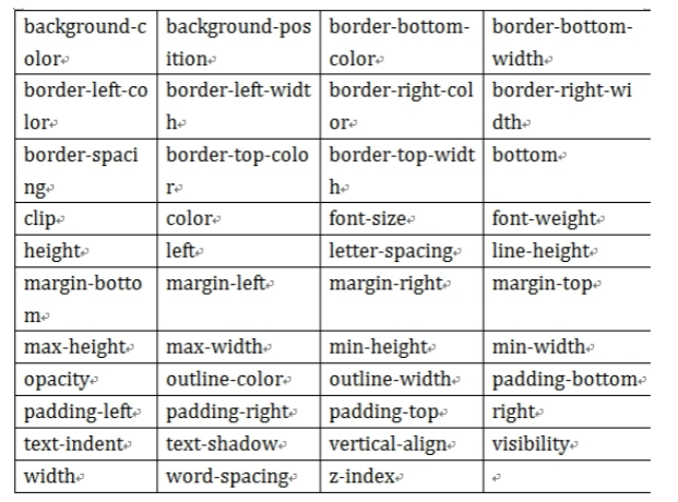
transition{1 2 3 4}
1:过渡或动画模拟的css属性
2:完成过渡所使用的时间(2s内完成)
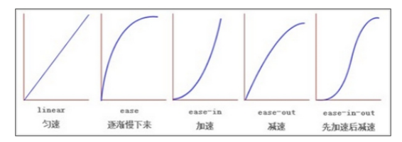
3:过渡函数。。。
4:过渡开始出现的延迟时间
transition: width 2s ease 1s;
目前,css3只开发出部分的过渡属性,下图所示:
<style>
div{
width: 100px;
height: 50px;
border: 2px solid red;
}
.a{
transition: width 2s linear 1s; /*1秒过后,div在2秒内匀速缓慢的变宽*/
}
div:hover{ width: 300px;} /*触发div变宽*/
</style>
<body>
<div class="a">Hello,拉勾</div>
</body>
动画
从一个状态到另一个状态,过程中每个时间点都可以控制。
关键帧:@keyframes 动画帧 { from{} to{} } 或者{ 0%{} 20%{}... }
动画属性:animation{ 1 , 2 , 3 , 4 , 5 }
1:动画帧
2:执行时间
3:过渡函数
4:动画执行的延迟(可省略)
5:动画执行的次数
需求1:一个 元素从左向右移动,3秒内执行2次
<style>
div{
width: 700px;
border: 1px solid red;
}
@keyframes x{
from{ margin-left: 0px;}
to{ margin-left: 550px;}
}
img{
animation: x 3s linear 2;
}
</style>
<body>
<div>
<img src="img/cat.gif">
</div>
</body>
需求2:一个 元素从左向右移动,3秒内执行完成。无限次交替执行
infinite:无限次
alternate:来回执行(交替,一去一回)
<style>
.wai{
width: 600px;
height: 100px;
border: 2px solid red;
}
.nei{
width: 40px;
height: 80px;
margin: 5px;
background: red;
}
.nei{
animation: x 3s linear infinite alternate;
}
@keyframes x{
0%{ margin-left: 0px; }
25%{ background: yellowgreen; }
50%{ background: goldenrod; }
75%{ background: palevioletred;}
100%{
background: coral;
margin-left: 550px;
}
}
</style>
<body>
<div class="wai">
<div class="nei"></div>
</div>
</body>
3 CSS - 练习


 浙公网安备 33010602011771号