鸿蒙HarmonyOS的导出导入与组件的详细讲解
模块
我们可以简单的理解为:在ArkTS中每个 ets 文件都可以看做是一个模块
默认导出和使用(与ES6一样)
默认导出:在一个模块,只能默认导出一个值或象。使用时可以自定义导入名称。
也就是说:一个文件中只能有一个默认导出。
//默认导出
export default 需要导出的内容(值或者对象)
// 使用时
import xxx from '模块路径'
默认导出的基本使用
在main/est/下创建一个目录,如:utils目录,在这个目录下创建一个module1.ets的文件.
注意:一个文件中只能有一个默认导出。
interface  Person{
  name:string,
  age:number,
  like:string[]
}

let userInfo:Person = {
  name:'zs',
  age:34,
  like:['唱歌','写代码']
}
// 现在我们导出这个对象
export  default  userInfo
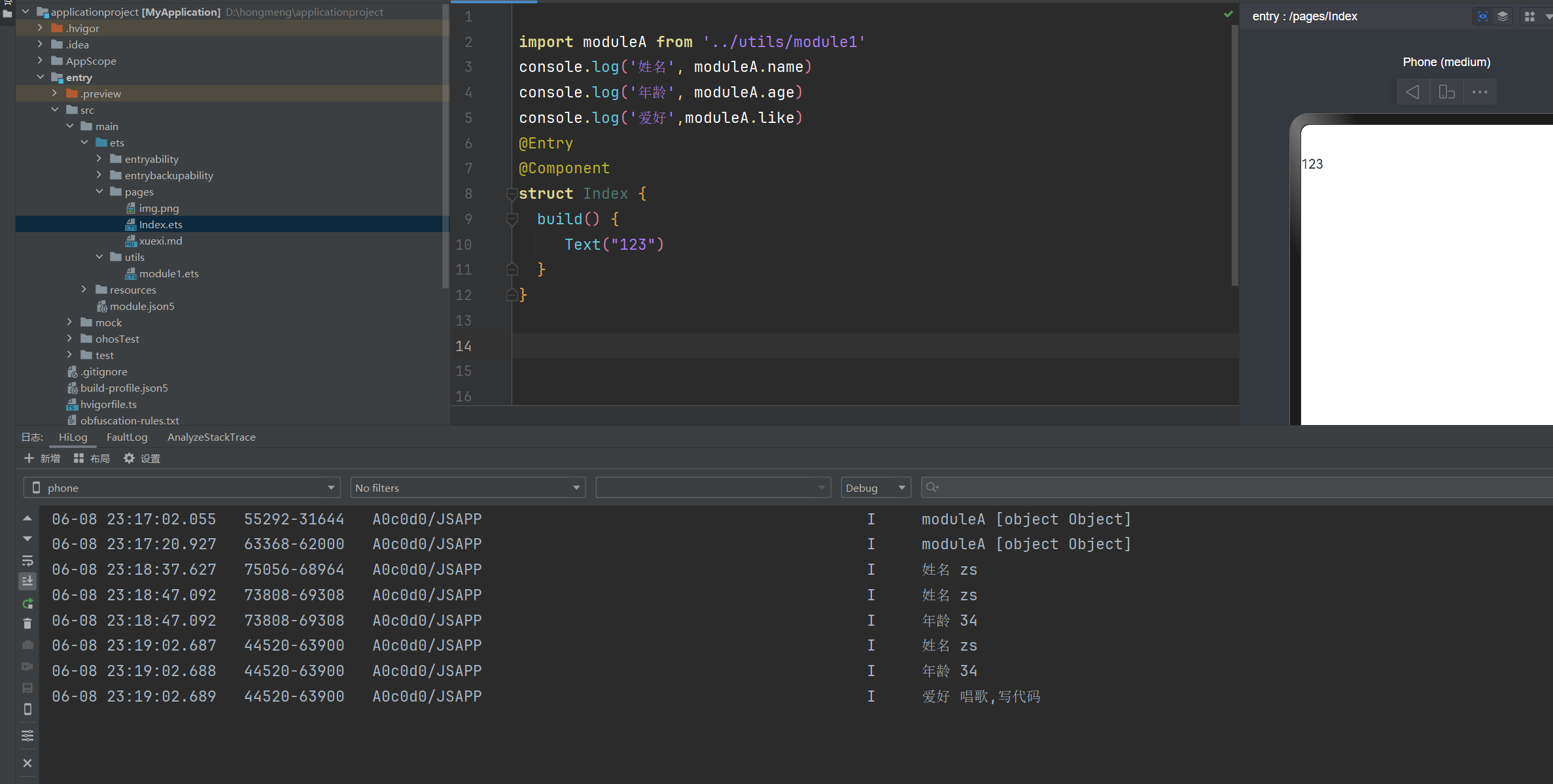
// 引入导出的文件
import moduleA from '../utils/module1'
// 获取导出的数据
console.log('姓名', moduleA.name)
console.log('年龄', moduleA.age)
console.log('爱好',moduleA.like)
@Entry
@Component
struct Index {
  build() {
     Text("123")
  }
}
按需导出和使用
按需导出:指一个模块,可以按照需要,导出多个特性
通过 export 变量A, export 变量B, export 变量C, export 变量D, 进行导出
通过 import { 变量A, 变量B,‘你需要导出的变量’ } from '路径'
按需导出和ES6一样的
interface  Person{
  name:string,
  age:number,
  like:string[]
}
//按需暴露
export  let userInfo:Person = {
  name:'zs',
  age:34,
  like:['唱歌','写代码']
}
//按需暴露
export function  sayHi(a:number,b:number){
  return a+b
}
// 按需导出
import {sayHi} from '../utils/module1'
console.log('姓名', sayHi(10,30))
@Entry
@Component
struct Index {
  build() {
     Text("123")
  }
}
按需导出使用别名 as
import {原来的名称 as 新的名称} from '路径'
// 使用别名
import {sayHi as addFun} from '../utils/module1'
console.log('姓名', addFun(10,30))
@Entry
@Component
struct Index {
  build() {
     Text("123")
  }
}
全部导入
将所有的按需导入,全部导入进来。导出部分不需要调整,调整导入的语法即可
语法:import * as moduleA from '路径'
通过 moduleA 即可获取 module1 模块中导出的所有内容
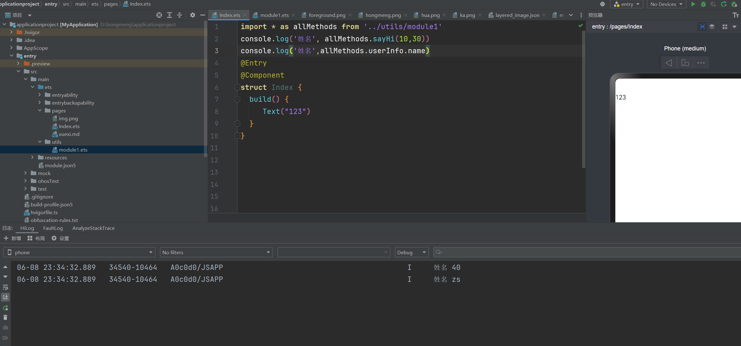
// 使用* as 进行全部导出
import * as allMethods from '../utils/module1'
console.log('姓名', allMethods.sayHi(10,30))
console.log('姓名',allMethods.userInfo.name)
@Entry
@Component
struct Index {
  build() {
     Text("123")
  }
}
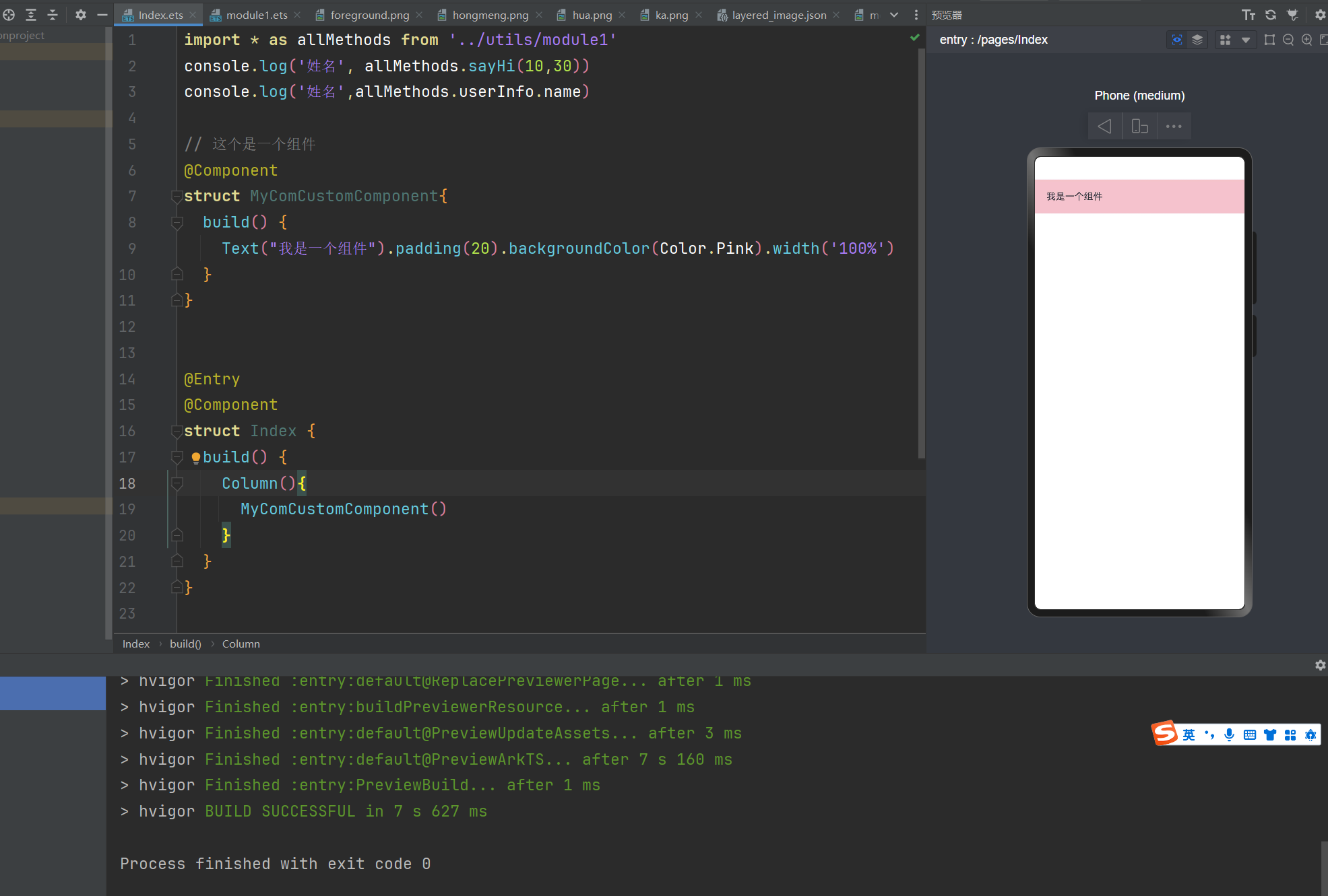
自定义组件
由框架直接提供的称为系统组件。
由开发者定义的称为自定义组件。
自定义组件的优势:1,代码复用,2,方便维护 3,提高效率
在我们自定义自定义组件的时候可以直接输入:comp然后回车快速生成组件
// 这个是一个组件
@Component
struct MyComCustomComponent{
  build() {
    Text("我是一个组件").padding(20).backgroundColor(Color.Pink).width('100%')
  }
}


@Entry
@Component
struct Index {
  build() {
    Column(){
      // 调用自定义组件
      MyComCustomComponent()
    }
  }
}
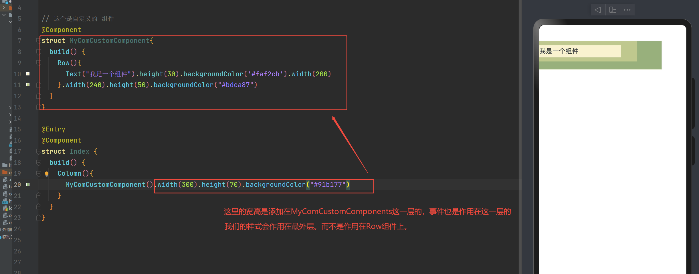
自定义组件的通用样式或组件
自定义组件可以通过点语法,设置通用的样式,通用事件等
给组件加的样式是加在组件最外层的,而不是添加在组件里面的根节点这一层。
下面我们给大伙详细介绍一下上面这一句话的意思
// 这个是自定义的 组件
@Component
struct MyComCustomComponent{
  build() {
    Row(){
      Text("我是一个组件").height(30).backgroundColor('#faf2cb').width(200)
    }.width(240).height(50).backgroundColor("#bdca87")
  }
}

@Entry
@Component
struct Index {
  build() {
    Column(){
      MyComCustomComponent().width(300).height(70).backgroundColor("#91b177")
    }
  }
}
导出组件
现在我们可以自定义组件了,在结合之前学习的导出。
此时,就是导出组件了。
我们创建components目录,在目录下创建xxx.ets文件
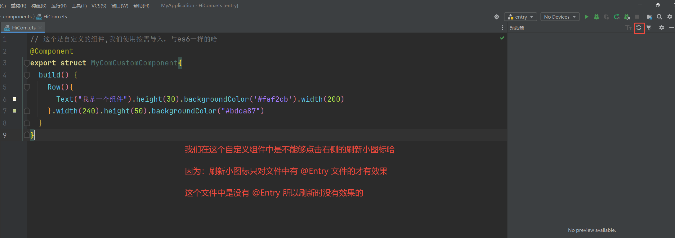
// 这个是自定义的组件,我们使用按需导入,与es6一样的哈
@Component
export struct MyComCustomComponent{
  build() {
    Row(){
      Text("我是一个组件").height(30).backgroundColor('#faf2cb').width(200)
    }.width(240).height(50).backgroundColor("#bdca87")
  }
}
import  { MyComCustomComponent } from '../components/HiCom'
@Entry
@Component
struct Index {
  build() {
    Column(){
      MyComCustomComponent().width(300).height(70).backgroundColor("#91b177")
    }
  }
}

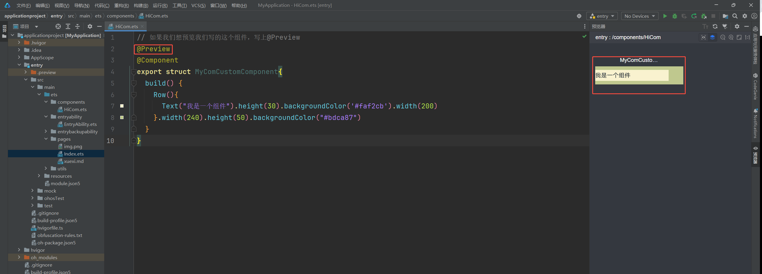
小技巧:刷新只对@Entry内容的文件才有效果
如果我们就是想预览我们写的那个组件,应该怎么操作呢?
// 如果我们想预览我们写的这个组件,写上@Preview
@Preview
@Component
export struct MyComCustomComponent{
  build() {
    Row(){
      Text("我是一个组件").height(30).backgroundColor('#faf2cb').width(200)
    }.width(240).height(50).backgroundColor("#bdca87")
  }
}
自定义组件成员变量
自定义组件,除了必须要实现build函数外,还可以定义成员函数以及成员变量。
成员函数和成员变量外部是可以覆盖的.
成员函数:使用箭头函数的就是成员函数。可以被外部覆盖
成员变量:没有@State修饰的或者说不是响应式的就是成员变量。可以被外部覆盖
@Component
export struct MyComCustomComponent{
  // 没有@State修饰的就是成员变量
  userName:string=''
  // 使用箭头函数的就是成员函数
  sayAge  = ()=>{}
  @State likeArr:string[] = ['唱歌','跳舞']
  build() {
    Row(){
      Text(`我叫${this.userName}`).height(30).backgroundColor('#faf2cb').width(200)
    }.width(240).height(50).backgroundColor("#bdca87")
  }
}
import  { MyComCustomComponent } from '../components/HiCom'
@Entry
@Component
struct Index {
  build() {
    Column(){
      MyComCustomComponent({
        userName:'张三哈',
        // 传递函数
        sayAge(){
         console.log('你好')
        }
      })
    }
  }
}
@BuilderParam (默认插槽)
利用 @BuilderParam 构建函数,可以让自定义组件允许外部传递 UI
自定义内容放在尾随闭包中,需要注意的是:尾随闭包只能放一个自定义内容
下面我们就来看下:@BuilderParam (默认插槽)
@Component
export struct MyComCustomComponent{
  // 使用 @BuilderParam 定义接收外部传递过来的UI样式
  @BuilderParam customSlotBuilder:()=>void = this.defaultCont

  // 我们可以理解为插槽的默认内容,如果没有传递就是要这里的默认内容
  @Builder
  defaultCont(){
    Text('默认内容样式').backgroundColor("#bdca87")
  }

  build() {
    Column(){
      // 我们在这里渲染样式
      this.customSlotBuilder()
    }
  }
}
import  { MyComCustomComponent } from '../components/HiCom'

@Entry
@Component
struct Index {
  build() {
    Column(){
      MyComCustomComponent(){
        // 这里叫做尾随闭包。也就是插槽中写入的UI样式。
        // 尾随闭包只能放一个自定义内容
        Text('我是父组件传递的样式').width('60%').padding(10).backgroundColor("#faf2cb")
      }
      MyComCustomComponent()
    }
  }
}
多个@BuilderParam怎么处理呢?
有的小伙伴会说: 如果多个@BuilderParam怎么传递呢?
如果是多个我们要使用key:value的形式。
有点像vue的具名插槽
@Component
export struct MyComCustomComponent{
  // 使用 @BuilderParam 定义接收外部传递过来的UI样式
  @BuilderParam customSlotBuilder:()=>void = this.defaultCont

  // 使用 @BuilderParam 定义接收外部传递过来的UI样式
  @BuilderParam helloSlotBuilder:()=>void = this.cusTomCont

  // 我们可以理解为插槽的默认内容,如果没有传递就是要这里的默认内容
  @Builder
  defaultCont(){
    Text('默认内容样式').backgroundColor("#bdca87")
  }

  // 我们可以理解为插槽的默认内容,如果没有传递就是要这里的默认内容
  @Builder
  cusTomCont(){
    Button('我就是按钮')
  }

  build() {
    Column(){
      // 我们在这里渲染样式
      this.customSlotBuilder()
      this.helloSlotBuilder()
    }
  }
}
import  { MyComCustomComponent } from '../components/HiCom'
@Entry
@Component
struct Index {
  @Builder MyCard(){
    Text('我是外界传入的').width('60%').padding(10).backgroundColor("#faf2cb")
  }

  @Builder MyButton(){
    Button('我是按钮').width('60%').padding(10).margin({ top:10 })
  }

  build() {
    Column(){
      MyComCustomComponent({
        customSlotBuilder: this.MyCard,
        helloSlotBuilder: this.MyButton
      })
    }
  }
}
尾声
现在下班好热,整的我下班都不想回去了。
遇见问题,这是你成长的机会,如果你能够解决,这就是收获。
出处:https://www.cnblogs.com/IwishIcould/
想问问题,打赏了卑微的博主,求求你备注一下的扣扣或者微信;这样我好联系你;(っ•̀ω•́)っ✎⁾⁾!
如果觉得这篇文章对你有小小的帮助的话,记得在右下角点个“推荐”哦,或者关注博主,在此感谢!
万水千山总是情,打赏5毛买辣条行不行,所以如果你心情还比较高兴,也是可以扫码打赏博主(っ•̀ω•́)っ✎⁾⁾!
想问问题,打赏了卑微的博主,求求你备注一下的扣扣或者微信;这样我好联系你;(っ•̀ω•́)っ✎⁾⁾!


如果文中有什么错误,欢迎指出。以免更多的人被误导。

 浙公网安备 33010602011771号