【从零开始搭建uniapp开发框架】(二)——使用自定义导航栏
框架开源地址:https://gitee.com/yunhaotian/uniapp_mobileFrame
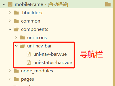
在项目文件下新建 components 文件
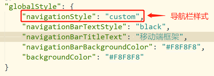
使用自定义标题栏需要把pages.json的globalStyle的导航栏样式取消默认的原生导航栏

官方的自定义导航栏样式和左边点击事件不太符合个人项目,所以对源码进行了修改,下面是源码:
<template>
	<view class="uni-navbar" :class="{'uni-dark':dark}">
		<view :class="{ 'uni-navbar--fixed': fixed, 'uni-navbar--shadow': shadow, 'uni-navbar--border': border }"
			:style="{ 'background-color': themeBgColor }" class="uni-navbar__content">
			<status-bar v-if="statusBar" />
			<view
				:style="{ color: themeColor,backgroundColor: themeBgColor ,height:navbarHeight,'background-image':bgImageColor}"
				class="uni-navbar__header">
				<view @tap="onClickLeft" class="uni-navbar__header-btns uni-navbar__header-btns-left"
					:style="{width:leftIconWidth}">
					<slot name="left">
						<view class="uni-navbar__content_view" v-if="leftIcon.length > 0">
							<uni-icons :color="themeColor" :type="leftIcon" size="20" />
						</view>
						<view :class="{ 'uni-navbar-btn-icon-left': !leftIcon.length > 0 }" class="uni-navbar-btn-text"
							v-if="leftText.length">
							<text :style="{ color: themeColor, fontSize: '12px' }">{{ leftText }}</text>
						</view>
					</slot>
				</view>
				<view class="uni-navbar__header-container " @tap="onClickTitle">
					<slot>
						<view class="uni-navbar__header-container-inner" v-if="title.length>0">
							<text class="uni-nav-bar-text uni-ellipsis-1"
								:style="{color: themeColor }">{{ title }}</text>
						</view>
					</slot>
				</view>
				<view @click="onClickRight" class="uni-navbar__header-btns uni-navbar__header-btns-right"
					:style="{width:rightIconWidth}">
					<slot name="right">
						<view v-if="rightIcon.length">
							<uni-icons :color="themeColor" :type="rightIcon" size="22" />
						</view>
						<view class="uni-navbar-btn-text" v-if="rightText.length && !rightIcon.length">
							<text class="uni-nav-bar-right-text" :style="{ color: themeColor}">{{ rightText }}</text>
						</view>
					</slot>
				</view>
			</view>
		</view>
		<view class="uni-navbar__placeholder" v-if="fixed">
			<status-bar v-if="statusBar" />
			<view class="uni-navbar__placeholder-view" :style="{ height:navbarHeight}" />
		</view>
	</view>
</template>

<script>
	import statusBar from './uni-status-bar.vue';
	const getVal = (val) => typeof val === 'number' ? val + 'px' : val;

	/**
	 * NavBar 自定义导航栏
	 * @description 导航栏组件,主要用于头部导航
	 * @tutorial https://ext.dcloud.net.cn/plugin?id=52
	 * @property {Boolean} dark 开启黑暗模式
	 * @property {String} title 标题文字
	 * @property {String} leftText 左侧按钮文本
	 * @property {String} rightText 右侧按钮文本
	 * @property {String} leftIcon 左侧按钮图标(图标类型参考 [Icon 图标](http://ext.dcloud.net.cn/plugin?id=28) type 属性)
	 * @property {String} rightIcon 右侧按钮图标(图标类型参考 [Icon 图标](http://ext.dcloud.net.cn/plugin?id=28) type 属性)
	 * @property {String} color 图标和文字颜色
	 * @property {String} backgroundColor 导航栏背景颜色
	 * @property {String} bgImage 导航栏背景颜色或者背景图片
	 * @property {Boolean} fixed = [true|false] 是否固定顶部
	 * @property {Boolean} statusBar = [true|false] 是否包含状态栏
	 * @property {Boolean} shadow = [true|false] 导航栏下是否有阴影
	 * @event {Function} clickLeft 左侧按钮点击时触发
	 * @event {Function} clickRight 右侧按钮点击时触发
	 * @event {Function} clickTitle 中间标题点击时触发
	 */
	export default {
		name: 'UniNavBar',
		components: {
			statusBar
		},
		emits: ['clickLeft', 'clickRight', 'clickTitle'],
		props: {
			dark: {
				type: Boolean,
				default: false
			},
			title: {
				type: String,
				default: ''
			},
			leftText: {
				type: String,
				default: ''
			},
			rightText: {
				type: String,
				default: ''
			},
			leftIcon: {
				type: String,
				default: ''
			},
			rightIcon: {
				type: String,
				default: ''
			},
			fixed: {
				type: [Boolean, String],
				default: false
			},
			color: {
				type: String,
				default: ''
			},
			backgroundColor: {
				type: String,
				default: ''
			},
			statusBar: {
				type: [Boolean, String],
				default: true
			},
			shadow: {
				type: [Boolean, String],
				default: false
			},
			border: {
				type: [Boolean, String],
				default: true
			},
			height: {
				type: [Number, String],
				default: 44
			},
			leftWidth: {
				type: [Number, String],
				default: 60
			},
			rightWidth: {
				type: [Number, String],
				default: 60
			},
			bgImage: {
				type: String,
				default: ''
			},
		},
		computed: {
			themeBgColor() {
				if (this.dark) {
					// 默认值
					if (this.backgroundColor) {
						return this.backgroundColor
					} else {
						return this.dark ? '#333' : '#FFF'
					}
				}
				return this.backgroundColor || '#FFF'
			},
			themeColor() {
				if (this.dark) {
					// 默认值
					if (this.color) {
						return this.color
					} else {
						return this.dark ? '#fff' : '#333'
					}
				}
				return this.color || '#fff'
			},
			bgImageColor() {
				// 默认值
				if (this.bgImage) {
					return this.bgImage
				} else {
					return 'linear-gradient(45deg, #ec008c, #6739b6)'
				}
			},
			navbarHeight() {
				return getVal(this.height)
			},
			leftIconWidth() {
				return getVal(this.leftWidth)
			},
			rightIconWidth() {
				return getVal(this.rightWidth)
			}
		},
		mounted() {
			if (uni.report && this.title !== '') {
				uni.report('title', this.title)
			}
		},
		methods: {
			onClickLeft() {
				// 把页面导航栏这边点击时间改造成页面返回事件
				// 有些页面需要返回上几级页面,使用本地存储的pageCurrent值来配合
				//默认返回上一页面
				if (uni.getStorageSync('pageCurrent') == '')
					uni.setStorageSync('pageCurrent', 1)
				if (uni.getStorageSync('pageCurrent') != 1) {
					uni.navigateBack({
						delta: uni.getStorageSync('pageCurrent')
					});
					uni.setStorageSync('pageCurrent', 1)
				} else {
					uni.navigateBack({
						delta: 1
					});
				}
				// this.$emit("clickLeft");
			},
			onClickRight() {
				this.$emit('clickRight');
			},
			onClickTitle() {
				this.$emit('clickTitle');
			}
		}
	};
</script>

<style lang="scss" scoped>
	$nav-height: 44px;

	.uni-navbar {
		// box-sizing: border-box;
	}

	.uni-nav-bar-text {
		/* #ifdef APP-PLUS */
		font-size: 34rpx;
		/* #endif */
		/* #ifndef APP-PLUS */
		font-size: 14px;
		/* #endif */
	}

	.uni-nav-bar-right-text {
		font-size: 12px;
	}

	.uni-navbar__content {
		position: relative;
		// background-color: #fff;
		// box-sizing: border-box;
		background-color: transparent;
	}

	.uni-navbar__content_view {
		// box-sizing: border-box;
	}

	.uni-navbar-btn-text {
		/* #ifndef APP-NVUE */
		display: flex;
		/* #endif */
		flex-direction: column;
		justify-content: flex-start;
		align-items: center;
		line-height: 12px;
	}

	.uni-navbar__header {
		/* #ifndef APP-NVUE */
		display: flex;
		/* #endif */
		padding: 0 10px;
		flex-direction: row;
		height: $nav-height;
		font-size: 12px;
	}

	.uni-navbar__header-btns {
		/* #ifndef APP-NVUE */
		overflow: hidden;
		display: flex;
		/* #endif */
		flex-wrap: nowrap;
		flex-direction: row;
		width: 120rpx;
		// padding: 0 6px;
		justify-content: center;
		align-items: center;
		/* #ifdef H5 */
		cursor: pointer;
		/* #endif */
	}

	.uni-navbar__header-btns-left {
		/* #ifndef APP-NVUE */
		display: flex;
		/* #endif */
		width: 120rpx;
		justify-content: flex-start;
		align-items: center;
	}

	.uni-navbar__header-btns-right {
		/* #ifndef APP-NVUE */
		display: flex;
		/* #endif */
		flex-direction: row;
		// width: 150rpx;
		// padding-right: 30rpx;
		justify-content: flex-end;
		align-items: center;
	}

	.uni-navbar__header-container {
		/* #ifndef APP-NVUE */
		display: flex;
		/* #endif */
		flex: 1;
		padding: 0 10px;
		overflow: hidden;
	}

	.uni-navbar__header-container-inner {
		/* #ifndef APP-NVUE */
		display: flex;
		/* #endif */
		flex: 1;
		flex-direction: row;
		align-items: center;
		justify-content: center;
		font-size: 12px;
		overflow: hidden;
		// box-sizing: border-box;
	}


	.uni-navbar__placeholder-view {
		height: $nav-height;
	}

	.uni-navbar--fixed {
		position: fixed;
		z-index: 998;
		/* #ifdef H5 */
		left: var(--window-left);
		right: var(--window-right);
		/* #endif */
		/* #ifndef H5 */
		left: 0;
		right: 0;
		/* #endif */

	}

	.uni-navbar--shadow {
		box-shadow: 0 1px 6px #ccc;
	}

	.uni-navbar--border {
		border-bottom-width: 1rpx;
		border-bottom-style: solid;
		border-bottom-color: #eee;
	}

	.uni-ellipsis-1 {
		overflow: hidden;
		/* #ifndef APP-NVUE */
		white-space: nowrap;
		text-overflow: ellipsis;
		/* #endif */
		/* #ifdef APP-NVUE */
		lines: 1;
		text-overflow: ellipsis;
		/* #endif */
	}

	// 暗主题配置
	.uni-dark {}
</style>
页面中使用自定义导航栏
<template>
<view>
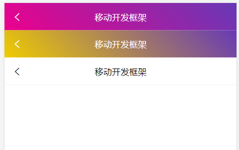
<uni-nav-bar leftIcon="arrowleft" :status-bar="true" fixed="true" color="#ffffff" bgImage="linear-gradient(45deg, #ec008c, #6739b6)" title="移动开发框架" />
<uni-nav-bar leftIcon="arrowleft" :status-bar="false" fixed="true" color="#ffffff" bgImage="url('/static/bg.png')" title="移动开发框架" />
<uni-nav-bar leftIcon="arrowleft" :status-bar="false" fixed="true" color="#000000" bgImage="#EEEEEE" title="移动开发框架" />
</view>
</template>
<script>
import uniNavBar from '@/components/uni-nav-bar/uni-nav-bar.vue'
export default {
data() {
return {
}
},
components: {
uniNavBar
},
onLoad() {
},
methods: {
}
}
</script>
<style>
</style>
效果: