CSS3
三、 CSS3
1. 圆角
1.1 border-radius: 半径
1.2 border-radius: 0px 10px 0px 10px; 左上角,右上角,右下角,左下角
1.3 border-radius: %; 通常用来设置一个椭圆,50% 为一个圆
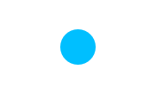
1.4 举例代码
       div{
            width: 40px; height: 40px;
            border-radius: 20px;
            background-color: deepskyblue;
            margin: 0 auto;
        }
        <div></div>
2. 添加阴影
2.1 box-shadow: 10px 20px 5px blue; 水平阴影位置,垂直阴影位置,模糊距离,颜色
3. 文本阴影
3.1 text-shadow: 10px 20px 5px blue; 水平阴影位置,垂直阴影位置,模糊度,颜色
3.2 举例代码
       p{
            color: black;
            text-shadow: 1px 1px 6px red;
            box-shadow: 6px 6px 40px black;
        }
        <p>今天天气真好,很适合学习!</p>

4. 添加字体
4.1 在项目中新建文件夹,用来放你下载好的字体资源
4.2 关键字与使用
       @font-face{
                  font-family: myFont; //你自定义的字体
                  src: url("res/ add.ttf"); //字体存放路径
       }
       p{font-family: myFont; font-size: 18px; }//使用<p></p>
5. transition 过渡
5.1 transition 允许 CSS 的属性在一定的时间内平滑的过渡
5.2 transition: left .3s ease-in-out .1s;属性名 持续时间 速度曲线 何时开始
5.3 速度曲线的属性
5.3.1 linear:以相同的速度过渡;
5.3.2 ease-in:慢速开始的过渡,等于 cubic-bezier(0.42, 0 , 1, 1)
5.3.3 ease:慢-快-慢
5.4 举例代码
       div{
            width: 200px; height: 300px;
            background-color: greenyellow;
            position: relative;
            margin-top: 20px;
            padding: 0px;
            overflow: hidden;
        }
        p{
            height: 100px;
            width: 200px;
            position: absolute;
            bottom: -100px;
            background-color: red;
            transition: .5s;
            margin: 0px;
            padding: 0px;
        }
        div:hover p{
            bottom: 0px;
        }
        <div>
           <p></p>
        </div>
6. transform 转换
6.1 transform 属性是通过函数来定义的
6.2 2D 常用属性
6.2.1 transform: rotate(20deg);元素顺时针旋转20角度,允许负值(进行逆时针旋转角度)
6.2.2 transform: translateX(20px); 元素沿X轴移动20px
6.2.3 transform: translateY(20px); 元素沿Y轴移动20px
6.3 3D 常用属性
6.3.1 transform: rotateX(); 元素围绕 x 轴以给定度数翻转
6.3.2 transform: rotateY(); 元素围绕 y 轴以给定度数翻转
6.3.3 transform: translate3d(x, y, z); 此函数规定指定元素在三维空间中的位移
6.3.4 transform: translateZ(-1px) scale(-1, 1); translateZ(-1px)改变层次,scale(x, y)负值可以达到镜像
6.3.5 transform-origin: left/right/center/top/bottom; 元素以…为原点翻转
6.3.6 transform-style: preserve-3d; 开启 3D 样式
6.3.7 perspective: 6000px; 3D 景深
7. animation 动画
7.1 animation 至少包含前两个属性值:动画的名称 动画的时长
7.2 关键字与使用
            @keyframes + 动画名{
                    from{}to{}
                    或
                    百分比{}
            }
            animation: 2s linear infinite Cd; 时长 效果 开始时间 动画名
7.3 举例代码
<style>
        div{
            width:100px; height: 100px;
            background: url("img/cd.png") no-repeat;
            background-size: 100px 100px;
            border-radius: 50%;
        }
        @keyframes CdTurn{
            from{transform: rotate(0deg);}
            to{transform: rotate(360deg);}
        }
        div:hover{
            animation: 2s linear infinite CdTurn;
        }
</style>
<div></div>

8. column 多列相关属性
8.1 column-gap: 50px; 列之间的距离
8.2 column-rule: 1px solid red; 列之间的宽度,样式,颜色
9. Media Query 媒体查询
9.1 响应式设计的核心 CSS 技术
9.2 CSS2 的媒体查询
9.2.1 表示当页页宽度为 600-900 之间,调用 small.css 样式
<link rel="stylesheet" media="screen and (min-width:600px) and (max-width:900px)" href="small.css" type="text/css" />
9.3 CSS3 的媒体查询
          <style>
             @media screen and (max-width: 600px){
                        body{background-color: red;}
             }
          </style>
9.4 关键字
9.4.1 @media 注解
9.4.2 screen 媒体类型,还有 all、print 等
9.4.3 and 连接词
9.4.4 (max-width:600px) 媒体特性
¨ 判断输出设备是否满足里面的逻辑表达式
¨ 括号内只接受0个或1个的逻辑表达式,但可以用 and 连接多个媒体特征
¨ 大部分属性接受 min/max 前缀,如 max-device-height ...
9.5 参考资料 https://www.cnblogs.com/moqiutao/p/4753839.html

 浙公网安备 33010602011771号