盒子模型
所有的标签都可以看成是一个盒子
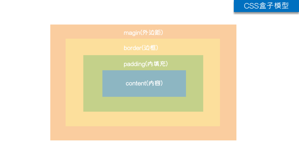
盒子模型的概念 :
1.magin(外边距):用于控制元素与元素之间的距离,两个标签之间的间隔
2.border(边框):外边框与标签的距离
3.padding(内填充):用于控制内容和标签边框的距离
4.content(内容):标签的内容(文本或者图片)
body标签自带8px的外边距
主要方法:(margin,padding)
margin-top 上边框距离
margin-left 左边框距离
margin-right 右边框距离
margin-bottom 下边框距离
ps:简写的话是四个方向的参数margin:10px 10px 10px 10px 分别是上右下左顺时针方向
padding用法与margin一致
代码实现:
<body>
  <div class="a">
     <div class="d"></div>
  </div>

</body>
  <style>
        .a{

            width: 400px;
            height: 200px;
            background: aquamarine;
            /*margin: 10px 10px 10px 10px;  !*margin参数的顺序是上右下左 顺时针方向*!*/
            margin: 100px auto;
            text-align: center;

        }
		 .d{
            width: 100px;
            height: 100px;
            background: brown;
            margin:auto; # 仅水平方向移动

        }
![image]()
浮动float(很重要!!)
在css中任何元素都可以浮动!

浮动的两个特点:
 1.浮动的框可以向左或向右移动,直到它的外边缘碰到包含框或另一个浮动边框为止
 2.由于浮动框是浮在元素上空的,文档流中的块框表现的好像浮动框不存在一样
浮动布局
float left/float right
<body>
  <div class="c">
    <div class="a"></div>
    <div class="b"></div>
  </div>
   .a{
      width: 100px;
      height: 100px;
      background: brown;
      float: left;
    }
    .b{
      width: 100px;
      height: 100px;
      background: chartreuse;
      float: left;
    }
	   .c{
      /*width: 500px;*/
      /*height: 500px;*/
      /*background: aqua;*/
      border: 5px solid black;  # 浮动塌陷现象
    }
浮动塌陷解决模板
浮动会造成父标签塌陷 这是一个不好的现象 因为会引起歧义解决浮动造成的父标签塌陷
.clearfix:after {
            content: '';
            display: block;
            clear: both;
        }
提前写好上述的css操作 遇到标签塌陷就给标签加clearfix类值即可
overflow溢出属性
值	描述
visible	默认值。内容不会被修剪,会呈现在元素框之外。
hidden	内容会被修剪,并且其余内容是不可见的。
scroll	内容会被修剪,但是浏览器会显示滚动条以便查看其余的内容。
auto	如果内容被修剪,则浏览器会显示滚动条以便查看其余的内容。
inherit	规定应该从父元素继承 overflow 属性的值。
# 圆形头像制作案例
 <style>
    div {
      height: 100px;
      width: 100px;
      border: 2px solid bisque;
      border-radius: 50%;
      overflow: hidden
    }
    div img{
      max-width: 100%;
    }
  </style>
定位
四种定位的概念
static(静态)
	所有的标签默认都不能直接通过定位修改位置 必须要切换成下面三种之一
relative(相对定位)
	相对于标签原来的位置做定位
absolute(绝对定位)
	基于已经定位过的父标签做定位(如果没有父标签则以body为参照)
fixed(固定定位)
	相对于浏览器窗口做定位
代码实操相对定位和绝对定位
<style>
        .c1 {
            height: 100px;
            width: 100px;
            background-color: red;
            float: left;
        }
        .c2 {
            height: 50px;
            width: 50px;
            background-color: #ff6700;
            float: right;
            margin-right: 400px;
            position: relative;   /*相对定位*/

        }
        .c3 {
            height: 200px;
            width: 200px;
            background-color: green;
            position: absolute;
            top: 50px;   /*绝对定位*/
        }
        .c4{
          height: 50px;
          width: 50px;
          background: bisque;
          position: fixed;   /*固定定位 */
          top: 200px;
        }
        .a{
          height: 1500px;
          width: 1500px;
          margin: 0;
          background: blueviolet;
        }
    </style>

 <div class="a">
     <div class="c1"></div>
     <div class="c2">
       <div class="c3"></div>
     </div>
     <div class="c4"></div>
  </div>
z-index
模态框!!!
浏览器的界面其实是一个三位坐标系 z轴指向用户
代码实操
<style>
    .cover {
      background-color: rgba(0,0,0,0.65);
      position: fixed;
      top: 0;
      right: 0;
      bottom: 0;
      left: 0;
      z-index: 998;
    }

    .modal {
      background-color: white;
      position: fixed;
      width: 600px;
      height: 400px;
      left: 50%;
      top: 50%;
      margin: -200px 0 0 -300px;
      z-index: 1000;
    }
  </style>
<div class="cover"></div>
<div class="modal"></div>


 浙公网安备 33010602011771号