常见的圣杯布局实现
圣杯布局
1.定位实现--圣杯布局
1.DOM结构
<div class="container">
        <div class="column" id="center"></div>
        <div class="column" id="left"></div>
        <div class="column" id="right"></div>
    </div>
首先定义出整个布局的DOM结构,主体部分由三部分组成包裹center,left,right三列,其中center定义在最前面。
2.CSS代码
假设左侧的固定宽度为200px,右侧的固定宽度为150px,则首先在container上设置,
#container{
padding-left:200px;
padding-right:150px;
}
然后对其left、right进行设置
#left{
width:200px;
margin-left:-100%;
}
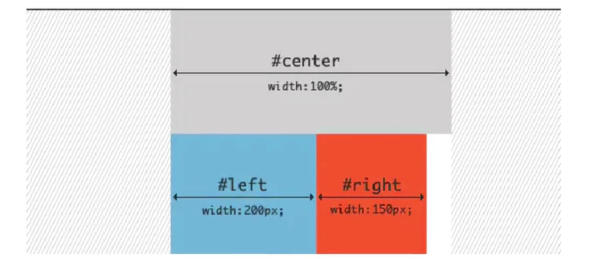
此时我们需要将其left利用定位移动到上面center位置,
postion:relative;
right:200px;
 最终 圣杯布局效果实现 center部位即可自适应
2.flex实现--圣杯布局
<!DOCTYPE html>
<html lang="en">

<head>
    <meta charset="UTF-8">
    <meta http-equiv="X-UA-Compatible" content="IE=edge">
    <meta name="viewport" content="width=device-width, initial-scale=1.0">
    <title>flex实现圣杯布局</title>
    <style>
        .container {
            display: flex;
        }

        .left {
            width: 200px;
            height: 200px;
            background-color: blueviolet;
        }

        .right {
            width: 150px;
            height: 200px;
            background-color: coral;
        }

        .center {
            flex: 1;
            /* 剩下的地方 他一个独占了 */
            height: 200px;
            background-color: aqua;
        }
    </style>
</head>

<body>
    <div class="container">
        <div class="left"></div>
        <div class="center"></div>
        <div class="right"></div>
    </div>
</body>

</html>
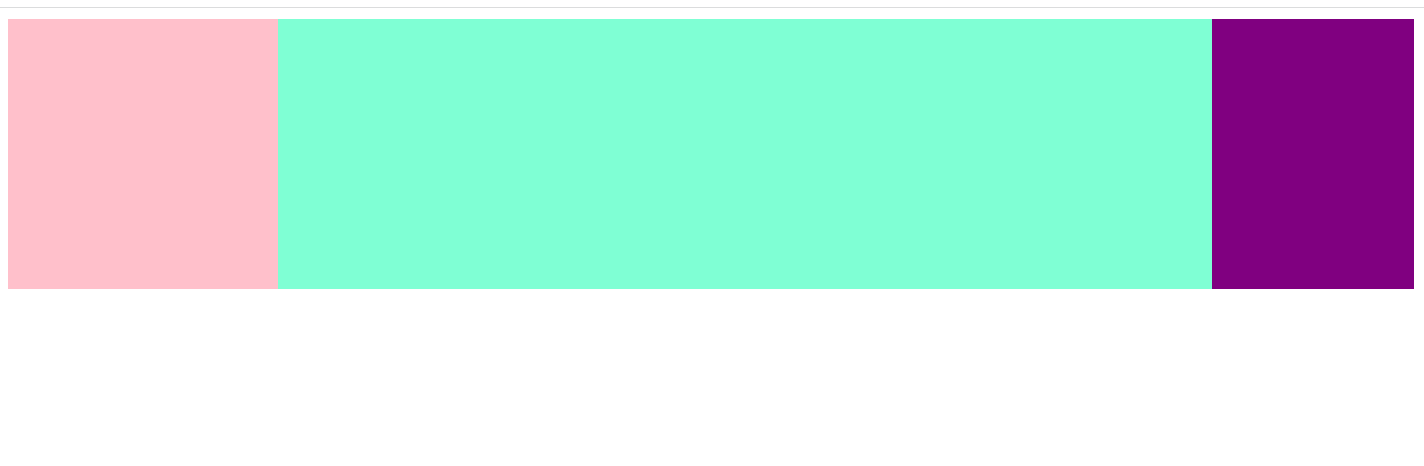
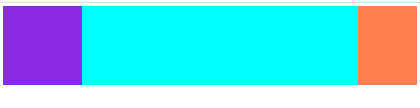
2.实现效果
3.浮动实现---圣杯布局
<!DOCTYPE html>
<html lang="en">

<head>
    <meta charset="UTF-8">
    <meta http-equiv="X-UA-Compatible" content="IE=edge">
    <meta name="viewport" content="width=device-width, initial-scale=1.0">
    <title>圣杯布局</title>
    <style>
        .container {
            margin-left: 120px;
            margin-right: 220px;
        }

        .main {
            float: left;
            width: 100%;
            height: 300px;
            background-color: green;
        }

        .left {
            position: relative;
            left: -120px;
            float: left;
            width: 100px;
            height: 300px;
            background-color: red;
            margin-left: -100%;
        }

        .right {
            position: relative;
            right: -220px;
            float: right;
            height: 300px;
            width: 200px;
            background-color: blue;
            margin-left: -200px;
        }
    </style>
</head>

<body>
    <div class="container">
        <div class="main"></div>
        <div class="left"></div>
        <div class="right"></div>
    </div>
    <script>

    </script>
</body>

</html>
喜欢阳光,更喜欢你~

 浙公网安备 33010602011771号