Python数据分析-Pyecharts第三方可视化数据分析图表
 Python数据分析-Pyecharts第三方可视化数据分析图表
1. 简介
Pyecharts是一个用于生成Echarts图表的类库。Echarts是百度开源的一个数据可视化JS库。用Echarts生成的图可视化效果非常好,而Pyecharts则是专门为了与Python衔接,方便在Python中直接使用的可视化数据分析图表。使用Pyecharts可以生成独立的网页格式的图表,还可以在flask、django中直接使用,非常方便。
2. Pyecharts图表的组成
Pyecharts不仅具备Matplotlib图表的一些常用功能,而且还提供了独有的、别具特色的功能。主要包括主题风格的设置、提示框、视觉映射、工具箱和区域缩放等。

2.1. 主题风格
theme参数设置值
|
主题 |
说明 |
主题 |
说明 |
|
ThemeType.WHITE |
默认主题 |
ThemeType.ROMA |
罗马假日主题 |
|
ThemeType.LIGHT |
浅色主题 |
ThemeType.ROMANTIC |
浪漫主题 |
|
ThemeType.DARK |
深色主题 |
ThemeType.SHINE |
闪耀主题 |
|
ThemeType.CHALK |
粉笔色 |
ThemeType.VINTAGE |
葡萄酒主题 |
|
ThemeType.ESSOS |
厄索斯大陆 |
ThemeType.WALDEN |
瓦尔登湖 |
|
ThemeType.INFOGRAPHIC |
信息图 |
ThemeType.WESTEROS |
维斯特洛大陆 |
|
ThemeType.MACARONS |
马卡龙主题 |
ThemeType.WONDERLAND |
仙境 |
|
ThemeType.PURPLE_PASSION |
紫色热烈主题 |
— |
— |
2.2. 图表标题

2.3. 图例
2.4. 提示框

2.5. 视觉映射

2.6. 工具箱

2.7. 区域缩放

3. Pyecharts图表的绘制(课上学习代码)
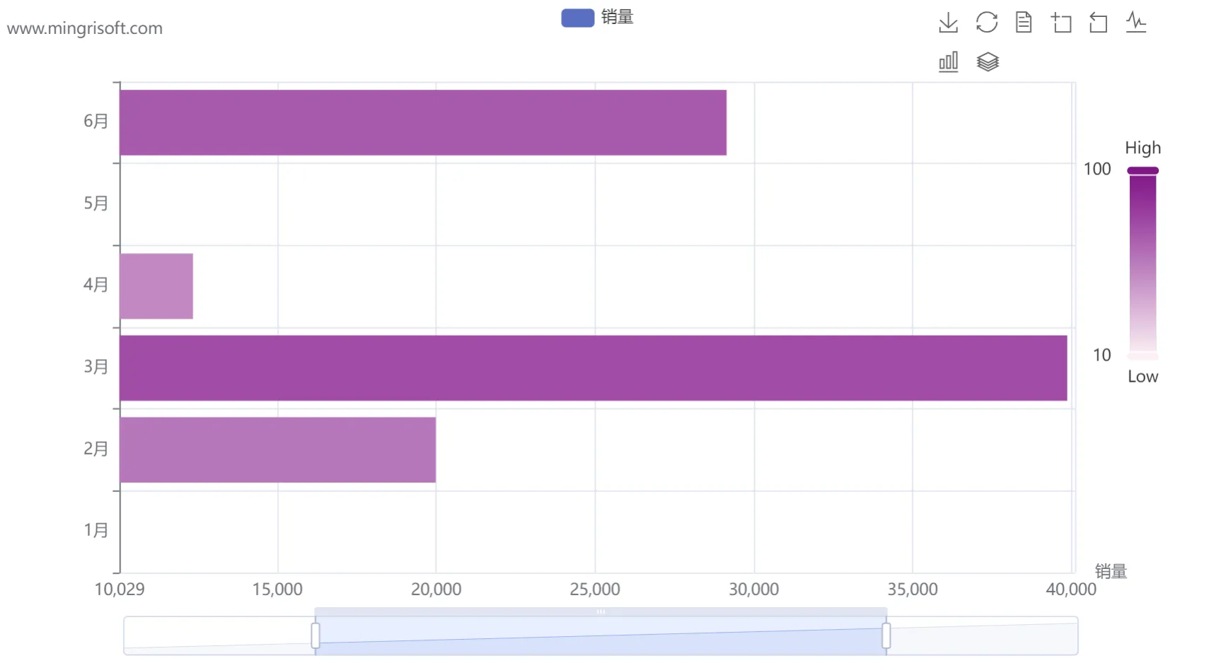
3.1. 柱状图——Bar模块
绘制柱状图/条形图主要使用Bar模块实现,主要方法介绍如下:
add_xaxis():x轴数据。
add_yaxis():y轴数据。
reversal_axis():翻转x、y轴数据。
add_dataset():原始数据。一般来说,原始数据表达的是二维表。
代码示例:
 1 from pyecharts import options as opts
 2 from pyecharts.charts import Bar
 3
 4 bar = Bar()
 5 # 为柱状图添加数据
 6 bar.add_dataset(source=[
 7     ["val", "销量", "月份"],
 8     [24, 10009, "1月"],
 9     [57, 19988, "2月"],
10     [74, 39870, "3月"],
11     [50, 12345, "4月"],
12     [99, 50145, "5月"],
13     [68, 29146, "6月"]
14 ]
15 )
16 bar.add_yaxis(
17     series_name="销量",  # 系列名称
18     y_axis=[],  # 系列数据
19     encode={"x": "销量", "y": "月份"},  # 对x轴y轴数据进行编码
20     label_opts=opts.LabelOpts(is_show=False)  # 不显示标签文本
21 )
22 bar.set_global_opts(
23     title_opts=opts.TitleOpts("线上图书月销量分析",  # 主标题
24                               subtitle='www.mingrisoft.com'),  # 副标题
25     xaxis_opts=opts.AxisOpts(name="销量"),  # x轴坐标轴名称
26     yaxis_opts=opts.AxisOpts(type_="category"),  # y轴坐标轴类型为“类目”
27     # 视觉映射
28     visualmap_opts=opts.VisualMapOpts(
29         orient="vertical",  # 竖直放置颜色条
30         pos_right=20,  # 离容器右侧的距离
31         pos_top=100,  # 离容器顶端的距离
32         min_=10,  # 颜色条最小值
33         max_=100,  # 颜色条最大值
34         range_text=["High", "Low"],  # 颜色条两端的文本
35         dimension=0,  # 颜色条映射的维度
36         range_color=["#FFF0F5", "#8B008B"]  # 颜色范围
37     ),
38     # 工具箱
39     toolbox_opts=opts.ToolboxOpts(is_show=True,  # 显示工具箱
40                                   pos_left=700),  # 工具箱离容器左侧的距离
41     # 区域缩放工具条
42     datazoom_opts=opts.DataZoomOpts()
43 )
44 bar.render("mycharts.html")  # 生成图表
运行结果:
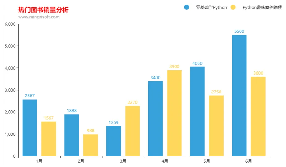
3.2. 折线/面积图——Line模块
代码示例:
 1 import pandas as pd
 2 from pyecharts.charts import Line
 3 from pyecharts import options as opts
 4
 5 # 导入Excel文件
 6 df = pd.read_excel('books.xlsx', sheet_name='Sheet2')
 7 x = list(df['年份'])
 8 y1 = list(df['京东'])
 9 y2 = list(df['天猫'])
10 y3 = list(df['自营'])
11 line = Line()  # 创建面积图
12 # 为面积图添加x轴和y轴数据
13 line.add_xaxis(xaxis_data=x)
14 line.add_yaxis(series_name="自营", y_axis=y3, areastyle_opts=opts.AreaStyleOpts(opacity=1))
15 line.add_yaxis(series_name="京东", y_axis=y1, areastyle_opts=opts.AreaStyleOpts(opacity=1))
16 line.add_yaxis(series_name="天猫", y_axis=y2, areastyle_opts=opts.AreaStyleOpts(opacity=1))
17 # 渲染图表到HTML文件,存放在程序所在目录下
18 line.render("myline2.html")
运行结果:

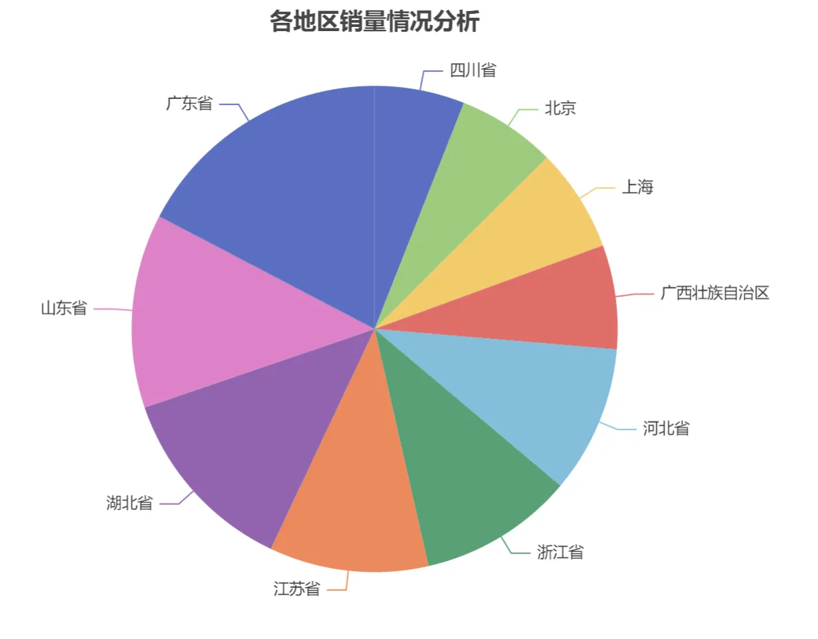
3.3. 饼形图——Pie模块
代码示例:
 1 import pandas as pd
 2 from pyecharts.charts import Pie
 3 from pyecharts import options as opts
 4
 5 # 导入Excel文件
 6 df = pd.read_excel('data2.xls')
 7 x_data = df['地区']
 8 y_data = df['销量']
 9 # 将数据转换为列表加元组的格式([(key1, value1), (key2, value2)])
10 data = [list(z) for z in zip(x_data, y_data)]
11 # 数据排序
12 data.sort(key=lambda x: x[1])
13
14 pie = Pie()  # 创建饼形图
15 # 为饼形图添加数据
16 pie.add(
17     series_name="地区",  # 序列名称
18     data_pair=data,  # 数据
19 )
20 pie.set_global_opts(
21     # 饼形图标题居中
22     title_opts=opts.TitleOpts(
23         title="各地区销量情况分析",
24         pos_left="center"),
25     # 不显示图例
26     legend_opts=opts.LegendOpts(is_show=False),
27 )
28 pie.set_series_opts(
29     # 序列标签
30     label_opts=opts.LabelOpts(),
31 )
32 # 渲染图表到HTML文件,存放在程序所在目录下
33 pie.render("mypie1.html")
运行结果:
3.4. 箱形图——Boxplot模块
代码示例:
 1 import pandas as pd
 2 from pyecharts.charts import Boxplot
 3
 4 # 导入Excel文件
 5 df = pd.read_excel('Tips.xlsx')
 6 y_data = [list(df['总消费'])]
 7
 8 boxplot = Boxplot()  # 创建箱形图
 9 # 为箱形图添加数据
10 boxplot.add_xaxis([""])
11 boxplot.add_yaxis('', y_axis=boxplot.prepare_data(y_data))
12 # 渲染图表到HTML文件,存放在程序所在目录下
13 boxplot.render("myboxplot.html")
运行结果:

3.5. 涟漪特效散点图——EffectScatter模块
代码示例:
 1 import pandas as pd
 2 from pyecharts.charts import EffectScatter
 3
 4 # 导入Excel文件
 5 df = pd.read_excel('books.xlsx', sheet_name='Sheet2')
 6 # x轴和y轴数据
 7 x = list(df['年份'])
 8 y1 = list(df['京东'])
 9 y2 = list(df['天猫'])
10 y3 = list(df['自营'])
11 # 绘制涟漪散点图
12 scatter = EffectScatter()
13 scatter.add_xaxis(x)
14 scatter.add_yaxis("", y1)
15 scatter.add_yaxis("", y2)
16 scatter.add_yaxis("", y3)
17 # 渲染图表到HTML文件,存放在程序所在目录下
18 scatter.render("myscatter.html")
运行结果:

3.6. 词云图——WordCloud模块
代码示例:
 1 from pyecharts.charts import WordCloud
 2 from jieba import analyse
 3
 4 # 基于TextRank算法从文本中提取关键词
 5 textrank = analyse.textrank
 6 text = open('111.txt', 'r', encoding='gbk').read()
 7 keywords = textrank(text, topK=30)
 8 list1 = []
 9 tup1 = ()
10
11 # 关键词列表
12 for keyword, weight in textrank(text, topK=30, withWeight=True):
13     print('%s %s' % (keyword, weight))
14     tup1 = (keyword, weight)  # 关键词权重
15     list1.append(tup1)  # 添加到列表中
16 # 绘制词云图
17 mywordcloud = WordCloud()
18 mywordcloud.add('', list1, word_size_range=[20, 100])
19 mywordcloud.render('wordclound.html')
运行结果:

3.7. 热力图——HeatMap模块
代码示例:
 1 import pyecharts.options as opts
 2 from pyecharts.charts import HeatMap
 3 import pandas as pd
 4
 5 # 导入Excel文件
 6 df = pd.read_csv('data.csv', encoding='gb2312')
 7 series = df['中奖号码'].str.split('  ', expand=True)  # 提取中奖号码
 8 # 统计每一位中奖号码出现的次数
 9 df1 = df.groupby(series[0]).size()
10 df2 = df.groupby(series[1]).size()
11 df3 = df.groupby(series[2]).size()
12 df4 = df.groupby(series[3]).size()
13 df5 = df.groupby(series[4]).size()
14 df6 = df.groupby(series[5]).size()
15 df7 = df.groupby(series[6]).size()
16 # 横向表合并(行对齐)
17 data = pd.concat([df1, df2, df3, df4, df5, df6, df7], axis=1, sort=True)
18 data = data.fillna(0)  # 空值NaN替换为0
19 data = data.round(0).astype(int)  # 浮点数转换为整数
20 # 数据转换为HeatMap支持的列表格式
21 value1 = []
22 for i in range(7):
23     for j in range(33):
24         value1.append([i, j, int(data.iloc[j, i])])
25 # 绘制热力图
26 x = ['第1位', '第2位', '第3位', '第4位', '第5位', '第6位', '第7位']
27 heatmap = HeatMap(init_opts=opts.InitOpts(width='600px', height='650px'))
28 heatmap.add_xaxis(x)
29 heatmap.add_yaxis("aa", list(data.index), value=value1,  # y轴数据
30                   # y轴标签
31                   label_opts=opts.LabelOpts(is_show=True, color='white', position="center"))
32 heatmap.set_global_opts(title_opts=opts.TitleOpts(title="统计2014~2019年双色球中奖号码出现的次数", pos_left="center"),
33                         legend_opts=opts.LegendOpts(is_show=False),  # 不显示图例
34                         xaxis_opts=opts.AxisOpts(  # 坐标轴配置项
35                             type_="category",  # 类目轴
36                             splitarea_opts=opts.SplitAreaOpts(  # 分隔区域配置项
37                                 is_show=True,
38                                 # 区域填充样式
39                                 areastyle_opts=opts.AreaStyleOpts(opacity=1)
40                             ),
41                         ),
42                         yaxis_opts=opts.AxisOpts(  # 坐标轴配置项
43                             type_="category",  # 类目轴
44                             splitarea_opts=opts.SplitAreaOpts(  # 分隔区域配置项
45                                 is_show=True,
46                                 # 区域填充样式
47                                 areastyle_opts=opts.AreaStyleOpts(opacity=1)
48                             ),
49                         ),
50                         # 视觉映射配置项
51                         visualmap_opts=opts.VisualMapOpts(is_piecewise=True,  # 分段显示
52                                                           min_=1, max_=170,  # 最小值、最大值
53                                                           orient='horizontal',  # 水平方向
54                                                           pos_left="center")  # 居中
55                         )
56 heatmap.render("heatmap.html")
运行结果:

3.8. 水球图——Liquid模块
代码示例:
1 from pyecharts.charts import Liquid
2
3 # 绘制水球图
4 liquid = Liquid()
5 liquid.add('', [0.7])
6 liquid.render("myliquid.html")
运行结果:

3.9. 日历图——Calendar模块
代码示例:
 1 import pandas as pd
 2 from pyecharts import options as opts
 3 from pyecharts.charts import Calendar
 4
 5 # 导入Excel文件
 6 df = pd.read_excel('202001.xls')
 7 data = df.stack()  # 行列转换
 8 # 求最大值和最小值
 9 mymax = round(max(data), 2)
10 mymin = round(min(data), 2)
11 # 生成日期
12 index = pd.date_range('20200601', '20200630')
13 # 合并列表
14 data_list = list(zip(index, data))
15 # 生成日历图
16 calendar = Calendar()
17 calendar.add("",
18              data_list,
19              calendar_opts=opts.CalendarOpts(range_=['2020-06-01', '2020-06-30']))
20 calendar.set_global_opts(
21     title_opts=opts.TitleOpts(title="2020年6月加班情况", pos_left='center'),
22     visualmap_opts=opts.VisualMapOpts(
23         max_=mymax,
24         min_=mymin + 0.1,
25         orient="horizontal",
26         is_piecewise=True,
27         pos_top="230px",
28         pos_left="70px",
29     ),
30 )
31 calendar.render("mycalendar.html")
运行结果:

时间:2024年2月24日

 浙公网安备 33010602011771号