

BFC
最近在面试的时候,在回答自适应布局之后被问到相关问题的时候出现了问题,后来才知道是BFC布局相关的知识,算是亡羊补牢,记录一下关于BFC的部分知识。
再说BFC之前我们要知道什么是BOX和Formatting Context。
BOX,CSS布局的基本单位。也就是盒子模型,那么我想学前端的人对这个东西一定非常熟悉。直观点来说,就是一个页面是由很多个 Box 组成的。元素的类型和 display 属性,决定了这个 Box 的类型。 不同类型的 Box, 会参与不同的 Formatting Context(一个决定如何渲染文档的容器),因此Box内的元素会以不同的方式渲染。
Formatting context 是 W3C CSS2.1 规范中的一个概念。它是页面中的一块渲染区域,并且有一套渲染规则,它决定了其子元素将如何定位,以及和其他元素的关系和相互作用。最常见的 Formatting context 有 Block fomatting context (简称BFC)和 Inline formatting context (简称IFC)。
那么BFC到底是什么呢?
如果概括一下的话,BFC就是一个独立的布局环境,其中的元素布局是不受外界的影响,并且在一个BFC中,块盒与行盒(行盒由一行中所有的内联元素所组成)都会垂直的沿着其父元素的边框排列。
BFC的布局规则
-
内部的Box会在垂直方向,一个接一个地放置。
-
Box垂直方向的距离由margin决定。属于同一个BFC的两个相邻Box的margin会发生重叠。
-
每个盒子(块盒与行盒)的margin box的左边,与包含块border box的左边相接触(对于从左往右的格式化,否则相反)。即使存在浮动也是如此。
-
BFC的区域不会与float box重叠。
-
BFC就是页面上的一个隔离的独立容器,容器里面的子元素不会影响到外面的元素。反之也如此。
-
计算BFC的高度时,浮动元素也参与计算。
如何创建BFC
- 1、float的值不是none。
- 2、position的值不是static或者relative。
- 3、display的值是inline-block、table-cell、flex、table-caption或者inline-flex
- 4、overflow的值不是visible
BFC的作用
1.利用BFC避免margin重叠。
看代码:
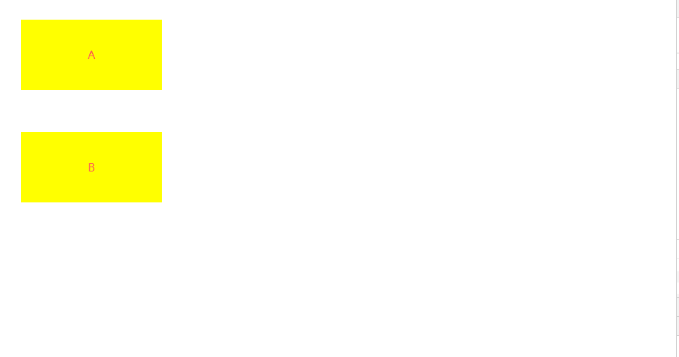
<!DOCTYPE html>
<html lang="en">
<head>
    <meta charset="UTF-8">
    <meta name="viewport" content="width=device-width, initial-scale=1.0">
    <meta http-equiv="X-UA-Compatible" content="ie=edge">
    <title>Document</title>
</head>
<style>
    *{
        margin: 0;
        padding: 0;
    }
    p {
        color: #f55;
        background: yellow;
        width: 200px;
        line-height: 100px;
        text-align:center;
        margin: 30px;
    }
</style>
<body>
    <p>A</p>
    <p>B</p>
</body>
</html>
我么看一下A和B的margin
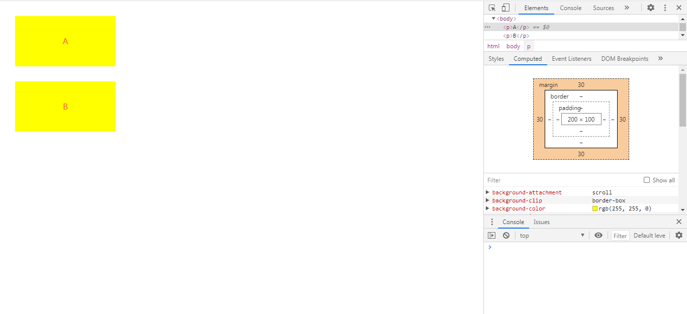
我们会看到,这两个BOX的margin都是30px 但我们会发现他们之间的距离只有30px,这不是我们期望的,那么该怎么处理呢?
这时就会用到我们的BFC,看代码
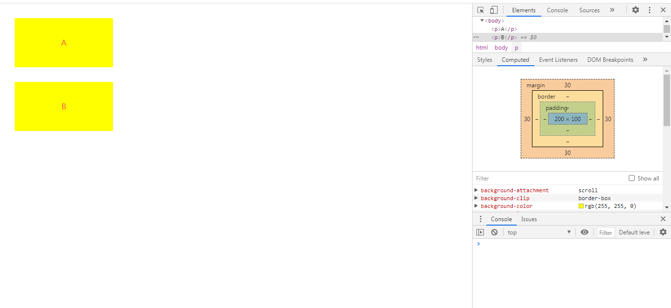
<!DOCTYPE html>
<html lang="en">
<head>
    <meta charset="UTF-8">
    <meta name="viewport" content="width=device-width, initial-scale=1.0">
    <meta http-equiv="X-UA-Compatible" content="ie=edge">
    <title>Document</title>
</head>
<style>
    *{
        margin: 0;
        padding: 0;
    }
    p {
        color: #f55;
        background: yellow;
        width: 200px;
        line-height: 100px;
        text-align:center;
        margin: 30px;
    }
    div{
        overflow: hidden;
    }
</style>
<body>
    <p>A</p>
     <div>
        <p>B</p>
    </div>
</body>
</html>
我们再看一下
很明显,他们之间的距离是60px了。根据上面第二条,我们设置两个不同的BFC,也就是我们可以让把第二个p用div包起来,然后激活它使其成为一个BFC便可以实现我们的需求。
2.自适应两栏布局
根据:
- 每个盒子的margin box的左边,与包含块border box的左边相接触(对于从左往右的格式化,否则相反)。即使存在浮动也是如此。
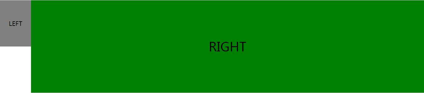
<!DOCTYPE html>
<html lang="en">
<head>
    <meta charset="UTF-8">
    <meta name="viewport" content="width=device-width, initial-scale=1.0">
    <meta http-equiv="X-UA-Compatible" content="ie=edge">
    <title>Document</title>
</head>
<style>
    *{
        margin: 0;
        padding: 0;
    }
    body {
        width: 100%;
        position: relative;
    }

    .left {
        width: 100px;
        height: 150px;
        float: left;
        background: gray;
        text-align: center;
        line-height: 150px;
        font-size: 20px;
    }

    .right {
        height: 300px;
        background: green;
        text-align: center;
        line-height: 300px;
        font-size: 40px;

    }
</style>
<body>
    <div class="left">LEFT</div>
    <div class="right">RIGHT</div>
</body>
</html>
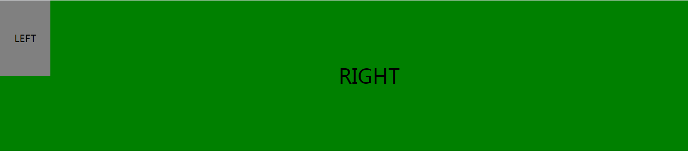
现在,我们通过是指right为一个单独的BFC便能够做到我们想要的样式。
<!DOCTYPE html>
<html lang="en">
<head>
    <meta charset="UTF-8">
    <meta name="viewport" content="width=device-width, initial-scale=1.0">
    <meta http-equiv="X-UA-Compatible" content="ie=edge">
    <title>Document</title>
</head>
<style>
    *{
        margin: 0;
        padding: 0;
    }
    body {
        width: 100%;
        position: relative;
    }

    .left {
        width: 100px;
        height: 150px;
        float: left;
        background: gray;
        text-align: center;
        line-height: 150px;
        font-size: 20px;
    }

    .right {
        height: 300px;
        background: green;
        text-align: center;
        line-height: 300px;
        font-size: 40px;
        overflow: hidden;
    }
</style>
<body>
    <div class="left">LEFT</div>
    <div class="right">RIGHT</div>
</body>
</html>
看,这就是最后的样式。
3.清除浮动。
当我们不给父节点设置高度,子节点设置浮动的时候,会发生高度塌陷,这个时候我们就要清楚浮动。
比如这样:
<!DOCTYPE html>
<html lang="en">
<head>
    <meta charset="UTF-8">
    <meta name="viewport" content="width=device-width, initial-scale=1.0">
    <meta http-equiv="X-UA-Compatible" content="ie=edge">
    <title>清除浮动</title>
</head>
<style>
    .par {
        border: 5px solid blue;
        width: 300px;
    }

    .child {
        border: 5px solid green;
        width:100px;
        height: 100px;
        float: left;
    }
</style>
<body>
    <div class="par">
        <div class="child"></div>
        <div class="child"></div>
    </div>
    <div id="i"></div>
</body>
</html>
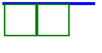
现在,我们通过给父元素激活BFC,来实现清除浮动
<!DOCTYPE html>
<html lang="en">
<head>
    <meta charset="UTF-8">
    <meta name="viewport" content="width=device-width, initial-scale=1.0">
    <meta http-equiv="X-UA-Compatible" content="ie=edge">
    <title>清除浮动</title>
</head>
<style>
    .par {
        border: 5px solid blue;
        width: 300px;
        overflow: hidden;
    }

    .child {
        border: 5px solid green;
        width:100px;
        height: 100px;
        float: left;
    }
</style>
<body>
    <div class="par">
        <div class="child"></div>
        <div class="child"></div>
    </div>
    <div id="i"></div>
</body>
</html>
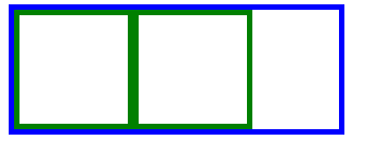
看,成功得到我们想要的样式。
总结一下:
BFC就是页面上的一个隔离的独立容器,容器里面的子元素不会影响到外面的元素。反之也如此。
因为BFC内部的元素和外部的元素绝对不会互相影响,因此, 当BFC外部存在浮动时,它不应该影响BFC内部Box的布局,BFC会通过变窄,而不与浮动有重叠。
同样的,当BFC内部有浮动时,为了不影响外部元素的布局,BFC计算高度时会包括浮动的高度

 浙公网安备 33010602011771号