考虑点:水平还是垂直;块还是行内;是否需要知道宽高;兼容性
水平居中:
块元素:margin: 0 auto
行内元素,行内块元素:text-align:center
垂直居中:
行内元素:line-height:xxpx
行内块元素:line-height:xxpx;vertical-align:middle
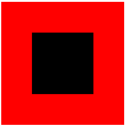
========================如果只使用line-height的效果======================
<!DOCTYPE html>
<html lang="en">
<head>
<meta charset="UTF-8">
<title>Document</title>
<style type="text/css">
#p {
width: 400px;
height: 400px;
background-color: #f00;
line-height: 400px;
}
#c {
display: inline-block;
width: 200px;
height: 200px;
background-color: #000;
}
</style>
</head>
<body>
<div id="p">
<div id="c">
</div>
</div>
</body>
</html>
![]()
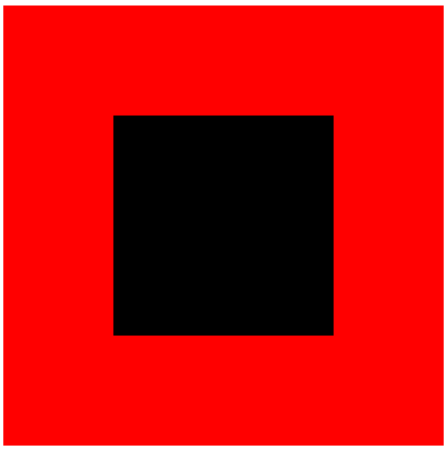
========================加上vertical-align:middle的效果======================
<!DOCTYPE html>
<html lang="en">
<head>
<meta charset="UTF-8">
<title>Document</title>
<style type="text/css">
#p {
width: 400px;
height: 400px;
background-color: #f00;
line-height: 400px;
}
#c {
display: inline-block;
width: 200px;
height: 200px;
background-color: #000;
/* 以中线为基准进行居中 */
vertical-align: middle;
}
</style>
</head>
<body>
<div id="p">
<div id="c">
</div>
</div>
</body>
</html>
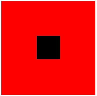
水平垂直同时居中:
absolute方法:
已知宽高:负数margin
===================举例========================
<!DOCTYPE html>
<html lang="en">
<head>
<meta charset="UTF-8">
<title>Document</title>
<style type="text/css">
#p {
width: 400px;
height: 400px;
background-color: #f00;
position: relative;
}
#c {
width: 200px;
height: 200px;
background-color: #000;
position: absolute;
top: 50%;
left: 50%;
margin-top: -100px;
margin-left: -100px;
}
</style>
</head>
<body>
<div id="p">
<div id="c">
</div>
</div>
</body>
</html>
已知宽高:calc(CSS3,IE8及以下不支持)
========================举例============================
<!DOCTYPE html>
<html lang="en">
<head>
<meta charset="UTF-8">
<title>Document</title>
<style type="text/css">
#p {
width: 400px;
height: 400px;
background-color: #f00;
position: relative;
}
#c {
width: 200px;
height: 200px;
background-color: #000;
position: absolute;
/* top: 50%;
left: 50%;
margin-top: -100px;
margin-left: -100px; */
top: calc(50% - 100px);
left: calc(50% - 100px);
}
</style>
</head>
<body>
<div id="p">
<div id="c">
</div>
</div>
</body>
</html>
需要设定宽高:margin auto
========================举例============================
<!DOCTYPE html>
<html lang="en">
<head>
<meta charset="UTF-8">
<title>Document</title>
<style type="text/css">
#p {
width: 400px;
height: 400px;
background-color: #f00;
position: relative;
}
#c {
width: 200px;
height: 200px;
background-color: #000;
position: absolute;
top: 0;
left: 0;
bottom: 0;
right: 0;
margin: auto;
}
</style>
</head>
<body>
<div id="p">
<div id="c">
</div>
</div>
</body>
</html>
不需要设定宽高:transform(CSS3,IE8及以下不支持)
========================举例============================
<!DOCTYPE html>
<html lang="en">
<head>
<meta charset="UTF-8">
<title>Document</title>
<style type="text/css">
#p {
width: 400px;
height: 400px;
background-color: #f00;
position: relative;
}
#c {
width: 200px;
height: 200px;
background-color: #000;
position: absolute;
top: 50%;
left: 50%;
transform: translate(-50%, -50%);
}
</style>
</head>
<body>
<div id="p">
<div id="c">
</div>
</div>
</body>
</html>
![]()
水平垂直同时居中:
inline-block + table>tr>td: align="center", valign="middle"
========================举例============================
<!DOCTYPE html>
<html lang="en">
<head>
<meta charset="UTF-8">
<title>Document</title>
<style type="text/css">
td {
text-align: center;
width: 400px;
height: 400px;
background-color: #f00;
}
#div1 {
display: inline-block;
width: 100px;
height: 100px;
background-color: #000;
}
</style>
</head>
<body>
<table>
<tr>
<td>
<div id="div1"></div>
</td>
</tr>
</table>
</body>
</html>
inline-block + table-cell: text-align: center; vertical-align: middle(CSS3, IE8及以下不支持)
========================举例============================
<!DOCTYPE html>
<html lang="en">
<head>
<meta charset="UTF-8">
<title>Document</title>
<style type="text/css">
#p {
width: 400px;
height: 400px;
background-color: #f00;
display: table-cell;
text-align: center;
vertical-align: middle;
}
.div1 {
display: inline-block;
width: 100px;
height: 100px;
background-color: #000;
}
</style>
</head>
<body>
<div id="p">
<div class="div1"></div>
</div>
</body>
</html>
inline-block + writing - mode: 两层嵌套
========================举例============================
<!DOCTYPE html>
<html lang="en">
<head>
<meta charset="UTF-8">
<title>Document</title>
<style type="text/css">
#div1 {
width: 400px;
height: 400px;
border: 2px solid #000;
writing-mode: vertical-lr;
text-align: center;
}
#div2 {
display: inline-block;
width: 100%;
writing-mode: horizontal-tb;
text-align: center;
}
#c {
vertical-align: middle;
display: inline-block;
width: 100px;
height: 100px;
background-color: #000;
}
</style>
</head>
<body>
<div id="div1">
<div id="div2">
<div id="c">
</div>
</div>
</div>
</body>
</html>
inline-block + 父子字体:
========================举例============================
<!DOCTYPE html>
<html lang="en">
<head>
<meta charset="UTF-8">
<title>Document</title>
<style type="text/css">
#p {
width: 200px;
height: 200px;
background-color: #f00;
text-align: center;
font-size: 128px;
}
#c {
font-size: 16px;
display: inline-block;
vertical-align: middle;
width: 50px;
height: 50px;
background-color: #000;
}
</style>
</head>
<body>
<div id="p">
<div id="c">
</div>
</div>
</body>
</html>
flex: justify - content: center; align-items: center; (CSS3, IE9及以下不支持)
========================举例============================
<!DOCTYPE html>
<html lang="en">
<head>
<meta charset="UTF-8">
<title>Document</title>
<style type="text/css">
#p {
display: flex;
justify-content: center;
align-items: center;
width: 400px;
height: 400px;
background-color: #f00;
}
#c {
width: 200px;
height: 200px;
background-color: #000;
}
</style>
</head>
<body>
<div id="p">
<div id="c">
</div>
</div>
</body>
</html>
grid: align - self: center; justify-self: center;(CSS3, IE9及以下,Chrome56及以下,FF51及以下,安卓5及以下,IOS10.2及以下,不支持)
========================举例============================
<!DOCTYPE html>
<html lang="en">
<head>
<meta charset="UTF-8">
<title>Document</title>
<style type="text/css">
#p {
display: grid;
width: 400px;
height: 400px;
background-color: #f00;
}
#c {
align-self: center;
justify-self: center;
width: 200px;
height: 200px;
background-color: #000;
}
</style>
</head>
<body>
<div id="p">
<div id="c">
</div>
</div>
</body>
</html>


 浙公网安备 33010602011771号