CSS样式-浮动
浮动,就是使元素脱离标准流,移动到其父元素指定的位置的过程,包括float: left float: right;
浮动只对后面的块元素有影响,不会影响到前面的块以及本身,但是块级元素对前后都产生影响
浮动常见的问题:
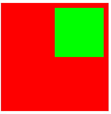
1.浮动的子元素无法超出父元素的范围;
<head>
<style type="text/css">
#father {
width: 200px;
height: 200px;
background-color:#f00;
}
#son {
width: 100px;
height: 100px;
background-color: #0f0;
float:right;
}
</style>
</head>
<body>
<div id="father">
<div id="son"></div>
</div>
</body>
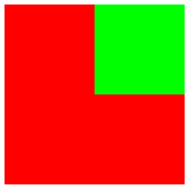
2.如果父元素设置padding,那么子元素无法超出父元素的padding;
<head>
<style type="text/css">
#father {
width: 200px;
height: 200px;
background-color:#f00;
padding: 10px;
}
#son {
width: 100px;
height: 100px;
background-color: #0f0;
float:right;
}
</style>
</head>
<body>
<div id="father">
<div id="son"></div>
</div>
</body>
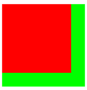
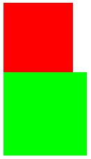
3.两个div,第一个浮动,布局方式:
<head>
<style type="text/css">
.red {
width: 100px;
height: 100px;
background-color:#f00;
float: left;
}
.green {
width: 120px;
height: 120px;
background-color:#0f0;
}
</style>
</head>
<body>
<div class="red"></div>
<div class="green"></div>
</body>
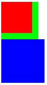
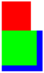
4.三个div,第一个浮动,布局方式:第一个div脱离标准流,剩余两个补位
<head>
<style type="text/css">
.red {
width: 100px;
height: 100px;
background-color:#f00;
float: left;
}
.green {
width: 120px;
height: 120px;
background-color:#0f0;
}
.blue {
width: 140px;
height: 140px;
background-color: #00f;
}
</style>
</head>
<body>
<div class="red"></div>
<div class="green"></div>
<div class="blue"></div>
</body>
5.两个div,第一个不浮动,第二个浮动,布局方式:两个div仍然独占一行,互不影响
<head>
<style type="text/css">
.red {
width: 100px;
height: 100px;
background-color:#f00;
}
.green {
width: 120px;
height: 120px;
background-color:#0f0;
float: left;
}
</style>
</head>
<body>
<div class="red"></div>
<div class="green"></div>
</body>
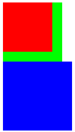
6.三个div,第一个不浮动,第二个浮动,第三个不浮动,布局方式:第一个和第二个div仍然独占一行,第三个补位
<head>
<style type="text/css">
.red {
width: 100px;
height: 100px;
background-color:#f00;
}
.green {
width: 120px;
height: 120px;
background-color:#0f0;
float: left;
}
.blue {
width: 140px;
height: 140px;
background-color: #00f;
}
</style>
</head>
<body>
<div class="red"></div>
<div class="green"></div>
<div class="blue"></div>
</body>
7.三个div,第一个浮动,第二个不浮动,第三个浮动,布局方式:第二个补位到第一个下面,第二个由于是块级元素,独占一行,第三个在第二个的下方
===================结论:====================
在工程中,一个父元素下,尽量让所有的子元素都浮动
<head>
<style type="text/css">
.red {
width: 100px;
height: 100px;
background-color:#f00;
float: left;
}
.green {
width: 120px;
height: 120px;
background-color:#0f0;
float: left;
}
.blue {
width: 140px;
height: 140px;
background-color: #00f;
}
</style>
</head>
<body>
<div>
<div class="red"></div>
<div class="green"></div>
</div>
<div class="blue"></div>
</body>

不设置宽度的前提下,一个块级元素浮动以后,会产生类似inline-block的特性,宽度是根据自己的内容的最小宽度,而不是父元素的最大宽度。
<head>
<style type="text/css">
div {
height: 50px;
background-color: #f00;
float: left;
}
</style>
</head>
<body>
<div>ABCD1234</div>
</body>

一个行内元素浮动以后,会产生类似inline-block的特性,可以设定宽度和高度
<head>
<style type="text/css">
span {
height: 50px;
background-color: #0f0;
float: left;
}
</style>
</head>
<body>
<span>1234abcd</span>
</body>

扩展一:不设置float: left;的场景:高度和宽度不生效,高度和宽度根据内容决定
<head>
<style type="text/css">
span {
height: 50px;
background-color: #0f0;
/*float: left;*/
}
</style>
</head>
<body>
<span>1234abcd</span>
</body>

扩展二:设置display: block;的场景,宽度会无限长,同时高度会按照设定的高度生效
<head>
<style type="text/css">
span {
height: 50px;
background-color: #0f0;
display: block;
}
</style>
</head>
<body>
<span>1234abcd</span>
</body>


 浙公网安备 33010602011771号