基于Sklearn机器学习代码实战
 本文主要跟随Datawhale的学习路线以及内容教程,详细介绍了机器学期常见的多个基础算法的基于sklearn的实现过程,内容丰富。
LinearRegression
线性回归入门
数据生成
为了直观地看到算法的思路,我们先生成一些二维数据来直观展现
import numpy as np
import matplotlib.pyplot as plt

def true_fun(X): # 这是我们设定的真实函数,即ground truth的模型
    return 1.5*X + 0.2

np.random.seed(0) # 设置随机种子
n_samples = 30 # 设置采样数据点的个数

'''生成随机数据作为训练集,并且加一些噪声'''
X_train = np.sort(np.random.rand(n_samples))
y_train = (true_fun(X_train) + np.random.randn(n_samples) * 0.05).reshape(n_samples,1)
# 训练数据是加上一定的随机噪声的
定义模型
我们可以直接点用sklearn中的LinearRegression即可:
from sklearn.linear_model import LinearRegression
model = LinearRegression() # 这就是我们的模型
model.fit(X_train[:, np.newaxis], y_train) # 训练模型
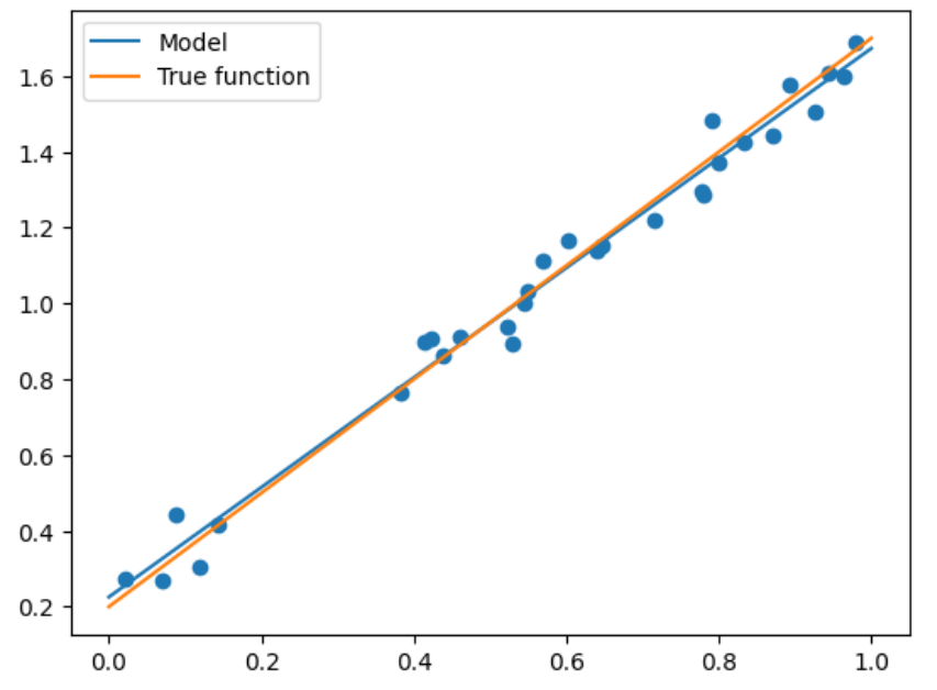
print("输出参数w:",model.coef_)
print("输出参数b:",model.intercept_)
输出参数w: [[1.4474774]]
输出参数b: [0.22557542]
注意上面代码中的np.newaxis,因为X_train是一个一维的向量,那么其作用就是将X_train变成一个N*1的二维矩阵而已。其实写成X_train[:,None]是相同的效果。
至于为什么要这么做,你可以不这么做试一下,会报错为:
Reshape your data either using array.reshape(-1, 1) if your data has a single feature or array.reshape(1, -1) if it contains a single sample.
可以简单理解为这是sklearn的库对训练数据的要求,不能够是一个一维的向量。
模型测试与比较
可以看到我们输出为1.44和0.22,还是很接近真实答案的,那么我们选取一批测试集来看看精度:
X_test = np.linspace(0,1,100)  # 0和1之间,产生100个等间距的
plt.plot(X_test, model.predict(X_test[:, np.newaxis]), label = "Model")  # 将拟合出来的散点画出
plt.plot(X_test, true_fun(X_test), label = "True function")  # 真实结果
plt.scatter(X_train, y_train)  # 画出训练集的点
plt.legend(loc="best")  # 将标签放在最合适的位置
plt.show()
上述情况是最简单的,但当出现更高维度时,我们就需要进行多项式回归才能够满足需求了。
多项式回归
具体实现
对于多项式回归,一般是利用线性回归求解\(y=\sum_{i=1}^m b_i \times x^i\),因此算法如下:
import numpy as np
import matplotlib.pyplot as plt
from sklearn.pipeline import Pipeline
from sklearn.preprocessing import PolynomialFeatures  # 导入能够计算多项式特征的类
from sklearn.linear_model import LinearRegression
from sklearn.model_selection import cross_val_score  # 交叉验证

def true_fun(X):  # 真实函数
    return np.cos(1.5 * np.pi * X)

np.random.seed(0)
n_samples = 30

X = np.sort(np.random.rand(n_samples))  # 随机采样后排序
y = true_fun(X) + np.random.randn(n_samples) * 0.1

degrees = [1, 4, 15] # 多项式最高次,我们分别用1次,4次和15次的多项式来尝试拟合
plt.figure(figsize=(14, 5))
for i in range(len(degrees)):
    ax = plt.subplot(1, len(degrees), i+1)  # 总共三个图,获取第i+1个图的图像柄
    plt.setp(ax, xticks = (), yticks = ())  # 这是 设置ax图中的属性
    polynomial_features = PolynomialFeatures(degree=degrees[i],include_bias=False)
    # 建立多项式回归的类,第一个参数就是多项式的最高次数,第二个是是否包含偏置
    linear_regression = LinearRegression()  # 线性回归
    pipeline = Pipeline([("polynomial_features", polynomial_features),
                         ("linear_regression", linear_regression)]) # 使用pipline串联模型
    pipeline.fit(X[:, np.newaxis], y)
    scores = cross_val_score(pipeline, X[:, np.newaxis], y, scoring="neg_mean_squared_error", cv=10)
    # 使用交叉验证,第一个参数为模型,第二个为输入,第三个为标签,第四个为误差计算方式,第五个为多少折
    X_test = np.linspace(0, 1, 100)
    plt.plot(X_test, pipeline.predict(X_test[:, np.newaxis]), label="Model")
    plt.plot(X_test, true_fun(X_test), label="True function")
    plt.scatter(X, y, edgecolor='b', s=20, label="Samples")
    plt.xlabel("x")
    plt.ylabel("y")
    plt.xlim((0, 1))
    plt.ylim((-2, 2))
    plt.legend(loc="best")
    plt.title("Degree {}\nMSE = {:.2e}(+/- {:.2e})".format(degrees[i], -scores.mean(), scores.std()))
plt.show()
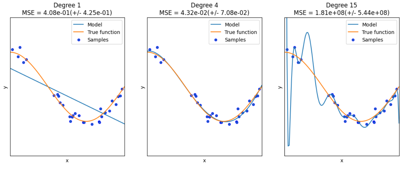
这里解释两个地方:
- PolynomialFeatures:这个类实际上是一个构造特征的类,因为我们原始的X是一个一维的向量,它多项式的次数为1,那我们希望构成一个多项式就需要拿X去计算\(X^1,X^2,...,X^m\)(这是一个变量的情况,如果是多个变量就会计算交叉乘),那么这个类就是实现这样的操作,构造成m个特征
- pipeline:这是方便我们的管道,它将各种模块加在一起让我们不用一步步去计算每一个模块,这里就是将PolynomialFeatures和线性回归模块加在一起,那我们将X传进去之后,就经过特征构造后就进行线性回归,因此拟合管道即可。
在其中我们还用到了交叉验证的思路,这部分很常见就不多做解释了。
LogisticRegression
算法思想简述
对于逻辑回归大部分是面对二分类问题,给定数据\(X=\{x_1,x_2,...,\},Y=\{y_1,y_2,...,\}\)
考虑二分类任务,那么其假设函数就是:
来表示为类别1或者类别0的概率。
那么其损失函数一般是采用极大似然估计法来定义:
这里假设\(y_1=1,y_2=0\)。那么就是该函数最大化,化简可得:
再利用梯度下降即可。
算法实现
# 下面为sklearn版本
import numpy as np
from sklearn.datasets import fetch_openml

mnist = fetch_openml("mnist_784")  # 数据
X, y = mnist['data'], mnist['target']
X_train = np.array(X[:60000], dtype = float)
y_train = np.array(y[:60000], dtype = float)
X_test = np.array(X[60000:], dtype = float)
y_test = np.array(y[60000:], dtype = float)  # 构造训练集和数据集
print(X_train.shape)
print(y_train.shape)
print(X_test.shape)
print(y_test.shape)
(60000, 784)
(60000,)
(10000, 784)
(10000,)
from sklearn.linear_model import LogisticRegression
clf = LogisticRegression(penalty='l1', solver='saga', tol=0.1)
# 第一个参数为惩罚项选择l1还是l2,tol是停止求解的条件,solver可以认为是求解器
clf.fit(X_train, y_train)
score = clf.score(X_test, y_test)
print("Test score with L1 penalty: %.4f" % score)
Test score with L1 penalty: 0.9245
这里我好奇的是逻辑回归面对的是二分类问题,可是这里我们直接给他多分类问题的数据集为何能够直接求解,查了一遍发现是类内部的优化帮你实现了这一过程。
# 以下为pytorch版本
from torch.utils.data import DataLoader
from torchvision import datasets
import torchvision
import torchvision.transforms as transforms
import matplotlib.pyplot as plt
from sklearn.linear_model import LogisticRegression
from sklearn.metrics import classification_report
import numpy as np
train_dataset = datasets.MNIST(root = p_parent_path+'/datasets/', train = True,transform = transforms.ToTensor(), download = False)
test_dataset = datasets.MNIST(root = p_parent_path+'/datasets/', train = False, transform = transforms.ToTensor(), download = False)
#加载数据集
batch_size = len(train_dataset)
train_loader = DataLoader(dataset=train_dataset, batch_size=batch_size, shuffle=True)
test_loader = DataLoader(dataset=test_dataset, batch_size=batch_size, shuffle=True)
# 数据加载器
X_train,y_train = next(iter(train_loader))
X_test,y_test = next(iter(test_loader))
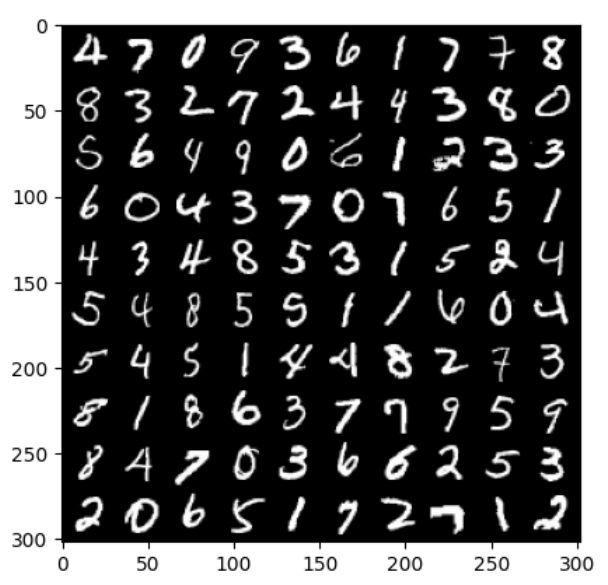
# 打印前100张图片
images, labels= X_train[:100], y_train[:100]
# 使用images生成宽度为10张图的网格大小
img = torchvision.utils.make_grid(images, nrow=10)
# cv2.imshow()的格式是(size1,size1,channels),而img的格式是(channels,size1,size1),
# 所以需要使用.transpose()转换,将颜色通道数放至第三维
img = img.numpy().transpose(1,2,0)
print(images.shape)
print(labels.reshape(10,10))
print(img.shape)
plt.imshow(img)
plt.show()
torch.Size([100, 1, 28, 28])
tensor([[4, 7, 0, 9, 3, 6, 1, 7, 7, 8],
        [8, 3, 2, 7, 2, 4, 4, 3, 8, 0],
        [5, 6, 4, 9, 0, 6, 1, 2, 3, 3],
        [6, 0, 4, 3, 7, 0, 7, 6, 5, 1],
        [4, 3, 4, 8, 5, 3, 1, 5, 2, 4],
        [5, 4, 8, 5, 5, 1, 1, 6, 0, 4],
        [5, 4, 5, 1, 4, 4, 8, 2, 7, 3],
        [8, 1, 8, 6, 3, 7, 7, 9, 5, 9],
        [8, 4, 7, 0, 3, 6, 6, 2, 5, 3],
        [2, 0, 6, 5, 1, 7, 2, 7, 1, 2]])
(302, 302, 3)
X_train,y_train = X_train.cpu().numpy(),y_train.cpu().numpy() # tensor转为array形式)
X_test,y_test = X_test.cpu().numpy(),y_test.cpu().numpy() # tensor转为array形式)
X_train = X_train.reshape(X_train.shape[0],784)  # 展开成1维度的向量的形式,长度为28*28等于784
X_test = X_test.reshape(X_test.shape[0],784)
model = LogisticRegression(solver='lbfgs', max_iter = 400)
model.fit(X_train, y_train)
y_pred = model.predict(X_test)
print(classification_report(y_test, y_pred)) # 打印报告
precision    recall  f1-score   support

           0       0.50      0.75      0.60         4
           1       0.71      1.00      0.83        10
           2       0.79      0.85      0.81        13
           3       0.79      0.69      0.73        16
           4       0.83      0.91      0.87        11
           5       0.60      0.23      0.33        13
           6       1.00      1.00      1.00         5
           7       0.88      1.00      0.93         7
           8       0.67      0.83      0.74        12
           9       0.71      0.56      0.63         9

    accuracy                           0.75       100
   macro avg       0.75      0.78      0.75       100
weighted avg       0.74      0.75      0.73       100
Decision Tree
首先介绍一个数据集,鸢尾花(iris)数据集,数据集内包含 3 类共 150 条记录,每类各 50 个数据,每条记录都有 4 项特征:花萼长度、花萼宽度、花瓣长度、花瓣宽度,可以通过这4个特征预测鸢尾花卉属于(iris-setosa, iris-versicolour, iris-virginica)中的哪一品种。
import seaborn as sns
from pandas import plotting
import pandas as pd
import numpy as np
import matplotlib.pyplot as plt
from sklearn.tree import DecisionTreeClassifier
from sklearn.datasets import load_iris
from sklearn.model_selection import train_test_split
from sklearn import tree

# 加载数据集
data = load_iris()
# 转换成DataFrame的格式
df = pd.DataFrame(data.data, columns=data.feature_names)
df['Species'] = data.target  # 添加品种列
# 查看数据集信息
print(f"数据集信息:\n{df.info()}")
# 查看前5条数据
print(f"前5条数据:\n{df.head()}")
df.describe()
<class 'pandas.core.frame.DataFrame'>
RangeIndex: 150 entries, 0 to 149
Data columns (total 5 columns):
 #   Column             Non-Null Count  Dtype
---  ------             --------------  -----
 0   sepal length (cm)  150 non-null    float64
 1   sepal width (cm)   150 non-null    float64
 2   petal length (cm)  150 non-null    float64
 3   petal width (cm)   150 non-null    float64
 4   Species            150 non-null    int32
dtypes: float64(4), int32(1)
memory usage: 5.4 KB
数据集信息:
None
前5条数据:
   sepal length (cm)  sepal width (cm)  petal length (cm)  petal width (cm)  \
0                5.1               3.5                1.4               0.2
1                4.9               3.0                1.4               0.2
2                4.7               3.2                1.3               0.2
3                4.6               3.1                1.5               0.2
4                5.0               3.6                1.4               0.2

   Species
0        0
1        0
2        0
3        0
4        0
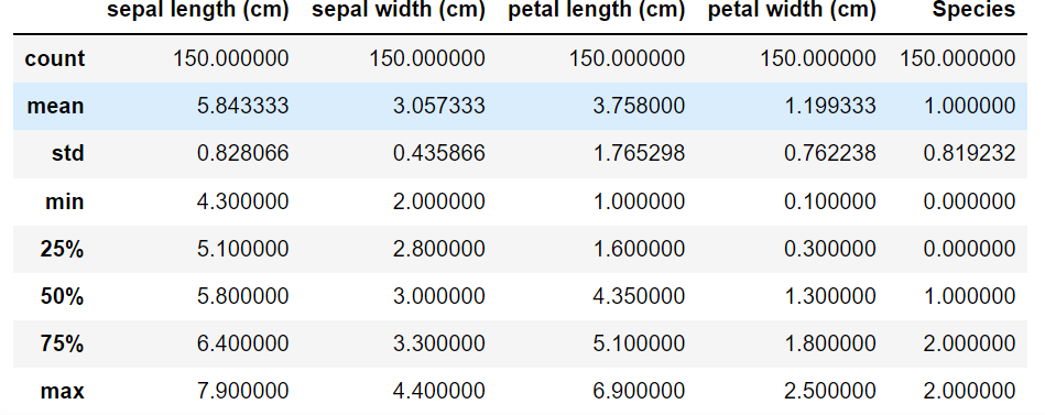
上述是对数据的初步观察,下面来看具体的算法实现:
# 用数值代替品类名称
target = np.unique(data.target)  # 去重
print(target)
target_names = np.unique(data.target_names)
print(target_names)
targets = dict(zip(target, target_names))
print(targets)
df['Species'] = df['Species'].replace(targets)

# 提取数据和标签
X =df.drop(columns = 'Species')  # 把标签列丢掉就是特征
y = df['Species']
feature_names = X.columns
labels = y.unique()

X_train, X_test, y_train, y_test = train_test_split(X, y, test_size = 0.4, random_state=42)
# 划分训练集与测试集,测试集比例为0.4,随机种子为42
model = DecisionTreeClassifier(max_depth = 3, random_state = 42)  # 决策树的最大深度为3
model.fit(X_train, y_train)
# 以文字的形式输出树
text_representation = tree.export_text(model)
print(text_representation)

# 以图片的形式画出
plt.figure(figsize=(30, 10), facecolor='w')
a = tree.plot_tree(model,
                  feature_names = feature_names,
                  class_names = labels,
                  rounded = True,
                  filled = True,
                  fontsize = 14)
plt.show()
[0 1 2]
['setosa' 'versicolor' 'virginica']
{0: 'setosa', 1: 'versicolor', 2: 'virginica'}
|--- feature_2 <= 2.45
|   |--- class: setosa
|--- feature_2 >  2.45
|   |--- feature_3 <= 1.75
|   |   |--- feature_2 <= 5.35
|   |   |   |--- class: versicolor
|   |   |--- feature_2 >  5.35
|   |   |   |--- class: virginica
|   |--- feature_3 >  1.75
|   |   |--- feature_2 <= 4.85
|   |   |   |--- class: virginica
|   |   |--- feature_2 >  4.85
|   |   |   |--- class: virginica
MLP
多层感知机的介绍可以看我这篇讲神经网络的博客
下面我们关注算法实现
from sklearn.neural_network import MLPClassifier
from sklearn.datasets import fetch_openml
import numpy as np

mnist = fetch_openml("mnist_784")  # 加载数据集
X, y = mnist['data'], mnist['target']
X_train = np.array(X[:60000], dtype=float)
y_train = np.array(y[:60000], dtype=float)
X_test = np.array(X[60000:], dtype=float)
y_test = np.array(y[60000:], dtype=float)

clf = MLPClassifier(alpha = 1e-5, hidden_layer_sizes = (15,15), random_state=1)
# alpha为正则项的惩罚系数,第二个为每一层隐藏节点的个数,这里就是2层,每层15个

clf.fit(X_train, y_train)

score = clf.score(X_test, y_test)
score
0.9124
那么还有一些值得注意的参数为:
- activation:选择激活函数,可选有{'identity','logistic','tanh','relu'},默认为relu
- solver:权重优化器,可选有{'lbfgs','sgd','adam'},默认为adam
- learning_rate_init:初始学习率,仅在sgd或者adam时使用
SVM
我们还是专注于SVM算法的实现。
选择不同的核主要是在svm.SVC中指定参数kernel
线性SVM
import numpy as np
import matplotlib.pyplot as plt
from sklearn import svm
data = np.array([
    [0.1, 0.7],
    [0.3, 0.6],
    [0.4, 0.1],
    [0.5, 0.4],
    [0.8, 0.04],
    [0.42, 0.6],
    [0.9, 0.4],
    [0.6, 0.5],
    [0.7, 0.2],
    [0.7, 0.67],
    [0.27, 0.8],
    [0.5, 0.72]
])# 建立数据集
label = [1] * 6 + [0] * 6  # 前6个数据的label为1,后6个为0
x_min, x_max = data[:,0].min() - 0.2, data[:,0].max() + 0.2
y_min, y_max = data[:,1].min() - 0.2, data[:,0].max() + 0.2
xx, yy = np.meshgrid(np.arange(x_min, x_max, 0.002),
                    np.arange(y_min, y_max, 0.002))  # 生成网格网络
model_linear = svm.SVC(kernel = 'linear', C = 0.001)  # 线性SVM模型
model_linear.fit(data, label)
Z = model_linear.predict(np.c_[xx.ravel(), yy.ravel()])
# 是先将xx(size*size)和yy(size*size)拉成一维,然后让它们相连,成为一个两列的矩阵,然后作为X进去预测
Z = Z.reshape(xx.shape)
plt.contourf(xx,yy, Z, cmap=plt.cm.ocean, alpha=0.6)
# 可以理解为绘制等高线,xx为横坐标,yy为轴坐标,Z为确切坐标点的取值,cmap为配色方案
plt.scatter(data[:6,0],data[:6,1], marker='o', color='r', s=100, lw=3)
plt.scatter(data[6:,0],data[6:,1], marker='x', color='k', s=100, lw=3)
plt.title("Linear SVM")
plt.show()
多项式核
plt.figure(figsize=(16,15))

# 画出多个多项式等级来对比
for i, degree in enumerate([1,3,5,7,9,12]):
    model_poly = svm.SVC(C=0.001, kernel='poly', degree = degree)  # 多项式核
    model_poly.fit(data, label)
    Z = model_poly.predict(np.c_[xx.ravel(), yy.ravel()])#预测
    Z = Z.reshape(xx.shape)

    plt.subplot(3,2, i+1)
    plt.subplots_adjust(wspace=0.2, hspace=0.2)  # 调整子图的间距
    plt.contourf(xx,yy, Z, cmap=plt.cm.ocean, alpha=0.6)

    plt.scatter(data[:6, 0], data[:6, 1], marker='o', color='r', s=100, lw=3)
    plt.scatter(data[6:, 0], data[6:, 1], marker='x', color='k', s=100, lw=3)
    plt.title('Poly SVM with $\degree=$' + str(degree))

plt.show()
高斯核
plt.figure(figsize=(16,15))

for i, gamma in enumerate([1,5,15,35,45,55]):
    model_rbf = svm.SVC(kernel='rbf', gamma=gamma, C = 0.001)  # 选择高斯核模型
    model_rbf.fit(data, label)
    Z = model_rbf.predict(np.c_[xx.ravel(), yy.ravel()])
    Z = Z.reshape(xx.shape)

    plt.subplot(3, 2, i + 1)
    plt.subplots_adjust(wspace=0.4, hspace=0.4)
    plt.contourf(xx, yy, Z, cmap=plt.cm.ocean, alpha=0.6)

    # 画出训练点
    plt.scatter(data[:6, 0], data[:6, 1], marker='o', color='r', s=100, lw=3)
    plt.scatter(data[6:, 0], data[6:, 1], marker='x', color='k', s=100, lw=3)
    plt.title('RBF SVM with $\gamma=$' + str(gamma))
plt.show()
对比不同核在Mnist上的效果
读取数据
from sklearn import svm
import numpy as np
from time import time
from sklearn.metrics import accuracy_score
from struct import unpack
from sklearn.model_selection import GridSearchCV

def readimage(path):
    with open(path, 'rb') as f:
        magic, num, rows, cols = unpack('>4I', f.read(16))
        img = np.fromfile(f, dtype=np.uint8).reshape(num, 784)
    return img

def readlabel(path):
    with open(path, 'rb') as f:
        magic, num = unpack('>2I', f.read(8))
        lab = np.fromfile(f, dtype=np.uint8)
    return lab

train_data  = readimage("../../datasets/MNIST/raw/train-images-idx3-ubyte")#读取数据
train_label = readlabel("../../datasets/MNIST/raw/train-labels-idx1-ubyte")
test_data   = readimage("../../datasets/MNIST/raw/t10k-images-idx3-ubyte")
test_label  = readlabel("../../datasets/MNIST/raw/t10k-labels-idx1-ubyte")
print(train_data.shape)
print(train_label.shape)
(60000, 784)
(60000,)
高斯核
#数据集中数据太多,为了节约时间,我们只使用前4000张进行训练
train_data=train_data[:4000]
train_label=train_label[:4000]
test_data=test_data[:400]
test_label=test_label[:400]

svc=svm.SVC()
parameters = {"kernel":['rbf'], "C":[1]}
print("Train....")
clf = GridSearchCV(svc, parameters, n_jobs=-1)  # 网格搜索来决定参数
start = time()
clf.fit(train_data, train_label)
end = time()
t = end - start
print("训练时间:%dmin%.3fsec" % (t//60, t-60 * (t//60)))
prediction = clf.predict(test_data)
print("accuracy:",accuracy_score(prediction, test_label))
accurate = [0] * 10
sumall = [0] * 10

i = 0
j = 0
while i < len(test_label):
    sumall[test_label[i]] += 1
    if prediction[i] == test_label[i]:
        j += 1
    i += 1
print("测试集准确率:", j/400)
Train....
训练时间:0min7.548sec
accuracy: 0.955
测试集准确率: 0.955
多项式核
parameters = {'kernel':['poly'], 'C':[1]}#使用了多项式核
print("Train...")
clf=GridSearchCV(svc,parameters,n_jobs=-1)
start = time()
clf.fit(train_data, train_label)
end = time()
t = end - start
print('Train:%dmin%.3fsec' % (t//60, t - 60 * (t//60)))
prediction = clf.predict(test_data)
print("accuracy: ", accuracy_score(prediction, test_label))
accurate=[0]*10
sumall=[0]*10
i=0
j=0
while i<len(test_label):#计算测试集的准确率
    sumall[test_label[i]]+=1
    if prediction[i]==test_label[i]:
        j+=1
    i+=1
print("测试集准确率:",j/400)
Train...
Train:0min6.438sec
accuracy:  0.93
测试集准确率: 0.93
线性核
parameters = {'kernel':['linear'], 'C':[1]}#使用了线性核
print("Train...")
clf=GridSearchCV(svc,parameters,n_jobs=-1)
start = time()
clf.fit(train_data, train_label)
end = time()
t = end - start
print('Train:%dmin%.3fsec' % (t//60, t - 60 * (t//60)))
prediction = clf.predict(test_data)
print("accuracy: ", accuracy_score(prediction, test_label))
accurate=[0]*10
sumall=[0]*10
i=0
j=0
while i<len(test_label):#计算测试集的准确率
    sumall[test_label[i]]+=1
    if prediction[i]==test_label[i]:
        j+=1
    i+=1
print("测试集准确率:",j/400)
Train...
Train:0min3.712sec
accuracy:  0.9175
测试集准确率: 0.9175
NBayes
这部分算法的调用相对简单:
import numpy as np
import matplotlib.pyplot as plt
import seaborn as sns; sns.set()
from sklearn.datasets import make_blobs
# make_blobs:为聚类产生数据集
# n_samples:样本点数,n_features:数据的维度,centers:产生数据的中心点,默认值3
# cluster_std:数据集的标准差,浮点数或者浮点数序列,默认值1.0,random_state:随机种子
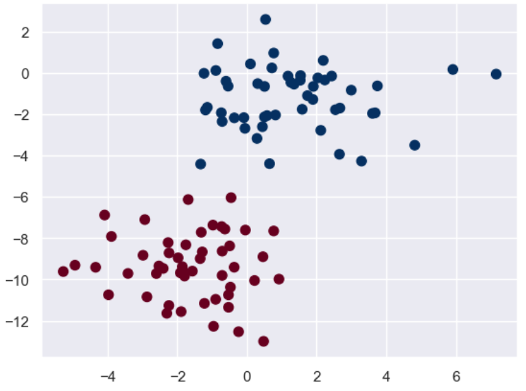
X, y = make_blobs(n_samples = 100, n_features = 2, centers = 2, random_state = 2, cluster_std = 1.5)
plt.scatter(X[:,0], X[:,1], c = y, s = 50, cmap = 'RdBu')
plt.show()
先画出训练集的散点图:
接下来我们再构建自己的测试集来看看效果:
from sklearn.naive_bayes import GaussianNB
model = GaussianNB()  # 朴素贝叶斯
model.fit(X, y)
rng = np.random.RandomState(0)
X_test = [-6, -14] + [14,18] * rng.rand(5000,2) # 生成测试集
y_pred = model.predict(X_test)
# 将训练集和测试集的数据用图像表示出来,颜色深直径大的为训练集,颜色浅直径小的为测试集
plt.scatter(X[:,0],X[:,1], c = y, s = 50, cmap = 'RdBu')
lim = plt.axis()  # 获取当前的坐标轴限制参数
plt.scatter(X_test[:,0], X_test[:,1], c = y_pred, s = 20, cmap='RdBu', alpha = 0.1)
plt.axis(lim)
plt.show()
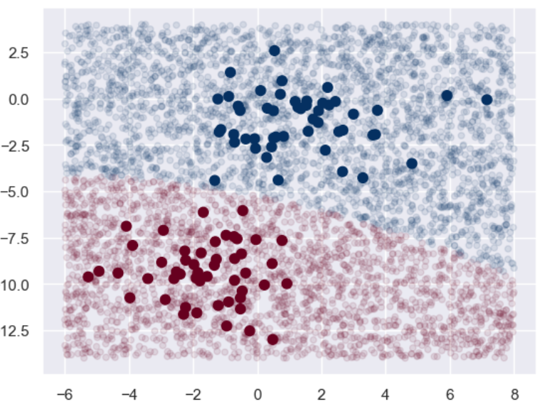
可以看到基本上两个分类的边界还是很明显的。
我们也可以看看预测出来的概率大概是什么样子:
yprob = model.predict_proba(X_test)
yprob[:20].round(2)
Out[25]:
array([[0.  , 1.  ],
       [0.  , 1.  ],
       [0.  , 1.  ],
       [0.  , 1.  ],
       [0.  , 1.  ],
       [0.  , 1.  ],
       [0.  , 1.  ],
       [1.  , 0.  ],
       [0.  , 1.  ],
       [0.  , 1.  ],
       [0.  , 1.  ],
       [0.  , 1.  ],
       [0.  , 1.  ],
       [0.  , 1.  ],
       [0.94, 0.06],
       [0.  , 1.  ],
       [0.  , 1.  ],
       [0.01, 0.99],
       [0.  , 1.  ],
       [0.  , 1.  ]])
bagging与随机森林
关于这方面的介绍可以看我这篇博客。
下面我们继续关注算法的实现:
首先是数据集的加载:
import pandas as pd
from sklearn.datasets import load_wine
from sklearn.model_selection import train_test_split
from sklearn.metrics import accuracy_score
from sklearn.tree import DecisionTreeClassifier
import matplotlib.pyplot as plt

wine = load_wine()  # 使用葡萄酒数据集
print(f"所有特征:{wine.feature_names}")
X = pd.DataFrame(wine.data, columns = wine.feature_names)
y = pd.Series(wine.target)
X_train, X_test, y_train, y_test = train_test_split(X, y, test_size = 0.2, random_state = 1)
所有特征:['alcohol', 'malic_acid', 'ash', 'alcalinity_of_ash', 'magnesium', 'total_phenols', 'flavanoids', 'nonflavanoid_phenols', 'proanthocyanins', 'color_intensity', 'hue', 'od280/od315_of_diluted_wines', 'proline']
接下来我们简单看看如果用单个的决策树将会有什么样的结果:
# 构造并训练决策树分类器
base_model = DecisionTreeClassifier(max_depth = 1, criterion='gini', random_state = 1)
# 使用基尼指数作为选择标准
base_model.fit(X_train, y_train)
y_pred = base_model.predict(X_test)
print(f"决策树的准确率为:{accuracy_score(y_test, y_pred):.3f}")
决策树的准确率为:0.694
可以看到,对于简单的决策树来说其精确度并不够。
那么我们尝试一下以该决策树作为基分类器的bagging集成,看看能有多大的提升:
from sklearn.ensemble import BaggingClassifier
# 这里的基分类器选择是上面构建的决策树模型,前面虽然已经fit了一次,但是不影响,应该也是重新fit的
model = BaggingClassifier(base_estimator = base_model,
                         n_estimators = 50,  # 最大的弱学习器的个数为50
                         random_state = 1)
model.fit(X_train, y_train)
y_pred = model.predict(X_test)# 预测
print(f"BaggingClassifier的准确率:{accuracy_score(y_test,y_pred):.3f}")
BaggingClassifier的准确率:0.917
可以看到提升还是很明显的!接下来我们关注一下重要参数——基分类器的个数对结果的影响:
# 下面来测试基分类器个数的影响
x = list(range(2,102,2))  # 从2到102之间的偶数
y = []
for i in x:
    model = BaggingClassifier(base_estimator = base_model,
                             n_estimators = i,
                             random_state = 1)
    model.fit(X_train, y_train)
    model_test_sc = accuracy_score(y_test, model.predict(X_test))
    y.append(model_test_sc)  # 将得分进行存储

plt.style.use('ggplot')  # 设置绘图背景样式
plt.title("Effect of n_estimators", pad = 20)
plt.xlabel("Number of base estimators")
plt.ylabel("Test accuracy of BaggingClassifier")
plt.plot(x,y)
plt.show()
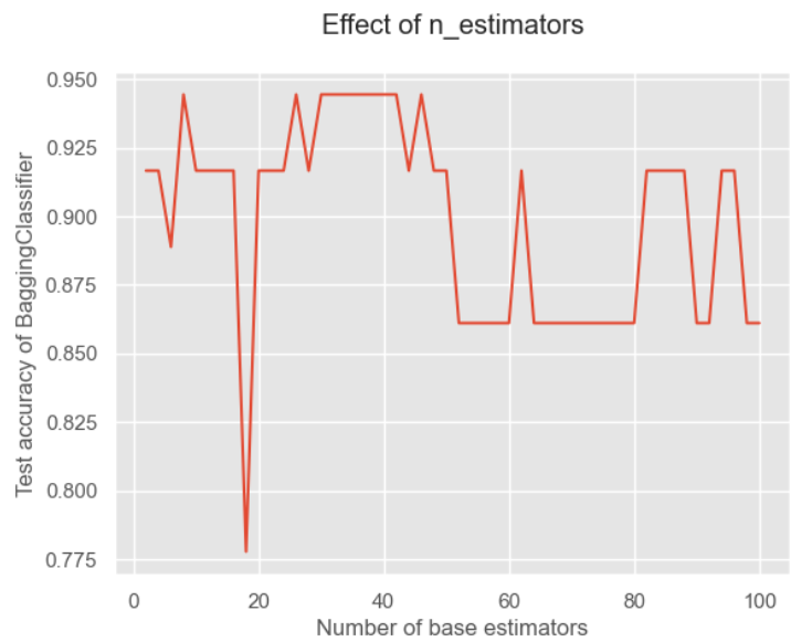
可以看到基分类器的数量并不是越多越好的!这是因为太多可能会出现冗余,导致分类结果不好。
接下来来观察改进算法——随机森林的实现:
from sklearn.ensemble import RandomForestClassifier
model = RandomForestClassifier( n_estimators = 50,
                              random_state = 1)
model.fit(X_train, y_train)
y_pred = model.predict(X_test)
print(f"RandomForestClassifier的准确率:{accuracy_score(y_test,y_pred):.3f}")
RandomForestClassifier的准确率:0.972
可以看到随机森林因为加入了特征随机性,因此其基分类器的多样性得到提升,进而分类精度也就得到进一步的提升。
我们也来观察基分类器个数对结果的影响:
x = list(range(2, 102, 2))# 估计器个数即n_estimators,在这里我们取[2,102]的偶数
y = []

for i in x:
    model = RandomForestClassifier(
                              n_estimators=i,

                              random_state=1)

    model.fit(X_train, y_train)
    model_test_sc = accuracy_score(y_test, model.predict(X_test))
    y.append(model_test_sc)

plt.style.use('ggplot')
plt.title("Effect of n_estimators", pad=20)
plt.xlabel("Number of base estimators")
plt.ylabel("Test accuracy of RandomForestClassifier")
plt.plot(x, y)
plt.show()
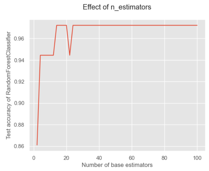
可以看对对于随机森林来说,我觉得是因为它加入了特征的随机性,因此对于数量就不那么敏感。
AdaBoost
关于AdaBoost的介绍也可以看我这篇博客。
下面我们仍然关注算法的实现:
同样先导入数据,然后看看在单个决策树上的模型好坏:
from sklearn.datasets import load_wine
from sklearn.model_selection import train_test_split
from sklearn import metrics
import pandas as pd
from sklearn.tree import DecisionTreeClassifier
from sklearn.metrics import accuracy_score

wine = load_wine()#使用葡萄酒数据集
print(f"所有特征:{wine.feature_names}")
X = pd.DataFrame(wine.data, columns=wine.feature_names)
y = pd.Series(wine.target)
X_train, X_test, y_train, y_test = train_test_split(X, y, test_size=0.20, random_state=1)

base_model = DecisionTreeClassifier(max_depth = 1, criterion='gini', random_state = 1)
base_model.fit(X_train, y_train)
y_pred = base_model.predict(X_test)
print(f"决策树的准确率:{accuracy_score(y_test,y_pred):.3f}")
决策树的准确率:0.694
跟之前的结果是一样的。
那么接下来我们尝试应用AdaBoost算法来拟合:
from sklearn.ensemble import AdaBoostClassifier
from sklearn.model_selection import GridSearchCV
model = AdaBoostClassifier(base_estimator=base_model, n_estimators=50, learning_rate = 0.8)
# n_estimators和learning_rate是要调的参数,lr是弱学习器的权重衰减系数
model.fit(X_train, y_train)
y_pred = model.predict(X_test)
acc = metrics.accuracy_score(y_test, y_pred) # 准确率
print(f"准确率:{acc:.2}")
准确率:0.97
可以看到其效果提升很多!但是这个参数是我们随机初始化的,我们尝试用网格搜索来搜索在训练集上表现最佳的参数:
hyperparameter_space = {"n_estimators":list(range(2,102,2)),
                       "learning_rate":[0,1,0.2,0.3,0.4,0.5,0.6,0.7,0.8,0.9,1]}
gs = GridSearchCV(AdaBoostClassifier(algorithm='SAMME.R', random_state = 1),
                 param_grid = hyperparameter_space,
                 scoring = 'accuracy', n_jobs = -1, cv = 5)
gs.fit(X_train, y_train)
print("最佳参数为:",gs.best_params_)
print("最佳得分为:",gs.best_score_)
最佳参数为: {'learning_rate': 0.8, 'n_estimators': 42}
最佳得分为:0.9857142857142858
再看看它在测试集上的分数:
model = AdaBoostClassifier(base_estimator=base_model, n_estimators=42, learning_rate = 0.8)
model.fit(X_train, y_train)
y_pred = model.predict(X_test)
acc = metrics.accuracy_score(y_test, y_pred) # 准确率
print(f"准确率:{acc:.2}")
准确率:0.94
可以看到居然还不如我们之前的参数。这里要注意在进行网格搜索的时候就进行了K折交叉验证的。我一开始是以为网格搜索是在训练集上寻找拟合效果最好的参数,这点需要注意。
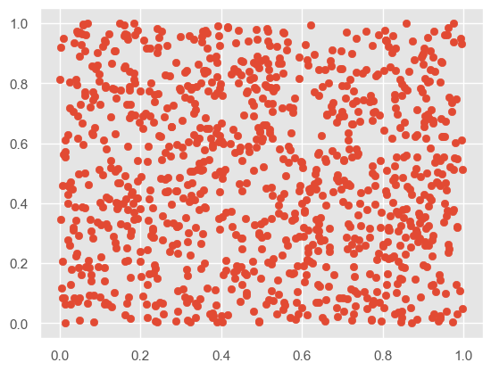
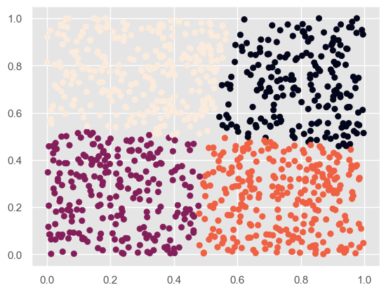
k-means算法
关于聚类算法的详细介绍可以看我这篇博客。
下面我们继续关注算法实现。
from sklearn.cluster import KMeans
import matplotlib.pyplot as plt
import numpy as np
import matplotlib as mpl
from sklearn import datasets
%matplotlib inline
# 聚类前
X = np.random.rand(1000,2)
plt.scatter(X[:,0], X[:,1], marker='o')
# 初始化质心,从原有数据中挑选k个作为质心
def IiniCentroids(X, k):
    index = np.random.randint(0, len(X)-1, k)
    return X[index]
# 聚类后
kmeans = KMeans(n_clusters = 4)  # 分成2类
kmeans.fit(X)
label_pred = kmeans.labels_
plt.scatter(X[:,0], X[:,1], c= label_pred)
plt.show()
他给的代码比较少,因此我去搜索了该函数的其他参数:
- n_clusters:int类型,生成的聚类数,默认为8
- max_iter:int类型,执行最大迭代次数,默认为300
- n_init:选择多份不同的聚类中心,同样运行结果最终选取一个
- init:有三个可选值
- k-means++:默认,用特殊方法选定初始质心并加速收敛
- random:随机从训练数据中选取质心
- 传递一个ndarray:自己指定质心
- n_jobs
- random_state
它的主要属性有:
- cluster_centers_:最后的聚类中心
- labels:每个样本对应的簇
- inertia_:用来评估簇的个数是否合适,距离越小说明分得越好,用来选择簇最佳个数
print("聚类中心为:",kmeans.cluster_centers_)
print("评估:",kmeans.inertia_)
聚类中心为: [[0.79862048 0.71591318]
 [0.22582347 0.26005466]
 [0.73845863 0.23886344]
 [0.29972473 0.76998545]]
评估: 41.37635968102986
KNN
这个算法的介绍可以看我这篇博客,里面讲解了算法以及详细的python实现过程。
下面我们专注于利用sklearn的实现过程。
sklearn 库的 neighbors 模块实现了KNN 相关算法,其中:
- KNeighborsClassifier类用于实现分类问题
- KNeighborsRegressor类用于实现回归问题(回归问题简单理解就是附近点在特征上的平均值赋给目标点)
这两个类的构造方法基本一致,这里我们主要介绍 KNeighborsClassifier 类,原型如下:
KNeighborsClassifier(
    n_neighbors=5,
    weights='uniform',
    algorithm='auto',
    leaf_size=30,
    p=2,
    metric='minkowski',
    metric_params=None,
    n_jobs=None,
    **kwargs)
主要关注这几个参数:
- n_neighbors:即 KNN 中的 K 值,一般使用默认值 5。
- weights:用于确定邻居的权重,有三种方式:
- weights=uniform,表示所有邻居的权重相同
- weights=distance,表示权重是距离的倒数,即与距离成反比
- 自定义函数,可以自定义不同距离所对应的权重,一般不需要自己定义函数
- algorithm:用于设置计算邻居的算法,它有四种方式:
- algorithm=auto,根据数据的情况自动选择适合的算法
- algorithm=kd_tree,使用 KD 树算法
- KD 树适用于维度较少的情况,一般维数不超过 20,如果维数大于 20 之后,效率会下降
- algorithm=ball_tree,使用球树算法
- 球树更适用于维度较大的情况
- algorithm=brute,称为暴力搜索
- 它和 KD 树相比,采用的是线性扫描,而不是通过构造树结构进行快速检索
- 缺点是,当训练集较大的时候,效率很低
- leaf_size:表示构造 KD 树或球树时的叶子节点数,默认是 30
下面来进入代码实战:
from sklearn.datasets import load_digits
import pandas as pd
digits = load_digits()
data = digits.data     # 特征集
target = digits.target # 目标集
data_pd = pd.DataFrame(data)
data_pd
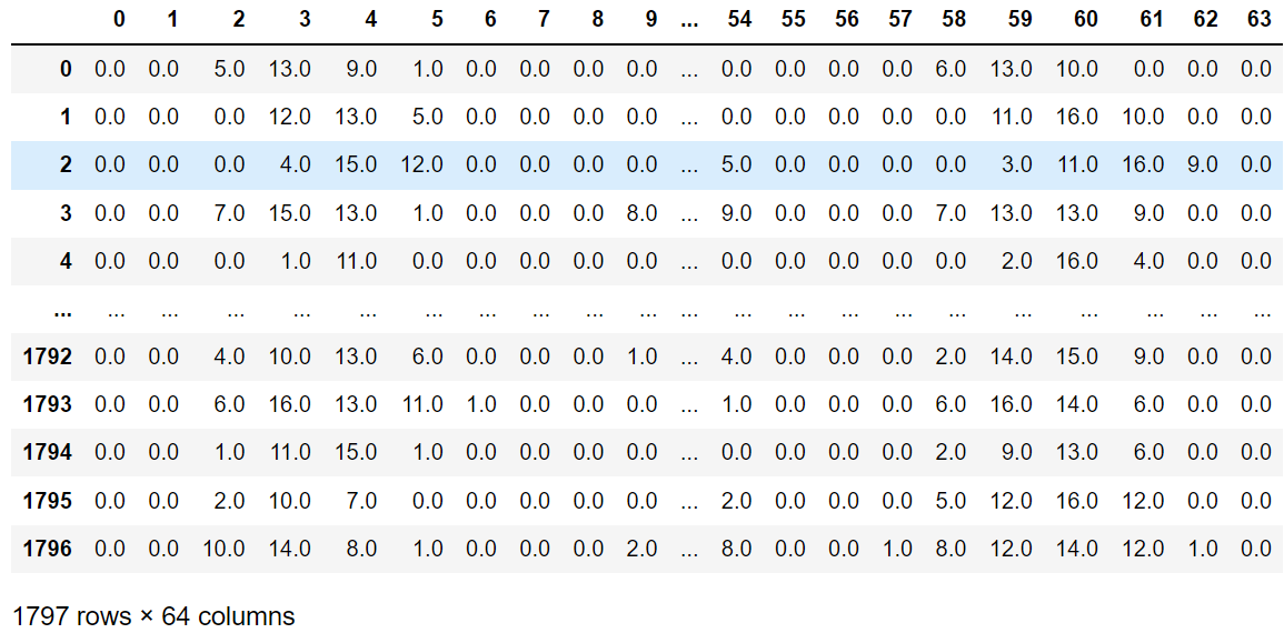
可以看到是64个维度,相当于是一个64维空间下的一个散点。
from sklearn.model_selection import train_test_split
train_x, test_x, train_y, test_y = train_test_split(
    data, target, test_size=0.25, random_state=33)

from sklearn.neighbors import KNeighborsClassifier
knn = KNeighborsClassifier()
knn.fit(train_x, train_y)
predict_y = knn.predict(test_x)
from sklearn.metrics import accuracy_score
score = accuracy_score(test_y, predict_y)
score
0.9844444444444445
PCA
关于PCA算法的详细解释可以看我这篇博客,讲解了PCA算法以及Numpy实现PCA的过程。
下面我们继续关注算法的实现过程:
#首先我们生成随机数据并可视化
import numpy as np
import matplotlib.pyplot as plt
from mpl_toolkits.mplot3d import Axes3D
%matplotlib inline
from sklearn.datasets import make_blobs
# X为样本特征,Y为样本簇类别, 共1000个样本,每个样本3个特征,共4个簇
X, y = make_blobs(n_samples=10000, n_features=3, centers=[[3,3, 3], [0,0,0], [1,1,1], [2,2,2]],
                  cluster_std=[0.2, 0.1, 0.2, 0.2], random_state =9)
fig = plt.figure()
ax = Axes3D(fig, rect=[0,0,1,1], elev = 20, azim = 10)
# rect是左,底部,宽度,高度,用来确定范围,elev是上下观察视角,azim是左右观察视角
plt.scatter(X[:,0],X[:,1], X[:,2], marker='o')
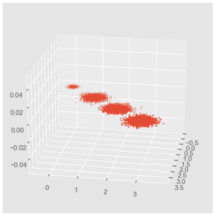
因为PCA降维的时候需要重点关注保留的方差,因此我们先不进行降维,只对数据进行投影,看看投影后的三个维度的方差分布:
from sklearn.decomposition import PCA
pca = PCA(n_components = 3)
pca.fit(X)
print(pca.explained_variance_ratio_)  # 各个特征保留的方差百分比
print(pca.explained_variance_)  # 各个特征的方差原始数值
[0.98318212 0.00850037 0.00831751]
[3.78521638 0.03272613 0.03202212]
可以看到第一个维度的方差占据了98%。
那么接下来尝试降到2维度:
pca = PCA(n_components=2)
pca.fit(X)
print(pca.explained_variance_ratio_)
print(pca.explained_variance_)
[0.98318212 0.00850037]
[3.78521638 0.03272613]
可以看到如果保留两个维度的话,它选择了前两个方差占据比较大的特征,舍弃了第三个特征。
我们将降维后的图画出来:
X_new = pca.transform(X)
plt.scatter(X_new[:, 0], X_new[:, 1],marker='o')
plt.show()
我们刚才的降维是指定保留维度数,那我们也可以指定保留的方差比例大小:
pca = PCA(n_components=0.95)
pca.fit(X)
print(pca.explained_variance_ratio_)
print(pca.explained_variance_)
print(pca.n_components_)
[0.98318212]
[3.78521638]
1
可以看到因为第一个就占据了98%,所以保留95%就直接保留第一个维度就可以了。
我们还可以让MLE算法自己选择降维的结果:
pca = PCA(n_components='mle')
pca.fit(X)
print(pca.explained_variance_ratio_)
print(pca.explained_variance_)
print(pca.n_components_)
[0.98318212]
[3.78521638]
1
可以看到MLE算法就只保留了第一个特征。
我们这里补充一下该类的具体参数:
- n_components:就是指定降维后的特殊数目或者指定保留的方差比例,还可以通过设为MLE来自动选择
- copy:布尔值,是否需要将原始训练数据复制
- whliten:布尔值,是否白化,使得每个特征都具有相同的方差
该类的属性有:
- n_components_:返回所保留的特征个数
- explained_variance_ratio_:返回所保留的各个特征的方差百分比
- explained_variance_:返回所保留的各个特征的方差大小
常用方法为:
- fit_transform(X):训练并返回降维后的数据
- inverse_transform(newData) :将降维得到的数据newData转换回原始数据,可能会有一点不同
- transform(X):将X转换为降维后的数据
尝试一下复原降维的数据:
new_Data = pca.transform(X)
X_regan = pca.inverse_transform(new_Data)
X-X_regan
array([[ 0.14364008, -0.1352249 , -0.00781994],
       [ 0.05135552, -0.01316744, -0.03802959],
       [-0.03610653,  0.07254754, -0.03665018],
       ...,
       [ 0.18537785, -0.0907325 , -0.09400653],
       [-0.2618617 ,  0.20035984,  0.06048799],
       [-0.02015389,  0.12283753, -0.10292754]])
还是有很大差距的。
HMM
对于HMM的原理介绍强烈推荐看这个视频,真的讲得很好!
我们继续关注程序的实现。
hmmlearn实现了三种HMM模型类,按照观测状态是连续状态还是离散状态,可以分为两类。GaussianHMM和GMMHMM是连续观测状态的HMM模型,而MultinomialHMM是离散观测状态的模型。那我们来尝试使用一下:
#pip install hmmlearn

import numpy as np
import matplotlib.pyplot as plt

from hmmlearn import hmm

# Prepare parameters for a 4-components HMM
# Initial population probability
startprob = np.array([0.6, 0.3, 0.1, 0.0])
# The transition matrix, note that there are no transitions possible
# between component 1 and 3
transmat = np.array([[0.7, 0.2, 0.0, 0.1],
                     [0.3, 0.5, 0.2, 0.0],
                     [0.0, 0.3, 0.5, 0.2],
                     [0.2, 0.0, 0.2, 0.6]])
# The means of each component
means = np.array([[0.0, 0.0],
                  [0.0, 11.0],
                  [9.0, 10.0],
                  [11.0, -1.0]])
# The covariance of each component
covars = .5 * np.tile(np.identity(2), (4, 1, 1))

# Build an HMM instance and set parameters
gen_model = hmm.GaussianHMM(n_components=4, covariance_type="full")

# Instead of fitting it from the data, we directly set the estimated
# parameters, the means and covariance of the components
gen_model.startprob_ = startprob
gen_model.transmat_ = transmat
gen_model.means_ = means
gen_model.covars_ = covars

# Generate samples
X, Z = gen_model.sample(500)

# Plot the sampled data
fig, ax = plt.subplots()
ax.plot(X[:, 0], X[:, 1], ".-", label="observations", ms=6,
        mfc="orange", alpha=0.7)

# Indicate the component numbers
for i, m in enumerate(means):
    ax.text(m[0], m[1], 'Component %i' % (i + 1),
            size=17, horizontalalignment='center',
            bbox=dict(alpha=.7, facecolor='w'))
ax.legend(loc='best')
fig.show()
scores = list()
models = list()
for n_components in (3, 4, 5):
    # define our hidden Markov model
    model = hmm.GaussianHMM(n_components=n_components,
                            covariance_type='full', n_iter=10)
    model.fit(X[:X.shape[0] // 2])  # 50/50 train/validate
    models.append(model)
    scores.append(model.score(X[X.shape[0] // 2:]))
    print(f'Converged: {model.monitor_.converged}'
          f'\tScore: {scores[-1]}')

# get the best model
model = models[np.argmax(scores)]
n_states = model.n_components
print(f'The best model had a score of {max(scores)} and {n_states} '
      'states')

# use the Viterbi algorithm to predict the most likely sequence of states
# given the model
states = model.predict(X)
Converged: True	Score: -1065.5259488089373
Converged: True	Score: -904.2908933008515
Converged: True	Score: -905.5449538166446
The best model had a score of -904.2908933008515 and 4 states
#让我们将我们的状态与生成的状态和我们的转换矩阵进行比较,来看我们的模型
# plot model states over time
fig, ax = plt.subplots()
ax.plot(Z, states)
ax.set_title('States compared to generated')
ax.set_xlabel('Generated State')
ax.set_ylabel('Recovered State')
fig.show()

# plot the transition matrix
fig, (ax1, ax2) = plt.subplots(1, 2, figsize=(8, 5))
ax1.imshow(gen_model.transmat_, aspect='auto', cmap='spring')
ax1.set_title('Generated Transition Matrix')
ax2.imshow(model.transmat_, aspect='auto', cmap='spring')
ax2.set_title('Recovered Transition Matrix')
for ax in (ax1, ax2):
    ax.set_xlabel('State To')
    ax.set_ylabel('State From')

fig.tight_layout()
fig.show()
visualizetion_report
该章节主要是讲解机器学习的相关可视化部分,使用Scikit-Plot来实现,主要包括以下几个部分:
- estimators:用于绘制各种算法
- metrics:用于绘制机器学习的onfusion matrix, ROC AUC curves, precision-recall curves等曲线
- cluster:主要用于绘制聚类
- decomposition:主要用于绘制PCA降维
先加载需要的模块:
# 加载需要用到的模块
import scikitplot as skplt

import sklearn
from sklearn.datasets import load_digits, load_boston, load_breast_cancer
from sklearn.model_selection import train_test_split

from sklearn.ensemble import RandomForestClassifier, RandomForestRegressor, GradientBoostingClassifier, ExtraTreesClassifier
from sklearn.linear_model import LinearRegression, LogisticRegression
from sklearn.cluster import KMeans
from sklearn.decomposition import PCA

import matplotlib.pyplot as plt

import sys

print("Scikit Plot Version : ", skplt.__version__)
print("Scikit Learn Version : ", sklearn.__version__)
print("Python Version : ", sys.version)
如果没有安装skplt库的话可以直接:
pip install scikit-plot
加载数据集
手写数据集
digits = load_digits()
X_digits, Y_digits = digits.data, digits.target

print("Digits Dataset Size : ", X_digits.shape, Y_digits.shape)

X_digits_train, X_digits_test, Y_digits_train, Y_digits_test = train_test_split(X_digits, Y_digits,
                                                                                train_size=0.8,
                                                                                stratify=Y_digits,
                                                                                random_state=1)

print("Digits Train/Test Sizes : ",X_digits_train.shape, X_digits_test.shape, Y_digits_train.shape, Y_digits_test.shape)
Digits Dataset Size :  (1797, 64) (1797,)
Digits Train/Test Sizes :  (1437, 64) (360, 64) (1437,) (360,)
肿瘤数据集
cancer = load_breast_cancer()
X_cancer, Y_cancer = cancer.data, cancer.target

print("Feautre Names : ", cancer.feature_names)
print("Cancer Dataset Size : ", X_cancer.shape, Y_cancer.shape)
X_cancer_train, X_cancer_test, Y_cancer_train, Y_cancer_test = train_test_split(X_cancer, Y_cancer,
                                                                                train_size=0.8,
                                                                                stratify=Y_cancer,
                                                                                random_state=1)

print("Cancer Train/Test Sizes : ",X_cancer_train.shape, X_cancer_test.shape, Y_cancer_train.shape, Y_cancer_test.shape)
Feautre Names :  ['mean radius' 'mean texture' 'mean perimeter' 'mean area'
 'mean smoothness' 'mean compactness' 'mean concavity'
 'mean concave points' 'mean symmetry' 'mean fractal dimension'
 'radius error' 'texture error' 'perimeter error' 'area error'
 'smoothness error' 'compactness error' 'concavity error'
 'concave points error' 'symmetry error' 'fractal dimension error'
 'worst radius' 'worst texture' 'worst perimeter' 'worst area'
 'worst smoothness' 'worst compactness' 'worst concavity'
 'worst concave points' 'worst symmetry' 'worst fractal dimension']
Cancer Dataset Size :  (569, 30) (569,)
Cancer Train/Test Sizes :  (455, 30) (114, 30) (455,) (114,)
波士顿房价数据集
boston = load_boston()
X_boston, Y_boston = boston.data, boston.target

print("Boston Dataset Size : ", X_boston.shape, Y_boston.shape)

print("Boston Dataset Features : ", boston.feature_names)
X_boston_train, X_boston_test, Y_boston_train, Y_boston_test = train_test_split(X_boston, Y_boston,
                                                                                train_size=0.8,
                                                                                random_state=1)

print("Boston Train/Test Sizes : ",X_boston_train.shape, X_boston_test.shape, Y_boston_train.shape, Y_boston_test.shape)
Boston Dataset Size :  (506, 13) (506,)
Boston Dataset Features :  ['CRIM' 'ZN' 'INDUS' 'CHAS' 'NOX' 'RM' 'AGE' 'DIS' 'RAD' 'TAX' 'PTRATIO'
 'B' 'LSTAT']
Boston Train/Test Sizes :  (404, 13) (102, 13) (404,) (102,)
性能可视化
交叉验证绘制
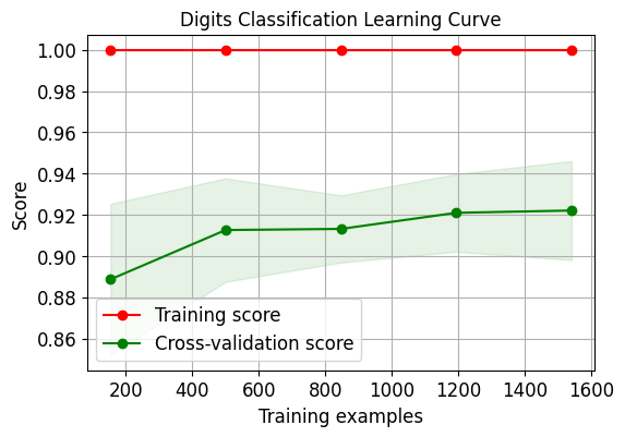
我们绘制出逻辑回归的交叉验证学习曲线:
skplt.estimators.plot_learning_curve(LogisticRegression(), X_digits, Y_digits,
                                     cv=7, shuffle=True, scoring="accuracy",
                                     n_jobs=-1, figsize=(6,4), title_fontsize="large", text_fontsize="large",
                                     title="Digits Classification Learning Curve")
plt.show()

skplt.estimators.plot_learning_curve(LinearRegression(), X_boston, Y_boston,
                                     cv=7, shuffle=True, scoring="r2", n_jobs=-1,
                                     figsize=(6,4), title_fontsize="large", text_fontsize="large",
                                     title="Boston Regression Learning Curve ");
plt.show()
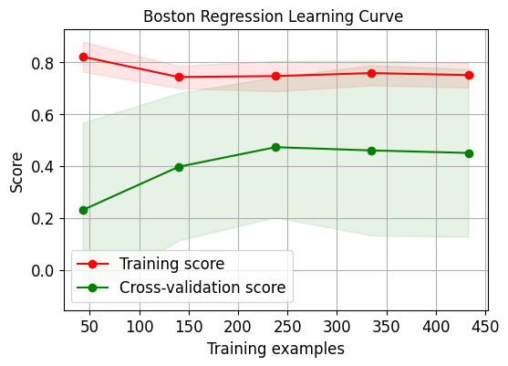
需要注意的是因为第二个数据集上的评估指标采用了r2,因此其分数跟第一个有些许不同。
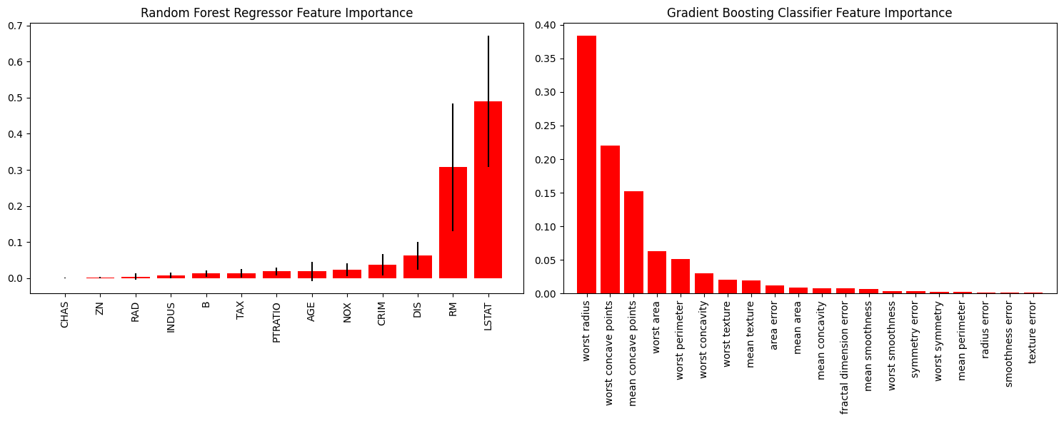
重要性特征绘制
好的特征具有的特点为:
- 有区分性,不会跟其他特征产生冗余
- 特征之间相互独立
- 简单易于理解
因此重要性特征绘制就是让我们能够直观看到哪些特征被函数认为是更加优秀、重要的特征。
rf_reg = RandomForestRegressor()  # 随机森林
rf_reg.fit(X_boston_train, Y_boston_train)
print(rf_reg.score(X_boston_test, Y_boston_test))
gb_classif = GradientBoostingClassifier()  # 梯度提升
gb_classif.fit(X_cancer_train, Y_cancer_train)
print(gb_classif.score(X_cancer_test, Y_cancer_test))
fig = plt.figure(figsize=(15,6))
ax1 = fig.add_subplot(121)  # 两张图,现在ax1是可以在第一张图上画
skplt.estimators.plot_feature_importances(rf_reg, feature_names=boston.feature_names,
                                         title = "Random Forest Regressor Feature Importance",
                                         x_tick_rotation = 90, order="ascending", ax=ax1)
# x_tick_rotation是将x轴的文字旋转90°
ax2 = fig.add_subplot(122)
skplt.estimators.plot_feature_importances(gb_classif, feature_names=cancer.feature_names,
                                         title="Gradient Boosting Classifier Feature Importance",
                                         x_tick_rotation=90,
                                         ax=ax2);

plt.tight_layout()  # 会自动调整子图参数,使之填充整个图像区域
plt.show()
机器学习度量
混淆矩阵
对于二分类来说,混淆矩阵简单理解就是下图:
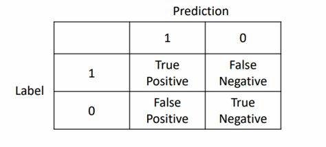
那我们就经常用于计算精准率与召回率,同时计算F1分数。而对于多分类来说相当于是将方阵的维度扩大而已。
log_reg = LogisticRegression()
log_reg.fit(X_digits_train, Y_digits_train)
log_reg.score(X_digits_test, Y_digits_test)
Y_test_pred = log_reg.predict(X_digits_test)

fig = plt.figure(figsize=(15,6))
ax1 = fig.add_subplot(1,2,1)
skplt.metrics.plot_confusion_matrix(Y_digits_test, Y_test_pred, title="Confusion Matrix", cmap="Oranges", ax=ax1)
ax2 = fig.add_subplot(1,2,2)
skplt.metrics.plot_confusion_matrix(Y_digits_test, Y_test_pred,
                                    normalize=True,  # 相当于约束到分数
                                    title="Confusion Matrix",
                                    cmap="Purples",
                                    ax=ax2);
plt.show()
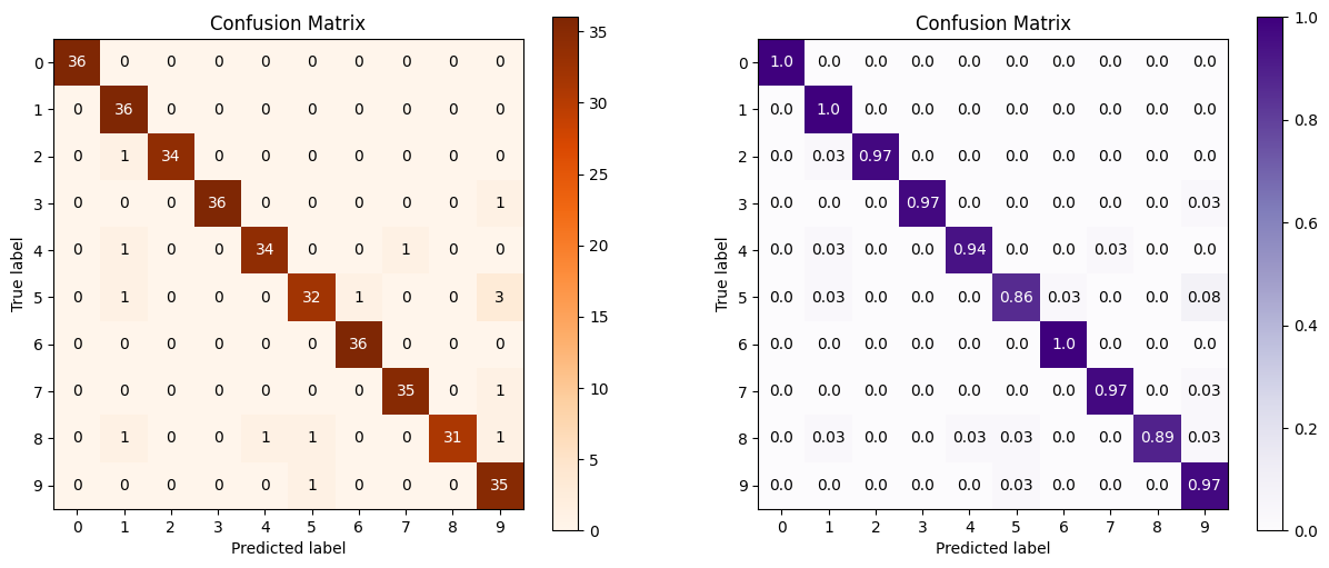
第二张图加了normalize=True,就相当于压缩到1之间的比例。
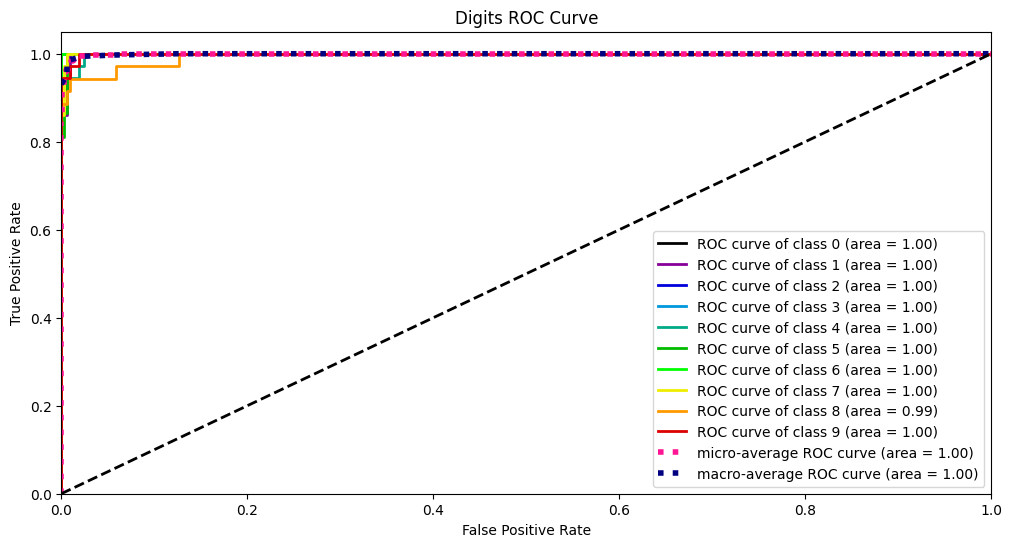
ROC、AUC曲线
要了解ROC曲线,我们要从混淆矩阵入手:
其中:
- TP:预测为1,真实为1,真阳率
- FP:预测为1,真实为0,假阳率
- TN:预测为0,真实为0,真阴率
- FN:预测为0,真实为1,假阴率
那么样本中真正的正例总数为TP+FN,那么预测正确的正类占所有正类的比例为:
同理,真正的反例为FP+TN,那么预测错误的反例占所有反例的比例为:
另外一个概念是截断点t,其代表着当模型对于样本的预测概率大于t时,那么就归类为正类,否则归类为负类。
那么ROC曲线就是对于数据集,当截断点t取不同的数值时,TPR和FPR的结果画出来的二维曲线。
而AUC曲线就是ROC曲线的面积。
Y_test_probs = log_reg.predict_proba(X_digits_test)
skplt.metrics.plot_roc_curve(Y_digits_test, Y_test_probs, title="Digits ROC Curve", figsize=(12,6))
plt.show()
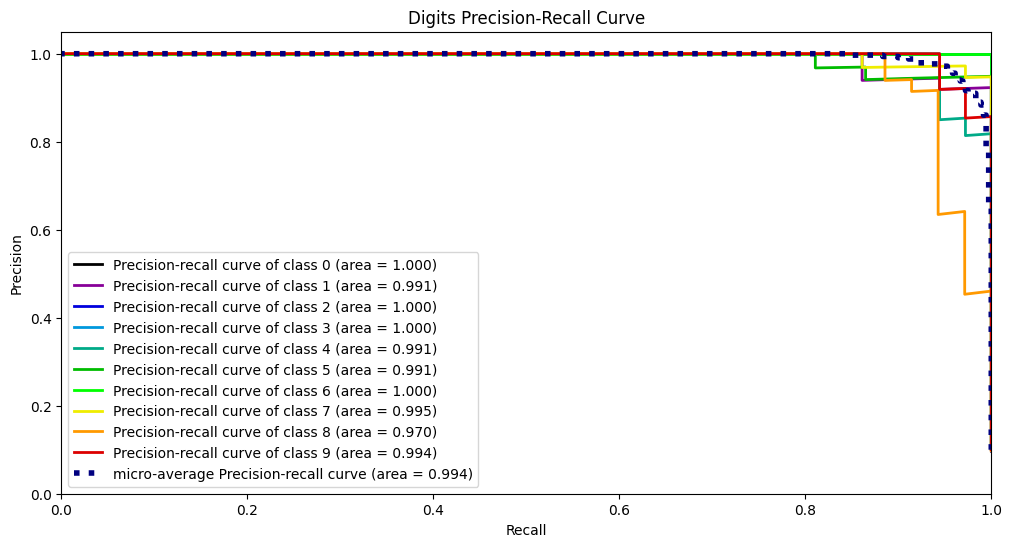
PR曲线
PR曲线的绘制方法跟ROC曲线同理,其选取的两个指标为精准率和召回率:
然后同样是选择不同的截断点画出数值。
skplt.metrics.plot_precision_recall_curve(Y_digits_test, Y_test_probs, title="Digits Precision-Recall Curve", figsize=(12,6))
plt.show()
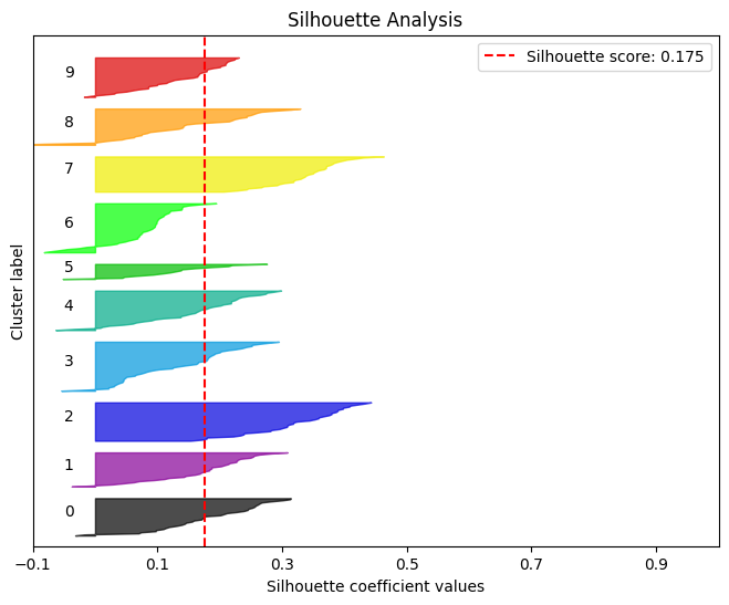
轮廓分析
简单理解轮廓分析就是用来评判聚类效果的好坏。
kmeans = KMeans(n_clusters=10, random_state=1)
kmeans.fit(X_digits_train, Y_digits_train)
cluster_labels = kmeans.predict(X_digits_test)
skplt.metrics.plot_silhouette(X_digits_test, cluster_labels,figsize=(8,6))
plt.show()
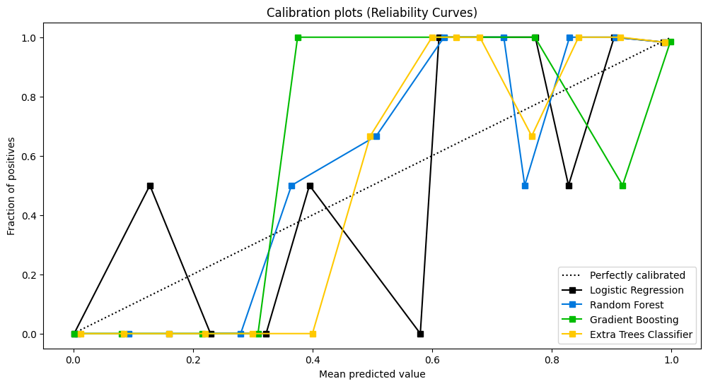
可靠性曲线
检验概率模型的可靠性。
lr_probas = LogisticRegression().fit(X_cancer_train, Y_cancer_train).predict_proba(X_cancer_test)
rf_probas = RandomForestClassifier().fit(X_cancer_train, Y_cancer_train).predict_proba(X_cancer_test)
gb_probas = GradientBoostingClassifier().fit(X_cancer_train, Y_cancer_train).predict_proba(X_cancer_test)
et_scores = ExtraTreesClassifier().fit(X_cancer_train, Y_cancer_train).predict_proba(X_cancer_test)

probas_list = [lr_probas, rf_probas, gb_probas, et_scores]
clf_names = ['Logistic Regression', 'Random Forest', 'Gradient Boosting', 'Extra Trees Classifier']
skplt.metrics.plot_calibration_curve(Y_cancer_test,
                                     probas_list,
                                     clf_names, n_bins=15,
                                     figsize=(12,6)
                                     )
plt.show()
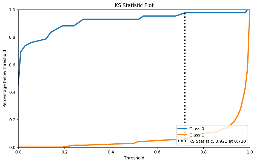
KS检验
KS检验是用来检验两样本是否服从相同分布的。
rf = RandomForestClassifier()
rf.fit(X_cancer_train, Y_cancer_train)
Y_cancer_probas = rf.predict_proba(X_cancer_test)

skplt.metrics.plot_ks_statistic(Y_cancer_test, Y_cancer_probas, figsize=(10,6))
plt.show()
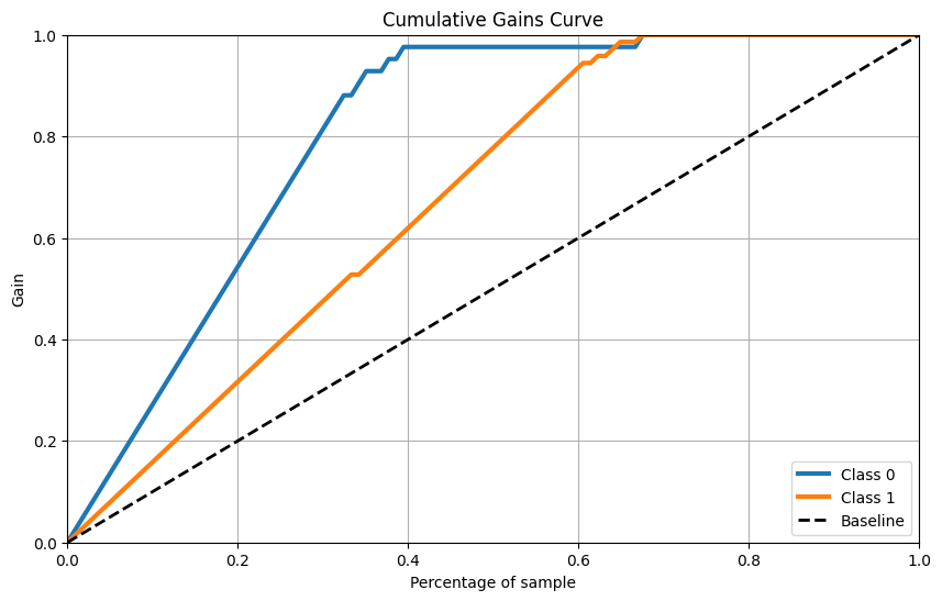
累计收益曲线
skplt.metrics.plot_cumulative_gain(Y_cancer_test, Y_cancer_probas, figsize=(10,6))
plt.show()
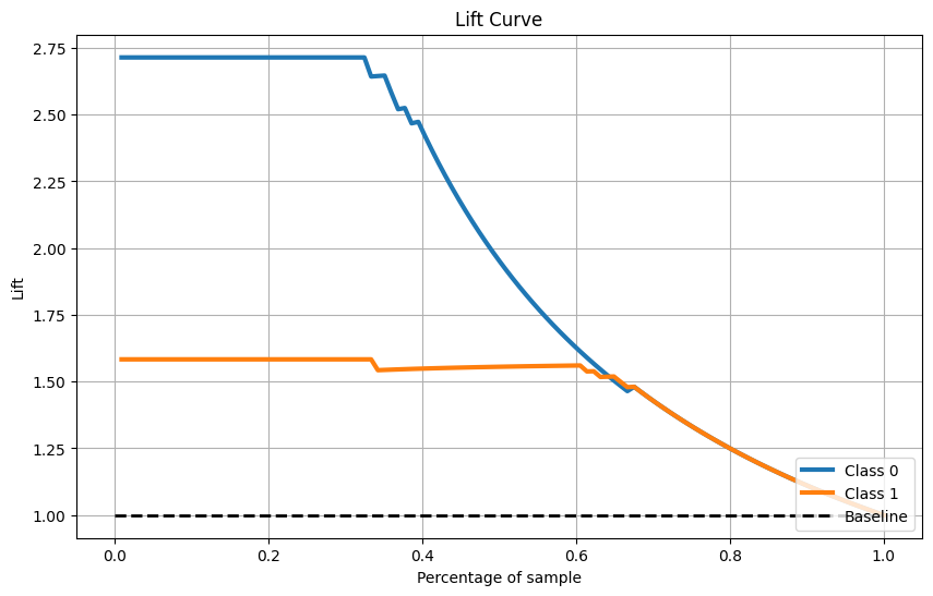
Lift曲线
skplt.metrics.plot_lift_curve(Y_cancer_test, Y_cancer_probas, figsize=(10,6))
plt.show()
聚类方法
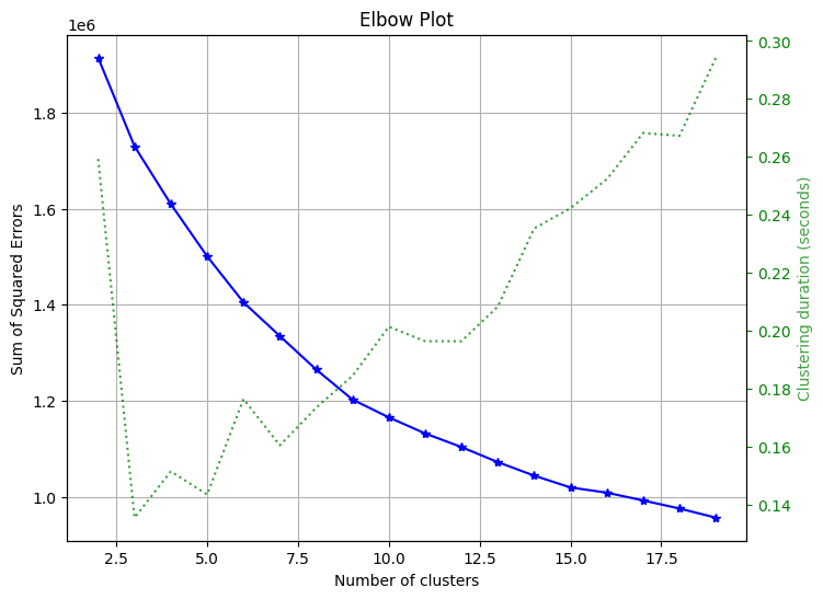
手肘法
用来选择聚类应该选择的簇数目
skplt.cluster.plot_elbow_curve(KMeans(random_state=1),
                               X_digits,
                               cluster_ranges=range(2, 20),
                               figsize=(8,6))
plt.show()
降维方法
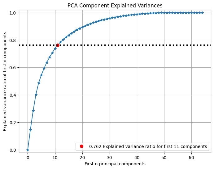
PCA
可以查看PCA前n个主成分所占方差比例:
pca = PCA(random_state=1)
pca.fit(X_digits)

skplt.decomposition.plot_pca_component_variance(pca, figsize=(8,6))
plt.show()
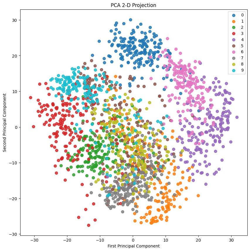
2-D Projection
2D投影:
skplt.decomposition.plot_pca_2d_projection(pca, X_digits, Y_digits,
                                           figsize=(10,10),
                                           cmap="tab10")
plt.show()

 浙公网安备 33010602011771号