
wpf 可以取消的单选checkbox
利用radioButton的groupName分组互斥。。再解决radiobutton的取消选择的问题。给radiobutton加了一个像checkbox的样式
2个方式:
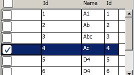
效果图
第一种usecontrol:
xaml:
 View Code

<RadioButton x:Class="GEMS.Windows.Controls.UserControls.SingleCheckBox"
             xmlns="http://schemas.microsoft.com/winfx/2006/xaml/presentation"
             xmlns:x="http://schemas.microsoft.com/winfx/2006/xaml"
             xmlns:mc="http://schemas.openxmlformats.org/markup-compatibility/2006"
             xmlns:d="http://schemas.microsoft.com/expression/blend/2008"
             mc:Ignorable="d" Click="RadioButton_Click_1" Unchecked="RadioButton_Unchecked_1" Style="{DynamicResource SingleCheckBox}"
           >
    <RadioButton.Resources>
        <Style x:Key="RadioButtonFocusVisual">
            <Setter Property="Control.Template">
                <Setter.Value>
                    <ControlTemplate>
                        <Border>
                            <Rectangle
            Margin="15,0,0,0"
            StrokeThickness="1"
            Stroke="#60000000"
            StrokeDashArray="1 2"/>
                        </Border>
                    </ControlTemplate>
                </Setter.Value>
            </Setter>
        </Style>
        <SolidColorBrush x:Key="DisabledForegroundBrush" Color="#888" />
        <SolidColorBrush x:Key="DisabledBorderBrush" Color="#AAA" />
        <SolidColorBrush x:Key="DisabledBackgroundBrush" Color="#EEE" />
        <SolidColorBrush x:Key="Normalborderbrush" Color="#5d7fad" />
        <Style x:Key="SingleCheckBox"  TargetType="{x:Type RadioButton}">
            <Setter Property="GroupName" Value="Single"/>
            <Setter Property="SnapsToDevicePixels" Value="true"/>
            <Setter Property="OverridesDefaultStyle" Value="true"/>
            <Setter Property="Foreground" Value="#071f3b"/>
            <Setter Property="FontFamily" Value="Arial"></Setter>
            <Setter Property="FontSize" Value="14"></Setter>
            <Setter Property="FocusVisualStyle"    Value="{StaticResource RadioButtonFocusVisual}"/>
            <Setter Property="Template">
                <Setter.Value>
                    <ControlTemplate TargetType="{x:Type RadioButton}">
                        <BulletDecorator Background="Transparent">
                            <BulletDecorator.Bullet>
                                <Border x:Name="Border"  Width="20" Height="20" CornerRadius="4" Background="#ffffff" BorderThickness="1" BorderBrush="{StaticResource Normalborderbrush}">
                                    <Path Width="14" Height="11" Margin="5,2,0,0" x:Name="CheckMark" SnapsToDevicePixels="False" Stroke="#173e78" StrokeThickness="2" Data="M 0 5 L 3 10 10 0" />
                                    <!--<Path Width="14" Height="11" Margin="5,2,0,0" x:Name="CheckMark" SnapsToDevicePixels="False" Stroke="{StaticResource Glyphbrush}" StrokeThickness="2" Data="M 0 0 L 7 7 M 0 7 L 7 0" /> cross-->
                                </Border>
                            </BulletDecorator.Bullet>
                            <ContentPresenter
            Margin="4,0,0,0"
            VerticalAlignment="Center"
            HorizontalAlignment="Left"
            RecognizesAccessKey="True"/>
                        </BulletDecorator>
                        <ControlTemplate.Triggers>
                            <Trigger Property="IsChecked" Value="false">
                                <Setter TargetName="CheckMark" Property="Visibility" Value="Collapsed"/>
                            </Trigger>
                            <Trigger Property="IsChecked" Value="{x:Null}">
                                <Setter TargetName="CheckMark" Property="Data" Value="M 0 7 L 7 0" />
                            </Trigger>
                            <Trigger Property="IsMouseOver" Value="true">
                                <Setter TargetName="Border" Property="Background" Value="#ffffff" />
                            </Trigger>
                            <Trigger Property="IsPressed" Value="true">
                                <Setter TargetName="Border" Property="Background" Value="#ffffff" />
                            </Trigger>
                            <Trigger Property="IsEnabled" Value="false">
                                <Setter TargetName="Border" Property="Background" Value="{StaticResource DisabledBackgroundBrush}" />
                                <Setter TargetName="Border" Property="BorderBrush" Value="{StaticResource DisabledBorderBrush}" />
                                <Setter Property="Foreground" Value="{StaticResource DisabledForegroundBrush}"/>
                            </Trigger>
                        </ControlTemplate.Triggers>
                    </ControlTemplate>
                </Setter.Value>
            </Setter>
        </Style>
    </RadioButton.Resources>
</RadioButton>
xaml的后台cs
View Code
using System;
using System.Collections.Generic;
using System.Linq;
using System.Text;
using System.Threading.Tasks;
using System.Windows;
using System.Windows.Controls;
using System.Windows.Data;
using System.Windows.Documents;
using System.Windows.Input;
using System.Windows.Media;
using System.Windows.Media.Imaging;
using System.Windows.Navigation;
using System.Windows.Shapes;

namespace GEMS.Windows.Controls.UserControls
{
    /// <summary>
    /// Interaction logic for SingleCheckBox.xaml
    /// </summary>
    public partial class SingleCheckBox : RadioButton
    {
        private bool hasCheck;
        /// <summary>
        ///
        /// </summary>
        public bool HasCheck
        {
            get { return hasCheck; }
            set { hasCheck = value; }
        }
        public SingleCheckBox()
        {
            InitializeComponent();
        }

        private void RadioButton_Click_1(object sender, RoutedEventArgs e)
        {
            if (this.HasCheck == false)
            {
                this.HasCheck = true;
                this.IsChecked = true;
            }
            else
            {
                this.HasCheck = false;
                this.IsChecked = false;
            }
        }

        private void RadioButton_Unchecked_1(object sender, RoutedEventArgs e)
        {
            this.HasCheck = false;
        }
    }
}
第2种customercontrol

注意的是在generic里面需要去引用singleCheckBox.xaml
View Code
<ResourceDictionary
    xmlns="http://schemas.microsoft.com/winfx/2006/xaml/presentation"
    xmlns:x="http://schemas.microsoft.com/winfx/2006/xaml"
    >
    <ResourceDictionary.MergedDictionaries>
        <ResourceDictionary Source="/GEMS.Windows.Controls.CustomControls;component/Themes/CustomRichTextBox.xaml"/>
        <ResourceDictionary Source="/GEMS.Windows.Controls.CustomControls;component/Themes/ColorPicker.xaml"/>
        <ResourceDictionary Source="/GEMS.Windows.Controls.CustomControls;component/Themes/MultipleDropDownBox.xaml"/>
        <ResourceDictionary Source="/GEMS.Windows.Controls.CustomControls;component/Themes/SingleCheckBox.xaml"/>
    </ResourceDictionary.MergedDictionaries>
</ResourceDictionary>
在singleCheckBox.xaml中定义样式
View Code
<ResourceDictionary xmlns="http://schemas.microsoft.com/winfx/2006/xaml/presentation"
                    xmlns:x="http://schemas.microsoft.com/winfx/2006/xaml"
                    xmlns:local="clr-namespace:GEMS.Windows.Controls.CustomControls"
                    >
    <Style x:Key="RadioButtonFocusVisual">
        <Setter Property="Control.Template">
            <Setter.Value>
                <ControlTemplate>
                    <Border>
                        <Rectangle
            Margin="15,0,0,0"
            StrokeThickness="1"
            Stroke="#60000000"
            StrokeDashArray="1 2"/>
                    </Border>
                </ControlTemplate>
            </Setter.Value>
        </Setter>
    </Style>
    <SolidColorBrush x:Key="DisabledForegroundBrush" Color="#888" />
    <SolidColorBrush x:Key="DisabledBorderBrush" Color="#AAA" />
    <SolidColorBrush x:Key="DisabledBackgroundBrush" Color="#EEE" />
    <SolidColorBrush x:Key="Normalborderbrush" Color="#5d7fad" />
    <Style  TargetType="{x:Type local:SingleCheckBox}">
        <Setter Property="GroupName" Value="Single"/>
        <Setter Property="SnapsToDevicePixels" Value="true"/>

        <Setter Property="Foreground" Value="#071f3b"/>
        <Setter Property="FontFamily" Value="Arial"></Setter>
        <Setter Property="FontSize" Value="14"></Setter>
        <Setter Property="Background" Value="Red"/>
        <Setter Property="Template">
            <Setter.Value>
                <ControlTemplate TargetType="{x:Type local:SingleCheckBox}">
                    <BulletDecorator Background="Transparent">
                        <BulletDecorator.Bullet>
                            <Border x:Name="Border"  Width="20" Height="20" CornerRadius="4" Background="#ffffff" BorderThickness="1" BorderBrush="Black">
                                <Path Width="14" Height="11" Margin="5,2,0,0" x:Name="CheckMark" SnapsToDevicePixels="False" Stroke="#173e78" StrokeThickness="2" Data="M 0 5 L 3 10 10 0" />

                            </Border>
                        </BulletDecorator.Bullet>
                        <ContentPresenter
            Margin="4,0,0,0"
            VerticalAlignment="Center"
            HorizontalAlignment="Left"
            RecognizesAccessKey="True"/>
                    </BulletDecorator>
                    <ControlTemplate.Triggers>
                        <Trigger Property="IsChecked" Value="false">
                            <Setter TargetName="CheckMark" Property="Visibility" Value="Collapsed"/>
                        </Trigger>
                        <Trigger Property="IsChecked" Value="{x:Null}">
                            <Setter TargetName="CheckMark" Property="Data" Value="M 0 7 L 7 0" />
                        </Trigger>
                        <Trigger Property="IsMouseOver" Value="true">
                            <Setter TargetName="Border" Property="Background" Value="#ffffff" />
                        </Trigger>
                        <Trigger Property="IsPressed" Value="true">
                            <Setter TargetName="Border" Property="Background" Value="#ffffff" />
                        </Trigger>
                        <Trigger Property="IsEnabled" Value="false">
                            <Setter TargetName="Border" Property="Background" Value="{StaticResource DisabledBackgroundBrush}" />
                            <Setter TargetName="Border" Property="BorderBrush" Value="{StaticResource DisabledBorderBrush}" />
                            <Setter Property="Foreground" Value="{StaticResource DisabledForegroundBrush}"/>
                        </Trigger>
                    </ControlTemplate.Triggers>
                </ControlTemplate>
            </Setter.Value>
        </Setter>
    </Style>
</ResourceDictionary>
在singleCheckBox.cs中
注意为了通知wpf正在提供一个信阳市,需要在自定义控件类的静态构造中调用overrideMetadata()。。我们使用DefaultStyleKeyProperty来调用这个方式
static SingleCheckBox()
{
DefaultStyleKeyProperty.OverrideMetadata(
typeof(SingleCheckBox), newFrameworkPropertyMetadata(typeof(SingleCheckBox
)));
}
View Code
using System;
using System.Collections.Generic;
using System.Linq;
using System.Text;
using System.Threading.Tasks;
using System.Windows;
using System.Windows.Controls;

namespace GEMS.Windows.Controls.CustomControls
{
  public  class SingleCheckBox:RadioButton
    {
        private bool hasCheck;
        /// <summary>
        ///
        /// </summary>
        public bool HasCheck
        {
            get { return hasCheck; }
            set { hasCheck = value; }
        }
        public SingleCheckBox()
        {
            this.Unchecked += SingleCheckBox_Unchecked;
            this.Click += SingleCheckBox_Click;

        }

      void SingleCheckBox_Unchecked(object sender, System.Windows.RoutedEventArgs e)
      {
          this.HasCheck = false;
      }


      static SingleCheckBox()
      {
          DefaultStyleKeyProperty.OverrideMetadata(typeof(SingleCheckBox), new FrameworkPropertyMetadata(typeof(SingleCheckBox)));
          //
      }
      void SingleCheckBox_Click(object sender, System.Windows.RoutedEventArgs e)
      {
          if (this.HasCheck == false)
          {
              this.HasCheck = true;
              this.IsChecked = true;
          }
          else
          {
              this.HasCheck = false;
              this.IsChecked = false;
          }

      }

    }
}

