
H5_Day2
一、选择器
已经学习的选择器:
基础选择器:通配符,标签、类、ID
高级选择器:交集、并集等
在HTML5中,新增了一些选择器,比如属性选择器,子类选择器,关系型选择器,伪类选择器,伪选择器等
1.1、属性选择器
属性选择器利用的是[]进行表示
<!DOCTYPE html>
<html lang="en">
<head>
    <meta charset="UTF-8">
    <meta http-equiv="X-UA-Compatible" content="IE=edge">
    <meta name="viewport" content="width=device-width, initial-scale=1.0">
    <title>Document</title>
    <style>
        *{
            margin: 0;
            padding: 0;
        }
        /* p标签且自定义属性为v-if的标签 */
        p[v-if]{
            color:red;
        }
         /* p标签且自定义属性为v-if = “xixi”的标签 */
        p[v-if = "xixi"]{
            color:green;
        }
         /* p标签且自定义属性为v-if的开头为li的标签 */
        p[v-if^="li"]{
            color:cyan;
        }
         /* p标签且自定义属性为v-if的结尾为tion的标签 */
        p[v-if$="tion"]{
            color:blue;
        }
         /* p标签且自定义属性为v-if且属性值中含有i的标签 */
        p[v-if*="i"]{
            font-size:20px;
        }
    </style>
</head>
<body>
    <p v-if>123</p>
    <p v-if = "xixi">123</p>
    <p v-if = "like">123</p>
    <p v-if = "condition">123</p>
    <p v-if = "iam">123</p>
</body>
</html>
注意:标签的属性分为两种,一种是系统内置的:class id src type等等,一种是程序员自定义的。
属性选择器的写法中的属性可以是系统内置的,也可以是自定义的。
jQuery函数库也支持属性选择器的写法
1.2子类选择器
作用:匹配某些父元素的子节点来使用的。子类选择器分为两种:一种是不区分子元素类型的选择器;一种是区分子元素类型的选择器
1.2.1不区分子元素类型
<!DOCTYPE html>
<html lang="en">
<head>
    <meta charset="UTF-8">
    <meta http-equiv="X-UA-Compatible" content="IE=edge">
    <meta name="viewport" content="width=device-width, initial-scale=1.0">
    <title>Document</title>
    <style>
        *{
            margin: 0;
            padding: 0;
        }
        /* 子类选择器,代表匹配div的子元素中索引值为1且为h1标签的标签 */
        h1:first-child{
            color:red;
        }
        /* 子类选择器,代表匹配div的子元素中最后一个索引值且为h4标签的标签*/
        h4:last-child{
            background: gray;
        }
        /* 匹配某一父亲节点的第N个子元素的标签 */
        p:nth-child(6){
            color:blue;
        }
        /* 匹配某一父亲节点的所有偶数索引值且标签名为p的标签 */
        p:nth-child(2n){
            background: green;
        }
        /* 匹配某一父亲节点的倒数第N个子元素的标签 */
        h4:nth-last-child(2){
            background: yellow;
        }
    </style>
</head>
<body>
    <div>
        <h1>一级标题</h1>
        <h1>一级标题</h1>
        <p>wuhu</p>
        <p>wuhu</p>
        <p>wuhu</p>
        <p>wuhu11</p>
        <p>wuhu</p>
        <p>wuhu</p>
        <p>wuhu</p>
        <p>wuhu</p>
        <h4>四级标题</h4>
        <h4>四级标题</h4>
    </div>
</body>
</html>
子类选择器【不区分子元素类型】,表示任意标签都是父节点的子元素,索引值从一开始
l 子类选择器【不区分子元素类型】:任意类型标签都是父节点子元素。
l 选择器:first-child,代表的含义是匹配某一个父元素的第一个儿子标签。
l 选择器:last-child,代表的含义是匹配某一个父元素的最后一个儿子标签。
l 选择器:nth-child(索引值),代表的是匹配某一个父元素的索引值为几的儿子标签。【索引值从1开始的】
l 选择器:nth-last-child(索引值),代表的是匹配某一个父元素的索引值为几的倒数儿子标签。
1.2.2区分子元素类型
匹配某一父元素中某一类型的子节点。
<!DOCTYPE html>
<html lang="en">
<head>
    <meta charset="UTF-8">
    <meta http-equiv="X-UA-Compatible" content="IE=edge">
    <meta name="viewport" content="width=device-width, initial-scale=1.0">
    <title>Document</title>
    <style>
        *{
            padding: 0;
            margin: 0;
        }
        /* 匹配p类型的子节点的第一个 */
        p:first-of-type{
            color:red;
        }
        /* 匹配p类型的子节点的最后一个 */
        p:last-of-type{
            background: cyan;
        }
        /* 匹配h1类型的子节点的第N个,同样的可以为2n,3n等 */
        h1:nth-of-type(5){
            background: yellow;
        }
        /* 匹配h1类型的子节点的倒数第N个 */
        h1:nth-last-of-type(3){
            background: blue;
        }
    </style>
</head>
<body>
    <div>
        <h1>123</h1>
        <h1>123</h1>
        <h1>123</h1>
        <p>123</p>
        <p>123</p>
        <p>123</p>
        <p>123</p>
        <p>123</p>
        <p>123</p>
        <h1>123</h1>
        <h1>123</h1>
        <h1>123</h1>
    </div>
</body>
</html>
l div:first-of-type:匹配的是某一个父元素内部div类型的第一个子节点
l div:last-of-type:匹配的是某一个父元素内部div类型的最后一个子节点
l div:nth-of-type(index):匹配的是某一个父元素内部div类型的索引值为几的子节点
l div:nth-last-of-type(index):匹配的是某一个父元素内部div类型的索引值为倒数第几的子节点
1.3、关系选择器
在HTML5中,新增了关系选择器。
语法规则:(A,B代表的是基础选择器或者高级选择器)
A+B 代表匹配的是A选择器节点的后面紧随的下一个姊妹元素B
A~B 代表匹配的是A选择器后面紧随的后面所有的姊妹元素B
<!DOCTYPE html>
<html lang="en">
<head>
    <meta charset="UTF-8">
    <meta http-equiv="X-UA-Compatible" content="IE=edge">
    <meta name="viewport" content="width=device-width, initial-scale=1.0">
    <title>Document</title>
    <style>
        *{
            margin: 0;
            padding: 0;
        }
        /* 代表匹配p节点后面的第一个姊妹元素h1标签 */
        p+h1{
            color:red;
        }
        /* 代表匹配p节点后面的所有姊妹元素h1标签 */
        p~h1{
            background: cyan;
        }
    </style>
</head>
<body>
    <p>123</p>
    <p>123</p>
    <p>123</p>
    <h1>一级标题</h1>
    <h1>一级标题</h1>
    <h1>一级标题</h1>
</body>
</html>
1.4、伪类选择器
常用的:
div:hover:鼠标移上
input:disabled:不可使用
input:focus:聚焦
div:empty:空的
<!DOCTYPE html>
<html lang="en">
<head>
    <meta charset="UTF-8">
    <meta http-equiv="X-UA-Compatible" content="IE=edge">
    <meta name="viewport" content="width=device-width, initial-scale=1.0">
    <title>Document</title>
    <style>
        *{
            margin: 0;
            padding: 0;
        }
        div{
            width: 200px;
            height: 200px;
            background: green;
        }
        /* :hover 鼠标移上事件 */
        div:hover{
            background: red;
        }
        /* :disabled 匹配到不可用的表单元素,可用的不能匹配到 */
        input:disabled{
            border:3px solid black;
        }
        /* :focus 匹配到聚焦的表单元素 */
        input:focus{
            font-size: 20px;
        }
        /* :empty 匹配到空的标签,不是空的不能匹配 */
        div:empty{
            width: 300px;
            height: 200px;
            background: green;
        }
    </style>
</head>
<body>
    <div>1</div>
    <input type="text" disabled>
    <input type="text">
    <input type="text" autofocus>
    <div></div>
</body>
</html>
1.5、伪选择器
基本语法:
基础选择器或高级选择器::伪选择器
<!DOCTYPE html>
<html lang="en">
<head>
    <meta charset="UTF-8">
    <meta http-equiv="X-UA-Compatible" content="IE=edge">
    <meta name="viewport" content="width=device-width, initial-scale=1.0">
    <title>Document</title>
    <style>
        *{
            margin: 0;
            padding: 0;
        }
        /* ::first-letter 选中文本的第一个字 */
        p::first-letter{
            font-size: 20px;
        }
        /* ::first-line 选中文本的第一行 */
        p::first-line{
            color:red;
        }
        /* ::selection 对文字选中部分加样式*/
        p::selection{
            background: blue;
        }
    </style>
</head>
<body>
    <p>
        四个历史时期各自承担前后相继的历史任务:救国、立国、富国、强国《决议》将新时代确定为党的百年奋斗的一个单独时期,凸显了新时代在实现中华民族伟大复兴进程中的标示性意义。这既具有充分的理论依据和现实依据,又具有重大意义“四个伟大飞跃”,对应四个历史时期,是我们党推进中华民族伟大复兴的四个里程碑、四座伟大丰碑。第四个伟大飞跃是一次大集成,是在前三个伟大飞跃基础上实现的,把中华民族伟大复兴事业推向一个新高度,即进入了不可逆转的历史进程
    </p>
</body>
</html>
二、伪元素(CSS3)
在HTML5中,新增了伪元素的概念,一共两个
伪元素:某一个父元素的内部子节点。
1.双闭合标签才有伪元素
2.伪元素务必带content属性,主要是用来设置子元素的文本
3.伪元素务必脱离标准文档流【定位或者浮动或者转块】
三个要求缺一不可
语法规则:
基础选择器或者高级选择器::after或者before
一个标签只能有两个伪元素,多了会覆盖同样定义的前面的伪元素(before或者after)
通过CSS层叠样式给父元素添加子标签。
<!DOCTYPE html>
<html lang="en">
<head>
    <meta charset="UTF-8">
    <meta http-equiv="X-UA-Compatible" content="IE=edge">
    <meta name="viewport" content="width=device-width, initial-scale=1.0">
    <title>Document</title>
    <style>
        *{
            margin: 0;
            padding: 0;
        }
        div{
            width: 400px;
            height: 400px;
            border:2px solid black;
            position:relative;
            margin:200px auto;
        }
        /* 添加伪元素方法之一: ::after */
        div::after{
            /* 务必带content属性 */
            content:"";
            /* 务必脱标 */
            position:absolute;
            width: 20px;
            height: 20px;
            background: cyan;
            left:200px;
            top:200px;
        }
        /* 添加伪元素方法之二: ::before */
        div::before{
            content:"";
            position:absolute;
            width: 20px;
            height: 20px;
            border-radius:50%;
            background: yellow;
        }
    </style>
</head>
<body>
    <div>

    </div>
</body>
</html>
三、border-radius圆角设置(CSS3)
属性值写法有两种:
一种是百分比写法;一种是数字+px。
其中数字+px也有两种写法:
border-radius:50px; border-radius:50px 50px 50px 50px;(分别为左上角、右上角、左下角、右下角)
<!DOCTYPE html>
<html lang="en">
<head>
    <meta charset="UTF-8">
    <meta http-equiv="X-UA-Compatible" content="IE=edge">
    <meta name="viewport" content="width=device-width, initial-scale=1.0">
    <title>Document</title>
    <style>
        *{
            margin: 0;
            padding: 0;
        }
        .cur{
            width: 400px;
            height: 400px;
            position: relative;
            margin:50px auto;
        }
        .cur p:nth-of-type(1){
            position: absolute;
            width: 200px;
            height: 200px;
            background: green;
            border-radius:0 200px 0 200px;
        }
        .cur p:nth-of-type(2){
            position: absolute;
            width: 200px;
            height: 200px;
            background: green;
            border-radius:200px 0px 200px 0px;
            left:200px;
        }
        .cur p:nth-of-type(3){
            position: absolute;
            width: 200px;
            height: 200px;
            background: green;
            border-radius:0 200px 0 200px;
            top:200px;
            left:200px;
        }
        .cur p:nth-of-type(4){
            position: absolute;
            width: 200px;
            height: 200px;
            background: green;
            border-radius:200px 0px 200px 0px;
            top:200px;
        }
    </style>
</head>
<body>
    <div class = "cur">
        <p></p>
        <p></p>
        <p></p>
        <p></p>
    </div>
</body>
</html>
做四叶草,左边和右边的数值保持一致
四、阴影效果(CSS3)
4.1盒子阴影
阴影功能分为两种:盒子阴影【box-shadow】、文本阴影【text-shadow】。
盒子阴影的写法:
1.(外)box-shadow:10px(右侧阴影) 10px(底部阴影) 10px(模糊程度)cyan(阴影颜色),10px(右侧阴影) 10px(底部阴影) 10px(模糊程度)yellow(阴影颜色);
可以给盒子添加多个阴影,但是多个阴影之间要用逗号隔开
2.(内)box-shadow:inset 10px(右侧阴影) 10px(底部阴影) 10px(模糊程度)cyan(阴影颜色);
代表内部阴影,表示div盒子加上阴影。
4.2文本阴影
使用方式跟盒子阴影一致,但是文本阴影只有外阴影,没有内部阴影。
同样的,多个阴影之间用逗号隔开。
五、background系列属性
l background背景系列综合属性
l background-image:背景图设置
l background-color:背景颜色设置
l background-position:背景图定位
l background-repeat:背景图重复设置
5.1background-origin
background-origin主要作用是可以设置背景图的起源,属性值有三个,分别是border-box padding-box content-box
颜色表示rgba(0,0,0,.2)最后一个参数表示透明度
  <style>
        *{
            margin: 0;
            padding: 0;
        }
        div{
            width: 600px;
            height: 600px;
            border:5px solid rgba(0,0,0,.2);
            margin:100px auto;
            background:url(../images/2.jpg) no-repeat;
            padding:100px;
            /* 设置背景图起源 */
            background-origin:content-box;
        }
    </style>
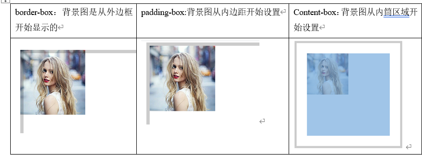
默认值是padding-box。
5.2、background-clip
背景图裁剪,他也是HTML5中新增的样式,主要的作用是可以对背景图进行裁剪。
属性值有四个:border-box padding-box content-box text
前三个是边框、内边距、内容区之外的图片全部裁剪掉,只留下内部的图片。
如果是文本裁剪则需要注意以下问题
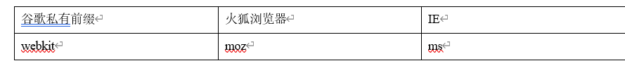
1.浏览器是有兼容问题的,需要在background-clip:text之前加上谷歌浏览器私有前缀-webkit-
2.需要给文字加上透明度才可以看到文字裁剪。
  <style>
        *{
            padding: 0;
            margin: 0;
        }
        div{
            width: 1000px;
            height: 1000px;
            border:20px solid rgba(0, 0, 0, .2);
            background:url(../images/2.jpg) no-repeat;
            background-origin:border-box;
            -webkit-background-clip: text;
            font-size: 20px;
            color:rgba(0, 0, 0, .2);
        }
    </style>
5.3,background-size
可以设置背景图的尺寸大小。
属性值有:数字+px,也可以是百分比,也可以是cover或者contain
background-size:200px 200px;//第一个代表宽度 第二个代表高度
background-size:50% 50%;//宽度的百分比和高度的百分比,参考的是盒子的宽高。
background-size:cover;//覆盖,相当于把原图的宽高进行拉伸,导致只能看到图片的一部分
background-size:contain;//将原图尽可能的在盒子中原封不动的展示出来
5.4、小练习。
概述:向刚才看见图片,在国内经常称之为‘精灵图’。但是在国外雪碧图。它是一种CSS图像合并技术。
该方法是将小图标和背景图合并到一张图片上。然后利用CSS的背景图定位来显示需要展示的图片部分。
简单点来说,在工作的时候经常在一整张图片中,分割出一部分自己想要的进行展示。
优点:减少加载网页图片对服务器的请求次数,提高网页的加载速度。
 <style>
        *{
            margin: 0;
            padding: 0;
        }
        div{
            width: 144px;
            height: 164px;
            background:url(../images/jingling.png) no-repeat;
            background-position: 0 -700px;
            margin: 100px auto;
            border:1px solid black;
            /* 需求,让自由女神的W/H是原图的一倍 */
            background-size:416px 1310px;
        }
    </style>
l 如果显示图片【精灵图】:如果是原图一半。
l 背景图尺寸大小是原图一半
l 背景图定位数据也是原来数据一半
l 显示图标W、H也是原来一半即可
六、过度动画transition
过度动画的触发是有条件的:
过度动画必须要有事件触发;【用hover或者JS给他绑定事件都可以】
参与过度动画的元素,某一些样式的属性值务必发生变化;
transition是一个综合的属性,由如下四个属性组成:过渡动画的属性 过渡动画的总时间 过渡动画速率 过渡动画延迟时间
可以给一个标签绑定多个动画,多个transition属性值之间用逗号隔开。【不建议这么写】
1.transition-property
2.transition-duration
3.transition-timing-function 属性值有linear(匀速)、ease-in(以慢速开始,后面速度变快)、ease-out(以慢速结束)、ease(以慢速开始慢速结束)、ease-in-out(与ease一样)、
4.transition-delay【m/ms】
<!DOCTYPE html>
<html lang="en">
<head>
    <meta charset="UTF-8">
    <meta name="viewport" content="width=device-width, initial-scale=1.0">
    <title>Document</title>
    <style>
        /* 清除默认样式 */
        *{
            margin:0;
            padding: 0;
        }
        div{
            width: 200px;
            height: 200px;
            background: cyan;
            margin:100px auto;
            /* 添加过渡动画:宽度变宽 */
            transition:width 2s linear 0s,
                       height 2s linear 0s;
        }
        div:hover{
            width: 400px;
            height: 400px;
        }
    </style>
</head>
<body>
    <div></div>
</body>
</html>
当宽高同时参与动画时,可以写为:
当元素的全部属性都参与变化时就可以写all
transition:all 2s linear 0s;

 div:hover{
            width: 400px;
            height: 400px;
        }

 浙公网安备 33010602011771号