布局-时间布局
今天做了一个小布局它的原理就是利用margin的负值当然因为使用到了定位的元素所以也可以用定位的方法来替换margin的作用
1.使用到了自适应高度
2.margin负值的运用
3.百分比获取的应用
4.清楚浮动的应用
代码:


<!DOCTYPE html>
<html xmlns=http://www.w3.org/1999/xhtml>
<head>
    <title></title>
    <meta http-equiv="content-type" content="text/html;charset=utf-8">
    <meta name="Keywords" content=""/>
    <meta name="Description" content=""/>
    <style type="text/css">
        *{padding:0;margin:0;}
        .cf:after,.cf:before{content:' ';display: table;}
        .cf:after{clear:both;}
        .cf{*zoom:1;}
        .box{width: 405px;border: solid 2px red;overflow: hidden;}
        .ls{float: left;width: 200px;height: 100px;position: relative;}
        .rs{float: right;width: 200px;height: 100px;position: relative;}
        .middle{float: left;width: 5px;background: #000000;padding-bottom:100%;margin-bottom:-100%;}
        .l-sub .tel,.r-sub .tel{height: 5px;line-height:5px;overflow:hidden;border-top:solid 2px white;border-bottom:solid 2px white;background: black;position: absolute;}
        .l-sub .tel{width: 100%;margin-right:-5px;padding-left:5px;}
        .r-sub .tel{width: 100%;margin-left:-5px;padding-right:5px;}
        .r-sub{padding-top:20px;}
    </style>
</head>
<body>
    <div class="box cf">
        <div class="ls">
            <div class="l-sub">
                <p class="tel"></p>
            </div>
        </div>
        <div class="middle"></div>
        <div class="rs">
            <div class="r-sub">
                <p class="tel"></p>
            </div>
        </div>
    </div>
</body>
</html>
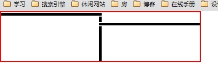
效果图:

 浙公网安备 33010602011771号