matplotlib 的几种柱状图
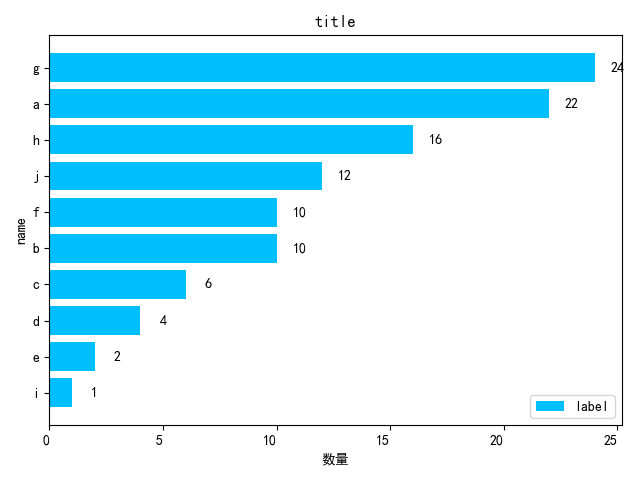
1、x 表示数量,y 表示名字
 1 import matplotlib.pyplot as plt
 2
 3
 4 dic = {'a': 22, 'b': 10, 'c': 6, 'd': 4, 'e': 2, 'f': 10, 'g': 24, 'h': 16, 'i': 1, 'j': 12}
 5 s = sorted(dic.items(), key=lambda x: x[1], reverse=False)  # 对dict 按照value排序 True表示翻转 ,转为了列表形式
 6 print(s)
 7 x_x = []
 8 y_y = []
 9 for i in s:
10     x_x.append(i[0])
11     y_y.append(i[1])
12
13 x = x_x
14 y = y_y
15
16 fig, ax = plt.subplots()
17 ax.barh(x, y, color="deepskyblue")
18 labels = ax.get_xticklabels()
19 plt.setp(labels, rotation=0, horizontalalignment='right')
20
21 for a, b in zip(x, y):
22     plt.text(b+1, a, b, ha='center', va='center')
23 ax.legend(["label"],loc="lower right")
24
25 plt.rcParams['font.sans-serif'] = ['SimHei']  # 用来正常显示中文标签
26 plt.ylabel('name')
27 plt.xlabel('数量')
28 plt.rcParams['savefig.dpi'] = 300  # 图片像素
29 plt.rcParams['figure.dpi'] = 300  # 分辨率
30 plt.rcParams['figure.figsize'] = (15.0, 8.0)  # 尺寸
31 plt.title("title")
32
33 plt.savefig('D:\\result.png')
34 plt.show()
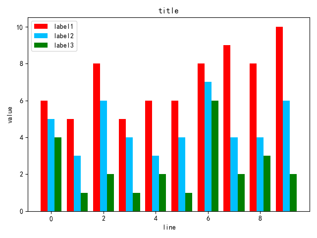
2、x 表示名字,y 表示数量,多重组合
import matplotlib.pyplot as plt
import numpy as np

x = ['a', 'b', 'c', 'd', 'e', 'f', 'g', 'h', 'i', 'j']
y1 = [6, 5, 8, 5, 6, 6, 8, 9, 8, 10]
y2 = [5, 3, 6, 4, 3, 4, 7, 4, 4, 6]
y3 = [4, 1, 2, 1, 2, 1, 6, 2, 3, 2]

plt.bar(x, y1, label="label1", color='red')
plt.bar(x, y2, label="label2",color='orange')
plt.bar(x, y3, label="label3", color='lightgreen')

plt.xticks(np.arange(len(x)), x, rotation=0, fontsize=10)  # 数量多可以采用270度,数量少可以采用340度,得到更好的视图
plt.legend(loc="upper left")  # 防止label和图像重合显示不出来
plt.rcParams['font.sans-serif'] = ['SimHei']  # 用来正常显示中文标签
plt.ylabel('数量')
plt.xlabel('name')
plt.rcParams['savefig.dpi'] = 300  # 图片像素
plt.rcParams['figure.dpi'] = 300  # 分辨率
plt.rcParams['figure.figsize'] = (15.0, 8.0)  # 尺寸
plt.title("title")
plt.savefig('D:\\result.png')
plt.show()

3、x为线路,y 为值,多重组合
import matplotlib.pyplot as plt
import numpy as np

size = 10
y1 = [6, 5, 8, 5, 6, 6, 8, 9, 8, 10]
y2 = [5, 3, 6, 4, 3, 4, 7, 4, 4, 6]
y3 = [4, 1, 2, 1, 2, 1, 6, 2, 3, 2]

x = np.arange(size)
total_width, n = 0.8, 3     # 有多少个类型,只需更改n即可
width = total_width / n
x = x - (total_width - width) / 2

plt.bar(x, y1,  width=width, label='label1',color='red')
plt.bar(x + width, y2, width=width, label='label2',color='deepskyblue')
plt.bar(x + 2 * width, y3, width=width, label='label3', color='green')

plt.xticks()
plt.legend(loc="upper left")  # 防止label和图像重合显示不出来
plt.rcParams['font.sans-serif'] = ['SimHei']  # 用来正常显示中文标签
plt.ylabel('value')
plt.xlabel('line')
plt.rcParams['savefig.dpi'] = 300  # 图片像素
plt.rcParams['figure.dpi'] = 300  # 分辨率
plt.rcParams['figure.figsize'] = (15.0, 8.0)  # 尺寸
plt.title("title")
plt.savefig('D:\\result.png')
plt.show()
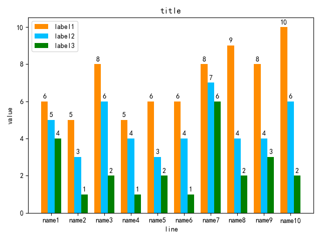
4、多个柱状图显示值,X轴显示x本应有的值
使用标签 tick_label
import matplotlib.pyplot as plt
import numpy as np

name = ["name1","name2","name3","name4","name5","name6","name7","name8","name9","name10"]
y1 = [6, 5, 8, 5, 6, 6, 8, 9, 8, 10]
y2 = [5, 3, 6, 4, 3, 4, 7, 4, 4, 6]
y3 = [4, 1, 2, 1, 2, 1, 6, 2, 3, 2]

x = np.arange(len(name))
width = 0.25

plt.bar(x, y1,  width=width, label='label1',color='darkorange')
plt.bar(x + width, y2, width=width, label='label2', color='deepskyblue', tick_label=name)
plt.bar(x + 2 * width, y3, width=width, label='label3', color='green')

# 显示在图形上的值
for a, b in zip(x,y1):
    plt.text(a, b+0.1, b, ha='center', va='bottom')
for a,b in zip(x,y2):
    plt.text(a+width, b+0.1, b, ha='center', va='bottom')
for a,b in zip(x, y3):
    plt.text(a+2*width, b+0.1, b, ha='center', va='bottom')

plt.xticks()
plt.legend(loc="upper left")  # 防止label和图像重合显示不出来
plt.rcParams['font.sans-serif'] = ['SimHei']  # 用来正常显示中文标签
plt.ylabel('value')
plt.xlabel('line')
plt.rcParams['savefig.dpi'] = 300  # 图片像素
plt.rcParams['figure.dpi'] = 300  # 分辨率
plt.rcParams['figure.figsize'] = (15.0, 8.0)  # 尺寸
plt.title("title")
plt.savefig('D:\\result.png')
plt.show()
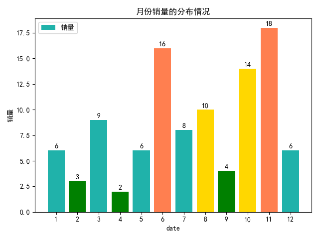
5、对不同区段的值使用不同的颜色
import matplotlib.pyplot as plt


x=[1,2,3,4,5,6,7,8,9,10,11,12]
y=[6,3,9,2,6,16,8,10,4,14,18,6]


def get_color(x, y):
    """对销量不同的区段标为不同的颜色"""
    color = []
    for i in range(len(x)):

        if y[i] < 5:
            color.append("green")
        elif y[i] < 10:
            color.append("lightseagreen")
        elif y[i] < 15:
            color.append("gold")
        else:
            color.append("coral")

    return color


plt.bar(x,y,label="销量",color=get_color(x,y), tick_label=x)

for a,b in zip(x, y):
    plt.text(a, b+0.1, b, ha='center', va='bottom')

plt.legend(loc="upper left")
plt.rcParams['font.sans-serif'] = ['SimHei']  # 用来正常显示中文标签
plt.ylabel('销量')
plt.xlabel('date')
plt.rcParams['savefig.dpi'] = 300  # 图片像素
plt.rcParams['figure.dpi'] = 300  # 分辨率
plt.rcParams['figure.figsize'] = (15.0, 8.0)  # 尺寸
plt.title("月份销量的分布情况")
plt.savefig('D:\\result.png')
plt.show()

 浙公网安备 33010602011771号