
body {
background-color: #e8dabf;
background-image: url(img/bg.png), url(img/bg_tile.png);
background-position: bottom right, top;
background-repeat: no-repeat, repeat;
background-attachment: fixed, scroll;
color: #444;
}

摘自:http://www.nowamagic.net/librarys/veda/detail/2328
对大片文字的显示样式进行限制是CSS中最常用的地方之一,比如以下几种情况:
强制不换行:
div {
white-space:nowrap;
}
自动换行:
div{
word-wrap: break-word;
word-break: normal;
}
强制英文单词断行:
div{
word-break:break-all;
}
我们在行列时,经常会出现一行文字超出了宽度,很多人使用了 overflow:hidden,让超出来的内容隐藏,有没有一种代码让文字超出时,出现省略号了?
可以使用这种方法:white-space:nowrap; text-overflow:ellipsis; -o-text-overflow:ellipsis;
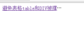
<title>...</title>
<style>
div.wid{ width:200px;white-space:nowrap;text-overflow:ellipsis; -o-text-overflow:ellipsis; overflow: hidden;}
</style>
</head>
<body>
<div class="wid"><a href="" target="_blank">避免表格table和DIV被撑开变形的CSS代码实例</a></div>
</body>
重剑无锋,大巧不工

 浙公网安备 33010602011771号