数据分析-收入预测分析
一、选题背景
当今社会,不管男女老少,都对成年人的收入倍感关注,所以收入一直以来都是一个社会热点话题,但是对于不同的职业和不同的个人条件来说,收入可能存在很大的差距。通过采用公开的数据集,对数据预处理通过可视化,可以直观地对比年龄、教育程度、工作类别、国家/地区、职业等各种特征与收入的关系,由此可以根据某个人的个人特质来预测此人的年收入。
二、大数据分析设计方案
1、 本数据集的数据内容与数据特征分析
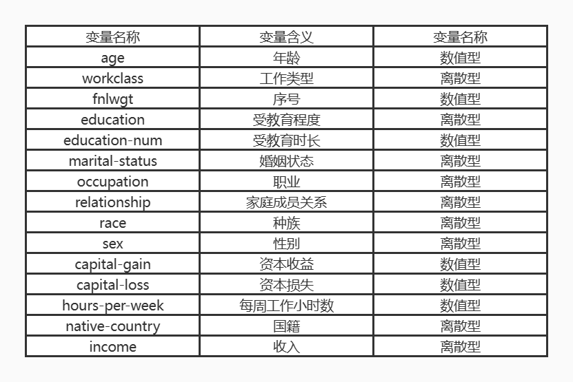
2、 数据分析的课程设计方案概述
采集公开的数据集:
https://www.kaggle.com/datasets/lodetomasi1995/income-classification
数据清洗:导入数据;数据预处理和特征工程;缺失值处理;
数据可视化:通过对部分特征变量进行数据可视化,以箱型图、条形图、热力图等形式显示,分析其对收入的影响;
机器学习:本次收入预测问题属于聚类问题,主要是通过数据集中的income变量将数据分成了两个类别(年收入>5W和年收入<=5W),
通过sklearn中五种模型,在训练集和测试集对特征变量进行收入预测,从而比对这五个模型的准确性。
三、数据分析步骤
导入需要的库
import numpy as np
import pandas as pd
import seaborn as sns
import matplotlib.pyplot as plt
import warnings
warnings.filterwarnings('ignore')
sns.set(style="whitegrid")
1、数据清洗
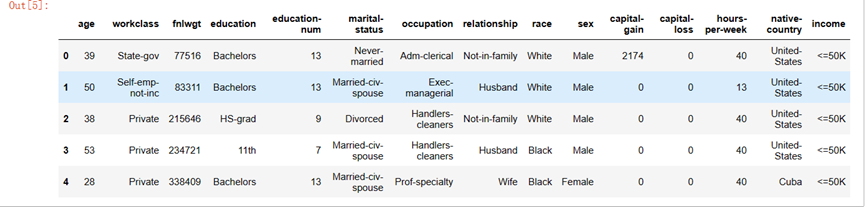
导入数据
df = pd.read_csv('E:/2022下/python/income_evaluation.csv')
df.head()
数据预处理和特征工程
区分分类特征和数值特征
处理缺失值及进行替换
# 用NaN进行替换
df['occupation'].replace(' ?', np.NaN, inplace=True)
df['workclass'].replace(' ?', np.NaN, inplace=True)
df['native_country'].replace(' ?', np.NaN, inplace=True)

2、数据可视化
(1)对income可视化
df['income'].value_counts()
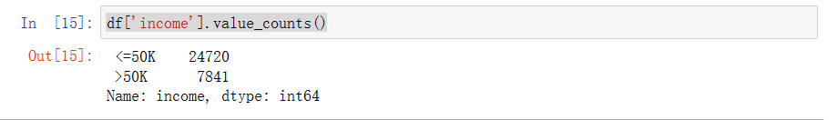

从上图中可知在此数据集中,年收入>50k的人数还是比较少的,约占24.1%;绝大多数的人年收入<=50k。
f, ax = plt.subplots(figsize=(8, 6))
ax = sns.countplot(x="income", hue="sex", data=df, palette="Set1")
ax.set_title("income分布与性别的关系")
plt.show()
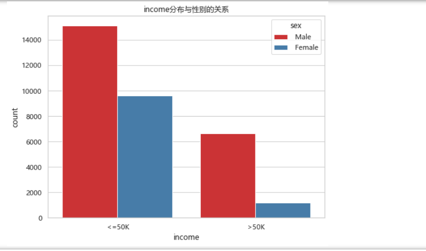
从上图中可知年收入<=50k中,男女比例相差的还不是很大,但在年收入>50k中,男女比例相差比较大,总体来说,男性的年收入比例要比女性的高。
(2)对workclass进行可视化
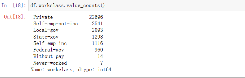
df.workclass.value_counts()
# workclass的分布
f, ax = plt.subplots(figsize=(10, 6))
ax = df.workclass.value_counts().plot(kind="bar", color="green")
ax.set_title("workclass的频数")
ax.set_xticklabels(df.workclass.value_counts().index, rotation=30)
plt.show()
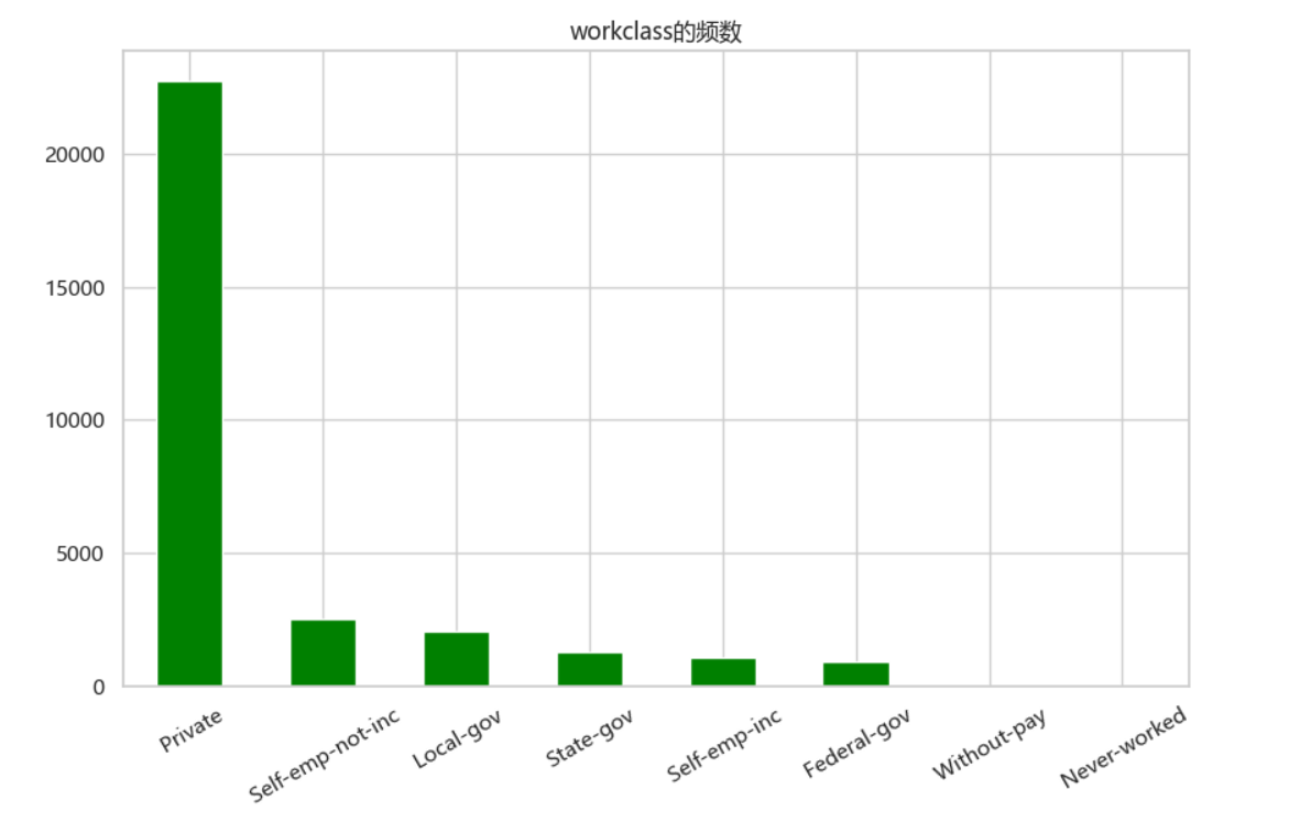
如上图可知Private是最受欢迎的,without-pay和never-worked是最不受欢迎的。
f, ax = plt.subplots(figsize=(10, 6))
ax = sns.countplot(x="workclass", hue="income", data=df, palette="Set1")
ax.set_title("各个工作类型的收入占比对比")
ax.legend(loc='upper right')
plt.show()
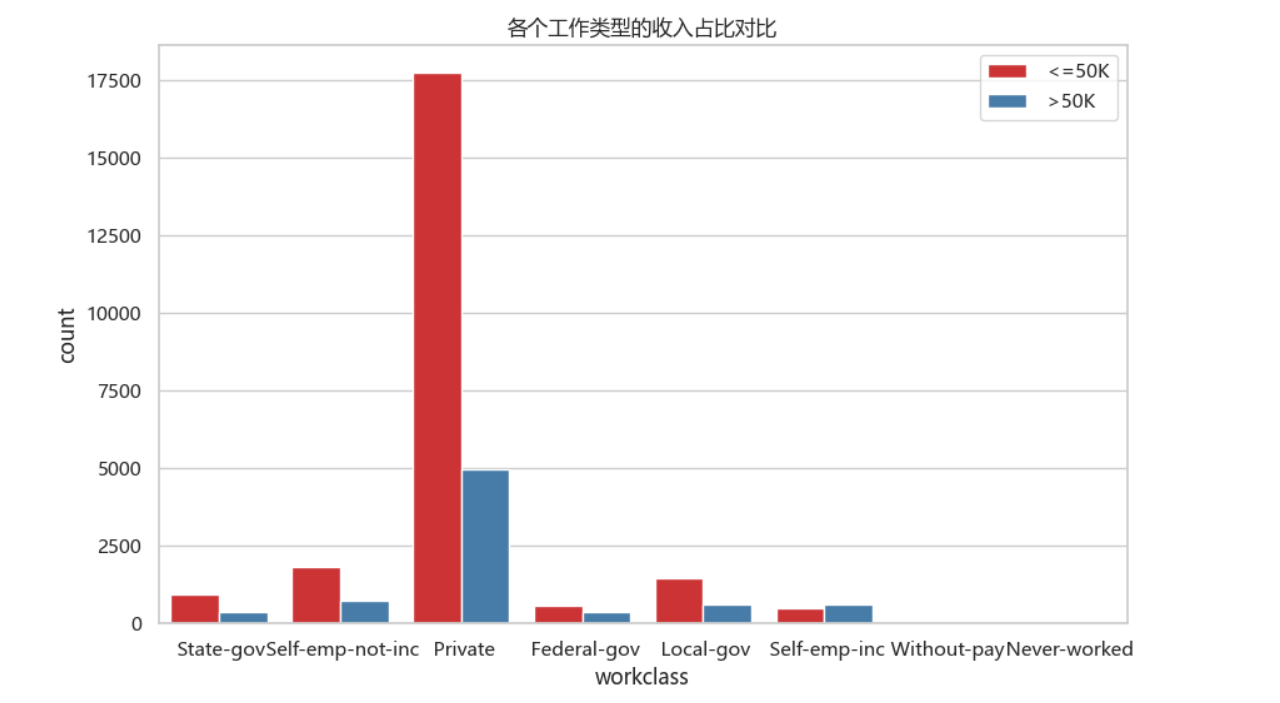
从上图中可知做Self-emp-inc工作的年收入>50k的比例比<=50k的要高,剩下的工作类型全是年收入<=50k居多,在最多人选择的Private工作中年收入<=50k最多。
(3)数值化变量可视化
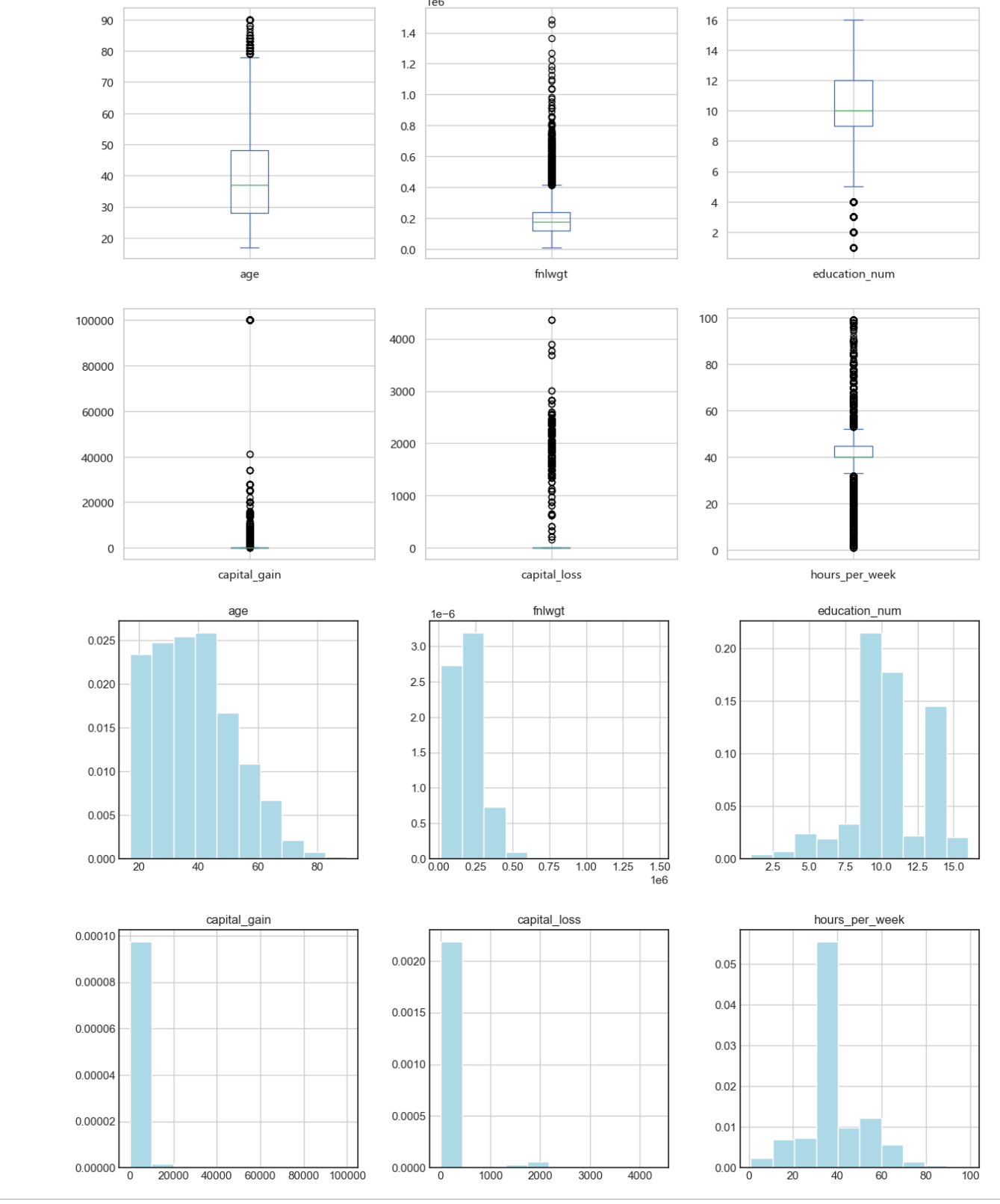
# 画出箱图
df.plot(kind='box', subplots=True, layout=(3,3), sharex=False, sharey=False, figsize = (15, 15))
plt.show()
plt.style.use('seaborn-white')
# 直方图
df.hist(layout=(3,3), density = 1, color = 'lightblue',figsize = (15, 15))
plt.show()
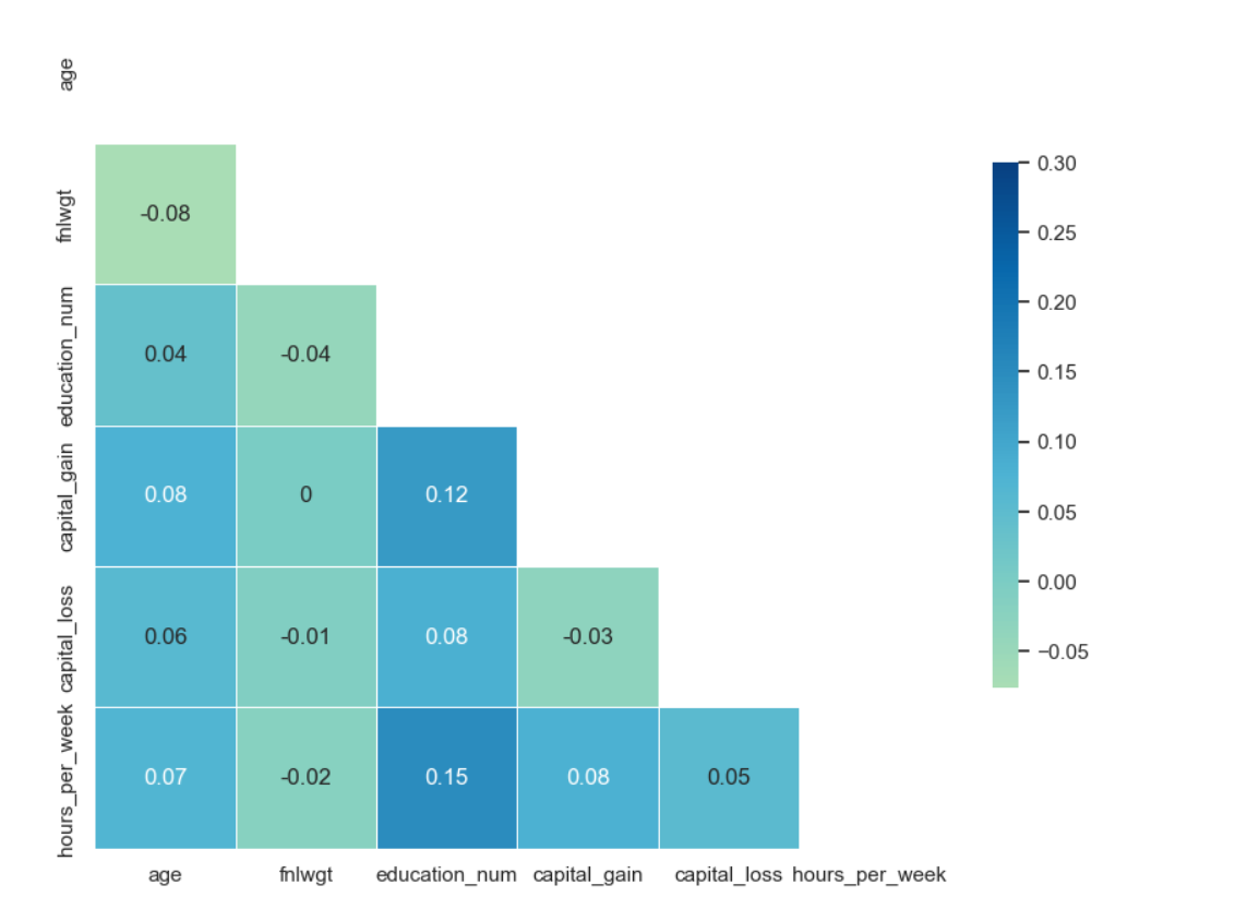
corr = df.corr()
# 画出热力图
sns.set(style="white")
mask = np.zeros_like(corr, dtype=np.bool)
mask[np.triu_indices_from(mask)] = True
f, ax = plt.subplots(figsize=(10, 10))
sns.heatmap(corr, mask=mask, cmap='GnBu', vmax=.3, center=0,
square=True, annot = corr.round(2), linewidths=.5, cbar_kws={"shrink": .50})
plt.show()
3、机器学习
对收入的特征变量利用算法进行训练达到收入预测的效果。
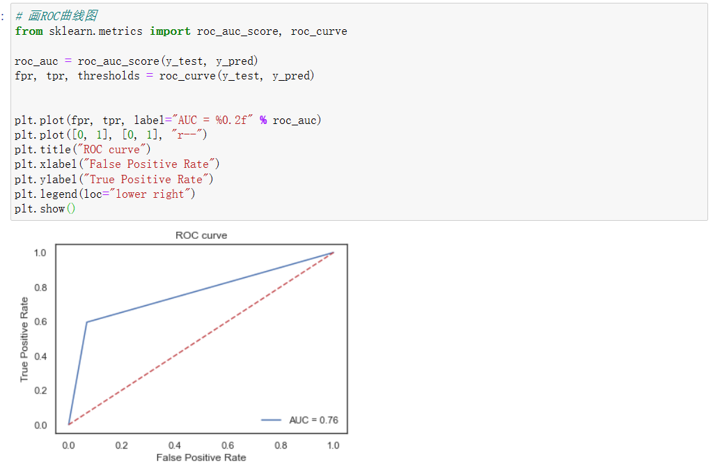
为了确保数据的精准性,本次采用了Logistic Regression, Decision Tree, Random Forest, SVM, XGBoost来进行本次的算法模型,分析使用了精确率(precision)、召回率(recall)、F1 Score等指标,同时对其数据的可视化,通过混淆矩阵和ROC曲线来显示出来,从而更直观的对数据进行精准度的对比。
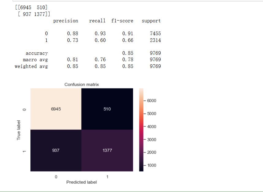
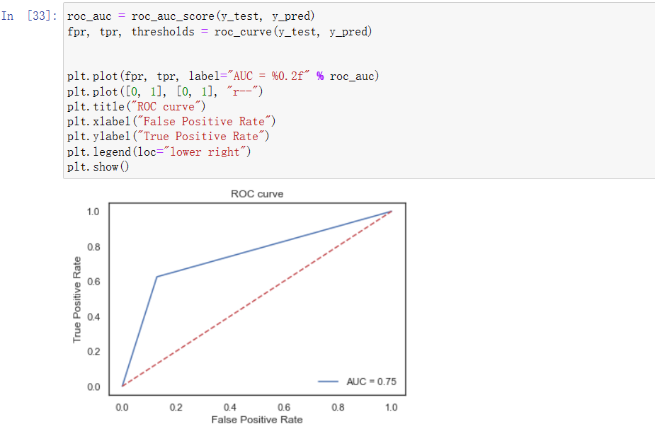
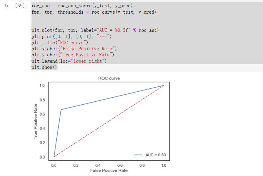
(1)线性训练模型及ROC曲线图
from sklearn.linear_model import LogisticRegression #逻辑回归
logreg = LogisticRegression()
logreg.fit(X_train, y_train)
y_pred = logreg.predict(X_test)
from sklearn.metrics import confusion_matrix, classification_report
# 计算最终模型在测试集上的精度
confusion_matrix1 = confusion_matrix(y_test, y_pred)
print(confusion_matrix1)
print(classification_report(y_test, y_pred))
# 画热力图
sns.heatmap(confusion_matrix1, annot=True, fmt="d")
plt.title("Confusion matrix")
plt.ylabel("True label")
plt.xlabel("Predicted label")
plt.show()
(2)决策树训练模型及ROC曲线图
from sklearn.tree import DecisionTreeClassifier
dtree = DecisionTreeClassifier()
dtree.fit(X_train, y_train)
y_pred = dtree.predict(X_test)
confusion_matrix2 = confusion_matrix(y_test, y_pred)
print(confusion_matrix2)
print(classification_report(y_test, y_pred))
# 画热力图
sns.heatmap(confusion_matrix2, annot=True, fmt="d")
plt.title("Confusion matrix")
plt.ylabel("True label")
plt.xlabel("Predicted label")
plt.show()
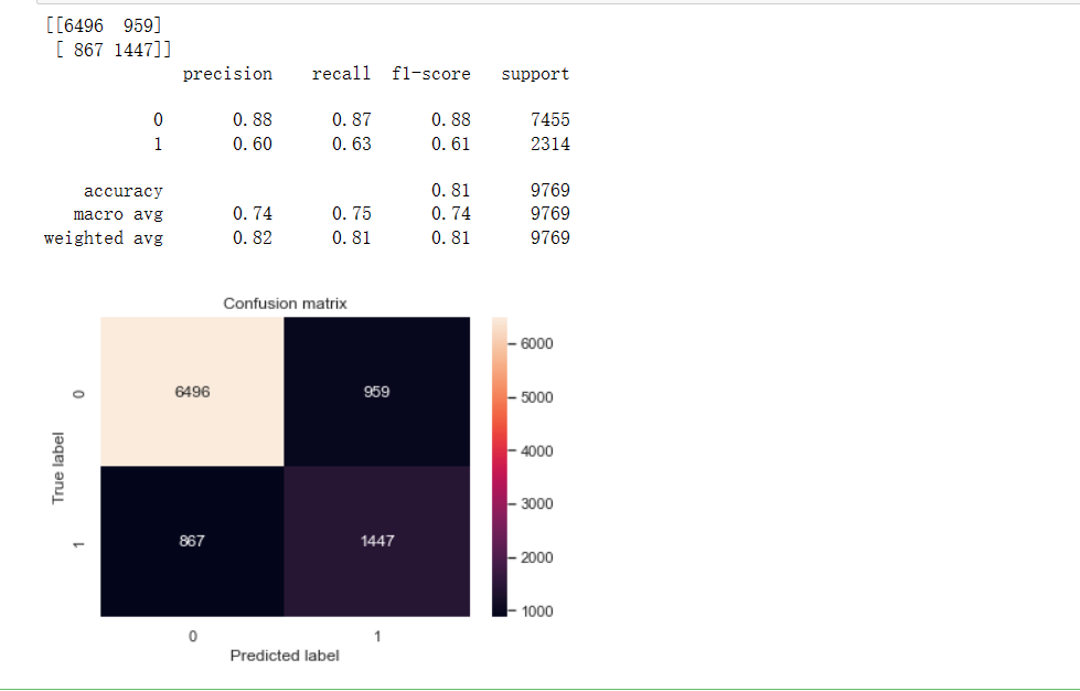
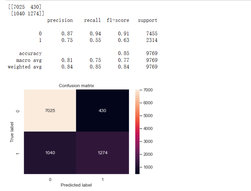
(3)随机森林训练模型及ROC曲线图
from sklearn.ensemble import RandomForestClassifier
rfc = RandomForestClassifier()
rfc.fit(X_train, y_train)
y_pred = rfc.predict(X_test)
confusion_matrix3 = confusion_matrix(y_test, y_pred)
print(confusion_matrix3)
print(classification_report(y_test, y_pred))
# 画热力图
sns.heatmap(confusion_matrix3, annot=True, fmt="d")
plt.title("Confusion matrix")
plt.ylabel("True label")
plt.xlabel("Predicted label")
plt.show()

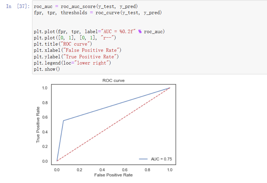
(4)支持向量机训练模型及ROC曲线图
from sklearn.svm import SVC
svm = SVC()
svm.fit(X_train, y_train)
y_pred = svm.predict(X_test)
confusion_matrix4 = confusion_matrix(y_test, y_pred)
print(confusion_matrix4)
print(classification_report(y_test, y_pred))
sns.heatmap(confusion_matrix4, annot=True, fmt="d")
plt.title("Confusion matrix")
plt.ylabel("True label")
plt.xlabel("Predicted label")
plt.show()
(5)xgboost训练模型及ROC曲线图
from xgboost import XGBClassifier
xgboost = XGBClassifier()
xgboost.fit(X_train, y_train)
y_pred = xgboost.predict(X_test)
confusion_matrix5 = confusion_matrix(y_test, y_pred)
print(confusion_matrix5)
print(classification_report(y_test, y_pred))
sns.heatmap(confusion_matrix5, annot=True, fmt="d")
plt.title("Confusion matrix")
plt.ylabel("True label")
plt.xlabel("Predicted label")
plt.show()

(6)汇总上面五种模型并进行AUC评价
models = ["Logistic Regression", "Decision Tree", "Random Forest", "SVM", "XGBoost"]
scores = [roc_auc_score(y_test, logreg.predict(X_test)),
roc_auc_score(y_test, dtree.predict(X_test)),
roc_auc_score(y_test, rfc.predict(X_test)),
roc_auc_score(y_test, svm.predict(X_test)),
roc_auc_score(y_test, xgboost.predict(X_test))]
sns.barplot(x=models, y=scores)
plt.title("Comparison of AUC scores")
plt.xlabel("Model")
plt.ylabel("AUC score")
plt.show()
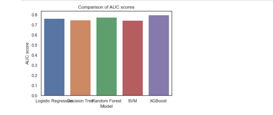
通过现有的auc score图、混淆矩阵和ROC图的对比,可看出在相同的数据集的情况下,在上述所尝试的各个模型中XGBoost的精确率、召回率、F1-Score均为各模型中精准度最高,所以XGBoost模型方法效果最好的。
4、附上完整代码
import numpy as np # 数据类型
import pandas as pd # 读取数据
import seaborn as sns # 画图
import matplotlib.pyplot as plt # 画图需要
# 忽略警告
import warnings
warnings.filterwarnings('ignore')
# 图的风格
sns.set(style="whitegrid")
df = pd.read_csv('E:/2022下/python/income_evaluation.csv')
df.head()
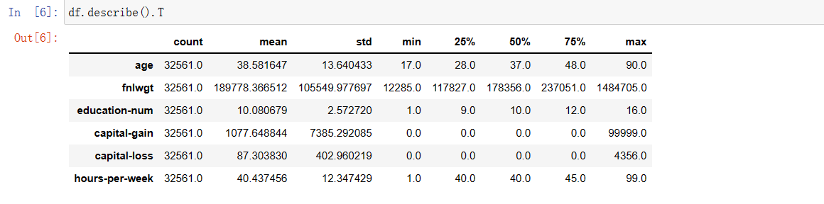
df.describe().T
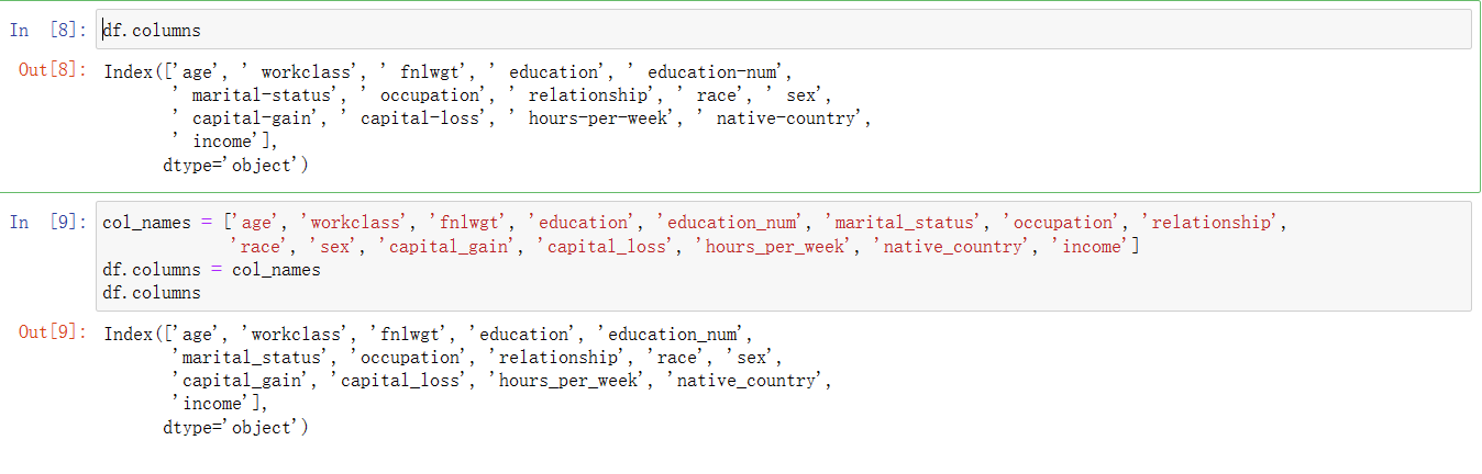
df.columns
col_names = ['age', 'workclass', 'fnlwgt', 'education', 'education_num', 'marital_status', 'occupation', 'relationship',
'race', 'sex', 'capital_gain', 'capital_loss', 'hours_per_week', 'native_country', 'income']
df.columns = col_names
df.columns
df.info()
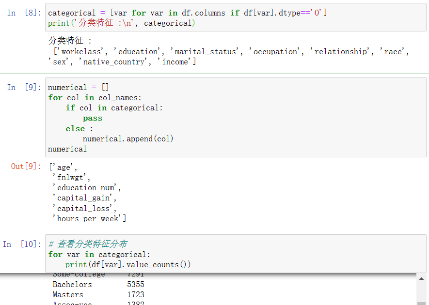
categorical = [var for var in df.columns if df[var].dtype=='O']
print('分类特征 :\n', categorical)
numerical = []
for col in col_names:
if col in categorical:
pass
else :
numerical.append(col)
numerical
# 查看分类特征分布
for var in categorical:
print(df[var].value_counts())
# 用NaN进行替换
df['occupation'].replace(' ?', np.NaN, inplace=True)
df['workclass'].replace(' ?', np.NaN, inplace=True)
df['native_country'].replace(' ?', np.NaN, inplace=True)
df.isnull().sum()
df['income'].value_counts()
# 解决中文显示问题
plt.rcParams['font.sans-serif'] = ['Microsoft YaHei']
# 定义两个子图
f,ax=plt.subplots(1,2,figsize=(15,5))
ax[0] = df['income'].value_counts().plot.pie(explode=[0,0],autopct='%1.1f%%',ax=ax[0])
ax[0].set_title('income的饼图')
ax[1] = sns.countplot(x="income", data=df, palette="Set1")
ax[1].set_title("income的频率分布")
plt.show()
f, ax = plt.subplots(figsize=(8, 6))
ax = sns.countplot(x="income", hue="sex", data=df, palette="Set1")
ax.set_title("income分布与性别的关系")
plt.show()
df.workclass.value_counts()
# workclass的分布
f, ax = plt.subplots(figsize=(10, 6))
ax = df.workclass.value_counts().plot(kind="bar", color="green")
ax.set_title("workclass的频数")
ax.set_xticklabels(df.workclass.value_counts().index, rotation=30)
plt.show()
f, ax = plt.subplots(figsize=(10, 6))
ax = sns.countplot(x="workclass", hue="income", data=df, palette="Set1")
ax.set_title("各个工作类型的收入占比对比")
ax.legend(loc='upper right')
plt.show()
# 画出箱图
df.plot(kind='box', subplots=True, layout=(3,3), sharex=False, sharey=False, figsize = (15, 15))
plt.show()
plt.style.use('seaborn-white')
# 直方图
df.hist(layout=(3,3), density = 1, color = 'lightblue',figsize = (15, 15))
plt.show()
corr = df.corr()
# 画出热力图
sns.set(style="white")
mask = np.zeros_like(corr, dtype=np.bool)
mask[np.triu_indices_from(mask)] = True
f, ax = plt.subplots(figsize=(10, 10))
sns.heatmap(corr, mask=mask, cmap='GnBu', vmax=.3, center=0,
square=True, annot = corr.round(2), linewidths=.5, cbar_kws={"shrink": .50})
plt.show()
# 查看缺失值
df.isnull().sum()
# 用众数填充缺失值
df['workclass'].fillna(df['workclass'].mode()[0], inplace=True)
df['occupation'].fillna(df['occupation'].mode()[0], inplace=True)
df['native_country'].fillna(df['native_country'].mode()[0], inplace=True)
print(df.isnull().sum())
#查看特征分类
df = pd.get_dummies(df, columns=categorical, drop_first=True)# onehot编码
print(df.head())
X = df.drop("income_ >50K", axis=1)
y = df["income_ >50K"]
# 划分数据集
from sklearn.model_selection import train_test_split
# 训练集和测试集7:3划分
X_train, X_test, y_train, y_test = train_test_split(X, y, test_size=0.3, random_state=42)
from sklearn.preprocessing import StandardScaler #标准化工具
scaler = StandardScaler()
X_train = scaler.fit_transform(X_train) # 训练
X_test = scaler.transform(X_test) # 预测
from sklearn.linear_model import LogisticRegression #逻辑回归
logreg = LogisticRegression()
logreg.fit(X_train, y_train)
y_pred = logreg.predict(X_test)
from sklearn.metrics import confusion_matrix, classification_report
# 计算最终模型在测试集上的精度
confusion_matrix1 = confusion_matrix(y_test, y_pred)
print(confusion_matrix1)
print(classification_report(y_test, y_pred))
# 画热力图
sns.heatmap(confusion_matrix1, annot=True, fmt="d")
plt.title("Confusion matrix")
plt.ylabel("True label")
plt.xlabel("Predicted label")
plt.show()
# 画ROC曲线图
from sklearn.metrics import roc_auc_score, roc_curve
roc_auc = roc_auc_score(y_test, y_pred)
fpr, tpr, thresholds = roc_curve(y_test, y_pred)
plt.plot(fpr, tpr, label="AUC = %0.2f" % roc_auc)
plt.plot([0, 1], [0, 1], "r--")
plt.title("ROC curve")
plt.xlabel("False Positive Rate")
plt.ylabel("True Positive Rate")
plt.legend(loc="lower right")
plt.show()
coefficients = pd.DataFrame(logreg.coef_, columns=X.columns)
print(coefficients)
intercept = logreg.intercept_
print(intercept)
roc_auc = roc_auc_score(y_test, y_pred)
fpr, tpr, thresholds = roc_curve(y_test, y_pred)
plt.plot(fpr, tpr, label="AUC = %0.2f" % roc_auc)
plt.plot([0, 1], [0, 1], "r--")
plt.title("ROC curve")
plt.xlabel("False Positive Rate")
plt.ylabel("True Positive Rate")
plt.legend(loc="lower right")
plt.show()
from sklearn.ensemble import RandomForestClassifier
rfc = RandomForestClassifier()
rfc.fit(X_train, y_train)
y_pred = rfc.predict(X_test)
confusion_matrix3 = confusion_matrix(y_test, y_pred)
print(confusion_matrix3)
print(classification_report(y_test, y_pred))
# 画热力图
sns.heatmap(confusion_matrix3, annot=True, fmt="d")
plt.title("Confusion matrix")
plt.ylabel("True label")
plt.xlabel("Predicted label")
plt.show()
roc_auc = roc_auc_score(y_test, y_pred)
fpr, tpr, thresholds = roc_curve(y_test, y_pred)
plt.plot(fpr, tpr, label="AUC = %0.2f" % roc_auc)
plt.plot([0, 1], [0, 1], "r--")
plt.title("ROC curve")
plt.xlabel("False Positive Rate")
plt.ylabel("True Positive Rate")
plt.legend(loc="lower right")
plt.show()
from sklearn.svm import SVC
svm = SVC()
svm.fit(X_train, y_train)
y_pred = svm.predict(X_test)
confusion_matrix4 = confusion_matrix(y_test, y_pred)
print(confusion_matrix4)
print(classification_report(y_test, y_pred))
sns.heatmap(confusion_matrix4, annot=True, fmt="d")
plt.title("Confusion matrix")
plt.ylabel("True label")
plt.xlabel("Predicted label")
plt.show()
roc_auc = roc_auc_score(y_test, y_pred)
fpr, tpr, thresholds = roc_curve(y_test, y_pred)
plt.plot(fpr, tpr, label="AUC = %0.2f" % roc_auc)
plt.plot([0, 1], [0, 1], "r--")
plt.title("ROC curve")
plt.xlabel("False Positive Rate")
plt.ylabel("True Positive Rate")
plt.legend(loc="lower right")
plt.show()
from xgboost import XGBClassifier
xgboost = XGBClassifier()
xgboost.fit(X_train, y_train)
y_pred = xgboost.predict(X_test)
confusion_matrix5 = confusion_matrix(y_test, y_pred)
print(confusion_matrix5)
print(classification_report(y_test, y_pred))
sns.heatmap(confusion_matrix5, annot=True, fmt="d")
plt.title("Confusion matrix")
plt.ylabel("True label")
plt.xlabel("Predicted label")
plt.show()
roc_auc = roc_auc_score(y_test, y_pred)
fpr, tpr, thresholds = roc_curve(y_test, y_pred)
plt.plot(fpr, tpr, label="AUC = %0.2f" % roc_auc)
plt.plot([0, 1], [0, 1], "r--")
plt.title("ROC curve")
plt.xlabel("False Positive Rate")
plt.ylabel("True Positive Rate")
plt.legend(loc="lower right")
plt.show()
models = ["Logistic Regression", "Decision Tree", "Random Forest", "SVM", "XGBoost"]
scores = [roc_auc_score(y_test, logreg.predict(X_test)),
roc_auc_score(y_test, dtree.predict(X_test)),
roc_auc_score(y_test, rfc.predict(X_test)),
roc_auc_score(y_test, svm.predict(X_test)),
roc_auc_score(y_test, xgboost.predict(X_test))]
sns.barplot(x=models, y=scores)
plt.title("Comparison of AUC scores")
plt.xlabel("Model")
plt.ylabel("AUC score")
plt.show()
四、总结
在本次课程设计中通过所学知识和参看资料后完成数据分析,也遇到一些问题,通过参阅资料和同学讨论解决了问题,同时熟悉了数据挖掘的重要流程:览数据集;明确分析的目的–导入数据并数据预处理–探索数据特征–清洗数据;构建模型–模型预测;模型评估,以及初步的了解了sklearn中的Logistic Regression, Decision Tree, Random Forest, SVM, XGBoost机器学习模型,由于自己的对于sklearn不够了解,不能进一步进行分析,希望自己以后可以不断学习深入了解并把其掌握在自己的脑子上。

 浙公网安备 33010602011771号