Python 绘制曲线、标注最值(坐标)
Python 绘制曲线、标注最值(坐标)
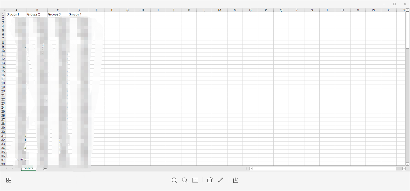
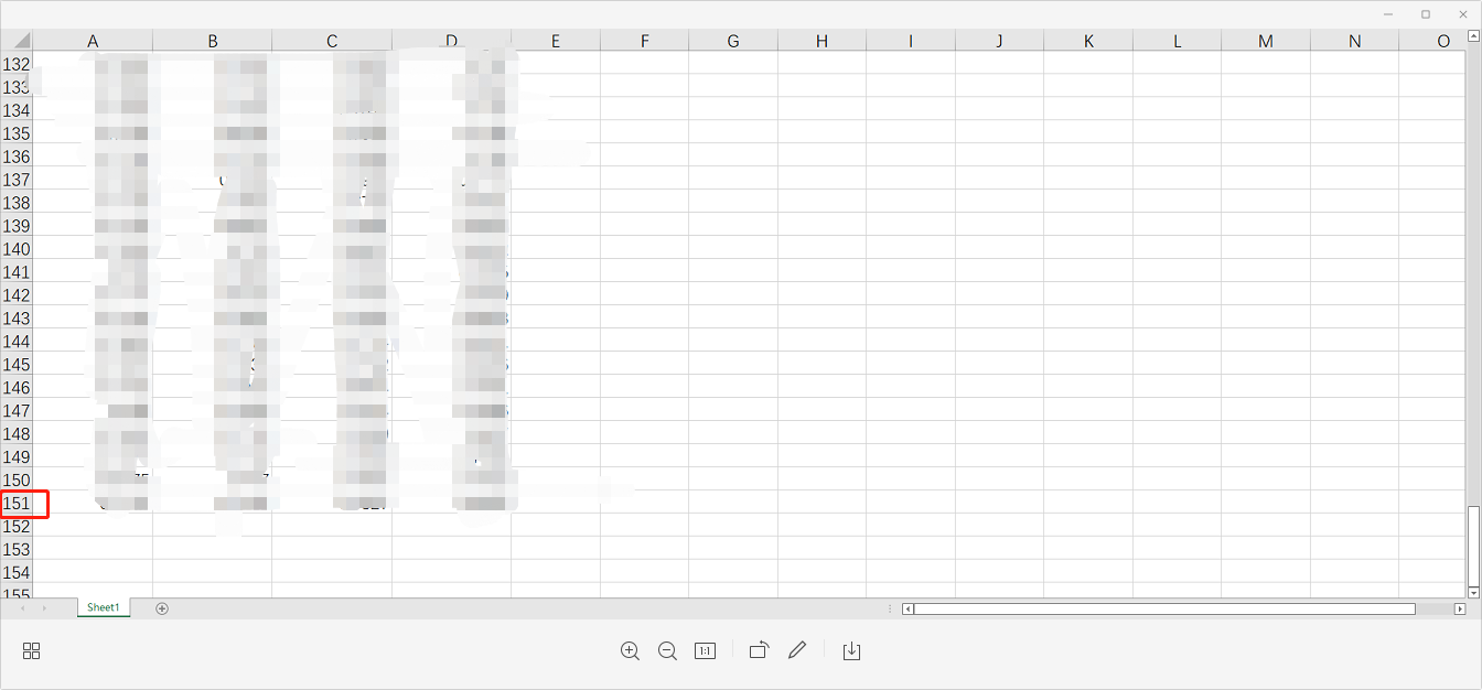
一、建立excel文件
二、代码
对于含有曲线、最值标注、最值坐标、箭头。
import matplotlib.pyplot as plt
import pandas as pd

plt.rcParams['font.sans-serif']=['SimHei'] #用来正常显示中文标签
plt.rcParams['axes.unicode_minus']=False #用来正常显示负号

data_source = pd.read_excel(r'E:\chengxu\yolov7-main\R.xlsx')  # excel文件地址

x = list(range(150))  # 共有150个数据


# y1、y2、y3、y4 四列
y1 = data_source['Groups 1'].values
y2 = data_source['Groups 2'].values
y3 = data_source['Groups 3'].values
y4 = data_source['Groups 4'].values

# ----------------------第一列数据---------------------------------
ordered_time1 = [x for (y1,x) in sorted(zip(y1,x))]
best_time1 = ordered_time1[-1]
plt.plot(x, y1, color='green', linewidth=1, label='Group 1')
max_point1 = plt.plot(best_time1, max(y1), 'bo', color='green')   # 标注最大值的点

# ----------坐标、箭头(箭头不太会使用)------------------#
# for xy in zip(x, y1):
    # if xy ==(best_time1,max(y1)):
        # plt.annotate("(%s,%s)"% xy,xy=xy,  xytext=(-30, -10), textcoords='offset points')
        # plt.annotate('max', xy=xy, xytext=(3, 1.5), arrowprops=dict(facecolor='black', shrink=0.05))
# ---------------------------------------------------#


# ----------------------第二列数据---------------------------------
ordered_time2 = [x for (y2,x) in sorted(zip(y2,x))]
best_time2 = ordered_time2[-1]
plt.plot(x, y2, color='red', linewidth=1, label='Group 2')
max_point2 = plt.plot(best_time2, max(y2), 'bo', color='red')
# for xy in zip(x, y2):
#     if xy ==(best_time2,max(y2)):
#         plt.annotate("(%s,%s)"% xy,xy=xy,  xytext=(-20, -20), textcoords='offset points')

# ----------------------第三列数据---------------------------------
ordered_time3 = [x for (y3,x) in sorted(zip(y3,x))]
best_time3 = ordered_time3[-1]
plt.plot(x, y3, color='m', linewidth=1, label='Group 3')
max_point3 = plt.plot(best_time3, max(y3), 'bo', color='m')
# for xy in zip(x, y3):
#     if xy ==(best_time3,max(y3)):
#         plt.annotate("(%s,%s)"% xy,xy=xy,  xytext=(-80, 5), textcoords='offset points')

# ----------------------第四列数据---------------------------------
ordered_time4 = [x for (y4,x) in sorted(zip(y4,x))]
best_time4 = ordered_time4[-1]
plt.plot(x, y4, color='blue', linewidth=1, label='Group 4')
max_point4 = plt.plot(best_time4, max(y4), 'bo', color='blue')
# for xy in zip(x, y4):
#     if xy ==(best_time4,max(y4)):
#         plt.annotate("(%s,%s)"% xy,xy=xy,  xytext=(-30, 0), textcoords='offset points')


plt.legend()
plt.xlabel('epoch')
plt.ylabel('Recall')
plt.show()
对于仅含有曲线。
import matplotlib.pyplot as plt
import pandas as pd

plt.rcParams['font.sans-serif']=['SimHei'] #用来正常显示中文标签
plt.rcParams['axes.unicode_minus']=False #用来正常显示负号

data_source = pd.read_excel(r'E:\chengxu\yolov7-main\R.xlsx')

x = list(range(150))
y1 = data_source['Groups 1'].values
y2 = data_source['Groups 2'].values
y3 = data_source['Groups 3'].values
y4 = data_source['Groups 4'].values

plt.plot(x, y2, color='red', linewidth=1, label='Groups 2')
plt.plot(x, y3, color='skyblue', linewidth=1, label='Groups 3')
plt.plot(x, y4, color='blue', linewidth=1, label='Groups 4')
plt.title('R')
plt.legend()

plt.xlabel('epoch')
plt.ylabel('R')
plt.show()


 浙公网安备 33010602011771号