CSS高级布局
float属性
基本浮动规则
先来了解一下block元素和inline元素在文档流中的排列方式。
block元素通常被现实为独立的一块,独占一行,多个block元素会各自新起一行,默认block元素宽度自动填满其父元素宽度。block元素可以设置width、height、margin、padding属性;
inline元素不会独占一行,多个相邻的行内元素会排列在同一行里,直到一行排列不下,才会新换一行,其宽度随元素的内容而变化。inline元素设置width、height属性无效。inline元素的margin和padding属性。水平方向的padding-left, padding-right, margin-left, margin-right都产生边距效果;但竖直方向的padding-top, padding-bottom, margin-top, margin-bottom不会产生边距效果。
- 常见的块级元素有 div、form、table、p、pre、h1~h5、dl、ol、ul 等。
- 常见的内联元素有span、a、strong、em、label、input、select、textarea、img、br等
所谓的文档流,指的是元素排版布局过程中,元素会自动从左往右,从上往下的流式排列。
脱离文档流,也就是将元素从普通的布局排版中拿走,其他盒子在定位的时候,会当做脱离文档流的元素不存在而进行定位。
BFC(Block formatting context)
块级格式化上下文,它是一个独立的渲染区域,只有Block-level box参与,它规定了内部的Block-level Box如何布局,并且与这个区域外部毫不相干。
BFC规则
① 内部的Box会在垂直方向,一个接一个地放置;
② Box自身垂直方向的位置由margin-top决定,属于同一个BFC的两个相邻Box的margin会发生重叠
③ Box自身水平方向的位置由margin左或右决定(具体已经参照BFC方位),属于同一个BFC的两个相邻Box的margin会发生叠加
只有绝对定位absolute和浮动float才会脱离文档流。
---部分无视和完全无视的区别?需要注意的是,使用float脱离文档流时,其他盒子会无视这个元素,但其他盒子内的文本依然会为这个元素让出位置,环绕在周围(可以说是部分无视)。而对于使用absolute position脱离文档流的元素,其他盒子与其他盒子内的文本都会无视它。(可以说是完全无视)
浮动的表现
定义:浮动的框可以向左或向右移动,直到它的外边缘碰到包含框或另一个浮动框的边框为止。由于浮动框不在文档的普通流中,所以文档的普通流中的浮动框之后的块框表现得就像浮动框不存在一样。(注意这里是块框而不是内联元素;浮动框只对它后面的元素造成影响)
注意 当初float被设计的时候就是用来完成文本环绕的效果,所以文本不会被挡住,这是float的特性,即float是一种不彻底的脱离文档流方式。无论多么复杂的布局,其基本出发点均是:“如何在一行显示多个div元素”。
现象1:
假如某个div元素A是浮动的,如果A元素上一个元素也是浮动的,那么A元素会跟随在上一个元素的后边(如果一行放不下这两个元素,那么A元素会被挤到下一行);
如果A元素上一个元素是标准流中的元素,那么A的相对垂直位置不会改变,也就是说A的顶部总是和上一个元素的底部对齐。
此外,浮动的框之后的block元素元素会认为这个框不存在,但其中的文本依然会为这个元素让出位置。 浮动的框之后的inline元素,会为这个框空出位置,然后按顺序排列。
现象2:
左右结构div盒子重叠现象,一般是由于相邻两个DIV一个使用浮动一个没有使用浮动。例如:相邻的两个盒子box2向左浮动、box3未浮动。一个使用浮动一个没有导致DIV不是在同个“平面”上,但内容不会照成覆盖现象,只有DIV形成覆盖现象。
解决方法:要么都不使用浮动;要么都使用float浮动;要么对没有使用float浮动的DIV设置margin样式。
浮动布局
<!DOCTYPE html>
<html>
<head>
	<meta charset="UTF-8">
	<title>浮动布局</title>
	<style type="text/css">
		body {
			/*background: cyan;*/
		}
		.temp {
			width: 200px;
			height: 200px;
			background: orange;

			/*Box自身水平方向的位置由margin左或右决定(具体依据: 参照BFC方位),属于同一个BFC的两个相邻Box的margin会发生叠加。*/
			margin-right: 100px;
			float: right;
		}
	</style>
	<style type="text/css">
		/*float: 浮动布局, 改变BFC的参照方位*/
		/*为什么要使用: 块级盒子就会同行显示*/
		/*float: left | right*/
		.box {
			width: 100px;
			height: 100px;
			background: orange;
			font: 900 40px/100px "STSong";
			text-align: center;
		}
		.box:nth-child(2n) {
			background: red;
		}

		.box {
			float: right;
		}
		.box:last-child {
			/*盒模型布局可以在其他布局的基础上进行盒子位置微调*/
			/*margin-left: 10px;*/
		}
		/*注: 浮动布局的横向显示范围由父级width决定, 当一行显示不下时, 会自动换行,排列方式(起点)还是遵循BFC参照方位 => 固定了父级width也就固定了浮动布局的行数*/
	</style>
</head>
<body>
	<!-- <div class="temp"></div> -->
	<div class="wraper">
		<div class="box">1</div>
		<div class="box">2</div>
		<div class="box">3</div>
		<div class="box">4</div>
		<div class="box">5</div>
	</div>
</body>
</html>
清浮动
<!DOCTYPE html>
<html>
<head>
	<meta charset="UTF-8">
	<title>清浮动</title>
	<style type="text/css">
		.outer {
			/*height: 200px;*/
			background: orange;
		}
		/*清浮动: 让父级(有浮动子级)获得一个合适的高度*/

		/*子标签设置浮动 => 子标签不完全脱离文档流*/

		/*脱离文档流: 产生可新的BFC, (不再关联父级宽高)*/
		/*浮动的子级, 默认不会获取父级宽度, 也不会撑开父级高度*/

		/*不完全: 父级在做清浮动操作后,可以重新被子级撑开高度*/

		/*当父级没有下兄弟标签, 可以不做清浮动操作, 但清浮动操作应该在每一次发送浮动后均需要处理的*/
		.inner {
			width: 200px;
			height: 200px;
			background: red;
			float: left;
			border-radius: 50%;
		}
		/*清浮动操作*/
		.outer:after {
			content: "";
			display: block;
			clear: both;
		}

		.box {
			width: 200px;
			height: 200px;
			background: cyan;
			/*margin-top: -200px;*/
		}
	</style>
	<style type="text/css">
		/*盒子先加载:before, 再加载自身(文本,图片,子标签), 最后加载:after*/
		.div:before {
			content: "123"
		}
		.div:after {
			content: "456"
		}
	</style>
</head>
<body>
	<!-- 清浮动: 清除浮动导致的布局问题 -->
	<div class="outer">
		<div class="inner"></div>
	</div>
	<div class="box"></div>

	<div class="div">原文本</div>
</body>
</html>
清浮动的四种方式
<!DOCTYPE html>
<html>
<head>
	<meta charset="UTF-8">
	<title>清浮动方式</title>
	<style type="text/css">
		.sub, .box {
			width: 200px;
			height: 200px;
			background: orange;
		}
		.box {
			background: red;
		}
		.sub {
			float: left;
		}

		/*① 设置死高度*/
		.sup {
			/*height: 200px;*/
		}
		/*② overflow*/
		.sup {
			/*background: cyan;*/
			/*隐藏无用的内容*/
			/*overflow: hidden;*/
		}
		/*③ 兄弟标签清浮动*/
		.box {
			/*清浮动属性: left | right | both*/
			/*clear: both;*/
		}
		/*④ 伪类清浮动*/
		.sup:after {
			content: "";
			display: block;
			clear: both;
		}
		/*before => 自身(子内容)(会产生问题) => after => 兄弟*/
	</style>
</head>
<body>
	<!-- 清浮动: 使父级获取一个合适高度 -->
	<!-- 通常情况下在子级浮动,父级不会被撑开高度在该问题发生之后做清浮动操作 -->

	<!-- 在发生浮动之前, 可以通过设置父级的高度来避免浮动问题 -->
	<div class="sup">
		<div class="sub"></div>
		<!-- <div class="sub"></div>
		<div class="sub" style="height: 300px"></div>
		<div class="sub"></div>
		<div class="sub"></div>
		<div class="sub"></div> -->
	</div>
	<div class="box"></div>

	<!-- overflow: hidden -->
	<style type="text/css">
		.bb {
			width: 100px;
			/*手动设置了死高度,才会产生超出高度的内容为无用内容*/
			/*height: 50px;*/
			background: pink;
			overflow: hidden;
		}
	</style>
	<!-- <div class="bb">好的好的好的好的好的好的好的好的好的好的</div> -->
</body>
</html>
浮动补充
<!DOCTYPE html>
<html>
<head>
	<meta charset="UTF-8">
	<title>复习预习</title>
	<!-- 1.总结display -->

	<!-- 2.浮动 -->
	<!-- 让块级标签在父级可利用的宽度(width)中进行同行排列 -->
	<!-- 针对block-level box进行布局 -->
	<!-- float: left | right => BFC 左 | 右 => marging-left | margin-right -->
	<!-- 在浮动的基础上进行盒模型布局 -->

	<!-- 3.清浮动 -->
	<!-- 浮动后的标签不再撑开父级高度,让父级获得一个合适的高度 -->
	<style type="text/css">
		/* (.sup>.sub)+.brother */

		.sup {
			/*设置固定高度*/
			height: 200px;
		}
		.brother {
			clear: both;
		}
		.sup {
			overflow: hidden;
		}
		.sup:after {
			content: "";
			display: block;
			clear: both;
		}

	</style>


	<!-- 今日 -->
	<!-- 浮动布局的作业 -->
	<!-- 盒子的显隐控制 -->
	<!-- 定位布局 ***** -->
	<!-- 流式布局思想 -->

	<style type="text/css">
		/*对于浮动布局,需要设置父级的宽度吗?需要设置父级的高度吗?*/
		/*宽度: 一定需要, 因为父级宽度是子级浮动的显示范围*/
		/*高度: 不需要设置, 高度由清浮动来处理*/

		/*需要设置子级的宽度吗?高度呢?*/
		/*子级的宽高均需要自身设置*/

		.box1 {
			width: 1000px;
			margin: 0 auto;

		}
		.box1:after {
			content: "";
			display: block;
			clear: both;
		}
		.box1 div {
			width: 200px;
			height: 100px;
			font: 900 40px/100px "STSong";
			text-align: center;
			color: white;
			background: red;
			float: left;
		}
		div.b6 {
			width: 600px;
			background: yellow;
			float: left;
		}
		div.b7 {
			width: 400px;
			height: 200px;
			background: yellowgreen;
			line-height: 200px;
			float: right;
		}
		div.b8 {
			width: 300px;
			height: 150px;
			background: #ccc;
			float: left;
		}
		div.b9 {
			width: 300px;
			height: 150px;
			background: black;
			float: left;
		}
		div.b10 {
			width: 400px;
			height: 150px;
			background: cyan;
			float: right;
		}
		div.b11 {
			width: 600px;
			height: 100px;
			background: red;
			float: right;
		}
		div.b12 {
			width: 1000px;
			height: 100px;
			background: blue;
			float: right;
		}
		.box1 {
			display: none;
		}
	</style>
	<style type="text/css">
		.box2 {
			width: 600px;
			overflow: hidden;
			margin: 0 auto;
		}
		.r, .y, .b {
			width: 200px;
			float: left;
		}
		.red, .blue {
			height: 180px;
			margin-bottom: 10px;
			background: red
		}
		.yellow {
			height: 275px;
			background: yellow;
			margin-bottom: 10px;
		}
		.blue {
			background: blue;
		}
	</style>
</head>
<body>
	<!-- 作业2 -->
	<div class="box2">
		<div class="r">
			<div class="red"></div>
			<div class="red"></div>
			<div class="red"></div>
		</div>
		<div class="y">
			<div class="yellow"></div>
			<div class="yellow"></div>
		</div>
		<div class="b">
			<div class="blue"></div>
			<div class="blue"></div>
			<div class="blue"></div>
		</div>
	</div>


	<!-- 作业1 -->
	<div class="box1">
		<div class="b1">1</div>
		<div class="b2">2</div>
		<div class="b3">3</div>
		<div class="b4">4</div>
		<div class="b5">5</div>
		<div class="b6">6</div>
		<div class="b7">7</div>
		<div class="b8">8</div>
		<div class="b9">9</div>
		<div class="b10">10</div>
		<div class="b11">11</div>
		<div class="b12">12</div>
	</div>

	<!-- 浮动细节 -->
	<style type="text/css">
		.box {
			background-color: orange;
			/*需要: box的宽度刚刚满足内容的显示宽度*/
			float: left;
		}
		.wrap { overflow: hidden; }
		/*1. 一般有inline类型的子内容,父级想自适应子内容的宽度, 让父级浮动起来*/
		/*2. 在一个结构中, 应该避免出现既有浮动又有非浮动的兄弟标签, 如果出现,要即将浮动的标签添加父级,并对添加的父级清浮动*/
		/*注: 同一结构下,如果有标签浮动,那么该结构下所有兄弟标签均是浮动布局*/

		.wrap {
			display: none;
		}
	</style>
	<div class="wrap">
		<div class="box">
			<a href="">百度</a>
			<span>|</span>
			<a href="">新浪</a>
		</div>
	</div>
</body>
</html>
position
static
static 默认值,无定位,不能当作绝对定位的参照物,并且设置标签对象的left、top等值是不起作用的的。
position:relative/absolute
relative: 相对定位
相对定位是相对于该元素在文档流中的原始位置,即以自己原始位置为参照物。有趣的是,即使设定了元素的相对定位以及偏移值,元素还占有着原来的位置,即占据文档流空间。对象遵循正常文档流,但将依据top,right,bottom,left等属性在正常文档流中偏移位置。而其层叠通过z-index属性定义。
注意:position:relative的一个主要用法:方便绝对定位元素找到参照物
<!DOCTYPE html>
<html>
<head>
	<meta charset="UTF-8">
	<title>相对定位布局</title>
	<style type="text/css">
		/*定位布局的导入*/
		/*需求: */
		/*1.子级在父级的右下角显示*/
		/*2.子级完成布局后,父级做content后,子级不需要重新布局*/
		.sup {
			width: 300px;
			height: 300px;
			background: pink;
			border: 10px solid black;
		}
		.sub {
			width: 50px;
			height: 50px;
			background: red;
			margin-left: auto;
			margin-top: 150px;
		}
		/*能不能有一种定位, 让盒子可以通过上下左右四个方位均操作自身布局 => 定位布局*/
		/*什么是定位布局: 可以通过上下左右四个方位完成自身布局的布局方式*/

		.sup {
			display: none;
		}
	</style>

	<style type="text/css">
		/*相对定位布局*/
		.box {
			width: 200px;
			height: 200px;
			background: pink;
		}
		.b2 { background: orange }
		.b1 {
			/*1.设置定位属性,就会打开定位方位*/
			position: relative;
			/*2.通过定位方位完成布局*/
			top: 300px;
			left: 300px;
			/*bottom: 100px;*/
			/*right: 100px;*/
			/*margin-top: 200px;*/
			/*结论*/
			/*1.左右取左,上下取上(eg:left与right共存是,left生效)*/
			/*2.left=-right, top=-bottom*/
			/*3.参考系: 自身原有位置(不是某一个点,eg: right参考的就是原有位置的右边界)*/
			/*4.自身布局后不会影响自身原有位置*/
			/*5.不脱离文档流(脱离文档流: 不再撑开父级高度)*/
		}

	</style>
</head>
<body>

	<div class="box b1">1</div>
	<div class="box b2"></div>


	<div class="sup">
		<div class="sub"></div>
	</div>

</body>
</html>
absolute: 绝对定位
定义:设置为绝对定位的元素框从文档流完全删除,并相对于最近的已定位祖先元素定位,如果元素没有已定位的祖先元素,那么它的位置相对于最初的包含块(即body元素)。元素原先在正常文档流中所占的空间会关闭,就好像该元素原来不存在一样。元素定位后生成一个块级框,而不论原来它在正常流中生成何种类型的框。
重点:如果父级设置了position属性,例如position:relative;,那么子元素就会以父级的左上角为原始点进行定位。这样能很好的解决自适应网站的标签偏离问题,即父级为自适应的,那我子元素就设置position:absolute;父元素设置position:relative;,然后Top、Right、Bottom、Left用百分比宽度表示。
另外,对象脱离正常文档流,使用top,right,bottom,left等属性进行绝对定位。而其层叠通过z-index属性定义。
<!DOCTYPE html>
<html>
<head>
	<meta charset="UTF-8">
	<title>绝对定位布局</title>
	<style type="text/css">

		.box {
			width: 200px;
			height: 300px;
			background: orange;
		}

		.sup {
			width: 200px;
			height: 200px;
			background: pink;
			/*position: absolute;*/
		}

		.sub {
			width: 50px;
			height: 50px;
			background: red;
			/*1.开的定位*/
			position: absolute;
			/*2.采用定位方位完成布局*/
			right: 0;
			bottom: 0;
		}
		body {
			position: relative;
		}
		/*注: 一般父级采用的是相对定位布局, 一般情况下,父级不需要脱离文档流*/
		/*如果父级需要脱离文档流,用绝对定位父级完成布局,完全可以,不会影响子级相对于自身的布局,但是自身又要需要一个在文档流中的(不脱离文档流中的)定位参考父级 => 父相子绝*/
		/*相对定位的应用场景大部分都是辅助于子级的绝对定位*/
		.sup {
			position: relative;
		}
		.sub {
			/*left: 0;*/
			right: 0;
		}
	</style>
</head>
<body>
	<!-- 绝对定位布局一定存在父子关系 -->
	<!-- 导入定位布局时,父级设置宽高没?(设置了) 子级呢?(也设置了) => 父级的高度不再依赖于子级 => 子级脱离文档流 -->

	<!-- 参考系: 最近的定位父级 -->
	<div class="sup">
		<div class="sub"></div>
	</div>
	<!-- <div class="box"></div> -->
	<!--
	1.top|bottom|left|right都可以完成自身布局, 上下取上,左右取左
	2.父级必须自己设置宽高
	3.完全离文档流
	 -->
</body>
</html>
总结:参照物用相对定位,子元素用绝对定位,并且保证相对定位参照物不会偏移即可。
position:fixed
fixed:对象脱离正常文档流,使用top,right,bottom,left等属性以窗口为参考点进行定位,当出现滚动条时,对象不会随着滚动。而其层叠通过z-index属性 定义。 注意点: 一个元素若设置了 position:absolute | fixed; 则该元素就不能设置float。这 是一个常识性的知识点,因为这是两个不同的流,一个是浮动流,另一个是“定位流”。但是 relative 却可以。因为它原本所占的空间仍然占据文档流。
在理论上,被设置为fixed的元素会被定位于浏览器窗口的一个指定坐标,不论窗口是否滚动,它都会固定在这个位置。
<!DOCTYPE html>
<html>
<head>
	<meta charset="UTF-8">
	<title>固定定位</title>
	<style type="text/css">
		/*参考系: 页面窗口*/
		/*1.top|bottom|left|right都可以完成自身布局, 上下取上,左右取左*/
		/*2.相对于页面窗口是静止的*/
		/*3.完全脱离文档流*/
		.box {
			width: 200px;
			height: 300px;
			background: orange;
		}
		.box {
			position: fixed;
			top: 200px;
			right: 50px;
		}
	</style>
</head>
<body>
	<div class="box"></div>
	<br>
	<br>
	<br>
	<br>
	<br>
	<br>
	<br>
	<br>
	<br>
	<br>
	<br>
	<br>
	<br>
	<br>
	<br>
	<br>
	<br>
	<br>
	<br>
	<br>
	<br>
	<br>
	<br>
	<br>
	<br>
	<br>
	<br>
	<br>
	<br>
	<br>
	<br>
	<br>
	<br>
	<br>
	<br>
	<br>
	<br>
	<br>
	<br>
	<br>
	<br>
	<br>
	<br>
	<br>
	<br>
	<br>
	<br>
	<br>
	<br>
	<br>
	<br>
	<br>
	<br>
	<br>
	<br>
	<br>
	<br>
	<br>
	<br>
	<br>
	<br>
	<br>
	<br>
	<br>
	<br>
	<br>
	<br>
	<br>
	<br>
	<br>
	<br>
	<br>
	<br>
	<br>
	<br>
	<br>
	<br>
	<br>
	<br>
	<br>
	<br>
	<br>
	<br>
	<br>
	<br>
	<br>
	<br>
	<br>
	<br>
	<br>
	<br>
	<br>
	<br>
	<br>
	<br>
	<br>
	<br>
	<br>
	<br>
	<br>
</body>
</html>
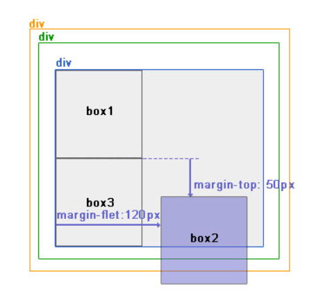
仅使用margin属性布局绝对定位元素
此情况,margin-bottom 和margin-right的值不再对文档流中的元素产生影响,因为该元素已经脱离了文档流。另外,不管它的祖先元素有没有定位,都是以文档流中原来所在的位置上偏移参照物。
使用margin属性布局相对定位元素。
层级关系为:
<div ——————————— position:relative;
<div—————————-没有设置为定位元素,不是参照物
<div———————-没有设置为定位元素,不是参照物
<div box1
<div box2 ——–position:absolute; margin-top:50px; margin-left:120px;
<div box3
效果图:
overflow:hidden
overflow:hidden的含义是超出的部分要裁切隐藏,float的元素虽然不在普通流中,但是他是浮动在普通流之上的,可以把普通流元素+浮动元素想象成一个立方体。如果没有明确设定包含容器高度的情况下,它要计算内容的全部高度才能确定在什么位置hidden,这样浮动元素的高度就要被计算进去。这样包含容器就会被撑开,清除浮动。
caution
默认的高度和宽度问题
父子都是块级标签
<!DOCTYPE html>
<html>
<head>
    <title>fortest</title>
    <style>
        div.parent{
            width: 500px;
            height: 300px;
            background: #ccc;
        }
        div.son{
            width: 100%;
            height: 200px;
            background: green;
        }
    </style>
</head>
<body>
    <div class="parent">
        <div class="son"></div>
    </div>
</body>
</html>
这时候,子元素设置为了父元素width的100% 那么子元素的宽度也是500px
但是如果我们把子元素的width去掉之后,就会发现子元素还是等于父元素的width。也就是说,对于块级元素,子元素的宽度默认为父元素的100%。
当我们给子元素添加padding和margin时,可以发现宽度width是父元素的宽度减去子元素的margin值和padding值。
毫无疑问,如果去掉子元素的height,就会发先子元素的高度为0,故height是不会为100%的,一般我们都是通过添加内容(子元素)将父元素撑起来。
父:块级元素 子:内联元素
如果内联元素是不可替换元素(除img,input以外的一般元素),元素是没有办法设置宽度的,也就谈不上100%的问题了。 即内联元素必须依靠其内部的内容才能撑开。
如果内联元素是可替换元素(img,input,本身可以设置长和宽),不管怎么设置父元素的宽度和高度,而不设置img的宽和高时,img总是表现为其原始的宽和高。
<!DOCTYPE html>
<html>
<head>
    <title>...</title>
    <style>
        div.parent{
            width: 500px;
            height: 300px;
            background: #ccc;
        }
        img{
            height: 100px;
            background: green;
        }
    </style>
</head>
<body>
    <div class="parent">
        <img class="son" src="s1.jpg"></img>
    </div>
</body>
</html>
由此我们可以发现,虽然没有设置宽度,但是表现在浏览器上为160px,它并没有继承父元素的100%得到500px,而是根据既定的高度来等比例缩小宽度。 同样, 如果只设置width,那么height也会等比例改变。 如果我们把img的width设置为100%,就可以发现其宽度这时就和父元素的宽度一致了。而我们一般的做法时,首先确定img的父元素的宽度和高度,然后再将img的宽度和高度设置位100%,这样,图片就能铺满父元素了。
过度动画
transition属性
transition: 过渡时间(必须) 延迟时间(一般不设) 过渡属性(一般采用all默认值) 过渡曲线(贝赛尔曲线)(cubic-bezier())
过渡属性具体设置给初始状态还是第二状态 根据具体需求
过渡的持续时间
transition-duration: 2s;
/*延迟时间*/
transition-delay: 50ms;
/*过渡属性*/
/*单一属性 | 属性1, ..., 属性n | all*/
transition-property: all;
/*过渡曲线*/
/*cubic-bezier() | ease | ease-in | ease-out | ease-in-out | linear*/
transition-timing-function: cubic-bezier(0, 2.23, 0.99, -1.34);
transition小结
1.尽量悬浮静止的盒子, 控制运动的盒子
2.不能确定区间范围的属性值, 不会产生动画效果
display 不能做动画 | opacity 可以做动画
<!DOCTYPE html>
<html>
<head>
	<meta charset="UTF-8">
	<title>动画</title>
	<style type="text/css">
		.box {
			width: 200px;
			height: 200px;
			background-color: red;
			/*通过过渡完成动画*/
			/*transition: 1s;*/

			/*过渡的持续时间*/
			transition-duration: 2s;
			/*延迟时间*/
			transition-delay: 50ms;
			/*过渡属性*/
			/*单一属性 | 属性1, ..., 属性n | all*/
			transition-property: all;
			/*过渡曲线*/
			/*cubic-bezier() | ease | ease-in | ease-out | ease-in-out | linear*/
			transition-timing-function: cubic-bezier(0, 2.23, 0.99, -1.34);
		}
		.box:hover {
			width: 800px;
			height: 400px;
			background-color: orange;
		}
	</style>
	<style type="text/css">
		.sup {
			width: 800px;
			height: 50px;
			background-color: pink;
			margin: 0 auto;
		}
		.sub {
			width: 50px;
			height: 50px;
			background-color: orange;
			/*整体设置: 注意点 第一个时间为过渡时间, 第二个为延迟时间,可以省略, 运动曲线和运动属性可以省略,位置也不做要求*/
			/*transition: .1s 1s all ease;*/
			transition: .7s ease-in-out;
			/*display: none;*/
			/*opacity: 0;*/
		}
		.sup:hover .sub {
			/*margin-left: auto;*/
			/*display: block;*/
			/*opacity: 1;*/
			margin-left: calc(100% - 50px);
		}
		/*结论:*/
		/*1.尽量悬浮静止的盒子, 控制运动的盒子*/
		/*2.不能确定区间范围的属性值, 不会产生动画效果*/
		/*display 不能做动画  | opacity可以做动画*/
	</style>
</head>
<body>
	<!-- 案例 -->
	<div class="sup">
		<div class="sub"></div>
	</div>

	<!-- 动画: 从一种状态渐变(非瞬变)到另一种状态 -->
	<!-- HTML5如何实现动画: transition(过渡) | animation(动画) -->
	<div class="box"></div>

</body>
</html>
过度补充案例
<!DOCTYPE html>
<html>
<head>
	<meta charset="UTF-8">
	<title>过渡案例</title>
	<style type="text/css">
		.wrapper {
			position: relative;
			width: 300px;
			height: 300px;
			/*background-color: orange;*/
			margin: 50px auto;
			border-bottom: 2px solid #ccc;
		}
		.box {
			position: absolute;
			width: 60px;
			height: 60px;
			background-color: orange;
			transition: .5s;
			/*top: 240px;*/
			bottom: 10px;
			/*采用定位布局情况下,固定top,动画会往下延伸,反之固定bottom,动画会往上延伸,左右同理*/
			left: 120px;
		}
		.box:hover {
			height: 300px;
		}
		.up, .down {
			width: 60px;
			height: 30px;
			background-color: black;
			border-radius: 50%;
			position: absolute;
		}
		/*做动画时,相当于谁是静止的*/
		.up {
			top: -15px;
		}
		.down {
			bottom: -15px;
		}
	</style>
</head>
<body>
	<div class="wrapper">
		<div class="box">
			<div class="up"></div>
			<div class="down"></div>
		</div>
	</div>
</body>
</html>
transition实现多个过度,并且使用伪类
<!DOCTYPE html>
<html>
<head>
    <title></title>
    <meta charset="utf-8">
    <style type="text/css">
        body{
            position: relative;
        }
        #box{
            /*如果动画的元素是margin,不能设置auto*/
            height: 100px;
            width: 100px;
            background-color: pink;
            position: absolute;
            top: 20px;
            transition: margin-left 3s,background-color 3s,border-radius 3s,top 3s;
        }
        #box:hover{
            background-color: purple;
            border-radius: 50px;
            top: 50px;
            margin-left: 100px;
        }
    </style>
</head>
<body>

<div id="box"></div>

</body>
</html>
盒子阴影
x轴偏移量 y轴偏移量 虚化程度 阴影宽度 阴影颜色
box-shadow: 0 0 10px 10px black;
一个盒子可以设置多个阴影, 每一套阴影间用逗号隔开
box-shadow: 0 -10px 10px -5px black, 0 10px 10px -5px black;
<!DOCTYPE html>
<html>
<head>
	<meta charset="UTF-8">
	<title>盒子阴影</title>
	<style type="text/css">
		body {
			margin: 0;
		}
		.box {
			width: 200px;
			height: 200px;
			background-color: cyan;
			/*屏幕正中央*/
			margin-top: calc(50vh - 100px);
			margin-left: calc(50vw - 100px)
		}
		.box {
			/*x轴偏移量 y轴偏移量 虚化程度 阴影宽度 阴影颜色*/
			/*box-shadow: 0 0 10px 10px black;*/

			/*一个盒子可以设置多个阴影*/
			box-shadow: -250px 0 10px 0 red, 250px -50px 0 10px blue, 100px -225px 10px 10px yellow, 0 10px 10px -5px #333;
		}
	</style>
</head>
<body>
	<div class="box"></div>
</body>
</html>
Flex布局
解决的经典案例
<!DOCTYPE html>
<html lang="en">
<head>
	<meta charset="UTF-8">
	<style type="text/css">
		.container {
		width: 600px;
		height: 600px;
		display: flex;
		flex-direction: column;
		border: 1px solid #333;
		}
		.it1, .it3 {
		flex-grow: 1;
		background-color: orange;
		}
		.it2 {
		flex-grow: 2;
		background-color: red;
		}
</style>
</head>
<body>
<div class="container">
<div class="item it1"></div>
<div class="item it2"></div>
<div class="item it3"></div>
</div>
</body>
</html>
学习目的
Flex是Flexible Box的缩写,意为”弹性布局”,用来为盒状模型提供最大的灵活性。
设为Flex布局以后,子元素的float、clear和vertical-align属性将失效。
基本概念
采用Flex布局的元素,称为Flex容器(flex container),简称”容器”。它的所有子元素自动成为容器成员,称为Flex项目(flex item),简称”项目”。
水平为轴(main axis),主轴的开始位置(与边框的交叉点)叫做main start,结束位置叫做main end。
垂直为交叉轴(cross axis),交叉轴的开始位置叫做cross start,结束位置叫做cross end。
项目默认沿主轴排列。单个项目占据的主轴空间叫做main size,占据的交叉轴空间叫做cross size。
容器属性
① flex-direction 属性 决定主轴的方向(即项目的排列方向)
flex-direction: row | row-reverse | column | column-reverse;
-- row(默认值):主轴为水平方向,起点在左端。
-- row-reverse:主轴为水平方向,起点在右端。
-- column:主轴为垂直方向,起点在上沿。
-- column-reverse:主轴为垂直方向,起点在下沿。

② flex-wrap 属性 定义,如果一条轴线排不下,如何换行。
flex-wrap: nowrap | wrap | wrap-reverse;
-- nowrap(默认):不换行。
-- wrap:换行,第一行在上方。
-- wrap-reverse:换行,第一行在下方。

③ flex-flow 属性 是flex-direction属性和flex-wrap属性的简写形式,默认值为row nowrap。
flex-flow: <flex-direction> <flex-wrap>;

④ justify-content 属性 定义了项目在主轴上的对齐方式。
justify-content: flex-start | flex-end | center | space-between | space-around;

⑤ align-items 属性 定义项目在交叉轴上如何对齐。
align-items: flex-start | flex-end | center | baseline | stretch;

⑥ align-content 属性 定义了多根轴线的对齐方式。如果项目只有一根轴线,该属性不起作用。
align-content: flex-start | flex-end | center | space-between | space-around | stretch;
项目属性
① order 属性 定义项目的排列顺序。数值越小,排列越靠前,默认为0。
order: <integer>;

② flex-grow 属性 定义项目的放大比例,默认为0,即如果存在剩余空间,也不放大。
flex-grow: <number>; /* default 0 */

③ flex-shrink 属性 定义了项目的缩小比例,默认为1,即如果空间不足,该项目将缩小。
flex-shrink: <number>; /* default 1 */

④ flex-basis 属性 定义了在分配多余空间之前,项目占据的主轴空间(main size)。
flex-basis: <length> | auto; /* default auto */

⑤ flex 属性 是flex-grow, flex-shrink 和 flex-basis的简写,默认值为0 1 auto。后两个属性可选。
flex: <flex-grow> <flex-shrink> <flex-basis>

⑥ align-self 属性 允许单个项目有与其他项目不一样的对齐方式,可覆盖align-items属性。默认值为auto,表示继承父元素的align-items属性,如果没有父元素,则等同于stretch。
align-self: auto | flex-start | flex-end | center | baseline | stretch;
z-index属性
<!DOCTYPE html>
<html>
<head>
	<meta charset="UTF-8">
	<title>z-index</title>
	<style type="text/css">
		.wrap {
			width: 200px;
			height: 200px;
			background: pink;
			/*父级做相对定位处理,并不是自己需要用定位完成布局,最主要的原因是辅助于子级完成绝对定位布局*/
			position: relative;
		}
		.box {
			width: 75px;
			height: 75px;
			font: normal 30px/75px "STSong";
			text-align: center;
			background: cyan;
			/*绝对定位需要大家脱离文档流,相互不会影响布局,每个都是独立相对于父级进行布局的个体*/
			position: absolute;
			/*top: 0;*/
			/*bottom: 0;*/
			/*left: 0;*/
		}
		.b1 {
			left: 0;
			top: 0;
			background: red;
		}
		.b2 {
			right: 0;
			top: 0;
			background: yellow;
		}
		.b3 {
			/*虽然子级脱离了文档流,但是父子关系以及存在,子级获取100%,得到的还是父级对应的值*/
			left: calc((100% - 75px) / 2);
			top: calc((100% - 75px) / 2);;
			background: green;
			/*z-index改变显示层级, 显示层级的值为正整数, 值越大,显示层级越高*/
			z-index: 1;
		}
		.b4 {
			left: 0;
			bottom: 0;
			background: blue;
			/*z-index: 88889;*/
		}
		.b5 {
			right: 0;
			bottom: 0;
			background: white;
		}
	</style>
</head>
<body>
	<div class="wrap">
		<div class="box b1">1</div>
		<div class="box b2">2</div>
		<div class="box b3">3</div>
		<div class="box b4">4</div>
		<div class="box b5">5</div>
	</div>`
</body>
</html>
流式布局思想
<!DOCTYPE html>
<html>
<head>
	<meta charset="UTF-8">
	<title>流式布局思想</title>
	<style type="text/css">
		html, body {
			margin: 0;
			width: 100%;
			/*辅助body内部的子级有height流式布局的基础*/
			height: 100%;
		}
		/*流式布局思想: 尽可能不去使用固定属性值*/
		/*通过父级来获取相应的属性值*/
		.b1 {
			width: 100%;
			height: 100%;
			background: red;
		}
		.b2 {
			/*view-width view-height*/
			width: 80vw;
			height: 80vh;
			background: orange;
			/*流式布局限制条件: 流式布局下宽度最大只能放大到800px,最小只能缩小到600px*/
			max-width: 800px;
			min-width: 600px;
		}

		html {
			font-size: 200px;
		}
		body {
			font-size: 100px;
		}
		span {
			/*设置自身字体时 em = ?px 父级字体的大小*/
			font-size: 2em;

			display: block;
			/*宽高em在自身设置字体大小后,值又会更改为相应大小*/
			/*eg: body: 100px => 设置自身字体时em=100px, */
			/*自身设置字体大小为2em,自身字体大小为200px => width=2em的em=200px*/
			/*结果自身宽度是400pk*/

			/*自身非设置字体时使用em单位,em值取自身字体大小*/
			width: 2em;

			/*rem = html字体的大小*/
			height: 2rem;
			background: red;
		}
	</style>
	<style type="text/css">
		.sup {
			width: 200px;
			height: 200px;
			padding: 50px;
			background: red;
		}
		.sub {
			/*父级的content是提供给子级盒子利用的*/
			margin: 0 5px;
			border: 5px solid black;
			padding: 5px;
			/*auto <= 100%*/
			width: auto;
			/*width: 100%;*/
			height: 50px;
			background: orange;
		}
	</style>
</head>
<body>
	<!-- <div class="b1"></div> -->

	<!-- <div class="b2"></div> -->

	<!-- <span>好的</span> -->

	<div class="sup">
		<div class="sub"></div>
	</div>
</body>
</html>
盒子的显隐
<!DOCTYPE html>
<html>
<head>
	<meta charset="UTF-8">
	<title>盒子的显隐</title>
	<style type="text/css">
		.box, .wrap {
			width: 200px;
			height: 200px;
			background: red;
		}
		.wrap {
			background: orange;
		}

		/*display: none; 通过控制盒子的显示方式来隐藏盒子*/
		/*该隐藏方式在页面中不占位*/
		.box {
			display: none;
		}
		/*opacity: 0; 通过控制盒子的透明度来隐藏盒子*/
		/*该隐藏方式在页面中占位*/
		.box {
			/*opacity: 0*/
		}
		/*注: 一般显隐操作的盒子都是采用定位布局*/

		/*悬浮父级显示子级*/
		body:hover .box {
			display: block;
		}


		/*将盒子藏到屏幕外: 不能通过盒模型布局, 也不建议通过浮动布局, 可以采用定位布局*/
		.box {
			/*margin-top: -208px*/
		}

	</style>
</head>
<body>
	<div class="box"></div>
	<div class="wrap"></div>
</body>
</html>
父子悬浮问题
<!DOCTYPE html>
<html>
<head>
	<meta charset="UTF-8">
	<title></title>
	<style type="text/css">
		.sup {
			width: 120px;
			height: 40px;
			background: pink;
			position: relative;
		}
		.sub {
			width: 120px;
			height: 100px;
			background: black;
			position: absolute;
			left: 0;
			top: 40px;
			display: none;
		}
		.sup:hover .sub {
			display: block;
		}
	</style>
</head>
<body>
	<div class="sup">
		<div class="sub"></div>
	</div>
</body>
</html>
后台管理布局
<!DOCTYPE html>
<html lang="en">
<head>
    <meta charset="UTF-8">
    <title>Title</title>

    <style>

        .pg-header{
           height: 48px;
           width: 100%;

           position: fixed;
           top:0;
           left: 0;
        }
        .left{
            position:absolute;
            left:0;
            top:48px;
            bottom:0;
            width:200px;

        }

        .right{
            position:absolute;
            right:0;
            left:200px;
            top:48px;
            bottom:0;
            overflow:auto;

        }
        .content{
            height: 2000px;
            width: 100%;

        }
    </style>
</head>
<body>


<div class="pg-header"></div>
<div>
    <div class="left">

    </div>
    <div class="right">
      <div class="content"></div>
    </div>
</div>

</body>
</html>
css响应式布局
<!DOCTYPE html>
<html lang="en">
<head>
    <meta charset="UTF-8">
    <title>Title</title>
    <style>

/*======================================初始化=====================*/
            *{
             margin: 0;
             padding: 0;
                  }

            body{
                font-size: 12px;
            }

            a{
              text-decoration: none;
            }

 /*======================================header区域设置=====================*/
        .header{
               height: 44px;
               width: 100%;

               position: fixed;
               top:0;
               left: 0;
        }


        .header_content{
            width: 80%;
            height: 44px;

            margin: 0 auto;
            line-height: 44px;
            position: relative;

        }


/*======header区part1:logo ===========*/


               .logo{

                    float: left;
                    width: 121px;
                    height: 23px;
                    margin-top: 9px;

                }

/*======header区part2:action-menu =====*/

               .action-menu{
                    float: left;
                    margin-left: 30px;
                }

                .action-menu a.tb{
                            color: #c0cddf;
                            padding: 0 10px;
                            text-align: center;
                            margin-left: -3px;
                            display: inline-block;


                        }

                .action-menu a.tb:hover {
                    color: #fff;


                }

                 .action-menu a.active, .action-menu a.active:hover {
                                color: #fff;
                                ;

                            }

/*======header区part3:key-search =====*/

                 .key-search{
                         margin-top: 5px;
                         float: right;
                    }


                 .key-search a.search-icon-box, .search-txt {
                        float: left;
                    }

                .search-txt {

                    color: #333;
                    line-height: 25px;
                    padding: 2px 2px 2px 5px;
                    height: 25px;
                    width: 91px;

                }

                .key-search a.search-icon-box {
                    border: 1px solid #e0e0e0;

                    width: 30px;
                    height: 31px;
                    border-left: 0;
                }


                .key-search a.search-icon-box span.search-icon{
                    background: url("images/icon.png") no-repeat 0 -197px;
                    float: left;
                    height: 12px;
                    width: 11px;
                    margin-left: 10px;
                    margin-top: 9px;
                }

/*======header区part4:action-nav =====*/

                .action-nav {
                       float: right;
                       margin-right: 10px;
                    }

                 .action-nav a {
                        color: white;
                        padding: 14px 18px;

                    }

                .action-nav a:hover{

                    color: white;
                }
 /*======================================content区域设置=====================*/

             .content-box {

                    padding-top: 44px;
                    height: 100%;
                }

             .content {
                    width: 960px;
                    margin: 0 auto;
                    height: auto!important;
                    overflow: hidden;
                    min-height: 713px;
                    padding: 6px 28px;

                    /*overflow: hidden;取消后看看效果*/
                }

/*===============================响应式布局=====================*/


         @media(max-width:1050px) {


          .action-menu a.item{

              display: none;

              border: dashed 1px rebeccapurple;

              color: black;

          }

             .action-menu a.active{

                 padding: 0 25px;

             }

             .action-nav{

                 float: left;

                 margin-left: 80px;

             }

             .key-search{
                 float: right;
                 margin-right: 100px;
             }

          .action-menu:hover a.item{
              display: block;


          }


         }

        @media(max-width:810px) {

             .key-search{
                 display: none;
             }

            .action-nav{
                display: none;
            }
        }

    </style>
</head>
<body>


    <!--header结构-->
    <div class="header">

         <div class="header_content">

               <div class="logo">
                   <a href="/"><img src="images/logo.png" alt=""></a>
               </div>

               <div class="action-menu">

                        <a href="#" class="tb active">全部</a>
                        <a href="#" class="tb item">42区</a>
                        <a href="#" class="tb item">段子</a>
                        <a href="#" class="tb item">图片</a>
                        <a href="#" class="tb item">挨踢1024</a>
                        <a href="#" class="tb item">你问我答</a>
               </div>

               <div class="key-search">

                    <form action="/" method="post">
                        <input type="text" class="search-txt">

                        <a href="#" class="search-icon-box" >
                            <span class="search-icon"></span>
                        </a>
                    </form>

               </div>

               <div class="action-nav">

                    <a href="#" class="register-btn">注册</a>
                    <a href="#" class="login-btn">登录</a>
               </div>

         </div>
    </div>

    <!--content结构-->

    <div class="content-box">

        <div class="content">


        </div>

    </div>


</body>
</html>

 浙公网安备 33010602011771号