CSS快速入门(四)
 本文总结:如何设置浮动和清除浮动,如何解决父标签塌陷的问题,position四种定位方法,以及什么是脱离文档流,如果溢出了该怎么解决,以及层级关系的设置,两种设置透明度的方法和区别,最后一个案例帮助大家理解div划分区和设置样式~
目录
CSS快速入门(四)
浮动
float属性
用于设置元素是否浮动,absolute(绝对)定位的元素会忽略float属性
| 属性值 | 描述 |
|---|---|
| none | 默认值,元素不浮动 |
| left | 元素左浮动 |
| right | 元素右浮动 |
clear属性
用于清除浮动,给元素清除浮动后,元素将会排在该元素之前的浮动元素下方
| 属性值 | 描述 |
|---|---|
| none | 默认值,元素不浮动 |
| left | 清除左浮动 |
| right | 清除右浮动 |
| both | 清除左右两侧浮动 |
浮动解决的问题及其影响
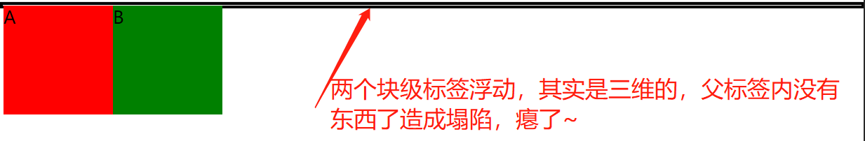
- 浮动可以使块级标签居于一行,以及可以实现文字环绕图片的效果等,因为浮动顾名思义,漂浮起来,并不是二维的画面了,对比浮动前是三维的画面;
- 浮动也有负面影响,会造成父标签的塌陷;
父标签塌陷
<!DOCTYPE html>
<html lang="en">
<head>
    <meta charset="UTF-8">
    <title>塌陷</title>
    <style>
        body {
			/*与边框对其*/
            margin: 0;
        }
        #d1 {
            /*上下左右一致边框 指定边框颜色*/
            border: 3px solid black;
        }
        #d2 {
            /*高度*/
            height: 100px;
            /*宽度*/
            width: 100px;
            /*背景颜色*/
            background-color: red;
            /*向左浮动*/
            float: left;
        }
        #d3 {
            /*高度*/
            height: 100px;
            /*宽度*/
            width: 100px;
            /*背景颜色*/
            background-color: green;
            /*向左浮动*/
            float: left;
        }
    </style>
</head>
<body>
<div id="d1">
    <div id="d2">A</div>
    <div id="d3">B</div>
</div>
</body>
</html>
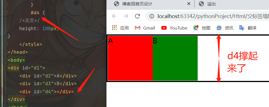
解决父标签塌陷的方法
- 写一个同比的块级标签后台撑场面(不可取)
#d4 {
	/*高度*/
	height: 100px;
}
- 使用clear属性清除浮动(可以使用)
#d4 {
/*该标签的左边(地面和空中)不能有浮动元素*/
clear: left;
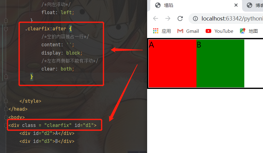
- 通用解决策略(非常推荐):
在写html页面之前 先提前写好处理浮动带来的影响的 css代码
        .clearfix:after {
            /*空的内容独占一行*/
            content: '';
            display: block;
            /*左右两侧都不能有浮动*/
            clear: both;
        }
之后只要标签出现了塌陷的问题就给该塌陷的div标签加一个class=“clearfix”属性即可
ps:浏览器默认都是文本优先展示
浮动案例
<style>
.layout {
width: 120px;
height: 300px;
margin: 10px;
background-color: cadetblue;
float: left;
}
.content {
width: 340px;
height: 300px;
margin: 10px;
background-color: powderblue;
float: left;
}
footer {
width: 500px;
height: 40px;
background-color: darkseagreen;
}
</style>
<main>
<section class="layout flex-center">侧边栏</section>
<section class="content flex-center">内容</section>
</main>
<footer></footer>
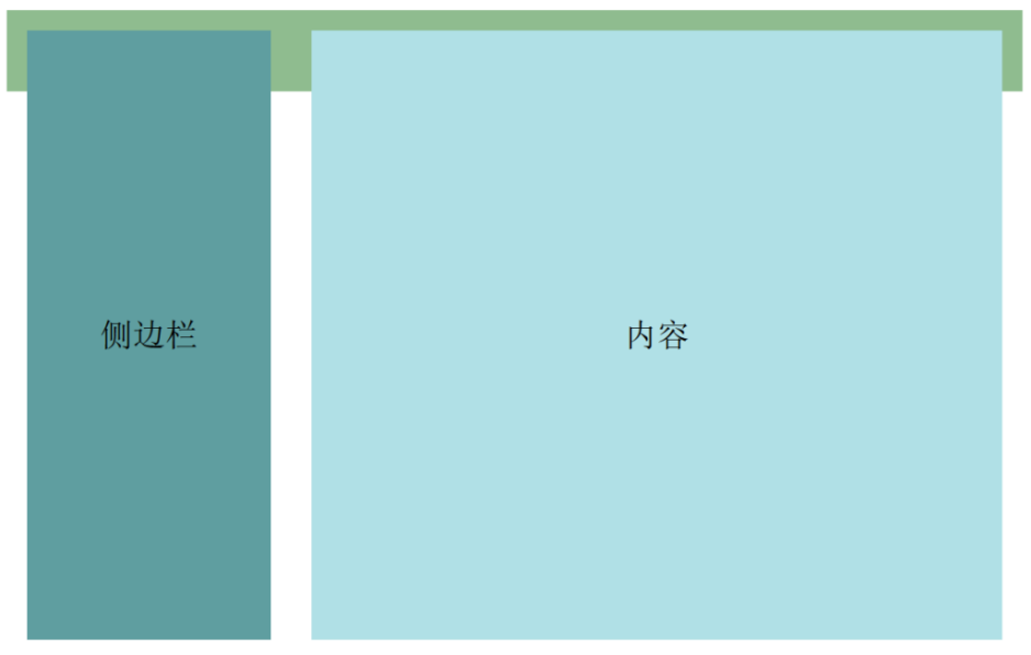
<!--
在以上代码使用浮动实现两列布局中,main中的section都为浮动元素,main元素的高度为0无法被撑开
main后的footer元素在页面布局时无法在main后正常显示(如下图)
-->
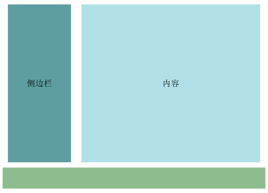
section元素左浮动,此时将footer元素左侧浮动清除,即可将footer元素置于main元素下方
/* 清除左右两侧浮动 */
footer {
	clear: both;
}
/* 或清除左侧浮动*/
footer {
	clear: left;
}
定位
什么是脱离文档流
观察标签位置改变之后,原来的位置是否会空出来,如果空出来了被其他标签自动占有,那么表示是脱离文档流否则不脱离;
| 脱离文档流 | 不脱离文档流 |
|---|---|
| 浮动、绝对定位、固定定位 | 相对定位 |
定位的两种方法
- 关键字
position - 位置关键字
left、right、top、bottom
position定位
position属性用于指定元素的定位类型,属性值可为
- static(默认定位):所有的标签默认都是静态定位既不能改变位置
- relative(相对定位):相对标签原来的位置做定位
- absolute(绝对定位)相对已经定位过的父标签做定位(没有则参考body标签),参考小米官网导航条内购物车
- fixed(固定定位):相对浏览器窗口做定位,固定不动,参考小米官网右边回到顶部
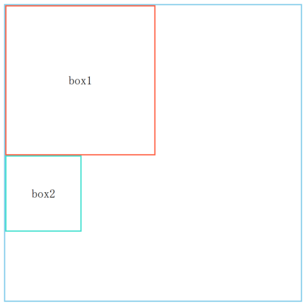
static定位
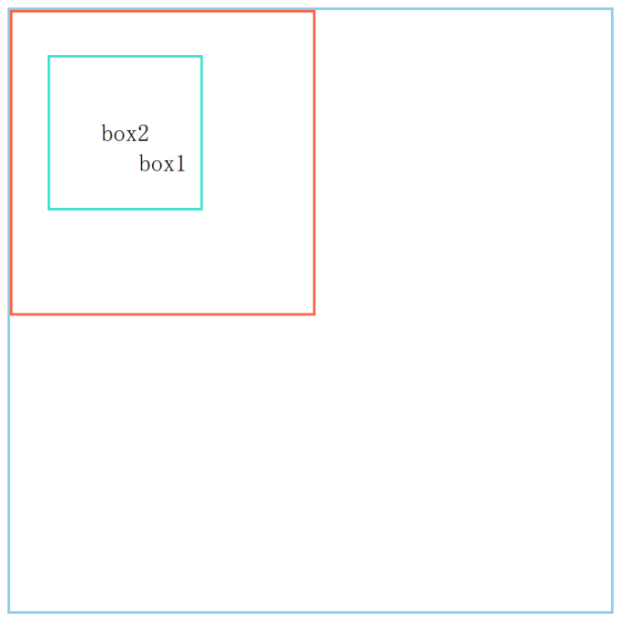
页面上的每个盒子从上到下、从左到右依次排列的布局
<div class="box-container">
	<div class="box1">box1</div>
	<div class="box2">box2</div>
</div>
relative定位
相对于元素自身原始位置定位,元素不脱离文档流,即原来元素所占的空间不会改变
上述static定位示例代码中,将box1设置以下属性,元素会相对于自身原始位置向右偏移20px,向下偏移50px
 .box1 {
    	position: relative;
    	top: 50px;
    	left: 20px;
    }
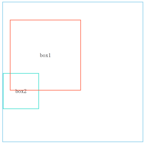
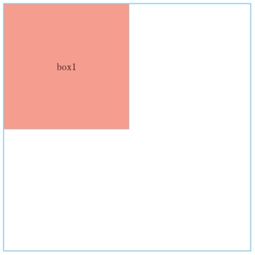
absolute定位
元素相对于最近的非static定位的祖先元素定位进行偏移,元素脱离文档流
- 上述static定位示例代码啊中,将box2以及其父级元素box-container设置如下属性
- box2元素相对于relative定位的box-container向右偏移25px,向下偏移30px
.box-container {
	position: relative;
}
.box2 {
	position: absolute;
	top: 30px;
	left: 25px;
}
fixed定位
相对于浏览器窗口进行定位,元素脱离文档流
常用于顶部导航栏、顶部搜索框、侧边联系客服等板块
下面上一个综合案例
overflow溢出属性
| 值 | 描述 |
|---|---|
| visible | 默认值。内容不会被修剪,会呈现在元素框之外。 |
| hidden | 内容会被修剪,并且其余内容是不可见的。 |
| scroll | 内容会被修剪,但是浏览器会显示滚动条以便查看其余的内容。 |
| auto | 如果内容被修剪,则浏览器会显示滚动条以便查看其余的内容。 |
| inherit | 规定应该从父元素继承 overflow 属性的值。 |
- overflow(水平和垂直均设置)
- overflow-x(设置水平方向)
- overflow-y(设置垂直方向)
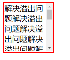
溢出问题
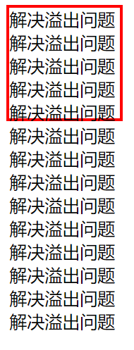
解决办法
/*默认值*/
div {
            width: 100px;
            height: 100px;
            border: 3px solid red;
            overflow: visible;
        }

div {
            width: 100px;
            height: 100px;
            border: 3px solid red;
            overflow: hidden;
        }
div {
            width: 100px;
            height: 100px;
            border: 3px solid red;
            overflow: scroll;
        }
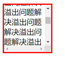
div {
            width: 100px;
            height: 100px;
            border: 3px solid red;
            overflow: auto;
        }
ps:下满的综合案例会有解决头像溢出的办法
层级属性z-index
用于设置元素的堆叠顺序,该属性仅能在非static定位的定位元素上生效,数值越高,层级越高,层级高的元素会覆盖层级低的元素(层级高的元素会在层级低的元素上方)
通俗理解为,’三明治结构‘,浏览器平面并不是二维坐标的而是三维坐标;
z-index属性值相同时,遵循
后来者居上的原则,后面的元素会覆盖前面的元素!
- 将box1、box2增加以
z-index属性,可将box1、box2层级改变,使box1在box2的上方
.box1 { z-index: 1; }
.box2 { z-index: 0; }
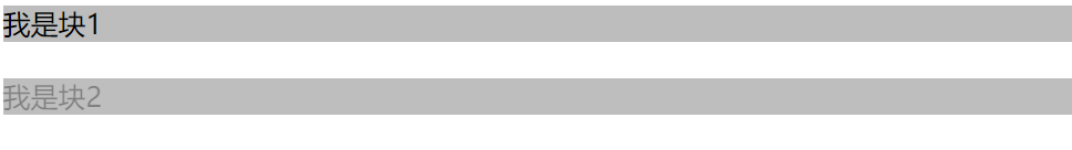
透明度的设置
- rbga(0,0,0,0.5):这里的0.5只影响颜色透明度
- opacity:0.5:这里的0.5影响颜色和字体透明度
.color1{

            background-color: rgba(124,124,124,0.5);
        }
        .color2{
            background-color: rgb(124,124,124);
            opacity:0.5

        }
<div class="color1">我是块1</div>
<br>
<div class="color2">我是块2</div>
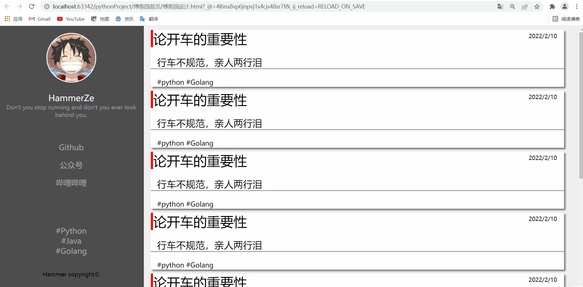
综合案例
设计一个简易版本的博客园首页
<!--首页框架搭建-->
<!DOCTYPE html>
<html lang="en">
<head>
<meta charset="UTF-8">
<title>博客园首页设计</title>
<link rel="stylesheet" href="博客园首页样式.css">
</head>
<body>
<main>
<!-- 左侧菜单栏 -->
<div class="layout flex-center">
<!--头像-->
<div class="img">
<img src="https://img0.baidu.com/it/u=3608430476,1945954109&fm=253&fmt=auto&app=138&f=JPEG?w=500&h=494" >
</div>
<!-- 简介 -->
<div class="total-info">
<div id="info1"><span >HammerZe</span></div>
<div id="info2"><span >Don't you stop running and don't you ever look behind you.</span></div>
</div>
<!-- 公众号链接 -->
<div class="public-account">
<ul>
<li><a href="#">Github</a></li>
</ul>
<ul>
<li><a href="#">公众号</a></li>
</ul>
<ul>
<li><a href="#">哔哩哔哩</a></li>
</ul>
</div>
<!-- 链接 -->
<div class="class-link">
<div id="link1"><span><a href="#" target="_blank">#Python</a></span></div>
<div id="link2"><span><a href="#" target="_blank">#Java</a></span></div>
<div id="link3"><span><a href="#" target="_blank">#Golang</a></span></div>
</div>
<div class="banquan"><p>Hammer copyright©</p></div>
</div>
<!--右边菜单栏-->
<div class="content flex-center">
<div class="content-son">
<div class="title" >
<span class="t1">论开车的重要性</span>
<span class="t2">2022/2/10</span>
<div class="t3" >行车不规范,亲人两行泪</div>
<div class="t4" >#python #Golang</div>
</div>
</div>
<div class="content-son">
<div class="title" >
<span class="t1">论开车的重要性</span>
<span class="t2">2022/2/10</span>
<div class="t3" >行车不规范,亲人两行泪</div>
<div class="t4" >#python #Golang</div>
</div>
</div>
<div class="content-son">
<div class="title" >
<span class="t1">论开车的重要性</span>
<span class="t2">2022/2/10</span>
<div class="t3" >行车不规范,亲人两行泪</div>
<div class="t4" >#python #Golang</div>
</div>
</div>
<div class="content-son">
<div class="title" >
<span class="t1">论开车的重要性</span>
<span class="t2">2022/2/10</span>
<div class="t3" >行车不规范,亲人两行泪</div>
<div class="t4" >#python #Golang</div>
</div>
</div>
<div class="content-son">
<div class="title" >
<span class="t1">论开车的重要性</span>
<span class="t2">2022/2/10</span>
<div class="t3" >行车不规范,亲人两行泪</div>
<div class="t4" >#python #Golang</div>
</div>
</div>
<div class="content-son">
<div class="title" >
<span class="t1">论开车的重要性</span>
<span class="t2">2022/2/10</span>
<div class="t3" >行车不规范,亲人两行泪</div>
<div class="t4" >#python #Golang</div>
</div>
</div>
<div class="content-son">
<div class="title" >
<span class="t1">论开车的重要性</span>
<span class="t2">2022/2/10</span>
<div class="t3" >行车不规范,亲人两行泪</div>
<div class="t4" >#python #Golang</div>
</div>
</div>
<div class="content-son">
<div class="title" >
<span class="t1">论开车的重要性</span>
<span class="t2">2022/2/10</span>
<div class="t3" >行车不规范,亲人两行泪</div>
<div class="t4" >#python #Golang</div>
</div>
</div>
</div>
</main>
</body>
</html>
/*样式设计*/
/*通用样式*/
body {
   margin: 0;
   background-color: rgb(239,239,239);
   clear: both;
}
/*左侧菜单*/
.layout {
    width: 25%;
    height: 100%;
    background-color: rgba(78, 78, 78);
    float: left;
   position: fixed;
   left: 0;
   top: 0;

}
/*头像*/
.layout .img{
    height: 100px;
    width: 100px;
    border-radius: 50%;
    border: 2px solid white;
    /*调位置*/
    margin: 0 auto;
    /*溢出位置隐藏*/
    overflow: hidden;
    margin-top: 15px;
}
.img>img {
   width: 100%;
}

/*简介*/
.total-info{
    text-align: center;
}
#info1{
    font-size: 18px;
    color: aliceblue;
    margin-top:20px ;
}
#info2{
    font-size: 10px;
    color: #999999;
    margin-top: auto;
}

/*a标签通用样式*/
a {
text-decoration: none;
color: darkgray;
}
a:hover{
color: indianred;
}

/*公众号链接样式*/
.public-account{
    text-align: center;
    margin-top: 50px;
}

/*无序列表*/
ul {
list-style-type: none;
padding-left: 0;
}

/*链接样式*/
.class-link{
    text-align: center;
    margin-top: 80px;
}
/*版权样式*/
.banquan{
    text-align: center;
    font-size: 5px;
    margin-top: 30px;
}


/*右边菜单栏*/
.content {
    width: 75%;
    height: 100%;
    float: right;
}
.content-son{
    margin: 8px 15px;
    width: 95%;
    height: 120px;
    background-color: white;
    box-shadow: 3px 3px 3px rgba(0,0,0,0.5);
}

.title .t1{
    border-left: 5px red  solid;
    font-size: 28px;
}
/*时间*/
.title .t2{
    font-size:8px;
    text-align: center;
    float: right;
    margin:5px 15px;
}
.title .t3{
    font-size: 20px;
    margin: 18px auto;
    text-indent: 13px;
    border-bottom: #aaa1a4 2px solid;
}

.title .t4{
    font-size: 14px;
    text-align: left;
    margin: 0 13px;
    padding-bottom: 10px;
}

 浙公网安备 33010602011771号