Python 绘图积累
seaborn 数据集: https://github.com/mwaskom/seaborn-data
matplotlib cheatsheet: https://github.com/rougier/matplotlib-cheatsheet
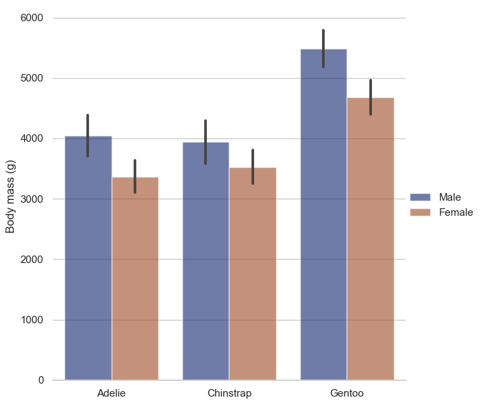
柱形图
import matplotlib.pyplot as plt
import seaborn as sns # seaborn == 0.11.0
sns.set(style="whitegrid")

penguins = sns.load_dataset("penguins")

# Draw a nested barplot by species and sex
g = sns.catplot(
    data=penguins, kind="bar",
    x="species", y="body_mass_g", hue="sex",
    ci="sd", palette="dark", alpha=.6, height=6
)
# ci: 估计值周围的置信区间大小,如果为 sd 跳过 bootstrapping 并绘制观测者标准偏差, none 则不会引导和绘制
# palette: 掉色板,根据 hue 变量
# kind: 图的类型 option: "strip", "swarm", "box", "violin", "boxen", "point", "bar" or "count"
g.despine(left=True)
g.set_axis_labels("", "Body mass (g)")
g.legend.set_title("")
plt.show()
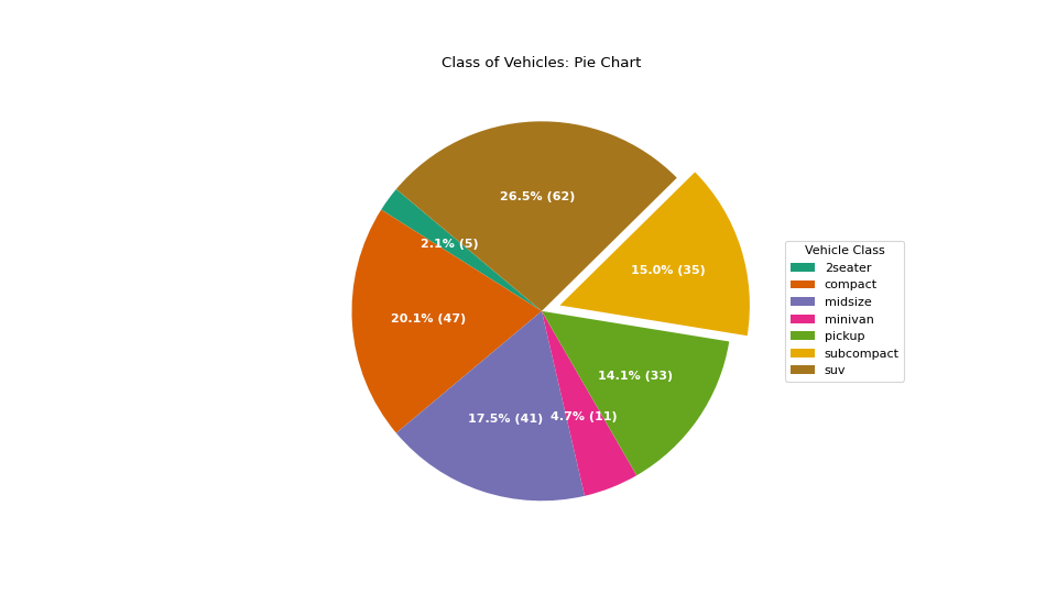
饼状图
import pandas as pd
import matplotlib.pyplot as plt
import numpy as np

df_raw = pd.read_csv("https://github.com/selva86/datasets/raw/master/mpg_ggplot2.csv")

# Prepare Data
df = df_raw.groupby('class').size().reset_index(name='counts')

# Draw Plot
fig, ax = plt.subplots(figsize=(12, 7), subplot_kw=dict(aspect="equal"), dpi= 80)

data = df['counts']
categories = df['class']
explode = [0, 0, 0, 0, 0, 0.1, 0] # explode the 6th slice

def func(pct, allvals):
    absolute = int(pct/100.*np.sum(allvals))
    return "{:.1f}% ({:d})".format(pct, absolute)

wedges, texts, autotexts = ax.pie(data,
                                  autopct=lambda pct: func(pct, data),
                                  textprops=dict(color="w"), # 标记颜色
                                  colors=plt.cm.Dark2.colors,
                                 startangle=140, # counterclockwise from the x-axis
                                 explode=explode)

# Decoration
ax.legend(wedges, categories, title="Vehicle Class", loc="center left", bbox_to_anchor=(1, 0, 0.5, 1))
plt.setp(autotexts, size=10, weight=700)
ax.set_title("Class of Vehicles: Pie Chart")
plt.show()
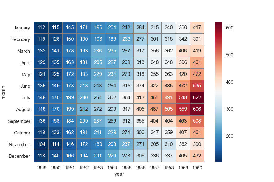
热力图
import matplotlib.pyplot as plt # matplotlib >= 3.1.2
import seaborn as sns
sns.set()

# Load the example flights dataset and convert to long-form
flights_long = sns.load_dataset("flights") # Seaborn中内置的flights航班数据集
flights = flights_long.pivot("month", "year", "passengers")

# Draw a heatmap with the numeric values in each cell
fig, ax = plt.subplots(figsize=(9, 6))
sns.heatmap(flights, annot=True, fmt="d", linewidths=.5, ax=ax, linecolor="grey", cmap="RdBu_r")
# linecolor:控制分割线的颜色
# cmap:设置颜色带的色系
# center:设置颜色带的分界线
# annot:是否显示数值注释
# fmt:format的缩写,设置数值的格式化形式
# linewidths:控制每个小方格之间的间距
# cbar_kws:关于颜色带的设置 如 cbar_kws={"orientation":"horizontal"}
# mask:传入布尔型矩阵,若为矩阵内为True,则热力图相应的位置的数据将会被屏蔽掉(常用在绘制相关系数矩阵图)
plt.show()
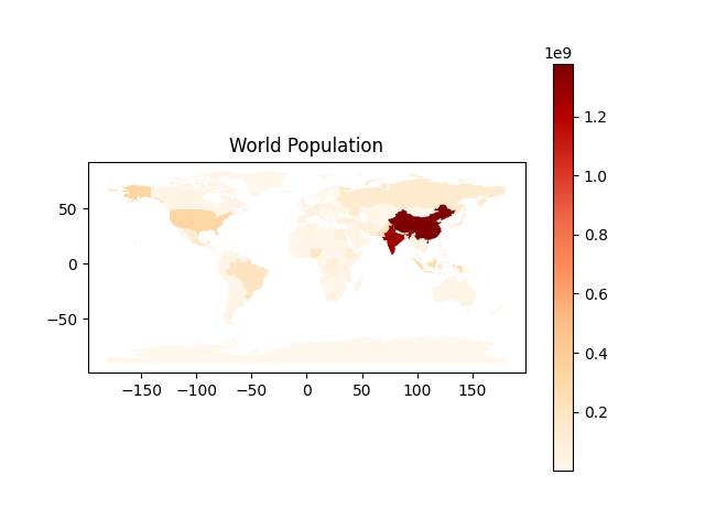
世界地图
https://geopandas.org/ https://github.com/geopandas/geopandas
import pandas as pd
import geopandas
import matplotlib.pyplot as plt

world = geopandas.read_file(geopandas.datasets.get_path('naturalearth_lowres'))
fig, ax = plt.subplots(1, 1)
world.plot(column= 'pop_est', cmap='OrRd', ax=ax, legend=True)
ax.set_title("World Population")
plt.show()
参考链接
posted by 2inf

 浙公网安备 33010602011771号