弹性盒简介
flex(弹性盒)
比浮动方便
是css中有一种布局手段,它主要用来替代浮动来完成页面的布局
flex可以使元素具有弹性,让元素可以跟随页面的大小的而改变而改变
弹性容器
要使用弹性盒,必须先将一个元素设置为弹性容器
我们通过 display 来设置弹性容器
display:flex 设置为块级弹性容器
display:inline-flex 设置为行内的弹性容器
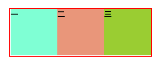
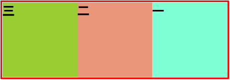
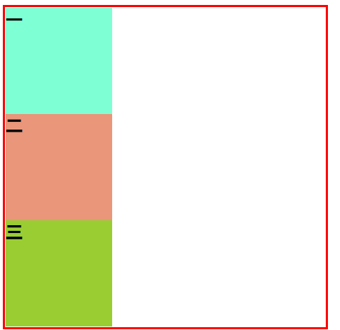
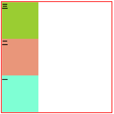
flex-direction 指定容器中弹性元素的排列方式
可选值:
row 默认值,弹性元素在容器中水平排列(左向右)
row-reverse 弹性元素在容器中反向水平排列(左向右)
column 弹性元素纵向排列(自上向下)
column-reverse 弹性元素反纵向排列(自下向上)
<!DOCTYPE html>
<html lang="en">
  <head>
    <meta charset="UTF-8" />
    <meta http-equiv="X-UA-Compatible" content="IE=edge" />
    <meta name="viewport" content="width=device-width, initial-scale=1.0" />
    <title>Document</title>
  </head>
  <style>
    * {
      padding: 0;
      margin: 0;
      list-style: none;
    }
    .ul1 {
      width: 600px;
      border: 5px solid red;
      margin: 0 auto;
      margin-top: 200px;
      /* 弹性容器 */
      display: flex;
      /*
 row 默认值,弹性元素在容器中水平排列(左向右)
        row-reverse 弹性元素在容器中反向水平排列(左向右)
        column 弹性元素纵向排列(自上向下)
        column 弹性元素反纵向排列(自下向上)

*/
      /*  默认值 flex-direction: row */
      /* flex-direction: row-reverse; */
      /* flex-direction: column; */
      flex-direction: column-reverse;
    }

    .box1 {
      width: 200px;
      height: 200px;
      background-color: aquamarine;
    }
    .box2 {
      width: 200px;
      height: 200px;
      background-color: darksalmon;
    }
    .box3 {
      width: 200px;
      height: 200px;
      background-color: yellowgreen;
    }
  </style>
  <body>
    <ul class="ul1">
      <li>
        <div class="box1"><h1>一</h1></div>
      </li>
      <li>
        <div class="box2"><h1>二</h1></div>
      </li>
      <li>
        <div class="box3"><h1>三</h1></div>
      </li>
    </ul>
  </body>
</html>
row 默认值,弹性元素在容器中水平排列(左向右)
row-reverse 弹性元素在容器中反向水平排列(左向右)
column 弹性元素纵向排列(自上向下)
column-reverse 弹性元素反纵向排列(自下向上)

 浙公网安备 33010602011771号