 6
6 
css3动画-跳动圈
通过设置不同圆圈之间的延迟参数来实现,我们一起来看看

上代码
.up_down_circle{
  width: 500px;
  height: 300px;
  background: linear-gradient(rgb(140, 0, 255),rgb(255, 217, 0));
   margin: 0 auto;
  display: flex;
  justify-content: center;
  align-items: center;
}
.up_down_circle span{
  width: 16px;
  height: 16px;
  border-radius: 99px;
  background: #fff;
  animation: up-down 1s infinite linear;
  margin-left: 10px;
}
.up_down_circle span:nth-child(1){
  animation-delay:0s ;
}
.up_down_circle span:nth-child(2){
  animation-delay:0.25s ;
}
.up_down_circle span:nth-child(3){
  animation-delay:0.5s ;
}
.up_down_circle span:nth-child(4){
  animation-delay:0.75s ;
}
.up_down_circle span:nth-child(5){
  animation-delay:1.0s ;
}
@keyframes up-down{
  0%{transform: translateY(0);opacity: 0.5;}
  50%{transform: translateY(-30px);opacity: 1;}
  100%{transform: translateY(0);opacity: 0.5;}
}
<div class="up_down_circle">
       <span></span>
       <span></span>
       <span></span>
       <span></span>
       <span></span>
    </div>
看效果
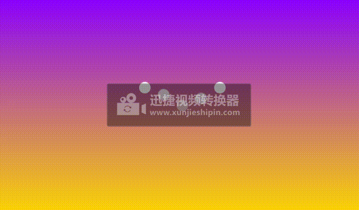
这我们主要利用transform:translateY()在y轴上移动,animation-delay属性是延迟n秒之后开始,可以参考博客2D转换那篇

 浙公网安备 33010602011771号