CSS3
>CSS3
CSS 用于控制网页的样式和布局。CSS3 是最新的 CSS 标准。
CSS3可以向后兼容。
CSS3模块
●选择器
●框模型
●背景和边框
●文本效果
●2D/3D 转换
●动画
●多列布局
●用户界面
>>CSS边框
通过CSS3,能够创建圆角边框,想矩形添加阴影。使用图片来绘制边框。
●border-radius
●box-shadow
●border-image
>>>border-radius
语法:border-radius: 1-4 length|% / 1-4 length|%;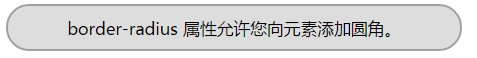
>>>box-shadow
语法:box-shadow: h-shadow v-shadow blur spread color inset;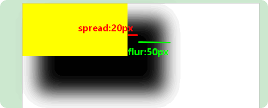
>>>border-image
是一个简写属性,用于设置一下属性
border-image-source
border-image-slice 图片边框向内偏移。
border-image-width 图片边框的宽度。
border-image-outset 边框图像区域超出边框的量。
border-image-repeat 如果省略值,会设置其默认值。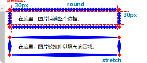
>>CSS背景
背景属性
●background-size
●background-origin|
>>>background-size
CSS3 之前,背景图片的尺寸是由图片的实际尺寸决定的。在 CSS3 中,可以规定背景图片的尺寸。
>>>background-size
规定背景图片的定位区域。
背景图片可以放置于 content-box、padding-box 或 border-box 区域。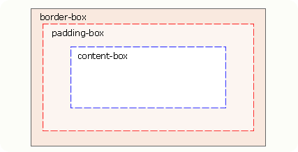
CSS3多重背景图片
body
{
background-image:url(bg_flower.gif),url(bg_flower_2.gif);
}
>>>background-clip
规定背景的绘制范围。:border-box、padding-box、content-box
>>文本效果
文本属性
text-shadow
word-wrap
>>>text-shadow
语法:text-shadow: h-shadow v-shadow blur color;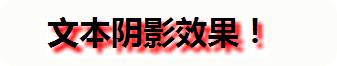
>>>word-wrap
单词太长可能会超出某个区域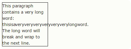
p {word-wrap:break-word;}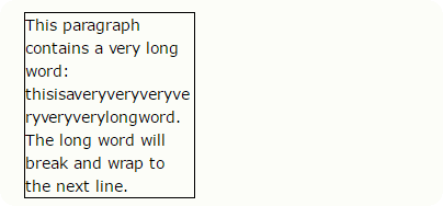
>>CSS3字体
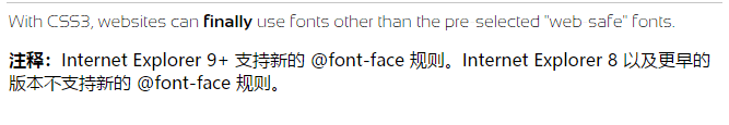
通过 CSS3,Web 设计师再也不必被迫使用“web-safe”字体了。
在CSS3之前,web设计师必须使用已在电脑上安装好的字体。
通过CSS3,web设计师可以使用它们喜欢的字体。
找到或购买到希望使用的字体时,可将该字体文件存放到 web 服务器上,它会在需要时被自动下载到用户的计算机上。
“自己的”的字体是在 CSS3 @font-face 规则中定义的。


<html>
<head>
<style>
@font-face
{
font-family: myFirstFont;
src: url('/example/css3/Sansation_Light.ttf')
    ,url('/example/css3/Sansation_Light.eot'); /* IE9+ */
}

@font-face
{
font-family: myFirstFont;
src: url('/example/css3/Sansation_Bold.ttf')
    ,url('/example/css3/Sansation_Bold.eot'); /* IE9+ */
font-weight:bold;
}

div
{
font-family:myFirstFont;
}
</style>
</head>
<body>

<div>
With CSS3, websites can <b>finally</b> use fonts other than the pre-selected "web-safe" fonts.
</div>

<p><b>注释:</b>Internet Explorer 9+ 支持新的 @font-face 规则。Internet Explorer 8 以及更早的版本不支持新的 @font-face 规则。</p>

</body>
</html>
>>CSS3 2D转换
通过 CSS3 转换,我们能够对元素进行移动、缩放、转动、拉长或拉伸。
2D转换方法:
●translate()
●rotate()
●scale()
●skew()
●matrix()
>>>translate()方法
元素从其当前位置移动,根据给定的 left(x 坐标) 和 top(y 坐标) 位置参数。
div
{
transform: translate(50px,100px);
-ms-transform: translate(50px,100px);        /* IE 9 */
-webkit-transform: translate(50px,100px);    /* Safari and Chrome */
-o-transform: translate(50px,100px);        /* Opera */
-moz-transform: translate(50px,100px);        /* Firefox */
}
>>>rotate()方法
元素顺时针旋转给定的角度。允许负值,元素将逆时针旋转。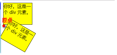
>>>scale()方法
元素的尺寸会增加或减少,根据给定的宽度(X 轴)和高度(Y 轴)参数。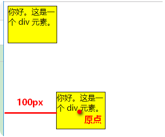

>>>skew()方法
元素翻转给定的角度,根据给定的水平线(X 轴)和垂直线(Y 轴)参数。
skew(30deg,20deg) 围绕 X 轴把元素翻转 30 度,围绕 Y 轴翻转 20 度。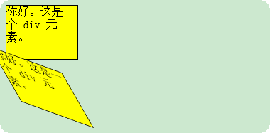
>>>matrix()方法
把所有 2D 转换方法组合在一起。
matrix(n,n,n,n,n,n) 定义 2D 转换,使用六个值的矩阵。
>>CSS3 3D转换
3D转换方法
●rotateX()
●rotateY()
>>>rotateX()方法
元素围绕其 X 轴以给定的度数进行旋转。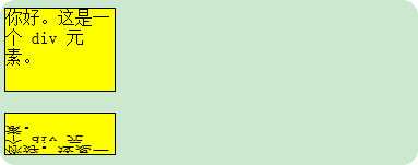
>>>rotateY()方法
元素围绕其 Y 轴以给定的度数进行旋转。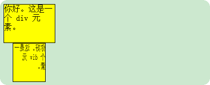
>>CSS3过渡
通过 CSS3,可以在不使用 Flash 动画或 JavaScript 的情况下,当元素从一种样式变换为另一种样式时为元素添加效果。
语法:transition: property duration timing-function delay;
参数:
transition-property 过渡效果的 CSS 属性的名称。
transition-duration 过渡效果需要多少秒或毫秒。
transition-timing-function 速度效果的速度曲线。
transition-delay 过渡效果何时开始。
>>CSS3动画
通过 CSS3,能够创建动画,这可以在许多网页中取代动画图片、Flash 动画以及 JavaScript。
在 @keyframes 中创建动画时,需将它捆绑到某个选择器,否则不会产生动画效果。
通过规定至少以下两项 CSS3 动画属性,即可将动画绑定到选择器:
规定动画的名称
规定动画的时长
div
{
animation: myfirst 5s;  /*动画名称*/
-moz-animation: myfirst 5s;    /* Firefox */
-webkit-animation: myfirst 5s;    /* Safari 和 Chrome */
-o-animation: myfirst 5s;    /* Opera */
}
@keyframes myfirst
{
from {background:red;}
to {background:yellow;}
}
什么是 CSS3 中的动画?
动画是使元素从一种样式逐渐变化为另一种样式的效果。
可以改变任意多的样式任意多的次数。
请用百分比来规定变化发生的时间(时间点),或用关键词 "from" 和 "to",等同于 0% 和 100%。
0% 是动画的开始,100% 是动画的完成。
为了得到最佳的浏览器支持,始终定义 0% 和 100% 选择器。
@keyframes 规定动画。
animation 所有动画属性的简写属性,除了 animation-play-state 属性。
animation-name 规定 @keyframes 动画的名称。
animation-duration 规定动画完成一个周期所花费的秒或毫秒。默认是 0。
animation-timing-function 规定动画的速度曲线。默认是 "ease"。
==》linear ease ease-in esse-out sease-in-out cubic-bezier(n,n,n,n)在 cubic-bezier 函数中自己的值。可能的值是从 0 到 1 的数值。
animation-delay 规定动画何时开始。默认是 0。
animation-iteration-count 规定动画被播放的次数。默认是 1。
animation-direction 规定动画是否在下一周期逆向地播放。默认是 "normal"。
animation-play-state 规定动画是否正在运行或暂停。默认是 "running"。
animation-fill-mode 规定对象动画时间之外的状态。
div
{
animation-name: myfirst;
animation-duration: 5s;
animation-timing-function: linear;
animation-delay: 2s;
animation-iteration-count: infinite;
animation-direction: alternate;
animation-play-state: running;
/* Firefox: */
-moz-animation-name: myfirst;
-moz-animation-duration: 5s;
-moz-animation-timing-function: linear;
-moz-animation-delay: 2s;
-moz-animation-iteration-count: infinite;
-moz-animation-direction: alternate;
-moz-animation-play-state: running;
/* Safari 和 Chrome: */
-webkit-animation-name: myfirst;
-webkit-animation-duration: 5s;
-webkit-animation-timing-function: linear;
-webkit-animation-delay: 2s;
-webkit-animation-iteration-count: infinite;
-webkit-animation-direction: alternate;
-webkit-animation-play-state: running;
/* Opera: */
-o-animation-name: myfirst;
-o-animation-duration: 5s;
-o-animation-timing-function: linear;
-o-animation-delay: 2s;
-o-animation-iteration-count: infinite;
-o-animation-direction: alternate;
-o-animation-play-state: running;
}
>>CSS3多列
通过 CSS3,能够创建多个列来对文本进行布局 - 就像报纸那样!
属性:
●column-count
●column-gap
●column-rule
>>>column-count
规定元素应该被分隔的列数。
column-count : 3;
>>>column-gap
规定列之间的间隔。
>>>column-rule
设置列之间的宽度、样式和颜色规则。
语法:column-rule: column-rule-width column-rule-style column-rule-color;
column-rule-style:规定列之间的样式规则。
语法:column-rule-style: none|hidden|dotted|dashed|solid|double|groove|ridge|inset|outset;
column-rule-span:规定元素应横跨多少列。
column-rule-span:规定列的宽度。
columns:是一个简写属性,用于设置列宽和列数。
>>用户界面
在 CSS3 中,新的用户界面特性包括重设元素尺寸、盒尺寸以及轮廓等。
用户界面属性:
●resize
●box-sizing
●outline-offset
>>>resize
规定是否可由用户调整元素尺寸。取值:none|both|horizontal|vertical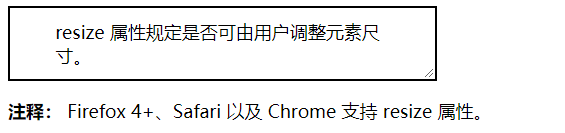
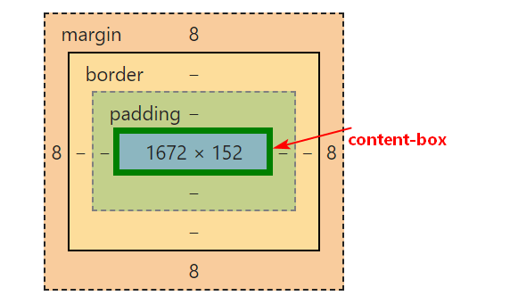
>>>box-sizing
允许以确切的方式定义适应某个区域的具体内容。
>>>outline-offset
对轮廓进行偏移,并在超出边框边缘的位置绘制轮廓。
轮廓和边框的两个不同:
●轮廓不占用空间
●轮廓可能是非矩形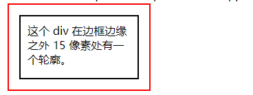
>>多媒体查询
CSS3多媒体查询继承了 CSS2 多媒体类型的所有思想: 取代了查找设备的类型,CSS3 根据设置自适应显示。
媒体查询可以检测:
●viewport(视窗) 的宽度与高度
●设备的宽度与高度
●朝向 (智能手机横屏,竖屏) 。
●分辨率
多媒体查询语法:
多媒体查询由多种媒体组成,可以包含一个或多个表达式,表达式根据条件是否成立返回 true 或 false。
@media not|only mediatype and (expressions) {
CSS 代码...;
}
not: not是用来排除掉某些特定的设备的,比如 @media not print(非打印设备)。
only: 用来定某种特别的媒体类型。对于支持Media Queries的移动设备来说,如果存在only关键字,移动设备的Web浏览器会忽略only关键字并直接根据后面的表达式应用样式文件。对于不支持Media Queries的设备但能够读取Media Type类型的Web浏览器,遇到only关键字时会忽略这个样式文件。
all: 所有设备,这个应该经常看到。
可以在不同的媒体上使用不同的样式文件:
<link rel="stylesheet" media="mediatype and|not|only (expressions)" href="print.css">


 浙公网安备 33010602011771号