

前不久,做了一个H5项目,需要在横竖屏变化时,做一些处理。毫无疑问,需要使用orientationchange来监听横竖屏的变化。
方案一:
// 监听 orientation changes
window.addEventListener("orientationchange", function(event) {
    // 根据event.orientation|screen.orientation.angle等于0|180、90|-90度来判断横竖屏
}, false);
代码添加上后,就各种兼容性问题。这里兼容性问题出现在两个地方:
- orientationchange
- event.orientation|screen.orientation.angle
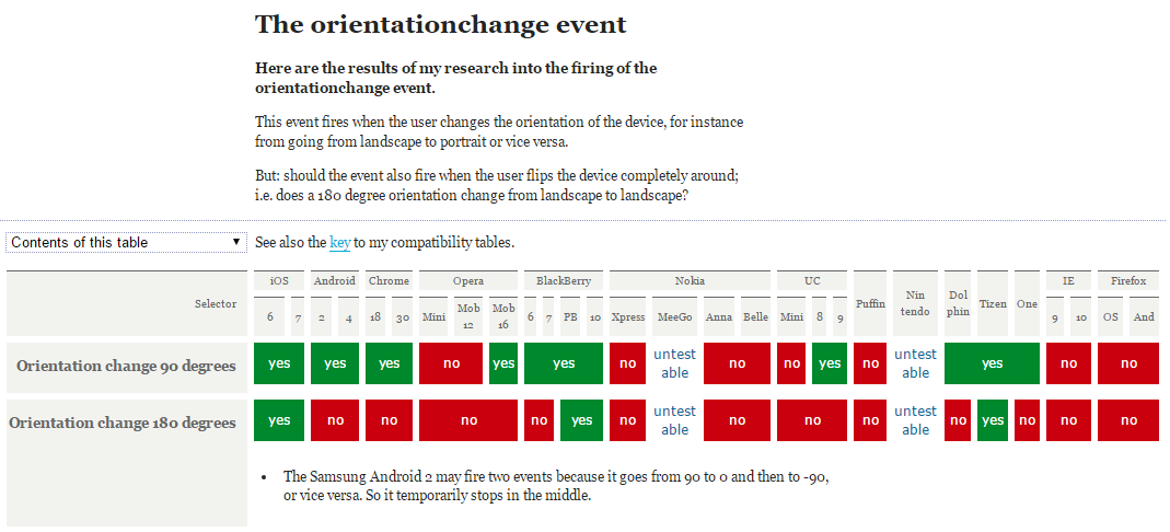
如下是orientationchange事件的兼容性:
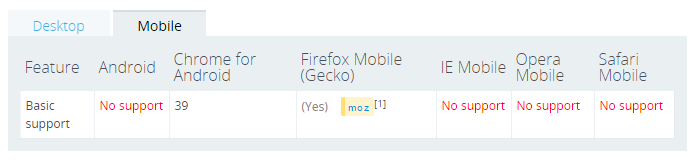
如下是screen.orientation的兼容性:
方案二:
上述方案不行,只能另行他法了。google一下,了解到可以通过resize配合(window.inner/outerWidth, window.inner/outerHeight)来实现:
window.addEventListener("resize", function(event) {
var orientation=(window.innerWidth > window.innerHeight)? "landscape":"portrait";
if(oritentation === 'portrait'){
// do something ……
} else {
// do something else ……
}
}, false);
这种方案基本满足大部分项目的需求,但是还是有些不足之处:
- 只要window的size变化,就会不断触发触发resize事件。可以使用setTimeout来优化一下
- 如果有多个地方需要监听横竖屏,就需要注册多个window.addEventListener("resize", function(event) {……})。能不能通过订阅与发布模式来改进一下,只注册一个resize负责监听横竖屏变化,只要横竖发生变化就发布通知订阅的对象。其他需要监听横竖屏的地方只需订阅一下即可。
关键代码如下:
    var resizeCB = function(){
      if(win.innerWidth > win.innerHeight){//初始化判断
        meta.init = 'landscape';
        meta.current = 'landscape';
      } else {
        meta.init = 'portrait';
        meta.current = 'portrait';
      }
      return function(){
        if(win.innerWidth > win.innerHeight){
          if(meta.current !== 'landscape'){
            meta.current = 'landscape';
            event.trigger('__orientationChange__', meta);
          }
        } else {
          if(meta.current !== 'portrait'){
            meta.current = 'portrait';
            event.trigger('__orientationChange__', meta);
          }
        }
      }
    }();
方案三:
不过个人觉得通过window.innerWidth > window.innerHeight来实现的是一种伪检测,有点不可靠。 可不可以通过浏览器来实现检测?如基于CSS3@media媒体查询来实现。
如下@media兼容性:
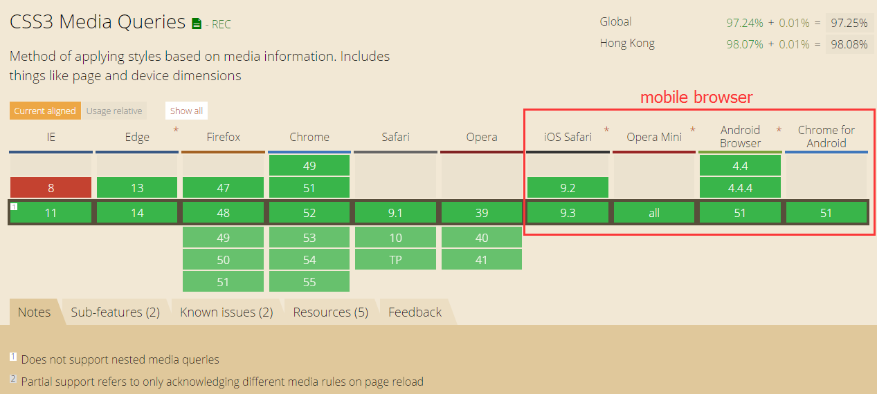
如上上图所示,移动端浏览器都支持CSS3 media。
实现思路:
- 创建包含标识横竖屏状态的特定css样式
- 通过JS向页面中注入CSS代码
- resize回调函数中获取横竖屏的状态
这里我选择<html></html>的节点font-family作为检测样式属性。理由如下:
- 选择<html></html>主要为了避免reflow和repaint
- 选择font-family样式,主要是因为font-family有如下特性:
- 优先使用排在前面的字体。
- 如果找不到该种字体,或者该种字体不包括所要渲染的文字,则使用下一种字体。
- 如果所列出的字体,都无法满足需要,则让操作系统自行决定使用哪种字体。
这样我们就可以指定特定标识来标识横竖屏的状态,不过需要将指定的标识放置在其他字体的前面,这样就不会引起hmtl字体的变化。
关键代码如下:
    // callback
    var resizeCB = function() {
        var hstyle = win.getComputedStyle(html, null),
            ffstr = hstyle['font-family'],
            pstr = "portrait, " + ffstr,
            lstr = "landscape, " + ffstr,
            // 拼接css
            cssstr = '@media (orientation: portrait) { .orientation{font-family:' + pstr + ';} } @media (orientation: landscape) {  .orientation{font-family:' + lstr + ';}}';
        // 载入样式
        loadStyleString(cssstr);
        // 添加类
        html.className = 'orientation' + html.className;
        if (hstyle['font-family'] === pstr) { //初始化判断
            meta.init = 'portrait';
            meta.current = 'portrait';
        } else {
            meta.init = 'landscape';
            meta.current = 'landscape';
        }
        return function() {
            if (hstyle['font-family'] === pstr) {
                if (meta.current !== 'portrait') {
                    meta.current = 'portrait';
                    event.trigger('__orientationChange__', meta);
                }
            } else {
                if (meta.current !== 'landscape') {
                    meta.current = 'landscape';
                    event.trigger('__orientationChange__', meta);
                }
            }
        }
    }();
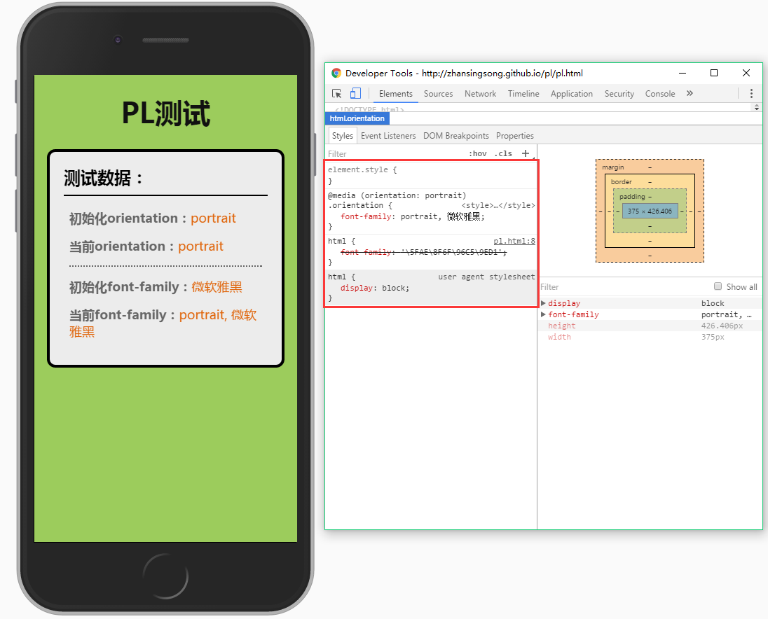
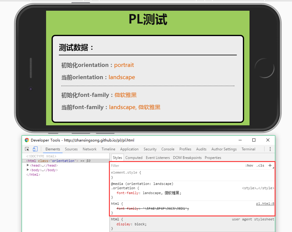
测试效果
- portrait效果:
- landscape效果:
方案四:
可以再改进一下,在支持orientationchange时,就使用原生的orientationchange,不支持则使用方案三。
关键代码如下:
// 是否支持orientationchange事件
var isOrientation = ('orientation' in window && 'onorientationchange' in window);
// callback
var orientationCB = function(e) {
    if (win.orientation === 180 || win.orientation === 0) {
        meta.init = 'portrait';
        meta.current = 'portrait';
    }
    if (win.orientation === 90 || win.orientation === -90) {
        meta.init = 'landscape';
        meta.current = 'landscape';
    }
    return function() {
        if (win.orientation === 180 || win.orientation === 0) {
            meta.current = 'portrait';
        }
        if (win.orientation === 90 || win.orientation === -90) {
            meta.current = 'landscape';
        }
        event.trigger(eventType, meta);
    }
};
var callback = isOrientation ? orientationCB() : (function() {
    resizeCB();
    return function() {
        timer && win.clearTimeout(timer);
        timer = win.setTimeout(resizeCB, 300);
    }
})();
// 监听
win.addEventListener(isOrientation ? eventType : 'resize', callback, false);
方案五:
目前,上述几种方案都是通过自定制的订阅与发布事件模式来实现的。这里可以基于浏览器的事件机制,来模拟orientationchange。即对orientationchange的不兼容进行修复。
关键代码如下:
var eventType = 'orientationchange';
// 触发原生orientationchange
var fire = function() {
    var e;
    if (document.createEvent) {
        e = document.createEvent('HTMLEvents');
        e.initEvent(eventType, true, false);
        win.dispatchEvent(e);
    } else {
        e = document.createEventObject();
        e.eventType = eventType;
        if (win[eventType]) {
            win[eventType]();
        } else if (win['on' + eventType]) {
            win['on' + eventType]();
        } else {
            win.fireEvent(eventType, e);
        }
    }
}
通过上述5种方案,自己对移动端横竖屏检测有了更进一步的认识,有些东西只有自己亲身经历过才知道为什么要这么写,自己也把其中缘由记录在文章中,希望对大家有帮助。经过5种方案的演变得到了最终orientationchange-fix,github地址:https://github.com/zhansingsong/orientationchange-fix

 浙公网安备 33010602011771号