

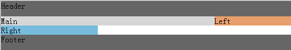
圣杯布局的实现过程
圣杯布局和双飞翼布局,他们的都要求三列布局,中间宽度自适应,两边定宽,这样做的优势是重要的东西放在文档流前面可以优先渲染,而双飞翼布局是对圣杯布局的一种改良,下一篇文章会讲到。
圣杯布局:用到浮动、负边距、相对定位,不添加额外标签
DOM结构:
<div class="header">Header</div>
<div class="bd">
    <div class="main">Main</div>
    <div class="left">Left</div>
    <div class="right">Right
    </div>
</div>
<div class="footer">Footer</div>
样式:
    <style>
        body{padding:0;margin:0}
        .header,.footer{width:100%;  background: #666;height:30px;clear:both;}
        .bd{
            padding-left:150px;
            padding-right:190px;
        }
        .left{
            background: #E79F6D;
            width:150px;
            float:left;
            margin-left:-100%;
            position: relative;
            left:-150px;
        }
        .main{
            background: #D6D6D6;
            width:100%;
            float:left;

        }
        .right{
            background: #77BBDD;
            width:190px;
            float:left;
            margin-left:-190px;
            position:relative;
            right:-190px;
        }
    </style>
左中右部分样式变化过程
1、中间部分需要根据浏览器宽度的变化而变化,所以要用100%,这里设左中右向左浮动,因为中间100%,左层和右层根本没有位置上去
       .left{
            background: #E79F6D;
            width:150px;
            float:left;
        }
        .main{
            background: #D6D6D6;
            width:100%;
            float:left;

        }
        .right{
            background: #77BBDD;
            width:190px;
            float:left;
        }

2、把左层负margin150后,发现left上去了,因为负到出窗口没位置了,只能往上挪
 .left{
            background: #E79F6D;
            width:150px;
            float:left;
            margin-left:-150px;
        }
3、那么按第二步这个方法,可以得出它只要挪动窗口宽度那么宽就能到最左边了,利用负边距,把左右栏定位
        .left{
            background: #E79F6D;
            width:150px;
            float:left;
            margin-left:-100%;
        }

        .right{
            background: #77BBDD;
            width:190px;
            float:left;
            margin-left:-190px;
        }

4、然而问题来了,中间被左右挡住了啊,只好给外层加padding了
       .bd{
            padding-left:150px;
            padding-right:190px;
        }

5、但是加了之后左右栏也缩进来了,于是采用相对定位方法,各自相对于自己把自己挪出去,得到最终结果
        .left{
            background: #E79F6D;
            width:150px;
            float:left;
            margin-left:-100%;
            position: relative;
            left:-150px;
        }
        .right{
            background: #77BBDD;
            width:190px;
            float:left;
            margin-left:-190px;
            position:relative;
            right:-190px;
        }

相关文章:
本文来自博客园,作者:tinyphp,转载请注明原文链接:https://www.cnblogs.com/tinyphp/p/4742922.html
向着星辰与深渊,博客园加油

 浙公网安备 33010602011771号