

Windows 8.1 应用再出发 - 几种新增控件(2)
本篇我们接着来介绍Windows 8.1 的新增控件,分别是:Flyout、MenuFlyout、SettingsFlyout、Hub 和 Hyperlink。
1. Flyout
Flyout被称为浮出控件,能起到提示或者简单交互作用。我们可以利用它来要求用户确认操作、收集用户输入信息或显示提示信息等。只有当用户点击时才显示Flyout,当点击外部任意点时,Flyout消失。
Flyout通常会附加到Button上,所以Button拥有Flyout属性来简化附加和使用的过程。
            <Button Content="Delete it">
                <Button.Flyout>
                    <Flyout>
                        <StackPanel>
                            <TextBlock>This item will be deleted. Do you want to continue ?</TextBlock>
                            <Button Click="DeleteConfirmation_Click">Yes, delete it.</Button>
                        </StackPanel>
                    </Flyout>
                </Button.Flyout>
            </Button>
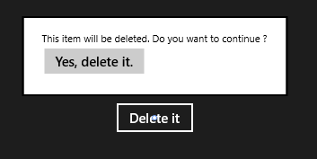
如上图所示,我们为Button附加了Flyout控件,当Button点击时,Flyout出现。当点击外部任意点时,Flyout消失。当然其他控件也能使用Flyout控件,这就需要使用FlyoutBase.AttachedFlyout附加属性。这时我们必须响应控件的交互操作,并在代码中控制打开Flyout。
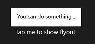
            <TextBlock Text="Tap me to show flyout." Tapped="TextBlock_Tapped" FontSize="20">
                <FlyoutBase.AttachedFlyout>
                    <Flyout>
                        <TextBlock FontSize="18" Text="You can do something..."/>
                    </Flyout>
                </FlyoutBase.AttachedFlyout>
            </TextBlock>
下面是TextBlock的Tapped事件处理
        private void TextBlock_Tapped(object sender, TappedRoutedEventArgs e)
        {
            TextBlock tb = sender as TextBlock;
            if (tb != null)
            {
                FlyoutBase.ShowAttachedFlyout(tb);
            }
        }
2. MenuFlyout
MenuFlyout被称为菜单浮出控件,能够浮出显示菜单。大家看名字就能猜出,MenuFlyout 和 Flyout的用法很相似,可参照我们刚刚介绍的Flyout例子。而不同就在于MenuFlyout可以通过MenuFlyoutItem、ToggleMenuFlyoutItem 和 MenuFlyoutSeparator轻松定义菜单内容。
- MenuFlyoutItem —— 执行即时操作
- ToggleMenuFlyoutItem —— 打开或关闭选项
- MenuFlyoutSeparator —— 菜单项之间的分隔符
我们下面以Button为例来演示MenuFlyout的用法
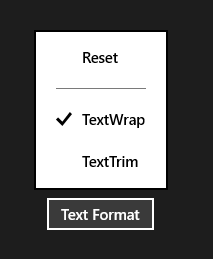
            <Button Content="Text Format">
                <Button.Flyout>
                    <MenuFlyout>
                        <MenuFlyoutItem Text="Reset" Click="Reset_Click"/>
                        <MenuFlyoutSeparator/>
                        <ToggleMenuFlyoutItem Text="TextWrap" IsChecked="True"/>
                        <ToggleMenuFlyoutItem Text="TextTrim" IsChecked="False"/>
                    </MenuFlyout>
                </Button.Flyout>
            </Button>
3. SettingsFlyout
SettingsFlyout被称为设置浮出控件,利用它我们可以更轻松的创建应用设置的浮出控件。用户可以通过“设置”超级按钮来访问设置浮出控件,或触发我们定义的事件来访问。下面我们来演示如何通过触发事件的方式来访问SettingsFlyout。
首先,新建一个SettingsFlyout控件,步骤是:添加新建项 -> 在对话框中,选择““设置”浮出控件” -> 设置名称为 AutoplaySettingsFlyout。
<SettingsFlyout
    x:Class="HelloWorld.AutoplaySettingsFlyout"
    xmlns="http://schemas.microsoft.com/winfx/2006/xaml/presentation"
    xmlns:x="http://schemas.microsoft.com/winfx/2006/xaml"
    xmlns:local="using:HelloWorld"
    xmlns:d="http://schemas.microsoft.com/expression/blend/2008"
    xmlns:mc="http://schemas.openxmlformats.org/markup-compatibility/2006"
    mc:Ignorable="d"
    IconSource="Assets/SmallLogo.png"
    Title="Autoplay"
    d:DesignWidth="346" Width="346">

    <!-- 此 StackPanel 充当内容部分的垂直布局的根面板-->
    <StackPanel VerticalAlignment="Stretch" HorizontalAlignment="Stretch" >
        <!-- 下列 StackPanel 定义个别内容部分-->
        <!-- 第 1 部分内容-->
        <StackPanel Style="{StaticResource SettingsFlyoutSectionStyle}">
            <!-- 第 1 部分标题-->
            <TextBlock Style="{StaticResource TitleTextBlockStyle}" Text="Automatic plays" />
            <!-- 第 1 部分正文-->
            <TextBlock Style="{StaticResource BodyTextBlockStyle}" Margin="0,0,0,25" TextWrapping="Wrap">
                <TextBlock.Text>
                    Turn automatic playing on or off.
                </TextBlock.Text>
            </TextBlock>
            <ToggleSwitch Header="play automatically" />
        </StackPanel>
        <!-- 根据需要在下面定义更多内容部分-->
    </StackPanel>
</SettingsFlyout>
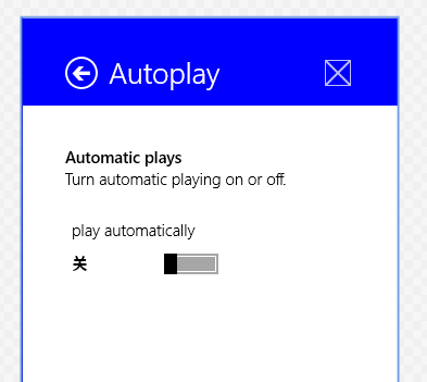
如上面代码和效果图所示,SettingsFlyout控件可以调整宽度和背景色,但高度一般是应用的高度。头部中包括了标题,回退按钮和应用图标。内容部分采用的是StackPanel流式布局。下面我们看看怎么把它添加到“设置”的窗体中。
        public MainPage()
        {
            this.InitializeComponent();
            Windows.UI.ApplicationSettings.SettingsPane.GetForCurrentView().CommandsRequested += MainPage_CommandsRequested;
        }

        void MainPage_CommandsRequested(Windows.UI.ApplicationSettings.SettingsPane sender, Windows.UI.ApplicationSettings.SettingsPaneCommandsRequestedEventArgs args)
        {
            Windows.UI.ApplicationSettings.SettingsCommand updateSetting =
                new Windows.UI.ApplicationSettings.SettingsCommand("AppUpdateSettings", "Auto Play", (handler) =>
                {
                    AutoplaySettingsFlyout autoplayFlyout = new AutoplaySettingsFlyout();
                    autoplayFlyout.Show();

                });

            args.Request.ApplicationCommands.Add(updateSetting);
        }
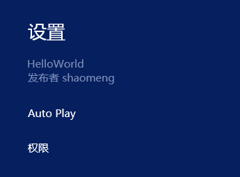
这样我们就把SettingsFlyout控件添加到“设置”中了,名字是'Auto Play',下面我们看看怎么通过按钮点击的方式来访问它。
<Button Content="App update settings" Click="AutoplaySettingsButton_Click"/>
        private void AutoplaySettingsButton_Click(object sender, RoutedEventArgs e)
        {
            AutoplaySettingsFlyout autoplayFlyout = new AutoplaySettingsFlyout();
            autoplayFlyout.Show();
        }
通过按钮点击事件,我们调用了SettingsFlyout控件的Show方法,这样控件就可以访问了。当控件中的回退按钮点击后,浮出控件关闭并重新打开设置窗体。
如果我们调用的是ShowIndependent方法,回退按钮点击后,浮出控件关闭并回到应用中。同时我们也可以通过调用控件的Hide方法来关闭浮出控件,效果和回退按钮点击类似。
需要注意的是,一次只能显示一个浮出控件,调用Show/ShowIndependent 方法显示会关闭当前其他浮出控件。
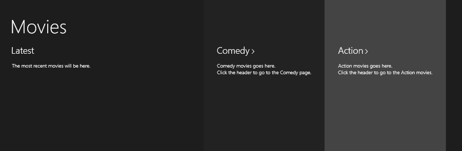
4. Hub
中心控件,帮助我们更好的实现“中心”设计模式,中心页是用户进入应用的入口点,比如说应用商城。用户进入应用商城后,看到的类别分类就是中心的实现,它可以在横向或纵向的滚动视图中显示丰富而有序的内容。
Hub的Header属性可以设置中心的标题,可以设置Header或HeaderTemplate来实现。
Hub可以分区显示,通过将不同的内容放入不同的HubSection来实现。HubSection也可以设置标题,做法与Hub一致。如果HubSection的IsHeaderInteractive属性为true,那么标题默认包含 '>' 字型,以及悬停和按下状态。我们来看看代码实现
        <Hub Header="Movies">
            <HubSection MinWidth="600" Header="Latest">
                <DataTemplate>
                    <Grid>
                        <TextBlock Text="The most recent movies will be here."
                           Style="{ThemeResource BodyTextBlockStyle}" />
                    </Grid>
                </DataTemplate>
            </HubSection>

            <HubSection Header="Comedy" IsHeaderInteractive="True"
                Background="#222222" MinWidth="250">
                <DataTemplate>
                    <StackPanel>
                        <TextBlock Text="Comedy movies goes here."
                           Style="{ThemeResource BodyTextBlockStyle}" />
                        <TextBlock Text="Click the header to go to the Comedy page."
                           Style="{ThemeResource BodyTextBlockStyle}" />
                    </StackPanel>
                </DataTemplate>
            </HubSection>

            <HubSection Header="Action" IsHeaderInteractive="True"
                Background="#444444" MinWidth="250">
                <DataTemplate>
                    <StackPanel>
                        <TextBlock Text="Action movies goes here."
                           Style="{ThemeResource BodyTextBlockStyle}" />
                        <TextBlock Text="Click the header to go to the Action movies."
                           Style="{ThemeResource BodyTextBlockStyle}" />
                    </StackPanel>
                </DataTemplate>
            </HubSection>
        </Hub>
5. Hyperlink
超链接,我们可以把它添加到文本上,它和文本具有相同的处理方式,换行、截断等。当文本被标记为超链接后,文本会显示为特定的颜色,点击文本会转到指定的URI,这个URI由NavigateUri属性来指定。
            <RichTextBlock Width="400" FontSize="20">
                <Paragraph>Hyperlinks let you give readers a visual hint that certain text links to other content.
                    <Hyperlink NavigateUri="http://dev.windows.com">Read more on the Windows Dev Center</Hyperlink>
                    ... Text in a Hyperlink element is treated like the rest of the text and participates in line breaking.
                </Paragraph>
            </RichTextBlock>
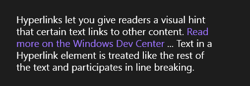
如上图所示,紫色文字部分为超链接,点击后会跳转到我们指定的NavigateUri。
这样我们就把Windows 8.1 的新增控件介绍完了,希望对大家有所帮助,谢谢。

 浙公网安备 33010602011771号