
Jqplot使用总结之二(双Y轴)
最近需要用Jqplot做双Y轴的Chart图,首先我找到了文档上的例子并对数据做了一些调整:
1.例子展示:


var s1 = [["2002-01-01", 112000], ["2003-01-01", 122000], ["2004-01-01", 104000], ["2005-01-01", 99000], ["2006-01-01", 121000],
   ["2007-01-01", 148000], ["2008-01-01", 114000], ["2009-01-01", 133000], ["2010-01-01", 161000]];
var s2 = [["2002-01-01", 10200], ["2003-01-01", 10800], ["2004-01-01", 11200], ["2005-01-01", 11800], ["2006-01-01", 12400],
["2007-01-01", 12800], ["2008-01-01", 13200], ["2009-01-01", 12600], ["2010-01-01", 13100]];
    plot1 = $.jqplot("systolicChart2", [s2, s1], {
        animate: true,
        animateReplot: true,
        cursor: {
            show: true,
            zoom: true,
            looseZoom: true,
            showTooltip: false
        },
        series:[
            {
                pointLabels: {
                    show: true
                },
                showHighlight: false,
                yaxis: 'y2axis',
                rendererOptions: {
                    animation: {
                        speed: 2500
                    },
                    barWidth: 15,
                    barPadding: -15,
                    barMargin: 0,
                    highlightMouseOver: false
                }
            },
            {
                rendererOptions: {
                    animation: {
                        speed: 2000
                    }
                }
            }
        ],
        axesDefaults: {
            pad: 0,
            tickOptions: {
                angle: -30
            },
        },
        axes: {
            xaxis: {
                renderer: $.jqplot.DateAxisRenderer,

            },
            yaxis: {
                tickOptions: {
                    formatString: "$%'d"
                },
                rendererOptions: {
                    forceTickAt0: true
                }
            },
            y2axis: {
                tickOptions: {
                    formatString: "$%'d"
                },
                rendererOptions: {
                    alignTicks: true,
                    forceTickAt0: true
                }
            }
        },
        highlighter: {
            show: true,
            showLabel: true,
            tooltipAxes: 'y',
            sizeAdjust: 7.5 , tooltipLocation : 'ne'
        }
    });
显示效果展示: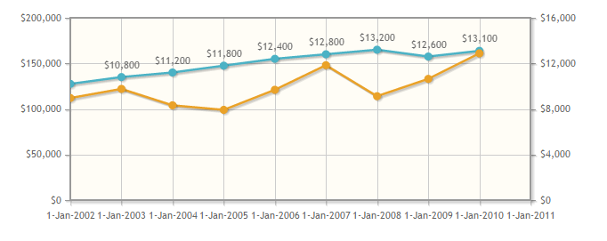
2. 由于需要从数据库中读取数据并且X轴需要显示为日期格式,所以我将从数据库中获取的数据的日期格式转为"yyyy-MM-dd":
另外,由于需要对数据进行重新组织,可能会用到JS中的Push()方法,在定义对象并调用Push()方法时,无论对象定义为new Array()或[],对结果均无任何影响。
function getPointList(pList) {
    var DataLists = [];//无论此处定义为new Array()或[],均对显示效果无影响。
    for (var x in pList) {
        DataLists.push([pList[x].PointShowDate, pList[x].PointValue]);
    }
    return DataLists;
}
完成数据组织并时调用呈现代码时,总是无法显示Chart,相关代码如下:
$.jqplot(ChartId, [LineList, LineListBG], {
            animate: true,
            animateReplot: true,
            seriesColors: ColorList,
            title: {
                text: v_Title,
                textAlign: 'left'
            },
            seriesDefaults: {
                show: true,
                lineWidth: 1,
                pointLabels: {
                    show: false,
                    formatString: "%.0f",
                    location: "s",
                    ypadding: 1,
                },
                markerOptions: {
                    show: true,
                    lineWidth: 1,
                    size: 12
                }
            },
            series: [{ yaxis: 'y2axis' }],
            axes: {
                xaxis: {
                    renderer: $.jqplot.DateAxisRenderer,
                    show: true,
                    ticks: X_Ticks,
                    tickOptions: {
                        formatString: '%d %b %n %Y %n %a',
                        show: true,
                        showGridline: false,
                        showMark: false
                    },
                    showTicks: true,
                    useSeriesColor: true,
                    rendererOptions: { drawBaseline: false }
                },
                yaxis: {
                    show: true,
                    ticks: Y_Ticks,
                    tickOptions: {
                        formatString: '%.0f',
                        mark: 'inside',
                        show: true,
                        showMark: false,
                        showGridLine: false,
                        showLabel: true,
                    },
                    label: 'Blood Pressure',
                    labelRenderer: $.jqplot.CanvasAxisLabelRenderer,
                    useSeriesColor: true,
                    showTickMarks: true,
                    rendererOptions: { drawBaseline: false }
                },
                y2axis: {
                    show: true,
                    ticks: Y_BGTicks,
                    tickOptions: {
                        formatString: '%.0f',
                        mark: 'inside',
                        show: true,
                        showMark: true,
                        showGridLine: false,
                        showLabel: true,
                    },
                    label: 'Glucose',
                    labelRenderer: $.jqplot.CanvasAxisLabelRenderer,
                    useSeriesColor: true,
                    showTickMarks: true,
                    rendererOptions: { drawBaseline: false }
                }
            },
            highlighter: {
                show: true,
                sizeAdjust: 4,
                tooltipContentEditor: tooltipContentEditor,
                tooltipLocation: 'n',
            },
            cursor: {
                show: false
            },
            grid: {
                background: '#FFFFFF',
                gridLineColor: '#cccccc',
                shadow: false,
                drawBorder: false,
                borderColor: '#FFFFFF',
                borderWidth: 2,
            },
            legend: {
                show: false,
                location: 'ne',
                background: '#FFFFFF',
                placement: "insideGrid",
                fontSize: 5
            }
        });
3. 修改第一步的代码,我怀疑是定义对象并调用Push()方法时,对象定义为new Array()或[]时引起了异常:
于是修改第一步的代码为如下:
$(document).ready(function () {
    var s1 = new Array();
    var s2 = new Array();
    s1.push(["2002-01-01", 112000]);
    s1.push(["2003-01-01", 122000]);
    s1.push(["2004-01-01", 104000]);
    s1.push(["2005-01-01", 99000]);
    s1.push(["2006-01-01", 121000]);
    s1.push(["2007-01-01", 148000]);
    s1.push(["2008-01-01", 114000]);
    s1.push(["2009-01-01", 133000]);
    s1.push(["2010-01-01", 161000]);

    s2.push(["2002-01-01", 10200]);
    s2.push(["2003-01-01", 10800]);
    s2.push(["2004-01-01", 11200]);
    s2.push(["2005-01-01", 11800]);
    s2.push(["2006-01-01", 12400]);
    s2.push(["2007-01-01", 12800]);
    s2.push(["2008-01-01", 13200]);
    s2.push(["2009-01-01", 12600]);
    s2.push(["2010-01-01", 13100]);
    $.jqplot("systolicChart2", [s2, s1], {
        animate: true,
        animateReplot: true,
        cursor: {
            show: true,
            zoom: true,
            looseZoom: true,
            showTooltip: false
        },
        series:[
            {
                pointLabels: {
                    show: true
                },
                showHighlight: false,
                yaxis: 'y2axis',
                rendererOptions: {
                    animation: {
                        speed: 2500
                    },
                    barWidth: 15,
                    barPadding: -15,
                    barMargin: 0,
                    highlightMouseOver: false
                }
            },
            {
                rendererOptions: {
                    animation: {
                        speed: 2000
                    }
                }
            }
        ],
        axesDefaults: {
            pad: 0,
            tickOptions: {
                angle: -30
            },
        },
        axes: {
            xaxis: {
                renderer: $.jqplot.DateAxisRenderer,

            },
            yaxis: {
                tickOptions: {
                    formatString: "$%'d"
                },
                rendererOptions: {
                    forceTickAt0: true
                }
            },
            y2axis: {
                tickOptions: {
                    formatString: "$%'d"
                },
                rendererOptions: {
                    alignTicks: true,
                    forceTickAt0: true
                }
            }
        },
        highlighter: {
            show: true,
            showLabel: true,
            tooltipAxes: 'y',
            sizeAdjust: 7.5 , tooltipLocation : 'ne'
        }
    });
});
结果可以正常显示,如下图所示:
然后修改第二步的代码为如下:
$(document).ready(function () {
    var s3 = [];
    var s4 = [];
    s3.push(["2016-04-28",105]);
    s3.push(["2016-04-29",90]);
    s3.push(["2016-05-18",80]);
    s3.push(["2016-05-18",80]);

    s4.push(["2016-05-04",17]);
    s4.push(["2016-05-08",8]);
    s4.push(["2016-05-12",6]);
    s4.push(["2016-05-16", 4]);
    $.jqplot(ChartId, [s3, s4], {
        animate: true,
        animateReplot: true,
        title: {
            text: v_Title,
            textAlign: 'left'
        },
        seriesDefaults: {
            show: true,
            lineWidth: 1,
            pointLabels: {
                show: false,
                formatString: "%.0f",
                location: "s",
                ypadding: 1,
            },
            markerOptions: {
                show: true,
                lineWidth: 1,
                size: 12
            }
        },
        series: [{ yaxis: 'y2axis' }],
        axes: {
            xaxis: {
                renderer: $.jqplot.DateAxisRenderer,
            },
            yaxis: {
                label: 'Blood Pressure',
                labelRenderer: $.jqplot.CanvasAxisLabelRenderer,
            },
            y2axis: {
                label: 'Glucose',
                labelRenderer: $.jqplot.CanvasAxisLabelRenderer,
            }
        },
        highlighter: {
            show: true,
            sizeAdjust: 4,
            tooltipContentEditor: tooltipContentEditor,
            tooltipLocation: 'n',
        },
        cursor: {
            show: false
        },
        grid: {
            background: '#FFFFFF',
            gridLineColor: '#cccccc',
            shadow: false,
            drawBorder: false,
            borderColor: '#FFFFFF',
            borderWidth: 2,
        },
        legend: {
            show: false,
            location: 'ne',
            background: '#FFFFFF',
            placement: "insideGrid",
            fontSize: 5
        }
    });
});
结果可以正常显示:
4. 启用Google Chrome的调试:
跟踪第二步无法正常显示的代码:
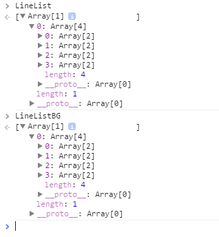
跟踪第三步可以正常显示的代码:

错误显而易见;
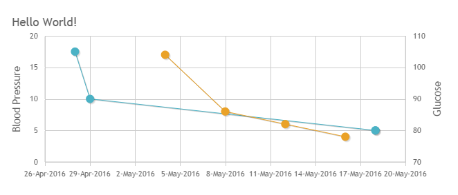
5. 修改代码并显示正确结果:
$(document).ready(function () {
    $.jqplot(ChartId, [LineListBG[0][0], LineList[0][0]], {
            animate: true,
            animateReplot: true,
            //seriesColors: ColorList,
            title: {
                text: v_Title,
                textAlign: 'left'
            },
            seriesDefaults: {
                show: true,
                lineWidth: 1,
                pointLabels: {
                    show: false,
                    formatString: "%.0f",
                    location: "s",
                    ypadding: 1,
                },
                markerOptions: {
                    show: true,
                    lineWidth: 1,
                    size: 12
                }
            },
            series: [{ yaxis: 'y2axis' }],
            axes: {
                xaxis: {
                    renderer: $.jqplot.DateAxisRenderer,
                    show: true,
                    ticks: X_Ticks,
                    tickOptions: {
                        formatString: '%d %b %n %Y %n %a',
                        show: true,
                        showGridline: false,
                        showMark: false
                    },
                    showTicks: true,
                    //useSeriesColor: true,
                    rendererOptions: { drawBaseline: false }
                },
                yaxis: {
                    show: true,
                    ticks: Y_Ticks,
                    tickOptions: {
                        formatString: '%.0f',
                        mark: 'inside',
                        show: true,
                        showMark: false,
                        showGridLine: false,
                        showLabel: true,
                    },
                    label: 'Blood Pressure',
                    labelRenderer: $.jqplot.CanvasAxisLabelRenderer,
                    //useSeriesColor: true,
                    showTickMarks: true,
                    rendererOptions: { drawBaseline: false }
                },
                y2axis: {
                    show: true,
                    ticks: Y_BGTicks,
                    tickOptions: {
                        formatString: '%.0f',
                        mark: 'inside',
                        show: true,
                        showMark: true,
                        showGridLine: false,
                        showLabel: true,
                    },
                    label: 'Glucose',
                    labelRenderer: $.jqplot.CanvasAxisLabelRenderer,
                    //useSeriesColor: true,
                    showTickMarks: true,
                    rendererOptions: { drawBaseline: false }
                }
            },
            highlighter: {
                show: true,
                sizeAdjust: 4,
                tooltipContentEditor: tooltipContentEditor,
                tooltipLocation: 'n',
            },
            cursor: {
                show: false
            },
            grid: {
                background: '#FFFFFF',
                gridLineColor: '#cccccc',
                shadow: false,
                drawBorder: false,
                borderColor: '#FFFFFF',
                borderWidth: 2,
            },
            legend: {
                show: false,
                location: 'ne',
                background: '#FFFFFF',
                placement: "insideGrid",
                fontSize: 5
            }
        });
});
最终结果显示:
6. 总结:
在只有一个X/Y轴时,X轴的英文日期格式可以被正确识别,即在传入数据时可以直接写对象名称而不用加"[]":如下所示:
$(document).ready(function () { $.jqplot(ChartId, LineList, {})
补充(Supplement): The parameters of property tooltipContentEditor(str, seriesIndex, pointIndex, plot)(tooltipContentEditor参数用法):
str:The value of current point;
seriesIndex:The thread number,if there are 2 threads in current chart and you move the cursor to the second thread,the value will be 2;
pointIndex:The order number of the point,such as 1,2,3,4... ...
plot:Can includes all of and all kinds of the value you want display when you move the cursor to any point,you can get what you want from this parameter!
7. 感谢
最后衷心感谢Google Chrome浏览器强大的调试功能!!!


 浙公网安备 33010602011771号