


A Closer Look at Table View Cells
A table view uses cell objects to draw its visible rows and then caches those objects as long as the rows are visible. Cells inherit from the UITableViewCell class. The table view’s data source provides the cell objects to the table view by implementing the tableView:cellForRowAtIndexPath: method, a required method of theUITableViewDataSource protocol.
表格视图使用单元格对象来绘制它的可见行,并且只要行可见就缓存那些对象。单元格(Cells)继承自UITableViewCell 类。表格视图数据源通过实现tableView:cellForRowAtIndexPath:方法给表格视图提供单元格对象,该方法是UITableViewDataSource 协议必须要实现的方法。
In this chapter, you’ll learn about:
在本章,你将学习:
-
The characteristics of cells
单元格的特性
-
How to use the default capabilities of
UITableViewCellfor setting cell content如何使用UITableViewCell的默认能里设置单元格内容
-
How to create custom
UITableViewCellobjects如何创建一个自定义UITableViewCell对象
Characteristics of Cell Objects
一、单元格对象的特性
A cell object has various parts, which can change depending on the mode of the table view. Normally, most of a cell object is reserved for its content: text, image, or any other kind of distinctive identifier. Figure 5-1 shows the major parts of a cell.
一个单元格对象有不同部分,各部分根据表格视图的模式可以改变。正常情况下,大部分单元格对象为以下这些内容而保留:文本,图像,或任何其它类型的独特标识符。 图5-1显示了一个单元格的主要部分。
Figure 5-1 Parts of a table view cell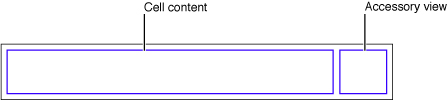
The smaller area on the right side of the cell is reserved for accessory views: disclosure indicators, detail disclosure controls, control objects such as sliders or switches, and custom views.
位于单元格右边的小区域是为辅助视图保留的:扩展指示器,详情扩展空间,控件对象比如滑动条或开关,以及自定义视图。
When the table view goes into editing mode, the editing control for each cell object (if it’s configured to have such a control) appears on its left side, in the area shown in Figure 5-2.
当表格视图进入编辑模式,每个单元格对象的编辑控件(如果配置有这样一个控件)将出现在它的左边,如图5-2.
Figure 5-2 Parts of a table-view cell in editing mode
图 5-2 编辑模式中的表格视图单元各部分
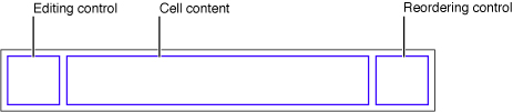
The editing control can be either a deletion control (a red minus sign inside a circle) or an insertion control (a green plus sign inside a circle). The cell’s content is pushed toward the right to make room for the editing control. If the cell object is configured for reordering (that is, relocation within the table view), the reordering control appears in the right side of the cell, next to any accessory view specified for editing mode. The reordering control is a stack of horizontal lines; to relocate a row within its table view, users press on the reordering control and drag the cell.
编辑控件可以是一个删除空间(圆圈里有一个红色减号)或一个插入控件(圆圈里有一个绿色加号)。单元格的内容向右移动以腾出地方给编辑控件。如果单元格对象被配置为可以重新排序(就是,能在表格视图里重新定位),重新排序控件出现在单元格的右侧,紧连任何指定为编辑模式的辅助视图。重新排序空间是水平线的叠加;要想在其表格视图里重新定位,用户按住重新排序控件并拖动单元格。
If a cell object is reusable—the typical case—you assign it a reuse identifier (an arbitrary string) in the storyboard. At runtime, the table view stores cell objects in an internal queue. When the table view asks the data source to configure a cell object for display, the data source can access the queued object by sending adequeueReusableCellWithIdentifier: message to the table view, passing in a reuse identifier. The data source sets the content of the cell and any special properties before returning it. This reuse of cell objects is a performance enhancement because it eliminates the overhead of cell creation.
如果一个单元格对象是可重用的---通常情况---你在故事板中给它分配一个可重用标识符(一个人鱼字符串)。在运行时,表格视图在一个内部队列里存储单元格对象。当表格视图请求数据源配置一个单元格对象用来显示时,数据源能通过给表格视图发送一个dequeueReusableCellWithIdentifier: 消息来访问排好队的对象,传递给它一个重用标识符。在运行之前,数据源设置单元格的内容,以及任何特殊属性。该单元格对象的重用是一种性能提升,因为它消除了单元格创建的开销。
With multiple cell objects in a queue, each with its own identifier, you can have table views constructed from cell objects of different types. For example, some rows of a table view can have content based on the image and text properties of a UITableViewCell in a predefined style, while other rows can be based on a customizedUITableViewCell that defines a special format for its content.
队列中的多个单元格对象,每个都有其自己的标识符,你可以从不同类型的单元格对象构建表格视图。比如,表格视图中一些行的内容,可以是基于一个预定义风格UITableViewCell的图像和文本属性的内容,而其它行则可以是基于一个为内容定义了一个特殊格式的自定义UITableViewCell。
When providing cells for the table view, there are three general approaches you can take. You can use ready-made cell objects in a range of styles, you can add your own subviews to the cell object’s content view (which can be done in Interface Builder), or you can use cell objects created from a custom subclass of UITableViewCell. Note that the content view is a container of other views and so displays no content itself.
当你给表格视图提供内容时,有三种基本方法。 1. 使用现成的一定风格范围内的单元格对象;2. 你可以添加自己的子视图到单元格对象的content view上(可以在Interface Builder上完成);3. 你可以使用从UITableViewCell对象的一个自定义子类上创建而来的单元格对象。注意content view 是其它视图的一个容器,所以它本身没有任何内容。
Using Cell Objects in Predefined Styles
二、使用预定义风格的单元格对象
Using the UITableViewCell class directly, you can create “off-the-shelf” cell objects in a range of predefined styles.“Standard Styles for Table View Cells” describes these standard cells and provides examples of how they look in a table view. These cells are associated with the following enum constants, declared in UITableViewCell.h:
直接使用UITableViewCell 类,你可以在预定于风格内创建现成的单元格对象。 “Standard Styles for Table View Cells” 描述了这些标准单元格,以及提供了它们在表格视图里的样子例子。这些单元格跟以下enum常量相关联,它们在UITableViewCell.h中声明:
typedef enum {
|
UITableViewCellStyleDefault, |
UITableViewCellStyleValue1, |
UITableViewCellStyleValue2, |
UITableViewCellStyleSubtitle |
} UITableViewCellStyle; |
These cell objects have two kinds of content: one or more text strings and, in some cases, an image. Figure 5-3 shows the approximate areas for image and text. As an image expands to the right, it pushes the text in the same direction.
这些单元格对象有两种内容:一个或多个文本字符串,以及一些情况下有一张图片。 图5-3显示了图片和文本的大概区域。
Figure 5-3 Default cell content in a UITableViewCell object
图 5-3 UITableViewCell对象的默认单元格内容
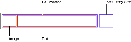
The UITableViewCell class defines three properties for this cell content:
UITableViewCell类为该单元格内容定义了三种属性:
-
textLabel—A label for the title (aUILabelobject)文本标签---一个标题标签(一个
UILabel 对象) -
detailTextLabel—A label for the subtitle if there is additional detail (aUILabelobject)详细文本标签---一个子标题标签如果有附加的详细内容。(一个UILabel对象)
-
imageView—An image view for an image (aUIImageViewobject)图像视图---一个图像视图用来显示图像(一个
UIImageView 对象)
Because the first two of these properties are labels, you can set the font, alignment, line-break mode, and color of the associated text through the properties defined by the UILabel class (including the color of text when the row is highlighted). For the image view property, you can also set an alternative image for when the cell is highlighted using the highlightedImage property of the UIImageView class.
因为最初的两个属性都是标签,你可以通过UILabel类定义的属性设置字体,对齐,换行模式,以及相关文本的颜色(当行处于高亮时,还能设置文本的颜色)。对于图像视图属性,当单元格处于高亮时,你还可以使用UIImageView类的highlightedImage设置一张替换图像。
Figure 5-4 gives an example of a table view whose rows are drawn using a UITableViewCell object in theUITableViewCellStyleSubtitle style; it includes both an image and, for textual content, a title and a subtitle.
图5-4给出了用一个UITableViewCell对象绘制的表格视图,该表格的风格是UITableViewCellStyleSubtitle;它包含了一张图片,至于文本内容,包含了一个标题和一个子标题。
Figure 5-4 A table view with rows showing both images and text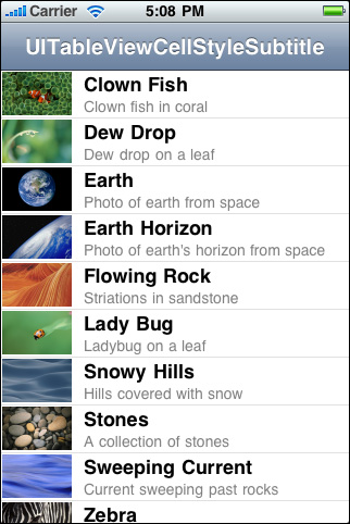
Listing 5-1 shows the implementation of tableView:cellForRowAtIndexPath: that creates the table view rows inFigure 5-4. The first thing the data source should do is send dequeueReusableCellWithIdentifier: to the table view, passing in a reuse identifier. If a prototype for the cell exists in a storyboard, the table view returns a reusable cell object. Then it sets the cell object’s content, both text and image.
列表5-1 显示了创建图5-4中的表格视图行的实现方法 tableView:cellForRowAtIndexPath: 。数据源应该做的第一件事是给表格视图发送dequeueReusableCellWithIdentifier: 消息,传递一个重用标识符。如果单元格的原型在一个故事板中,表格视图返回一个可重用单元格对象。然后它设置单元格对象的内容,包括文本和图片。
Listing 5-1 Configuring a UITableViewCell object with both image and text
列表 5-1 用图片和文本配置一个UITableViewCell 对象
- (UITableViewCell *)tableView:(UITableView *)tableView cellForRowAtIndexPath:(NSIndexPath *)indexPath {
|
UITableViewCell *cell = [tableView dequeueReusableCellWithIdentifier:@"MyIdentifier"]; |
if (cell == nil) {
|
cell = [[UITableViewCell alloc] initWithStyle:UITableViewCellStyleSubtitle reuseIdentifier:@"MyIdentifier"]; |
cell.selectionStyle = UITableViewCellSelectionStyleNone; |
} |
NSDictionary *item = (NSDictionary *)[self.content objectAtIndex:indexPath.row]; |
cell.textLabel.text = [item objectForKey:@"mainTitleKey"]; |
cell.detailTextLabel.text = [item objectForKey:@"secondaryTitleKey"]; |
NSString *path = [[NSBundle mainBundle] pathForResource:[item objectForKey:@"imageKey"] ofType:@"png"]; |
UIImage *theImage = [UIImage imageWithContentsOfFile:path]; |
cell.imageView.image = theImage; |
return cell; |
} |
The table view’s data source implementation of tableView:cellForRowAtIndexPath: should always reset all content when reusing a cell.
tableView:cellForRowAtIndexPath: 方法的表格视图数据源实现应该总是在重用一个单元格时重置所有内容。
When you configure a UITableViewCell object, you can also set various other properties, including (but not limited to) the following:
当你配置一个UITableViewCell对象时,你还可以设置其它很多不同的属性,包括(但不仅限于)以下:
-
selectionStyle—Controls the appearance of the cell when selected.selectionStyle---控制选中时单元格的外形。
-
accessoryTypeandaccessoryView—Allow you to set one of the standard accessory views (disclosure indicator or detail disclosure control) or a custom accessory view for a cell in normal (nonediting) mode. For a custom view, you may provide anyUIViewobject, such as a slider, a switch, or a custom view.accessoryType 和 accessoryView---允许你设置其中一个标准辅助视图(扩展指示器或详情扩展指示器)或一个用于正常模式(不是编辑模式)下的单元格的自定义辅助视图。对于自定义视图,你可以提供任何
UIView对象,比如一个滑动条,一个开关,或者一个自定义视图。 -
editingAccessoryTypeandeditingAccessoryView—Allow you to set one of the standard accessory views (disclosure indicator or detail disclosure control) or a custom accessory view for a cell in editing mode. For a custom view, you may provide anyUIViewobject, such as a slider, a switch, or a custom view.editingAccessoryType和editingAccessoryView---允许你设置标准辅助视图的其中之一(扩展指示器或详情扩展指示器)或一个用于编辑模式中的单元格的自定义辅助视图。对于自定义视图,你可以提供任何UIView对象,比如一个滑动条,一个开关,或者一个自定义视图。 -
showsReorderControl—Specifies whether it shows a reordering control when in editing mode. The related but read-onlyeditingStyleproperty specifies the type of editing control the cell has (if any). The delegate returns the value of theeditingStyleproperty in its implementation of the tableView:editingStyleForRowAtIndexPath:method.showsReorderControl---当它处于编辑模式时,指定它是否显示一个重新排序控件。相关的只读属性editingStyle指定了单元格拥有(如果有)的编辑控件的类型。委托在它的方法 tableView:editingStyleForRowAtIndexPath: 中返回editingStyle属性的值。
-
backgroundViewandselectedBackgroundView—Provide a background view (when a cell is unselected and selected) to display behind all other views of the cell.backgroundView和selectedBackgroundView---给所有的单元格提供一个背景视图。 -
indentationLevelandindentationWidth—Specify the indentation level for cell content and the width of each indentation level.indentationLevel和indentationWidth---为单元格内容指定缩进级别以及每个缩进级别的宽度。
Because a table view cell inherits from UIView, you can also affect its appearance and behavior by setting the properties defined by that superclass. For example, to affect a cell’s background color, you could set itsbackgroundColor property. Listing 5-2 shows how you might use the delegate methodtableView:willDisplayCell:forRowAtIndexPath: to alternate the background color of rows (via their backing cells) in a table view.
因为表格视图单元格从UIView继承,你还可以通过设置由其父类定义的各种属性来影响它的外形和行为。 比如,你可以设置它的backgroundColor 属性来影响单元格的背景颜色。列表5-2显示了如何使用委托方法tableView:willDisplayCell:forRowAtIndexPath: 来改变表格视图中行的背景颜色(通过它们的底层单元格)。
Listing 5-2 Alternating the background color of cells
- (void)tableView:(UITableView *)tableView willDisplayCell:(UITableViewCell *)cell forRowAtIndexPath:(NSIndexPath *)indexPath {
|
if (indexPath.row%2 == 0) {
|
UIColor *altCellColor = [UIColor colorWithWhite:0.7 alpha:0.1]; |
cell.backgroundColor = altCellColor; |
} |
} |
Listing 5-2 also illustrates an important aspect of the table view API. A table view sends atableView:willDisplayCell:forRowAtIndexPath: message to its delegate just before it draws a row. If the delegate chooses to implement this method, it can make last-minute changes to the cell object before it is displayed. With this method, the delegate should change only state-based properties that were set earlier by the table view, such as selection and background color, and not content.
列表 5-2 还演示了表格视图API的一个重要方面。表格视图在它绘制行之前给它的委托发送了 tableView:willDisplayCell:forRowAtIndexPath: 消息。如果委托选择实现该方法,它可以在行显示之前对单元格对象做最后的改变。使用该方法,委托应该只改变表格视图早期已经设置好的基于状态的属性,比如区颜色和背景颜色,而不是改变内容。
Customizing Cells
三、自定义单元格
The four predefined styles of UITableViewCell objects suffice for most of the rows that table views display. With these ready-made cell objects, rows can include one or two styles of text, often an image, and an accessory view of some sort. The application can modify the text in its font, color, and other characteristics, and it can supply an image for the row in its selected state as well as its normal state.
UITableViewCell 对象预定义的这四种风格已经能满足表格视图显示的大多数行的需求。使用这些现成的单元格对象,行可以包含一种或两种类型的文本,经常还有一个图片,以及一个某种类型的辅助视图。应用程序可以修改文本的字体,颜色以及其他特性,而且它能给选中和未选中状态的行提供一个图片。
As flexible and useful as this cell content is, it might not satisfy the requirements of all applications. For example, the labels permitted by a native UITableViewCell object are pinned to specific locations within a row, and the image must appear on the left side of the row. If you want the cell to have different content components and to have these laid out in different locations, or if you want different behavioral characteristics for the cell, you have two alternatives:
即使它的单元格内容如何灵活和有用,它还是不可能满足所有应用程序的需求。比如,原始 UITableViewCell 对象允许的标签需要固定在行内指定位置,图片必须出现在行的左边。如果你想单元格有不同的内容组件,并且需要它们在不同的位置出现,或者如果你想实现单元格的不同行为特性,你有两种实现方法:
-
Add subviews to a cell’s content view.
向单元格的内容视图(content view)添加子视图。
-
Create a custom subclass of
UITableViewCell.创建一个 UITableViewCell 对象的自定义子类。
The following sections discuss both approaches.
接下来的章节将讨论这两种方法。
Loading Table View Cells from a Storyboard
1、从故事板载入表格视图单元格
In a storyboard, the cells in a table view are dynamic or static. With dynamic content, the table view is a list with a large (and potentially unbounded) number of rows. With static content, the number of rows is a finite quantity that’s known at compile time. A table view that presents a detail view of an item is a good candidate for static content.
在故事板中,表格视图中的单元格可以是动态的或静态的。表格视图的动态内容是一个有大量数量行(无限数量)的列表。有静态内容的表格视图是有限行数量的表格视图,该数量在它编译时就已经知道。对于呈现一个数据项的详细视图的表格视图,静态内容是一个很好的选择。
You can design dynamic or static cell content directly inside a table view object. Figure 5-5 shows the master and detail table views in a simple storyboard. In this example, the master table view contains dynamic prototype cells, and the detail table view contains static cells.
你可以直接在一个表格视图对象中设计动态或静态单元格内容。图5-5显示了在一个简单的故事板中的主表格视图和详细表格视图。在该例子中,主表格视图包含了动态原型单元格,以及包含静态单元格的详情表格视图。
Figure 5-5 Table view cells in a storyboard
图 5-5 故事板中的表格视图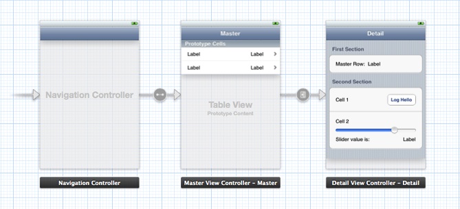
The following sections demonstrate how to load data into table views that contain custom-configured cells.
以下章节演示了如何加载包含有自定义配置单元格的数据到表格视图。
The Technique for Dynamic Row Content
2、动态行内容的技术
In this section, you compose a custom prototype cell in a storyboard. At runtime, the data source dequeues cells, prepares them, and gives them to its table view for drawing the rows depicted in Figure 5-6.
在本节,你在故事板中添加一个自定义原型单元格。在运行时,数据源从队列中取出单元格(cells),准备好它们,并把它们应用到它的表格视图来绘制如图5-6所示的行。
Figure 5-6 Table view rows drawn with a custom prototype cell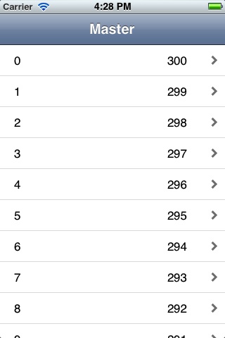
The data source can use two different ways to access the subviews of the cells. One approach uses the tag property defined by UIView and the other approach uses outlets. Using tags is convenient, although it makes the code more fragile because it introduces a coupling between the tag numbers in the storyboard and the code. Using outlets requires a little more work because you need to define a custom subclass of UITableViewCell. Both approaches are described here.
数据源可以使用两种不同的方法来访问单元格的子视图。一种方法使用UIView定义的tag属性,另一种方法使用输出口(outlets)。 使用标签(tags)很方便,尽管它让代码变得更加脆弱,因为它在故事板中的标签值和代码之间引入了一个耦合(coupling)。使用输出口要求多做一点工作,因为你需要自定义一个UITableViewCell对象的自定义子类。以下描述这两种方法。
 To create a project that uses a storyboard to load custom table view cells创建一个使用故事板来加载自定义表格视图单元格的项目
-
Create a project using the Master-Detail Application template and select the Use Storyboards option.
使用Master-Detail Application 模板创建一个项目,并选中Use Storyboards 选项。
-
On the storyboard canvas, select the master view controller.
在故事板画布上,选中主视图控制器(master view controller)。
-
In the Identity inspector, verify that Class is set to the custom MasterViewController class.
在Identity inspector(身份检查器)中,确认那个类已经被设置为自定义MasterViewController类。
-
Select the table view inside the master view controller.
在主视图控制器中选中表格视图(table view)。
-
In the Attributes inspector, verify that the Content pop-up menu is set to Dynamic Prototypes.
在Attributes inspector(属性检查器),确认Content弹出菜单被设置为Dynamic Prototypes(动态原型).
-
Select the prototype cell.
选中原型单元格.
-
In the Attributes inspector, choose Custom in the Style pop-up menu.
在属性检查器中,在Style 弹出菜单中选择Custom。
-
Enter a reuse identifier in the Identifier text field.
在标识符文本字段(Identifier)区输入一个重用标识符。
This is the same reuse identifier you send to the table view in the
dequeueReusableCellWithIdentifier:message. For an example, see Listing 5-3.该重用标识符跟在dequeueReusableCellWithIdentifier: 消息中传递给表格视图的重用标识符相同。参见列表5-3.
-
Choose Disclosure Indicator in the Accessory pop-up menu.
在Accessory弹出菜单中选择Disclosure Indicator.
-
Drag objects from the Library onto the cell.
从对象库中拖动对象到单元格上。
For this example, drag two label objects and position them near the ends of the cell (leaving room for the accessory view).
在本例中,拖动两个标签对象,并把它们定位在接近单元格两端的位置(给辅助视图腾出位置)。
-
Select the objects and set their attributes, sizes, and autoresizing characteristics.
选中对象并设置它们的属性(attribute),尺寸以及自动调整尺寸特性。
Now write the code you would normally write to obtain the table view’s data. (For this example, the only data you need is the row number of each cell.) Implement the data source method tableView:cellForRowAtIndexPath: to create a new cell from the prototype and populate it with data, in a manner similar to Listing 5-3.
现在开始编写你通常会写来获取表格视图数据的代码。(本例,你需要的唯一数据是每个单元格的行号)实现数据源方法 tableView:cellForRowAtIndexPath:,从原型创建一个新单元格,并用数据填充它。参见列表5-3.
Listing 5-3 Adding data to a cell using tags
- (UITableViewCell *)tableView:(UITableView *)tableView cellForRowAtIndexPath:(NSIndexPath *)indexPath |
{
|
UITableViewCell *cell = [tableView dequeueReusableCellWithIdentifier:@"MyIdentifier"]; |
UILabel *label; |
label = (UILabel *)[cell viewWithTag:1]; |
label.text = [NSString stringWithFormat:@"%d", indexPath.row]; |
label = (UILabel *)[cell viewWithTag:2]; |
label.text = [NSString stringWithFormat:@"%d", NUMBER_OF_ROWS - indexPath.row]; |
return cell; |
} |
There are a few aspects of this code to note:
这些代码中需要注意以下几点:
-
The string identifier you assign to the prototype cell is the same string you pass to the table view in
dequeueReusableCellWithIdentifier:.你分配给原型单元格的字符串标识符跟你传递给表格视图放在 dequeueReusableCellWithIdentifier: 中的字符串一样。
-
Because the prototype cell is defined in a storyboard, the
dequeueReusableCellWithIdentifier:method always returns a valid cell. You don’t need to check the return value against nil and create a cell manually.因为原型单元格式在故事板中定义的, dequeueReusableCellWithIdentifier:方法总是返回一个有效单元格。你不需要查看返回值是否为nil,并手动创建一个单元格。
-
The code gets the labels in the cell by calling
viewWithTag:, passing in their tag integers. It can then set the textual content of the labels.代码中通过调用viewWithTag: 方法来获取单元格中的标签,传进它们的标签值。然后它就能设置标签的文本内容。
If you prefer not to use tags, you can use an alternative method for setting the content in the cell. Define a customUITableViewCell subclass with outlet properties for the objects you want to set. In the storyboard, associate the new class with the prototype cell and connect the outlets to the corresponding objects in the cell.
如果你不喜欢使用标签,你可以使用一个替换方法来设置单元格中的内容。用输出口(outlet)属性给你想要设置的对象定义一个UITableViewCell 对象的自定义子类。在故事板中,关联新类跟原型单元格,并把输出口链接到单元格中的相应对象。
To use outlets for the custom cell content为自定义单元格内容应用输出口-
Add an Objective-C class named
MyTableViewCellto your project.向你的项目添加一个Objective-C类,名字为MyTableViewCell。
-
Add the following code to the interface in
MyTableViewCell.h:把以下代码添加到MyTableViewCell.h的接口中。
@interface MyTableViewCell : UITableViewCell
@property (nonatomic, weak) IBOutlet UILabel *firstLabel;
@property (nonatomic, weak) IBOutlet UILabel *secondLabel;
@end
-
Add the following code to the implementation in
MyTableViewCell.m:把以下代码添加到MyTableViewCell.m的实现中:
@synthesize firstLabel, secondLabel;
-
Add the following line of code to the source file that implements the data source:
把以下代码添加到实现数据源的源文件中。
#import "MyTableViewCell.h"
-
Use the Identity inspector to set the Class of the prototype cell to
MyTableViewCell.使用使用身份检查器(Identity inspector)来把原型单元格的类设置为MyTableViewCell.
-
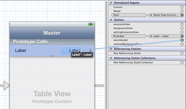
Use the Connections inspector to connect the two outlets in the prototype cell to their corresponding labels.
使用链接检查器(Connections inspector)把两个输出口链接到它们相关的标签上。
![../Art/connect_outlet.jpg]()
-
Implement the data source method
tableView:cellForRowAtIndexPath:in a manner similar to Listing 5-4.实现数据源方法tableView:cellForRowAtIndexPath:,参见列表5-4.
Listing 5-4 Adding data to a cell using outlets
- (UITableViewCell *)tableView:(UITableView *)tableView cellForRowAtIndexPath:(NSIndexPath *)indexPath |
{
|
MyTableViewCell *cell = [tableView dequeueReusableCellWithIdentifier:@"MyIdentifier"]; |
cell.firstLabel.text = [NSString stringWithFormat:@"%d", indexPath.row]; |
cell.secondLabel.text = [NSString stringWithFormat:@"%d", NUMBER_OF_ROWS - indexPath.row]; |
return cell; |
} |
The code gains access to the labels in the cell using accessor methods (dot notation is used here). The code can then set the textual content of the labels.
代码使用访问器方法实现对标签的访问(这里使用了点运算符)。然后代码就可以设置标签的文本内容。
The Technique for Static Row Content
3、静态行内容技术
In this section, you compose several cells in a table view with static content. At runtime, when the table view is loaded from the storyboard, the table view controller has immediate access to these cells and composes the sections and rows of the table view with them, as depicted in Figure 5-7.
在本节,你在表格视图中使用了一个静态内容的单元格。在运行时,当表格视图从故事板加载时,表格视图控制器立即访问了这些单元格并用它们构成了表格视图的区和行,如图5-7.
Figure 5-7 Table view rows drawn with multiple cells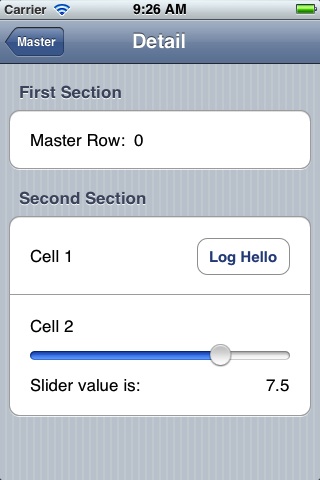
As with the procedure for dynamic content, start by adding a subclass of UITableViewController to your project. Define outlet properties for the master row label in the first cell and the slider value label in the last cell, as shown inListing 5-5.
就像动态内容程序中,首先向项目中添加一个UITableViewController子类。为第一个单元格中中的主行标签(master row label)以及最后一个单元格的滑动条标签定义输出口属性,参见列表 5-5.
Listing 5-5 Defining outlet properties for static cell objects
@interface DetailViewController : UITableViewController |
@property (strong, nonatomic) id detailItem; |
@property (weak, nonatomic) IBOutlet UILabel *masterRowLabel; |
@property (weak, nonatomic) IBOutlet UILabel *sliderValueLabel; |
@property (weak, nonatomic) IBOutlet UISlider *slider; |
- (IBAction)logHello; |
- (IBAction)sliderValueChanged:(UISlider *)slider; |
@end |
In the storyboard, drag a Table View Controller object from the Library onto the canvas. Select the table view and set the following attributes in the Attributes inspector:
故事板中,从库中拖放一个表格视图控制器对象到画布。选择表格视图并在属性检查器里设置以下属性:
-
Set the Content pop-up menu to Static Cells.
设置Content弹出菜单为静态单元格
-
Set the number of sections to 2.
设置区的数量为2.
-
Set the Style pop-up menu to Grouped.
设置Style弹出菜单为Grouped.
For each section in the table view, use the Attributes inspector to enter a string in the Header field. Then for the cells, complete the following steps:
对于表格视图中的每个区,使用属性检查器在Header字段输入一个字符串。然后为单元格完成以下步骤:
-
Delete two of the three cells in the first table-view section and one cell in the second section.
在第一个表格视图区内删除两个单元格,在第二个区里删除一个。
-
Increase the height of each remaining cell as needed.
根据需要增加每个被保留的单元格高度。
It isn’t necessary to assign reuse identifiers of these cells, because you’re not going to implement the data source method
tableView:cellForRowAtIndexPath:.没有必要给这些单元格分配重用标识符,因为你不需要实现数据源方法 :
tableView:cellForRowAtIndexPath:. -
Drag objects from the Library to compose the subviews of each cell as depicted in Figure 5-7.
如Figure 5-7中所示,从库中拖放对象构成每个单元格的子视图。
-
Set any desired attributes of these objects.
给这些对象设置任何需要的属性。
The slider in this example has a range of values from 0 to 10 with an initial value of 7.5.
本例中的滑动条范围值是从1-10,初始值为7.5。
Select the table view controller and display the Connections inspector. Make connections between the three outlets in your table view controller and the corresponding objects, as shown in Figure 5-8. While you’re at it, implement the two action methods declared in Listing 5-5 and make target-action connections to the button and the slider.
选中表格视图控制器并打开Connections inspector. 在表格视图控制器的三个输出口和相应对象之间做链接,如图5-8.
Figure 5-8 Making connections to your static cell content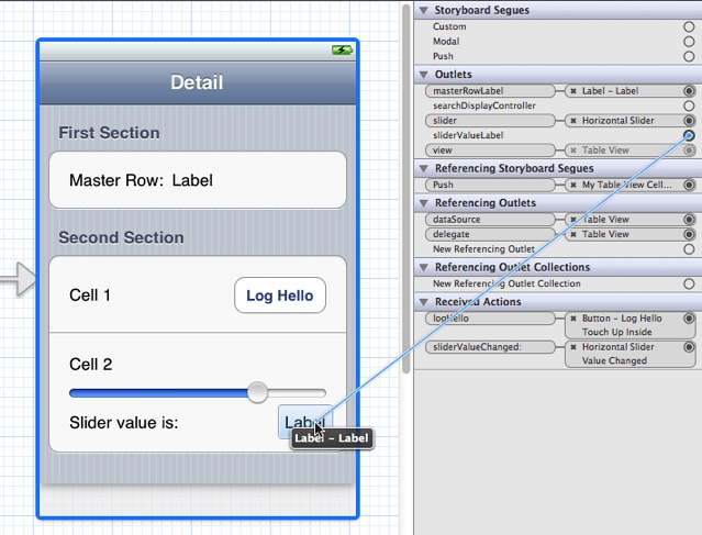
To populate the data in the static cells, implement a method called configureView in the detail view controller. In this example, detailItem is an NSString object passed in by the master view controller in itsprepareForSegue:sender: method. The string contains the master row number.
要想在静态单元格里填充数据,实现在详细视图控制器里的configureView方法。 在本例中,detailItem 是一个NSString对象,它由master 视图控制器中的prepareForSegue:sender: 方法传递。该字符串包含了master 行号。
Listing 5-6 Setting the data in the user interface
- (void)configureView |
{
|
if (self.detailItem) {
|
self.masterRowLabel.text = [self.detailItem description]; |
} |
self.sliderValueLabel.text = [NSString stringWithFormat:@"%1.1f", self.slider.value]; |
} |
The detail view controller calls the configureView method in viewDidLoad and setDetailItem:, as illustrated in the Xcode template Master-Detail Application.
detail 视图控制器在viewDidLoad和setDetailItem:方法里调用configureView方法, 就像在Xcode模板 Master-Detail Application中说明的那样。
Programmatically Adding Subviews to a Cell’s Content View
4、通过程序像单元格的Content View添加子视图
A cell that a table view uses for displaying a row is a view (UITableViewCell inherits from UIView). As a view, a cell has a content view—a superview for cell content—that it exposes as a property. To customize the appearance of rows in a table view, add subviews to the cell’s content view, which is accessible through its contentView property, and lay them out in the desired locations in their superview’s coordinates. You can configure and lay them out programmatically or in Interface Builder. (The approach using Interface Builder is discussed in “Loading Table View Cells from a Storyboard.”)
表格视图用来显示行的单元格是一个视图(UITableViewCell 继承自 UIView)。作为一个视图,单元格有一个content view(内容视图)---单元格内容的父视图---它作为一个属性被使用。要想在表格视图里定制行的外形,向单元格的content view 添加子视图,它可以通过它的contentView属性访问,并在它们父视图的坐标系中放置在需要的位置。你可以通过程序或界面生成器(Interface Builder)进行配置并布局。(使用界面生成器的方法在“Loading Table View Cells from a Storyboard.” 中描述。)
One advantage of this approach is its relative simplicity; it doesn’t require you to create a custom subclass ofUITableViewCell and handle all of the implementation details required for custom views. However, if you do take this approach, avoid making the views transparent, if you can. Transparent subviews affect scrolling performance because of the increased compositing cost. Subviews should be opaque, and typically should have the same background color as the cell. And if the cell is selectable, make sure that the cell content is highlighted appropriately when selected. The content is selected automatically if the subview implements (if appropriate) the accessor methodsfor the highlighted property.
该方法的优点是它相对简单;它不要求你创建一个UITableViewCell类的自定义子类,并处理了多有自定义视图所需的所有实现细节。然而,如果你采用该方法,如果可以避免透明视图。透明子视图影响滚动性能,因为它增加合成消耗。子视图应该是不透明的,并且通常单元格应该有相同的背景颜色。如果单元格是可选择的,确保当单元格被选中时,内容可以适当的高亮。如果子视图实现了highlighted 属性的访问器方法,内容会自动被选中。
Suppose you want a cell with text and image content in custom locations. For example, you want the image on the right side of the cell and the title and subtitle of the cell right-aligned against the left side of the image. Figure 5-9show how a table view with rows drawn with such a cell might look. (This example is for illustration only, and is not intended as a human-interface model.)
假设你想要一个单元格在自定义位置带有文本和图片内容的。比如,你想让图片显示在单元格的右边,主标题和副标题在图片的左边,向右跟图片对齐。图5-9 显示了该例子的可能外形。(该例子只用于演示,不打算作为一个人性化接口模型。)
Figure 5-9 Cells with custom content as subviews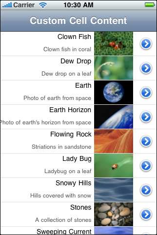
The code example in Listing 5-7 illustrates how the data source programmatically composes the cell with which this table view draws its rows. In tableView:cellForRowAtIndexPath:, it first checks to see the table view already has a cell object with the given reuse identifier. If there is no such object, the data source creates two label objects and one image view with specific frames within the coordinate system of their superview (the content view). It also sets attributes of these objects. Having acquired an appropriate cell to use, the data source sets the cell’s content before returning the cell.
列表5-7中的代码说明了数据源如何通过程序组成单元格,然后用它绘制表格视图的行。在 tableView:cellForRowAtIndexPath:方法中,它首先检查表格视图是否已经存在一个带有重用标识符的单元格对象。如果没有这样的对象,数据源在它们的父视图(content view)中的坐标系统中用指定的边框创建两个标签对象和一个图片视图。它还设置了这些对象的属性。获取了一个适当的单元格之后,数据源在返回单元格之前设置单元格的内容。
Listing 5-7 Adding subviews to a cell’s content view
#define MAINLABEL_TAG 1 |
#define SECONDLABEL_TAG 2 |
#define PHOTO_TAG 3 |
- (UITableViewCell *)tableView:(UITableView *)tableView cellForRowAtIndexPath:(NSIndexPath *)indexPath {
|
static NSString *CellIdentifier = @"ImageOnRightCell"; |
UILabel *mainLabel, *secondLabel; |
UIImageView *photo; |
UITableViewCell *cell = [tableView dequeueReusableCellWithIdentifier:CellIdentifier]; |
if (cell == nil) {
|
cell = [[UITableViewCell alloc] initWithStyle:UITableViewCellStyleDefault reuseIdentifier:CellIdentifier]; |
cell.accessoryType = UITableViewCellAccessoryDetailDisclosureButton; |
mainLabel = [[[UILabel alloc] initWithFrame:CGRectMake(0.0, 0.0, 220.0, 15.0)]]; |
mainLabel.tag = MAINLABEL_TAG; |
mainLabel.font = [UIFont systemFontOfSize:14.0]; |
mainLabel.textAlignment = UITextAlignmentRight; |
mainLabel.textColor = [UIColor blackColor]; |
mainLabel.autoresizingMask = UIViewAutoresizingFlexibleLeftMargin | UIViewAutoresizingFlexibleHeight; |
[cell.contentView addSubview:mainLabel]; |
secondLabel = [[[UILabel alloc] initWithFrame:CGRectMake(0.0, 20.0, 220.0, 25.0)]]; |
secondLabel.tag = SECONDLABEL_TAG; |
secondLabel.font = [UIFont systemFontOfSize:12.0]; |
secondLabel.textAlignment = UITextAlignmentRight; |
secondLabel.textColor = [UIColor darkGrayColor]; |
secondLabel.autoresizingMask = UIViewAutoresizingFlexibleLeftMargin | UIViewAutoresizingFlexibleHeight; |
[cell.contentView addSubview:secondLabel]; |
photo = [[[UIImageView alloc] initWithFrame:CGRectMake(225.0, 0.0, 80.0, 45.0)]]; |
photo.tag = PHOTO_TAG; |
photo.autoresizingMask = UIViewAutoresizingFlexibleLeftMargin | UIViewAutoresizingFlexibleHeight; |
[cell.contentView addSubview:photo]; |
} else {
|
mainLabel = (UILabel *)[cell.contentView viewWithTag:MAINLABEL_TAG]; |
secondLabel = (UILabel *)[cell.contentView viewWithTag:SECONDLABEL_TAG]; |
photo = (UIImageView *)[cell.contentView viewWithTag:PHOTO_TAG]; |
} |
NSDictionary *aDict = [self.list objectAtIndex:indexPath.row]; |
mainLabel.text = [aDict objectForKey:@"mainTitleKey"]; |
secondLabel.text = [aDict objectForKey:@"secondaryTitleKey"]; |
NSString *imagePath = [[NSBundle mainBundle] pathForResource:[aDict objectForKey:@"imageKey"] ofType:@"png"]; |
UIImage *theImage = [UIImage imageWithContentsOfFile:imagePath]; |
photo.image = theImage; |
return cell; |
} |
When the data source creates the cells, it assigns each subview an identifier called a tag. With tags, you can locate a view in its view hierarchy by calling the viewWithTag: method. If the delegate later gets the designated cell from the table view’s queue, it uses the tags to obtain references to the three subviews prior to assigning them content.
当数据源创建单元格时,它给每个子视图分配了一个标识符,被称为标签。使用标签,你可以在其视图层次里通过调用viewWithTag: 方法来定位一个视图。如果以后委托要从表格视图的队列中获取指定的单元格,它首先使用标签来获得到这三个子视图的引用,然后给它们分配内容。
This code creates a UITableViewCell object in the predefined default style (UITableViewCellStyleDefault). Because the content properties of the standard cells—textLabel, detailTextLabel, and imageView—are nil until assigned content, you may use any predefined cell as the template for customization.
该代码以预定义默认风格(UITableViewCellStyleDefault)创建一个UITableViewCell对象。因为标准单元格的内容属性---textLabel, detailTextLabel, 和 imageView-- 都为nil直到给它们分配内容,你可以使用任何预定义的单元格作为定制模板。
Note: Another approach is to subclass UITableViewCell and create instances in theUITableViewCellStyleSubtitle style. Then override the layoutSubviews method to reposition the textLabel,detailTextLabel, and imageView subviews (after calling super).
注意:另一种方法是子类化UITableViewCell并以UITableViewCellStyleSubtitle风格创建实例。然后重写layoutSubviews方法来重新定位textLabel,detailTextLabel, 和 imageView 子视图(在调用super之后)。
One way to achieve “attributed string” effects with textual content is to lay out UILabel subviews of theUITableViewCell content view. The text of each label can have its own font, color, size, alignment, and other characteristics. If you want that kind of variation within a label object, create multiple labels and lay them out relative to each other.
用文本内容实现“属性字符串”效果的一种方法是布局UITableViewCell content view的UILabel 子视图。每个标签的文本能有自己的字体,颜色,尺寸,对齐方式,以及其他特性。如果你想在一个标签对象里实现那种变化,创建多个标签,然后每个标签互相相对布局。
Enhancing the Accessibility of Table View Cells
四。增强表格视图单元格的访问性
If your app displays a table view in which each cell contains items other than (or in addition to) text, there are a few things you can do to make it more accessible. Similarly, if your table view displays more than one piece of information per row, you can enhance a VoiceOver user’s experience by aggregating the information in a single, easy-to-understand label.
如果你的应用程序显示了一个表格视图,而它的每个单元格所包含的数据项不止(或没有)文本,你可以通过一些事情让其更易被访问。类似地,如果你的表格视图每行不止显示一个信息,你可以通过把所有信息聚集在一个唯一的易于理解的标签中来增强一个VoiceOver用户的体验。
Note: If your table cells contain any of the standard table-view elements, such as the disclosure indicator, detail disclosure button, or delete control, you do not have to do anything to make these elements accessible. If, however, your table cells include other types of controls, such as a switch or a slider, you need to make sure that these elements are appropriately accessible.
注意:如果表格单元格包含了任何标准表格视图元素,比如扩展指示器,详情扩展按钮,或删除控件,你不需要做任何事来让这些元素容易使用。但是,如果如果你的表格单元格包含了其他类型的控件,比如一个开关或一个滑动条,你需要确保这些元素有适当的访问性。
If the table cells in your app contain a mix of different elements, determine whether users interact with each cell as a unit, or with individual elements inside the cell. If users need to access individual elements inside the cell, you should:
如果应用程序的表格单元格混合包含了不同元素,决定用户是否与每个单元格做交互,还是跟单元格中的独立元素交互。如果用户需要访问单元格中的独立元素,你应该:
-
Make each individual element accessible separately.
让每个独立的元素能分开被访问。
-
Make sure the table cell itself is not accessible.
确保表格单元格本身不能被访问。
-
Succinctly describe the overall contents of the cell and use this description for the label attribute of the cell. Note that, in this case, the label is considered to be one of the accessible elements within the cell.
简明扼要的描述单元格的全部内容,并把该描述用于单元格的标签属性。注意,在这种情况下,标签被考虑为是单元格里的一个可访问元素。
You’ve probably recognized that a table cell that contains multiple items, such as text and controls, fits the criteria of a container view, as defined by the UI Accessibility programming interface. However, you do not have to identify the cell as a container view or implement any of the methods of the UIAccessibilityContainer protocol, because the table cell is automatically designated as a container.
你可能已经认识到包含多个类型元素(比如文本和控件)的表格单元格,正如UI Accessibility 编程接口里所定义,符合容器视图的标准。但是,你不必把单元格识别为一个容器视图,或实现 UIAccessibilityContainer 协议的的任何方法,因为表格单元格自动被识别为一个容器。
If your table contains cells that provide information in discrete chunks, you should consider combining the information from these chunks in the label attribute. When you do this, VoiceOver users can get the meaning of the cell’s contents with one gesture, instead of having to access each piece of information separately.
如果你的表格包含的单元格在分离块中提供信息,你应该考虑把这些信息从不同块合并到标签属性内。 当你完成这些,VoiceOver用户就可以用一个手势获取单元格内容的意义,而不需要分别访问每块信息。
A good example of how this can work is in the built-in Stocks app. Instead of providing the company name, current stock price, and change in price as separate strings, Stocks combines this information in the label, which might sound like this: “Apple Inc., $648.11, up 1.85%." Notice the commas in this label. When you combine discrete pieces of information in this way, you can use commas to tell VoiceOver to pause briefly between phrases, making it easier for users to understand the information.
实现该功能的一个很好的例子是内置的Stocks应用程序。该应用程序不把公司名称,当前股票价格,以及价格的改变放在不同的字符串中,而是把它们都组合到标签里,该标签听起来像这样:“Apple Inc., $648.11, up 1.85%.” 注意在该标签中的逗号。当你以这种方式组合分离的信息块时,你可以使用逗号来让VoiceOver在不同词组之间做一停顿,让用户能很容易理解这些信息。
Listing 5-8 shows how to combine the information in the labels of two separate elements into a single label that describes both:
列表 5-8 显示了如何把两个分离元素中的标签信息组合到一个唯一标签:
Listing 5-8 Concatenating labels of a table cell
列表 5-8 串联一个表格单元格的标签
@implementation WeatherTableViewController |
// This is a view that provides weather information. It contains a city subview and a temperature subview, each of which provides a separate label. |
- (UITableViewCell *)tableView:(UITableView *)tableView cellForRowAtIndexPath:(NSIndexPath *)indexPath |
{
|
UITableViewCell *cell = [tableView dequeueReusableCellWithIdentifier:@"Cell" forIndexPath:indexPath]; |
// set up the cell here... |
NSString *cityLabel = [self.weatherCity accessibilityLabel]; |
NSString *temperatureLabel = [self.weatherTemp accessibilityLabel]; |
// Combine the city and temperature information so that VoiceOver users can get the weather information with one gesture. |
[cell setAccessibilityLabel:[NSString stringWithFormat:@"%@, %@", cityLabel, temperatureLabel]]; |
return cell; |
} |
@end |
Joining the table cell’s accessibility labels isn’t the only thing you can do to enhance the overall accessibility of your table view. You can also change the way VoiceOver reads the table view’s indexed list. To learn more, read “Populating an Indexed List.”
连接表格单元格的无障碍标签不是你可以用来增强表格视图的整个可访问性的唯一方法。你还可以改变VoiceOver阅读表格视图索引列表的方法。更多学习,请看 “Populating an Indexed List.”
Cells and Table View Performance
五、单元格和表格视图的性能
The proper use of table view cells, whether off-the-shelf or custom cell objects, is a major factor in the performance of table views. Ensure that your application does the following three things:
正确使用表格视图的单元格,不管是现成或自定义单元格对象,是决定表格视图性能的主要因素。确保你的应用程序完成了以下三件事:
-
Reuse cells. Object allocation has a performance cost, especially if the allocation has to happen repeatedly over a short period—say, when the user scrolls a table view. If you reuse cells instead of allocating new ones, you greatly enhance table view performance.
重用单元格。对象分配内存有一个性能消耗,特别是如果分配内存在一个短时间内重复发生---,比如当用户滚动一个表格视图时。如果你重用单元格而不是分配内存给新单元格,你将大大增强表格视图的性能。
-
Avoid relayout of content. When reusing cells with custom subviews, refrain from laying out those subviews each time the table view requests a cell. Lay out the subviews once, when the cell is created.
避免重新布局内容。当用自定义子视图重用单元格时, 避免表格视图请求单元格时每次都布局那些子视图。当单元格被创建时,一次性布局子视图。
-
Use opaque subviews. When customizing table view cells, make the subviews of the cell opaque, not transparent.
使用不透明子视图。当自定义表格视图单元格时,让单元格的子视图不透明,而不是透明。


 浙公网安备 33010602011771号