
UWP控件与DataBind
在uwp开发中必不可少的一个环节就是各种通用的控件的开发,所以在闲暇时间汇总了一下在uwp开发中控件的几种常用写法,以及属性的几种绑定方式,有可能不全面,请大家多多包涵 :)
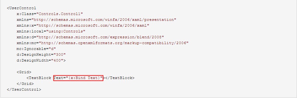
1、先从win10新增的{x:Bind}绑定方式说起,相对于{Binding},{x:Bind}在时间复杂度和空间复杂度上都要降低不少。但并不是说{x:Bind}能够完全取代{Binding},因为{x:Bind} 比 {Binding} 少了许多功能,例如 Source、UpdateSourceTrigger等,并且不支持后台C#代码编写,所以使用者还是要根据自己的需求来选择用哪种方式,下面是Control1的简单实现
Control1.xaml
<UserControl
    x:Class="Controls.Control1"
    xmlns="http://schemas.microsoft.com/winfx/2006/xaml/presentation"
    xmlns:x="http://schemas.microsoft.com/winfx/2006/xaml"
    xmlns:local="using:Controls"
    xmlns:d="http://schemas.microsoft.com/expression/blend/2008"
    xmlns:mc="http://schemas.openxmlformats.org/markup-compatibility/2006"
    mc:Ignorable="d"
    d:DesignHeight="300"
    d:DesignWidth="400">

    <Grid>
        <TextBlock Text="{x:Bind Text}"></TextBlock>
    </Grid>
</UserControl>
Control1.xaml.cs
using Windows.UI.Xaml.Controls;

// The User Control item template is documented at http://go.microsoft.com/fwlink/?LinkId=234236

namespace Controls
{
    public sealed partial class Control1 : UserControl
    {
        public Control1()
        {
            this.InitializeComponent();
        }

        public string Text { set; get; }
    }
}
使用方式
<Page
    x:Class="Controls.MainPage"
    xmlns="http://schemas.microsoft.com/winfx/2006/xaml/presentation"
    xmlns:x="http://schemas.microsoft.com/winfx/2006/xaml"
    xmlns:local="using:Controls"
    xmlns:d="http://schemas.microsoft.com/expression/blend/2008"
    xmlns:mc="http://schemas.openxmlformats.org/markup-compatibility/2006"
    mc:Ignorable="d"
    xmlns:controls="using:Controls">

    <StackPanel Background="{ThemeResource ApplicationPageBackgroundThemeBrush}" Margin="40">
        <controls:Control1 Text="这是控件1"></controls:Control1>
    </StackPanel>
</Page>
值得一提是{x:Bind}在DataTemplate中绑定时是需要指定类型的(x:DataType),并且Mode默认是OneTime,所以使用者如果有需要千万不要忘了改成Mode=OneWay或者Mode=TwoWay
<DataTemplate x:DataType="model:Student">
        <TextBlock Text="{x:Bind Name}"></TextBlock>
        <TextBlock Text="{x:Bind Age}"></TextBlock>
</DataTemplate>
2、{Binding}绑定方式,大家应该比较熟悉了,它提供了丰富的绑定功能,绑定方式也比较灵活,闲话不多说啦,下面的Control2和Control3的实现
TextVisibilityConverter.cs


using System;
using System.Collections.Generic;
using System.Linq;
using System.Text;
using System.Threading.Tasks;
using Windows.UI.Xaml;
using Windows.UI.Xaml.Data;

namespace Controls.Common
{
    public class TextVisibilityConverter : IValueConverter
    {
        public object Convert(object value, Type targetType, object parameter, string language)
        {
            if(value is string)
            {
                var text = value as string;

                if(string.IsNullOrEmpty(text))
                {
                    return Visibility.Collapsed;
                }
                else
                {
                    return Visibility.Visible;
                }
            }

            return Visibility.Visible;
        }

        public object ConvertBack(object value, Type targetType, object parameter, string language)
        {
            throw new NotImplementedException();
        }
    }
}
Control2.xaml
<UserControl
    x:Class="Controls.Control2"
    xmlns="http://schemas.microsoft.com/winfx/2006/xaml/presentation"
    xmlns:x="http://schemas.microsoft.com/winfx/2006/xaml"
    xmlns:local="using:Controls"
    xmlns:converter="using:Controls.Common"
    xmlns:d="http://schemas.microsoft.com/expression/blend/2008"
    xmlns:mc="http://schemas.openxmlformats.org/markup-compatibility/2006"
    mc:Ignorable="d"
    d:DesignHeight="300"
    d:DesignWidth="400">
    <UserControl.Resources>
        <converter:TextVisibilityConverter x:Name="TextVisibilityConverter"></converter:TextVisibilityConverter>
    </UserControl.Resources>
    <Grid>
        <TextBlock Text="{Binding Text}" Visibility="{Binding Text,Converter={StaticResource TextVisibilityConverter}}"></TextBlock>
    </Grid>
</UserControl>
Control2.xaml.cs
using Windows.UI.Xaml;
using Windows.UI.Xaml.Controls;

// The User Control item template is documented at http://go.microsoft.com/fwlink/?LinkId=234236

namespace Controls
{
    public sealed partial class Control2 : UserControl
    {
        public Control2()
        {
            this.InitializeComponent();

            this.DataContext = this;
        }

        public string Text
        {
            get { return (string)GetValue(TextProperty); }
            set { SetValue(TextProperty, value); }
        }

        // Using a DependencyProperty as the backing store for Text.  This enables animation, styling, binding, etc...
        public static readonly DependencyProperty TextProperty =
            DependencyProperty.Register("Text", typeof(string), typeof(Control2), new PropertyMetadata(""));

    }
}
Control3.xaml
<UserControl
    x:Class="Controls.Control3"
    Name="uc"
    xmlns="http://schemas.microsoft.com/winfx/2006/xaml/presentation"
    xmlns:x="http://schemas.microsoft.com/winfx/2006/xaml"
    xmlns:local="using:Controls"
    xmlns:d="http://schemas.microsoft.com/expression/blend/2008"
    xmlns:mc="http://schemas.openxmlformats.org/markup-compatibility/2006"
    mc:Ignorable="d"
    d:DesignHeight="300"
    d:DesignWidth="400">

    <Grid>
        <TextBlock Text="{Binding ElementName=uc,Path=Text}"></TextBlock>
    </Grid>
</UserControl>
Control3.xaml.cs
using System;
using System.Collections.Generic;
using System.IO;
using System.Linq;
using System.Runtime.InteropServices.WindowsRuntime;
using Windows.Foundation;
using Windows.Foundation.Collections;
using Windows.UI.Xaml;
using Windows.UI.Xaml.Controls;
using Windows.UI.Xaml.Controls.Primitives;
using Windows.UI.Xaml.Data;
using Windows.UI.Xaml.Input;
using Windows.UI.Xaml.Media;
using Windows.UI.Xaml.Navigation;

// The User Control item template is documented at http://go.microsoft.com/fwlink/?LinkId=234236

namespace Controls
{
    public sealed partial class Control3 : UserControl
    {
        public Control3()
        {
            this.InitializeComponent();
        }

        public string Text { set; get; }
    }
}
大家可以看出Control2和Control3是有些微差别的:
Control2是通过 this.DataContext = this,然后将依赖属性(至于为什么是依赖属性,下面会有详细的介绍)绑到xaml页面的控件属性上
Control3的特点也不难发现,充分利用了{Binding}强大功能的一个小小角落;个人感觉应该提一下的是,如果Control3有一个叫做Control1属性,类型是Control1,我们可以把控件1绑到控件3上面去,这样我们就可以在控件3里访问控件1啦,这个只是{Binding}灵活运用的一个例子
<controls:Control1 x:Name="ctr1" Text="这是控件1"></controls:Control1>
<controls:Control3 Control1="{Binding ElementName=ctr1}"></controls:Control3>
3、通过依赖属性的PropertyChangedCallback来实现对控件属性赋值,请看示例Control5
Control5.xaml
<UserControl
    x:Class="Controls.Control5"
    xmlns="http://schemas.microsoft.com/winfx/2006/xaml/presentation"
    xmlns:x="http://schemas.microsoft.com/winfx/2006/xaml"
    xmlns:local="using:Controls"
    xmlns:d="http://schemas.microsoft.com/expression/blend/2008"
    xmlns:mc="http://schemas.openxmlformats.org/markup-compatibility/2006"
    mc:Ignorable="d"
    d:DesignHeight="300"
    d:DesignWidth="400">

    <Grid>
        <TextBlock Name="txt"></TextBlock>
    </Grid>
</UserControl>
Control5.xaml.cs
using Windows.UI.Xaml;
using Windows.UI.Xaml.Controls;

// The User Control item template is documented at http://go.microsoft.com/fwlink/?LinkId=234236

namespace Controls
{
    public sealed partial class Control5 : UserControl
    {
        public Control5()
        {
            this.InitializeComponent();
        }

        public string Text
        {
            get { return (string)GetValue(TextProperty); }
            set { SetValue(TextProperty, value); }
        }

        // Using a DependencyProperty as the backing store for Text.  This enables animation, styling, binding, etc...
        public static readonly DependencyProperty TextProperty =
            DependencyProperty.Register("Text", typeof(string), typeof(Control5), new PropertyMetadata("", OnTextChanged));

        private static void OnTextChanged(DependencyObject d, DependencyPropertyChangedEventArgs e)
        {
            var me = d as Control5;
            me.OnTextChanged();
        }

        private void OnTextChanged()
        {
            var text = txt.Text = this.Text;

            if (string.IsNullOrEmpty(text))
            {
                txt.Visibility = Visibility.Collapsed;
            }
            else
            {
                txt.Visibility = Visibility.Visible;
            }
        }
    }
}
不用通过任何绑定,就可以实现数据赋值,好处在于更加灵活,实现了与Control2同样的功能,您会不会觉得与使用Converter相比,这样写更加直观和舒服呢,而且很多复杂的功能都可以在OnTextChanged里面处理。当然,并不是说Converter是多余的,如果仅限于“值”的转换,Converter还是很方便的,而且还可以重用。
如果我们增加一个属性TextMaxLength,用来表示最多可显示的字符数,这样我们把Control5做一下改装
Control5.xaml
<UserControl
    x:Class="Controls.Control5"
    xmlns="http://schemas.microsoft.com/winfx/2006/xaml/presentation"
    xmlns:x="http://schemas.microsoft.com/winfx/2006/xaml"
    xmlns:local="using:Controls"
    xmlns:d="http://schemas.microsoft.com/expression/blend/2008"
    xmlns:mc="http://schemas.openxmlformats.org/markup-compatibility/2006"
    mc:Ignorable="d"
    d:DesignHeight="300"
    d:DesignWidth="400">

    <StackPanel>
        <TextBlock Name="txt"></TextBlock>
        <TextBlock><Run Text="最多可显示"></Run><Run x:Name="run1" Foreground="Red"></Run><Run Text="个字符"></Run></TextBlock>
        <TextBlock><Run Text="还有"></Run><Run x:Name="run2" Foreground="Blue"></Run><Run Text="个字符可以显示"></Run></TextBlock>
    </StackPanel>
</UserControl>
Control5.xaml.cs
using Windows.UI.Xaml;
using Windows.UI.Xaml.Controls;

// The User Control item template is documented at http://go.microsoft.com/fwlink/?LinkId=234236

namespace Controls
{
    public sealed partial class Control5 : UserControl
    {
        public Control5()
        {
            this.InitializeComponent();
        }

        public int TextMaxLength
        {
            get { return (int)GetValue(TextMaxLengthProperty); }
            set { SetValue(TextMaxLengthProperty, value); }
        }

        // Using a DependencyProperty as the backing store for TextMaxLength.  This enables animation, styling, binding, etc...
        public static readonly DependencyProperty TextMaxLengthProperty =
            DependencyProperty.Register("TextMaxLength", typeof(int), typeof(Control5),
                new PropertyMetadata(int.MaxValue, OnTextChanged));

        public string Text
        {
            get { return (string)GetValue(TextProperty); }
            set { SetValue(TextProperty, value); }
        }

        // Using a DependencyProperty as the backing store for Text.  This enables animation, styling, binding, etc...
        public static readonly DependencyProperty TextProperty =
            DependencyProperty.Register("Text", typeof(string), typeof(Control5),
                new PropertyMetadata("", OnTextChanged));

        private static void OnTextChanged(DependencyObject d, DependencyPropertyChangedEventArgs e)
        {
            var me = d as Control5;
            me.OnTextChanged();
        }

        private void OnTextChanged()
        {
            run1.Text = TextMaxLength.ToString();

            if (string.IsNullOrEmpty(this.Text))
            {
                txt.Visibility = Visibility.Collapsed;
            }
            else
            {
                txt.Visibility = Visibility.Visible;
                var len = this.Text.Length;
                if (len <= TextMaxLength)
                {
                    txt.Text = this.Text;
                    run2.Text = (TextMaxLength - len).ToString();
                }
                else
                {
                    txt.Text = this.Text.Remove(TextMaxLength);
                    run2.Text = "0";
                }
            }
        }
    }
}
使用方式
<Page
    x:Class="Controls.MainPage"
    xmlns="http://schemas.microsoft.com/winfx/2006/xaml/presentation"
    xmlns:x="http://schemas.microsoft.com/winfx/2006/xaml"
    xmlns:local="using:Controls"
    xmlns:d="http://schemas.microsoft.com/expression/blend/2008"
    xmlns:mc="http://schemas.openxmlformats.org/markup-compatibility/2006"
    mc:Ignorable="d"
    xmlns:controls="using:Controls">

    <StackPanel Background="{ThemeResource ApplicationPageBackgroundThemeBrush}" HorizontalAlignment="Center" Margin="40">
        <controls:Control5 x:Name="control5" TextMaxLength="10" Text="这是控件5"></controls:Control5>
    </StackPanel>
</Page>
运行结果

需求好无厘头啊,不过确实体现出了通过PropertyChangedCallback来处理实现两种或两种以上属性间“联动”(我给起的名字,具体意思就是多个属性联合在一起来实现某个功能,意会吧)情况的方便之处,在这里提醒一下大家,请尽量使用同一个PropertyChangedCallback来处理属性“联动”问题,否则可能会因为属性赋值先后问题,而导致出现各种“值”不一致的bug
4、{TemplateBinding}绑定方式实现自定义控件
用UserControl来制作自定义控件是一个很方便的做法,但是用来制作一些简单或者功能单一的那些最基本的自定义控件时,就显得有点大材小用了,同时UserControl也带来了许多多余的开销,这个时候就可以用另外一种方式来编写这样的控件了,我们可以通过看一下Control4的实现方式,来了解一下
Generic.xaml
<ResourceDictionary
    xmlns="http://schemas.microsoft.com/winfx/2006/xaml/presentation"
    xmlns:x="http://schemas.microsoft.com/winfx/2006/xaml"
    xmlns:controls="using:Controls">

    <Style TargetType="controls:Control4">
        <Setter Property="Template">
            <Setter.Value>
                <ControlTemplate TargetType="controls:Control4">
                    <Grid>
                        <TextBlock x:Name="txt" Text="{TemplateBinding Text}"></TextBlock>
                    </Grid>
                </ControlTemplate>
            </Setter.Value>
        </Setter>
    </Style>
</ResourceDictionary>
Control4.cs
using Windows.UI.Xaml;
using Windows.UI.Xaml.Controls;

namespace Controls
{
    public class Control4 : Control
    {
        TextBlock txt;

        public Control4()
        {
            DefaultStyleKey = typeof(Control4);
        }

        //public string Text { set; get; }


        public string Text
        {
            get { return (string)GetValue(TextProperty); }
            set { SetValue(TextProperty, value); }
        }

        // Using a DependencyProperty as the backing store for Text.  This enables animation, styling, binding, etc...
        public static readonly DependencyProperty TextProperty =
            DependencyProperty.Register("Text", typeof(string), typeof(Control4), new PropertyMetadata(""));


        protected override void OnApplyTemplate()
        {
            base.OnApplyTemplate();

            txt = GetTemplateChild("txt") as TextBlock;
        }
    }
}
这种实现方式有几个特点:
a)Generic.xaml文件要放在主项目的根目录下的一个叫做“Themes”的文件夹下,如果没有“Themes”文件夹,可以自己创建一个
b)构造函数里不能缺少DefaultStyleKey = typeof(Control4)
c)您需要对控件的生命周期有一定的了解,因为在不同的时期txt有可能为null
d)所有的绑定方式都是TemplateBinding,当然你也可以用txt.Text=Text来赋值,但是在这之前最好能确定txt不为空
一般在重写控件时使用的比较多例如重写Button、ListView等,您可以到系统的“C:\Program Files (x86)\Windows Kits\10\DesignTime\CommonConfiguration\Neutral\UAP\{版本号比如 10.0.10586.0}\Generic\generic.xaml”里找到这些控件的样式,可以根据视觉需求对控件样式做一些修改,也可以增加一些自定义的功能
5、比较一下
把这5个控件放到一起比较一下
MainPage.xaml
<Page
    x:Class="Controls.MainPage"
    xmlns="http://schemas.microsoft.com/winfx/2006/xaml/presentation"
    xmlns:x="http://schemas.microsoft.com/winfx/2006/xaml"
    xmlns:local="using:Controls"
    xmlns:d="http://schemas.microsoft.com/expression/blend/2008"
    xmlns:mc="http://schemas.openxmlformats.org/markup-compatibility/2006"
    mc:Ignorable="d"
    xmlns:controls="using:Controls">

    <StackPanel Background="{ThemeResource ApplicationPageBackgroundThemeBrush}" HorizontalAlignment="Center" Margin="40">
        <controls:Control1 x:Name="control1" Text="这是控件1"></controls:Control1>
        <controls:Control2 x:Name="control2" Text="这是控件2"></controls:Control2>
        <controls:Control3 x:Name="control3" Text="这是控件3"></controls:Control3>
        <controls:Control4 x:Name="control4" Text="这是控件4"></controls:Control4>
        <controls:Control5 x:Name="control5" Text="这是控件5"></controls:Control5>
        <TextBox Name="txt"></TextBox>
        <Button Click="Button_Click">update</Button>
    </StackPanel>
</Page>
MainPage.xaml.cs
using Windows.UI.Xaml;
using Windows.UI.Xaml.Controls;

// The Blank Page item template is documented at http://go.microsoft.com/fwlink/?LinkId=402352&clcid=0x409

namespace Controls
{
    /// <summary>
    /// An empty page that can be used on its own or navigated to within a Frame.
    /// </summary>
    public sealed partial class MainPage : Page
    {
        public MainPage()
        {
            this.InitializeComponent();
        }

        private void Button_Click(object sender, RoutedEventArgs e)
        {
            control1.Text = txt.Text;
            control2.Text = txt.Text;
            control3.Text = txt.Text;
            control4.Text = txt.Text;
            control5.Text = txt.Text;
        }
    }
}
运行结果
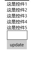
看上去这些控件都没有问题,但是如果我们在TextBox中输入内容,然后update一下,再看一下结果
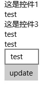
我们发现Control1和Control3的值没有更新,问题到底出在哪呢?仔细检查一下会发现这俩个控件的Text属性是普通属性(public string Text { set; set; }),依赖属性是有通知属性变更的能力的,而普通属性是不具备这个能力的,所以我们需要控件继承INotifyPropertyChanged接口,于是我们将Control1.xaml.cs作如下变更,Control3也如Control1一样
using System.ComponentModel;
using System.Runtime.CompilerServices;
using Windows.UI.Xaml.Controls;

// The User Control item template is documented at http://go.microsoft.com/fwlink/?LinkId=234236

namespace Controls
{
    public sealed partial class Control1 : UserControl, INotifyPropertyChanged
    {
        public event PropertyChangedEventHandler PropertyChanged;

        public void RaisePropertyChanged([CallerMemberName]string propertyName = null)
        {
            var handler = PropertyChanged;

            if (handler != null)
                handler(this, new PropertyChangedEventArgs(propertyName));
        }

        public Control1()
        {
            this.InitializeComponent();
        }

        private string text;

        public string Text
        {
            get
            {
                return text;
            }
            set
            {
                text = value;
                RaisePropertyChanged();
            }
        }
    }
}
现在我们再来看一下运行结果
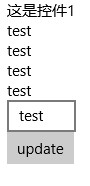
Control3是可以了,可是为什么Control1还是不能更新呢,why?让我们来重新看一下Control1的code,原来问题出现在这里
前面我们说过{x:Bind}的默认Mode是OneTime,所以我们需要把它改成OneWay
<UserControl
    x:Class="Controls.Control1"
    xmlns="http://schemas.microsoft.com/winfx/2006/xaml/presentation"
    xmlns:x="http://schemas.microsoft.com/winfx/2006/xaml"
    xmlns:local="using:Controls"
    xmlns:d="http://schemas.microsoft.com/expression/blend/2008"
    xmlns:mc="http://schemas.openxmlformats.org/markup-compatibility/2006"
    mc:Ignorable="d"
    d:DesignHeight="300"
    d:DesignWidth="400">

    <Grid>
        <TextBlock Text="{x:Bind Text,Mode=OneWay}"></TextBlock>
    </Grid>
</UserControl>
再来不厌其烦地看一下结果

Great!用螺丝钉们经常说的一句话叫“大功告成”。:-D
题外话,给大家出个谜语,猜一猜下面的程序运行结果是多少?
for (var i = 0; i < 10; i++)
{
    await Dispatcher.RunAsync(Windows.UI.Core.CoreDispatcherPriority.Normal, async () =>
    {
        await Dispatcher.RunAsync(Windows.UI.Core.CoreDispatcherPriority.Normal, () =>
        {
            Debug.WriteLine(i);
        });
    });
}

 浙公网安备 33010602011771号