如果给你这样一张原型图,需求是根据某个区域生产的某一大类产品的生产起始日期,用可视化的时间轴来展示,你第一时间会想到用什么办法去实现?
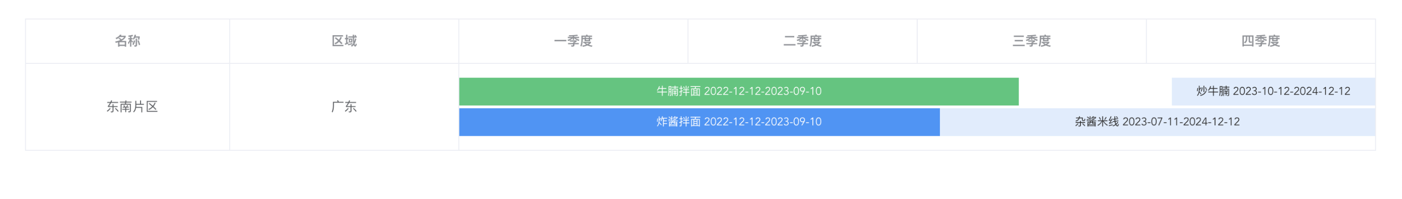
图1
相关解释:片区下面有多个省份,这里只拿一个来举例子。一到四季度的单元格里面的每一行表示某一种大类的产品名称,例如:牛腩(第一行)、杂酱(第二行);这里无需关心这些条状背景颜色后面的特殊含义
 ̄□ ̄ 刚拿到这张图片时我又有点手足无措,懒羊羊的我第一时间肯定是想找现成的组件来完成(因为不想自己去计算宽度和边距),盯着图看了半天,横看竖看,(内心暗喜),于是打开了echarts官网,用我近视500多度的眼睛迅速浏览大佬给的demo
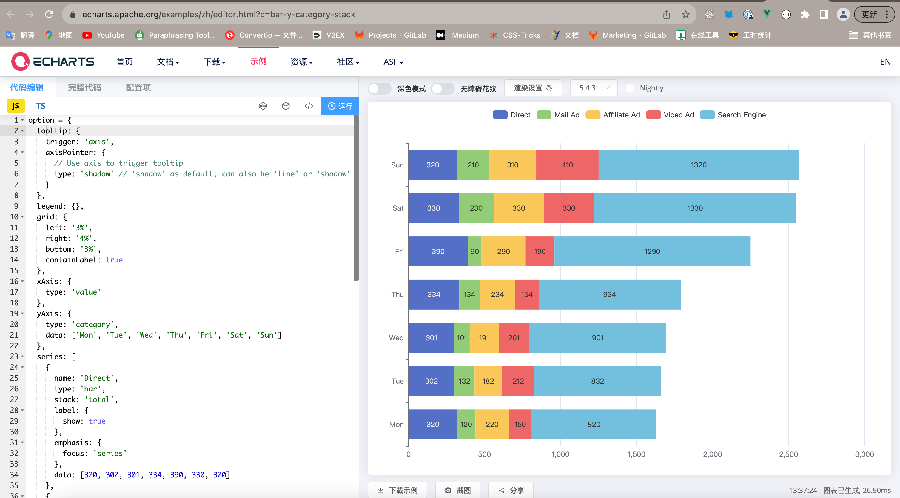
图2
嘿嘿,看着很像哦!开撸~ 【这里浅浅记录一下过程,虽然最后实现的效果不符合实际的需求😅】
查看令我伤心的代码
第一步要给echart图表安置不同的dom元素
// 因为会嵌套多个图,这里采用了动态构造元素id的方式
<el-table-column
        label="地址">
        <template slot-scope="scope">
          <div class="chart-box">
             <div :id="'chart'+scope.row.id" class="chart-box"></div>
          </div>
        </template>
      </el-table-column>
- 构造自己想要的数据结构类型(mock数据)
这里只对我用到的一些配置项写了注释,更多配置项可阅读官网配置项手册
option = {
	// 图例,即图2图表最上方那一排
 export default {
    tooltip: {
        show:false, // 控制图例的展示
        trigger: 'axis',
        axisPointer: {
        // Use axis to trigger tooltip
            type: 'line' // 'shadow' as default; can also be 'line' or 'shadow'
      }
    },
    legend: {
        show:false
    },
    grid: {
        show:false,
        left: 1,
        top:"top",
        right: 0,
        bottom: 5,
        containLabel: true,
        tooltip:{
            show:false
        }
    },
    xAxis: {
        type: 'value', // 注意x轴表示数值了
        show:false,
        axisLine:{ // 坐标轴
            show:false
        },
        axisTick:{ // 刻度线
            show:false
        },
        axisLable:{ // 刻度线
            show:false
        },
        min:0,
        max:366, // 可以动态获取一年的天数
    },
    // yAxis的 data里面每一个元素代表一种产品
    yAxis: {
      show:false,
      type: 'category', // y轴表示类目
      data: ['Mon', 'Tue', 'Wed'], // 纵坐标
      axisLine:{
        show:false
      }
    },
    series: [
        // 可以把产品名称、时间段信息存在name字段里面
      {
        name: '可销售', //*
        type: 'bar',
        stack: 'total',
        label: {
          show: true,
          formatter: function(params) { //自定义柱状图里面显示的文字内容
            // console.log(params);
            // params 包含了标签相关的信息
            // params.value 为柱状图对应的数据值
            return  `${params.seriesName}【${params.value}】`;
        },
        color:"#FFFFFF", // 文字颜色
        },
        itemStyle:{
            color:"#3296FA", // 柱状条颜色
        },
        emphasis: {
          focus: 'none'
        },
        // data里面的每一个元素对应上面yAxis的 data里面的每一个元素【竖着看】
        data: [49, 120, 10],
        barWidth:20,  // 柱状条的宽度
      },
      {
        name: '临期',
        type: 'bar',
        stack: 'total',
        label: {
          show: true,
          color:'#FFFFFF '
        },
        itemStyle:{
            color:"#35C779"
        },
        emphasis: {
          focus: 'none'
        },
        data: [8,300,40],
        barWidth:20,
        barGap: 10,
        barCategoryGap:10
      },
      {
        name: '计划生产',
        type: 'bar',
        stack: 'total',
        // 设置柱状条颜色
        itemStyle:{
            color:"#DEECFE"
        },
        label: {
          show: true,
          color:'#323232'
        },
        emphasis: {
          focus: 'none'
        },
        barWidth:20,
        data: [99,0,200],
      }
    ]
  };
options准备好了,接下来就是把数据塞进每一个echarts实例中。
<script>
// 引入echarts ,不同版本的引入方式可能有区别,我的是5.+,其他版本请问度娘👻
import * as echarts from "echarts"
import options from "../test/options.js"
export default {
      data() {
        return {
		 tableData: [{
            id:1,
            date: '2016-05-02',
            name: '王小虎',
            address: '上海市普陀区金沙江路 1518 弄'
          }
          ],
          options,
        }
      },
      methods:{
	    // 生成多个chart实例
            generChart(){
              if(this.tableData.length==0) return;
			  // 根据表单数据来创建echarts实例
              this.tableData.forEach(item=>{
                let domId=`chart${item.id}`; // 动态获取id
                this.initChart(domId); // 初始化实例
              })
            },

            initChart(domId){
              var chartDom = document.getElementById(domId);
              var myChart = echarts.init(chartDom);
              // 监听柱状图的点击事件
              myChart.on('click', function (params) {
                // 产品名称(params.name)、图例名称(params.seriesName)、数值(params.value)
                  console.log(params.name,params.seriesName,params.value);

                  // 在这里处理点击事件的逻辑

                  // console.log('数据值:', params.value); // 点击的柱状图的数据值
              });
			  // 实际情况需要根据接口返回数据去构造options,这里复用了同一个options
                 this.options && myChart.setOption(this.options);
            },
      },
      mounted(){
        this.$nextTick(()=>{ //  为了保证能够获取到动态渲染的dom元素,需要放在这个钩子函数里面【涉及到vue dom更新相关知识】
          this.generChart();
        })
      },

    }
</script>
好了,跑一下看看效果呢
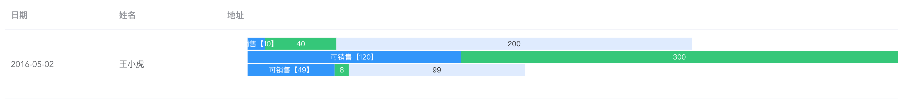
图3
🤔和图1长得差不多嘛 但总觉得哪里不对呢🤔🤔
后来仔细想了想,二维坐标下柱状图只能表示x和y轴两个维度上数据的一些关联,无法再描述其他维度,即无法量化离起点(这里是指图1的一季度开始的时间)的距离。😠得儿,等于说白干了呗(开摆)
🌚看来还是得自己计算了 谁怕谁!
仔细观察其实可以发现图1一到四季度的单元格可以使用二维数组来实现(即双重v-for来实现),而只需要将每一小块儿柱状图看做是一个基本单元【下文用CustomBar代替】,即可轻松(也不轻松😅)实现
- 准备渲染模板、数据结构。 .row采用相对定位,其子组件.row-item采用绝对定位。根据时间跨度算出时间差、开始时间距离1月1日的天数即可实现在时间轴上的定位
查看代码
// index.vue
<template>
 <el-table-column prop="test" label="一季度"  align="center" >
        <template slot-scope="scope">
          <div class="box" ref="chartContainer" style="'padding':0px;position: relative;">
            <!-- 行 -->
            <div v-for="(product,index) in scope.row.productList" :key="index" class="row">
              <!-- 每一个小的柱状图单元
			  	1. info 时间跨度、名称等其他相关信息
				2.父盒子的宽度,即.row的宽度
			  -->
              <CustomBar v-for="(item,i) in product" :key="i" class="row-item" :parentWidth="chartContainerWidth" :info="item" >
              </CustomBar>
            </div>
          </div>
        </template>
      </el-table-column>
</template>
// table绑定的数据
 tableData: [
          {
          id: '1',
          name: '东南片区',
          province:"广东",
          productList:[
                // 代表一种产品
                [
                {
                  content:"牛腩拌面 2022-12-12-2023-09-10",
                  dateRange:[1670774400000,1691769600000],
                  collectTag:2
                },
                {
                  content:"炒牛腩 2023-10-12-2024-12-12",
                 dateRange:[1697040000000,1733932800000],
                  collectTag:3
                },
                ],
                 [
                {
                  content:"炸酱拌面 2022-12-12-2023-09-10",
                  dateRange:[1670774400000,1691769600000],
                  collectTag:1
                },
                {
                  content:"杂酱米线 2023-07-11-2024-12-12",
                  dateRange:[1689047293000,1733932800000],
                  collectTag:3
                },
                ],
          ]
        },
      ],
- 给CustomBar组件传递宽度,需要监听窗口宽度的变化
查看代码
// index.vue
<script >
import CustomBar from '@/components/progressBar.vue'
export default{
    data(){
        return{
      // 四个季度合并之后单元格的长度
      chartContainerWidth:0,
     }
    },
    methods: {
	// el-table 合并单元格的方法
      arraySpanMethod({ row, column, rowIndex, columnIndex }) {
        if(columnIndex >1){ // 合并四个季度
          return [1,4]
        }
      },
      // 防抖【封装需注意this的指向】
      myDebunce(time){
        let timer=null;
        return ()=>{
            if(timer) clearTimeout(timer);
            timer=setTimeout(()=>{
                // 保存宽度
                this.chartContainerWidth=this.$refs.chartContainer.offsetWidth;
            },time)
        }
      }
    },
    mounted(){
      this.$nextTick(()=>{ // 保证dom已经更新
        // 初始化页面需要获取一下宽度
         this.chartContainerWidth=this.$refs.chartContainer.offsetWidth;
          window.addEventListener("resize",this.myDebunce(200));
      })

    },
    beforeDestroy(){
      window.removeEventListener("resize",this.myDebunce(200));
    },
    components:{
      CustomBar
    }
}
</script>
- 实现CustomBar里面的逻辑
查看代码
// progressBar.vue
<template>
    <div class="bar"
    :style="{
        'background-color': getBgColor(info.collectTag),
        'width':getBarWidth,
        'color':getFontColor(info.collectTag),
        'left':getLeft
        }" :title="info.content">
    {{info.content}}
  </div>

</template>
<script>
....
// 属性
 props:{
        info:{
            type:Object
        },
        parentWidth:{
            type:Number
        }
    },
....
</script>

<style>
.bar{
    height: 30px; // 高度是必须的,不然撑不开
    font-size: 12px;
    line-height: 30px;
    position: absolute; // 必须的
}
</style>
最重要的就是计算宽度和左边距的两个方法,因为都依赖parentWidth属性,所以放到了computed里面
getBarWidth(){
const dateRange=this.info.dateRange;
let days=getDays(dateRange[0],dateRange[1]); // 获取开始日期与截止时间相差的天数【转换为Date对象进行运算(毫秒),然后再除以一个天数的进制】
let unit=this.parentWidth/ this.totalDays // 计算单位像素表示的天数
return `${days*unit}px`;
},
getLeft(){
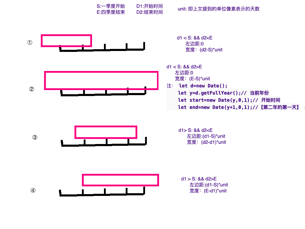
let [d1,d2]=this.info.dateRange
let passedDays=getDiffDays(d1); // 计算开始时间距离1月1日(一季度开始)的天数,和上面的思路相似
let marginLeft=`0px`;
if(passedDays>0){ // 开始时间在今年内
let unit=this.parentWidth/this.totalDays;
marginLeft=`${passedDays*unit}px`
}
// 开始时间早于今年,左边距直接为0****
return marginLeft;
}
注意:计算相隔天数可能有四种情况 后面再考虑有没有更简单的办法计算
图4
😇 嘿嘿,到这里已经基本实现想要的功能了,最后贴上效果图
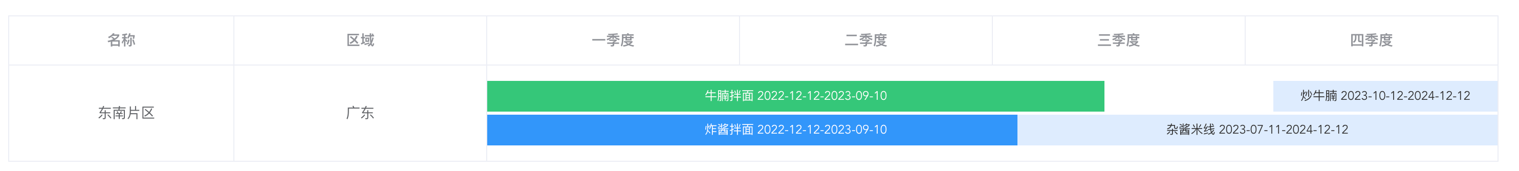
图5

 浙公网安备 33010602011771号