


PS网页设计教程XIX——在Photoshop中创建一个优雅的作品集的网页布局
 本篇的教程主要体现在2个方面,一个是中间的图片滑动栏很有特色,加了不常见的光泽效果以及3D效果。二是整个页面的颜色用的少,用的巧,很多元素的颜色都是通过修改不透明度来达到效果。这样,如果整个页面要更改色系的话,只需更改背景色和文字的颜色即可。网页的复用度比较高。
作为编码者,美工基础是偏弱的。我们可以参考一些成熟的网页PS教程,提高自身的设计能力。套用一句话,“熟读唐诗三百首,不会作诗也会吟”。
本系列的教程来源于网上的PS教程,都是国外的,全英文的。本人尝试翻译这些优秀的教程。因为翻译能力有限,翻译的细节上还有待推敲,希望广大网友不吝赐教。
约定:
1、本文的软件是Photoshop CS5版本
2、原教程的截图是英文的,本人在重新制作的基础上,重新截了中文版的图
3、原文中有些操作没有给出参数。本人在反复测试的情况下测定了一些参数,以红色的文字显示。有些错误的参数,直接以红色文字显示正确的参数
例如:(90,22,231,77),表示矩形的左上角的坐标是(90,22),宽231,高77
例如:(90,22),表示矩形的左上角的坐标是(90,22),矩形的其他两个参数教程里已经指定
4、在教程的最后会附上本人的心得。有些是对教程中的一些步骤的优化等。
In this Photoshop web design tutorial, I would like to show you how to create a clean and elegant portfolio web layout that has numerous areas for common content types such as an area that displays a blog post excerpt, a nice image slider for featured works, social media information, and a thumbnail gallery. We will cover plenty of professional-grade web designing techniques in this Photoshop tutorial.
在本Photoshop网页设计教程中,我想向您展示了如何创建一个干净,优雅的作品集布局。有许多领域常见的内容区域,如显示博客文章摘录特色的作品,一个漂亮的图像滑块,社会化媒体的信息,和缩略图画廊。在这个Photoshop教程中,我们将涉及大量的专业级的网页设计技术。
Step 1: Create a New Document
步骤1:新建文档
Start by creating a new document (Ctrl/Cmd + N) in Photoshop. Make the document 1000px by 1000px and with a White background.
先在PS中新建一个文档(Ctrl/Cmd + N)。文档的尺寸:1000px*1000px,用白色的背景

Step 2: Add Photoshop Guides
步骤2:添加PS的参考线
Now add guides on the canvas in order to ensure proper alignment of the various web layout components. You can create guides accurately by going to View > New Guide.
现在在画布上添加参考线,以确保正确对齐的各种网页布局的组件。您可以精确的创建参考线,点击:查看 > 新建参考线。
Create vertical guides at 50px, 500px and 950px.
你可以在50px、500px、950px处创建垂直参考线
Create horizontal guides at 75px, 467px, 651px and 943px.
你可以在75px、467px、651px、943px处创建水平参考线

Step 3: Creating the Background
步骤3:创建背景
Double-click on the default Background layer, which will be locked and uneditable; the New Layer dialog window will open. I renamed the layer to "BG" and then pressed OK. Doing this also unlocks the Background layer, making it editable.
双击默认的背景图层,原本是锁定的和不能编辑的;新建图层的窗口会被打开。我重命名该图层为BG,并按确定。做这些是为了解锁背景图层,使得其能编辑。
Let’s create a new group called "Background" (Layer > New > Group) that will contain all layers associated with our layout’s background. Move the "BG" layer into this group.
新建组Background(图层 > 新建 > 组),将会包含所有布局的背景。移动BG层到该组中
Now, set your foreground color to teal (#547980) and fill your "BG" layer with the foreground color by pressing Alt/Option + Backspace.
现在,设置你的前景色为蓝绿色(#547980),并按Alt/Option + Backspace用前景色填充BG图层

Now add some noise to our background by going to Filter > Noise > Add Noise. In the Add Noise dialog window, set the Amount to 1%, Distribution to Uniform and check the Monochromatic option. Click OK to apply the filter.
现在给背景添加一些杂色,点击:滤镜 > 杂色 > 添加杂色。在添加杂色的窗口里,设置数量为1%,分布选择平均分布,并勾选上单色

Now set your foreground color to black (#000000), create a new layer (Shift + Ctrl/Cmd + N) and name it "Dark sections".
设置前景色为黑色(#000000),创建一个新图层(Shift + Ctrl/Cmd + N),并命名为Dark sections
Reach for the Rectangular Marquee Tool (M), select the top part of the canvas (use our guides to make the proper selection), and press Alt/Option + Backspace to fill the selected area with our black foreground color.
用矩形选框工具(M),在画布上选择最上面的部分(使用我们的参考线做出正确的选择),按Alt / Option + Backspace键用黑色前景色填充所选的区域。
Repeat the process for the middle section and bottom section so that you end up with three horizontal bars running across the canvas.
重复同样的过程在中部的选区和底部的选区,在结束的时候你有3个水平的区块穿越整个画布

Now reduce the "Dark sections" layer’s Opacity to 15%.
现在调整Dark sections图层的不透明度为15%

Step 4: Creating Inset Divider Lines
步骤4:创建内陷分隔线
Now create a new group inside the "Background" layer group, above the "BG" and "Dark sections" layers. Let us call this group "Lines".
在Background组中创建新组,在BG和Drak sections图层的上方。让我们命名它为Line
Create a new layer inside the group called "Dark". Make sure that your foreground color is still set to black (#000000) and, with the Pencil Tool (B) set at 1px Master Diameter, draw a solid horizontal line above the first guide at the top.
在组中创建新的图层,命名为Dark。确保你的前景色仍然是黑色(#000000),用主直径为1px铅笔工具在顶部的第一条水平参考线的上面画一条水平线(下图是放大到800%的图)
也可以用直线工具画一条水平线(0,74,1000,1),颜色: #000000

Create another layer inside the "Line" group named "Bright". Change your foreground color to white (#FFFFFF) and use the Pencil Tool again to draw a line right below the black one.
在Line组中创建另一个图层命名为Bright。改变你的前景色为白色(#FFFFFF),用铅笔工具在黑色的直线的下方画一条水平线(下图是放大到800%的图)
也可以用直线工具画一条水平线(0,75,1000,1),颜色: #FFFFFF

Collapse the "Line" group by clicking on the small triangle next to the group’s name so that we’re keeping our Layers Panel manageable. Reduce the group’s Opacity to 12%.
点击组名前面的小三角收起Line组,保持我们的图层面板可管理的。调整组的不透明度为12%(下图是放大到800%的图)

Now duplicate the "Line" group (right-click on it in the Layers Panel and choose Duplicate Group from the contextual menu that appears) and rename the duplicate to "Line 2".
复制Line组(在图层面板上右键在出现的菜单中选择复制组),然后命名复制的组为Line 2
Move "Line 2" on our second horizontal guide using the Move Tool (V).
用移动工具移动Line 2到第二条水平参考线
Repeat the above method for creating two more inset divider lines on the 3rd and 4th horizontal guides.
重复上面的方法创建2条内陷分割线在第3条和第4条的水平参考线

Step 5: Create the Layout’s Header
步骤5:创建布局的头部区域
Before we go on, I would like to note that in this layout, we will be working with plenty of layers, which is good so that our work is flexible. However, this also leads to a Layers Panel that can become quite large and unwieldy. Therefore, whenever we are finished with a component of our web design, we should collapse its layer group as well as ensure that we are naming our layers and layer groups intuitively. So let’s go ahead and collapse the "Background" group since we are now done with that component.
在我们继续之前,我想请注意,在这种布局中,我们将使用大量的层,使我们的工作是灵活的,这是很好的。然而,这也导致到图层面板中可能会变得非常庞大和笨重。因此,每当我们完成了我们的网页设计的一个组成部分,我们应该折叠组以确保我们能直观地命名图层和组。所以,让我们继续前进,因为我们现在完成了背景和折叠Background组。
Create a new layer group called "Header" on top of the "Background" group.
在Background组的上方创建新组Header
Let us make the site’s logo — it will simply be a text-based logo that has a slick and stylish layer style. To begin, choose the Horizontal Type Tool (T) and set it to Lobster font at 36pt. Set the text color to light green (#E5FCC2) then write your site name. In this instance I wrote, "Instruct portfolio".
让我们创建网站的LOGO——这是非常简单的文字LOGO,拥有光滑的和时尚的图层样式。一开始,选择水平文字工具(T),设置字体为Lobster,36pt。设置文字的颜色为亮绿色(#E5FCC2),然后书写你的网站的名字。在本实例中,我写Instruct portfolio

With the text layer selected in the Layers Panel, go to Layer > Layer Style > Blending Options. We will give our logo a Drop Shadow, Gradient Overlay, and Stroke.
在图层面板里选择文字图层,点击:图层 > 图层样式 > 混合选项。我们要给我们的LOGO添加投影、渐变叠加、和描边的图层样式


渐变编辑器,黑白的分界线为53%的位置


The following image shows the result of our layer style. Quick and simple, but beautiful, don’t you think?
下面的图像显示了添加图层样式后的结果。快速简单,但是美丽,你不这样认为么?

Use the Horizontal Type Tool again for writing out the main navigation menu items. This time, set your text color to a light green color (#E5FCC2) and font size at 18pt. I wrote "Home", "About", "Blog", "Work", and "Contact" — but of course, you should feel free to write out other links.
再次用水平文字工具书写主导航菜单的文字。这次,设置你的文字的颜色为亮绿色(#E5FCC2),字号18pt。我写Home、About、Blog、Work、Contact——当然,你可以自由的写一些其他的链接
Once done, use the Move Tool (V) to place the navigation menu text at the top right side of the header area.
当做完的时候,用移动工具摆放导航菜单到顶部头部区域的右边

We will copy the layer style we applied to the logo to the navigation menu text. Right-click on the "Instruct portfolio" layer in the Layers Panel and choose Copy Layer Style from the menu that appears. Next, right-click on the navigation menu text layer and choose Paste Layer Style.
我们要复制LOGO的图层样式到导航菜单。在图层面板中的Instruct portfolio图层上右键,在出现的菜单中选择拷贝图层样式。接下来,在导航菜单文本的图层上右键选择粘贴图层样式

Now we will create the active link’s background to indicate what page the user is on. It can also serve as our hover state (i.e. we display it when the user mouses over an inactive link).
现在要创建活动链接的背景来显示用户在哪个页面上。他也能表示页面的悬停状态(即我们鼠标移到非活动链接上的时候显示)
Create a new layer called "Button" (because the active link item’s background looks like a UI button). This layer should be beneath the navigation menu text layer because it will act as its background.
创建新的图层Button(因为是活动链接的背景看起来像是一个UI按钮)。该图层在导航菜单文字的下方,因为它像是链接的背景。
Select the Rounded Rectangle Tool (U), set the Radius to 5px and draw the button behind your text. Shown below is the active link’s background shape drawn behind the "Home" navigation menu text.
选择圆角矩形工具(U),设置半径为5px,并在文字的后面绘制按钮。如下所示,活动链接的背景绘制在Home导航菜单文本的后面。

Double-click on the "Button" layer in the Layers Panel to access the Layer Style dialog window. Let’s give our active link’s background shape a Drop Shadow, Gradient Overlay and Stroke.
双击图层面板中的Button的图层打开图层样式窗口。给活动链接的背景添加投影、渐变叠加和描边的样式

渐变叠加的分界的位置是50%


After applying the layer style, simply lower the "Button" layer’s Opacity to 10%.
在添加完图层样式后,调低Button图层的不透明度为10%

Step 6: Create the "Featured Work" Area
步骤6:创建Featured Work区域
Time to move on to another component of our layout. Remember: Collapse the "Header" layer group in the Layers Panel so that it’s out of our way.
是时候移到另一个布局的组件。记住:收起图层面板中的Header图层组,表示已经离开我们的流程
Next, create a new layer group called "Work". This group will contain the featured works in a 3D image slider.
接下来,新建组Work。该组将包含一个3D图像滑动栏的Featured Work
What we want to do first is locate three images (look through your work and pick ones you like) and open them in Photoshop. For this tutorial, what I did was simply use the final results from several Web Design tutorials here on Design Instruct, namely:
首先确定要摆放的3张图片(看看你过去的工作,挑选中意的图片),并在PS中打开。在本教程,我最后要摆放的从Web Design上的教程的图片
Place your selected images inside the "Work" group as separate layers. Use Free Transform (Ctrl/Cmd + T) to resize the images as needed.
摆放你选中的图片在Work组中的单独的图层。用自由变形工具(Ctrl/Cmd + T)调整你的图片到合适的大小
Here is the first image placed at the middle of the canvas:
这是我的第一张图片摆放在画布的中央:(图片的大小为400px*300px,位置在(300,127))

Place the other two images below the middle image and at either sides of it.
摆放其他两张图片在中间的图片的下方的左右两侧
注:教程中没有交代两侧图片的摆放过程,这里补充完整
用矩形工具新建一个矩形(130,127,400,300),矩形在中间图片的下方

在PS中置入另一张图片,锁定纵横比,调整宽度为400px,图片的位置在(300,127)
![]()

在图片的图层上右键选择创建剪贴蒙版

选中矩形图层和图片图层,右键选择转换为智能对象,并在新的图层上右键选择栅格化图层,新的图层命名为Left Picture
用同样的方法在右侧摆放一张图片,矩形为(470,127,400,300),图片的位置为(470,127)

Click on the "Right picture" layer in the Layers Panel to make it our active layer. Go to Edit > Transform > Perspective and transform the image (as shown below) so that it looks as if it is 3-dimensional.
点击图层面板中的Right Picture的图层,保证激活图层。点击:编辑 > 变换 > 透视,变换图片(按照下图所示),看起来就像是3D效果

Do the same for the left image but this time angle it to face towards the right.
对左侧的图片执行同样的步骤,只是这时面朝右边罢了

When complete, this is how the featured images should look:
当做完的时候,这就是特色图片看起来的样子:

Let us give the featured images a bit of style as well as further support the 3D look. Click the "Left picture" layer in the Layers Panel to make it the active layer. Use the Blur Tool (R) with a soft round 100px brush to blur the sides of the image closest to the main picture.
让我们给特色图片一点风格,看起来更好的3D外观。在图层面板中点击Left Picture层,使其保持激活。使用模糊工具(R)用100px的柔边圆画刷去模糊最接近的主图像的那一边。
注:效果不明显的话,可以反复涂抹。另,沿着主图像的左边沿效果最好

Do the same thing with the featured image on the right.
对右边的特色图像做同样的操作。

We will now create a shadow being cast by the main image using a quick and easy technique. To start, create a new layer under the "Main picture" layer.
现在,我们将创建主图像的投影,使用一个快速和简单的技术。首先,在Main Picture下方创建一个新的图层。
Choose the Ellipse Tool (U) from the Tools Panel and then draw a black (#000000) thin vertical ellipse towards the left. If done right, you should only see the left half of the ellipse. Now go to Filter > Blur > Gaussian Blur, set the Radius option to 5px and then press OK to apply the filter.
从工具面板中选择椭圆工具(U),然后在紧贴左边的地方绘制一个黑色(#000000)椭圆(294,297,12,300)。如果做得正确,你应该只看到椭圆形的左半部分。现在点击:滤镜 > 模糊 > 高斯模糊,设置半径为5px,然后按确定应用添加滤镜。

Lower the layer’s Opacity to 40%.
设置图层的不透明度为40%
To create the shadow on the right of the main featured image, just duplicate the left shadow layer (Ctrl/Cmd + J) and then use the Move Tool (V) to move it on the right.
要创建的主图像在右边的阴影,只是重复的左边阴影层(按Ctrl / Cmd+ J),然后使用移动工具(V)将它放在右边。

Now I want to create a slick reflective effect on the main image — it’s really simple to do. Start by duplicating the "Main picture" layer (Ctrl/Cmd + J). Then press Ctrl/Cmd + T to enter Free Transform mode and set the Height option in the Options Bar to -100%. This flips the image vertically (you could also use Transform > Flip Vertical as an alternative).
现在我想创建主图像的一个漂亮的倒影效果 - 这是很简单的事情。复制Main Picture层(按Ctrl / Cmd + J)。然后按Ctrl/ Cmd + T进入自由变换模式,并设置高度选项,在选项栏里填上:-100%,以达到垂直翻转图像(你也可以使用:编辑 > 变换 > 垂直翻转作为替代)。

Switch to the Move Tool (V) so that you can move the duplicated image down below the original image. Leave a 1px gap between the original image and the flipped duplicated image.
切换到移动工具(V),这样您就可以将复制的图像移动到低于原始图像的位置。在原始图像和翻转复制的图像之间,保持1px的空隙(精确的话,可以把复制好的图层移到(300,428))。
We don’t need the entire duplicated image; we are just interested in the top part of it. So use the Rectangular Marquee Tool (M) to select the area that is below the guide we created earlier on, and then press Delete to remove the selected area.
我们不需要整个复制的图像,我们只关心它的上半部分。因此,使用矩形选框工具(M),选择低于我们先前创建的参考线的部分,然后按Delete键删除所选区域。

So now, we only have a little bit of the duplicated image. Next, we need a layer mask on it (click the Add layer mask button at the bottom of the Layers Panel, shown in red).
现在,我们只需要一点点复制的图像。接下来,我们需要一个图层蒙版(点击图层面板底部的“添加图层蒙版”按钮,显示为红色)。
Make sure that the layer mask is the active layer. Switch to the Gradient Tool (G). Select a linear gradient that goes from black (#000000) to transparent. Apply the gradient from the bottom to the top. To finish off the reflection, reduce the layer’s Opacity to 40%.
确保图层蒙版是激活的(之前要按Ctrl/Cmd + D取消选择)。切换到渐变工具(G)。选择从黑色(#000000)到透明的线性渐变。应用从底部到顶端的简便。要完成的倒影效果,降低图层的不透明度为40%。

What we want to do now is to stylize the main image further by applying a simple glossy reflection on its surface. Start by creating a new layer above the "Main picture" layer called "Gloss".
我们现在要做的是风格化的主图像,进一步应用一个简单的在其表面的光泽反射。首先,在Main Picture层上方创建一个新层Gloss。
Use the Polygonal Lasso Tool (L) to make a selection similar to the one shown below:
使用多边形套索工具(L)选择类似下面的选区:

Fill your polygonal lasso selection with white (#FFFFFF). Next, hold down Ctrl/Cmd and click on the "Main picture" layer’s thumbnail in the Layers Panel to place a selection around it. Your "Gloss" layer should still be your active layer, and if not, switch back to it without deselecting your current selection. Go to Select > Inverse (Shift + Ctrl/Cmd + I) to invert the current selection. Press Delete to remove the selected area. This ensures that our gloss remains within the image. You can now deselect your selection (Ctrl/Cmd + D).
用白色(#FFFFFF)填充您的多边形套索选区(新建图层,前景色设置为#FFFFFF,按Alt + Backspace用前景色填充选区)。接下来,按住Ctrl/ cmd,然后单击在图层面板上的main picture图层的缩略图,使它周围形成一个选区。你的Gloss层仍然应该是您的活动层,如果没有,请切换回不取消当前的选择。点击:选择 > 反选(Shift + Ctrl / Cmd + I)实现反向的选择。按Delete键删除所选区域。这确保了我们的光泽保持在主图像内。现在,您可以取消选择(按Ctrl / Cmd+ D)。

To finish off the effect, just set the "Gloss" layer’s Opacity to 7%.
要完成的效果,只需要设置Gloss图层的不透明度为7%。

Moving on, we are now going to create the arrows that will control the movement of the 3D slider. Inside our "Works" layer group, create a new layer named "Right arrow". Set your foreground color to dark gray (#1E1E1E) and pick the Custom Shape Tool (U) from the Tools Panel. In the Options Bar, there should be a Shape option dropdown menu. Locate the custom shape named Arrow 2 (this shape comes with Photoshop by default) and use it to draw the right arrow (shown below).
继续,我们现在要创建箭头,将控制的3D滑块的运动。在我们的Works组中,创建一个新图层,命名为Right Arrow。设置前景色为深灰色(#1E1E1E),并从工具面板中选择自定义形状工具(U)。在选项栏上,应该有一个自定义形状的下拉菜单。找到命名为Arrow 2的自定形状(这种形状在Photoshop默认情况下会有的),并用它来画右箭头(如下图所示)。

Give the right arrow a Drop Shadow and Inner Shadow Layer style (suggested settings for each layer effect shown below).
给右箭头添加一个投影和内阴影图层样式(建议设置为每一层的效果如下图所示)。


Reduce the "Right arrow" layer’s Opacity to 15%.
调整Right arrow图层的不透明度为15%

Well, we will need a left arrow also but — no worries — we can just duplicate the "Right arrow" layer (Ctrl/Cmd + J) and move the copy to the left side of the images. Then, similarly to the reflection of the main image, we will use Free Transform (Ctrl/Cmd + T) to flip it horizontally. To do this, we just set the Width option in the Options Bar to -100%. (You should rename the duplicated layer to "Left arrow" to keep our layer organization maintained).
好了,我们也需要一个左箭头 - 不用担心 - 我们就可以复制Right Arrow图层(Ctrl / Cmd+ J)和移动复制的到图像的左侧。然后,同样的相对主图像的翻转,我们将使用自由变换工具(Ctrl / Cmd的+ T)水平翻转。要做到这一点,我们要把宽度选项在选项栏中设置为-100%。 (你应该复制的图层重命名为Left Arrow,以使我们的层组织清晰)。

Step 7: Create the Social Media Area
步骤7:创建社会媒体区域
We are done with the "Work" layer group, so you can collapse it in the Layers Panel now.
我们完成了Work组,所以你现在可以在图层面板中把它折叠,。
Go to Layer > New > Group and create a new layer group called "Social media". Set your foreground color to black (#000000) and then create a new layer called "Bubble" inside the new group. Pick the Rounded Rectangle Tool (U), set its Radius option to 5px and draw a rounded rectangle on the "Bubble" layer (as shown below). This rectangular box will contain your most recent Tweet.
点击: 图层 > 新建 > 组,并创建新组Social media。设置前景色为黑色(#000000),然后在新组内创建一个新层Bubble。选择圆角矩形工具(U),设置半径为5px,并在Bubble层绘制一个圆角矩形(50,489,427,97)(如下图所示)。此矩形框,将包含最新的Tweet。

Now pick the Custom Shape Tool (U) and set the Shape option in the Options Bar to Talk 10 (this custom shape comes bundled with Photoshop by default). Draw the shape on the lower right corner of the rounded rectangle box.
现在选择自定义形状工具(U),在选项栏中设置形状选项,选择Talk 10(在Photoshop中选择台词框,使用这个自定义形状)。绘制在圆角矩形的右下角。

I want to flip the tail of the talk bubble so that it is facing towards the right of the canvas. We will just use the same technique as before: Free Transform (Ctrl/Cmd + T) then changing the Width option to -100%.
我要翻转的谈话框的尾巴,使它面向画布的右侧。我们将使用和以前一样的技术,自由变换(Ctrl / Cmd + T),然后改变宽度选项为:-100%。
After that, select both the "Bubble" and "Talk 10" layers in the Layers Panel. Right-click on one of them and choose Merge Layers (Ctrl/Cmd + E) to combine the two layers. To finish off the talk bubble, just reduce the merged layer’s Opacity to 15%.
之后,在图层面板中选择Bubble和Talk 10图层。右键单击其中一个,并选择合并图层(Ctrl / Cmd + E)使两图层合并。要完成通话框的制作,调整合并图层的不透明度为15%。

Now set the foreground color to light green (#E5FCC2) and pick the Horizontal Type Tool (T) from the Tools Panel. Set your font to 18pt, Georgia (Italic). Then write up the Twitter message for our comp.
设置前景颜色为浅绿色(#E5FCC2),并从工具面板中选择水平文字工具(T)。设置字体为18pt,Georgia(斜体)。为我们的对话框写Twitter的消息。

Then right-click on the Twitter message text layer in the Layers Panel and choose Blending Options from the menu that appears. Let’s give our Tweet text layer a Drop Shadow layer style (which we can recreate using the CSS3 text-shadow property in our HTML/CSS template).
在图层面板中的 Twitter 消息文本图层上右键单击,然后从出现的菜单中选择混合选项。让我们给 Tweet 文本图层设置投影图层样式 (这在我们的 HTML/CSS 模板中使用 CSS3 文本阴影属性,我们可以重新创建对象)。

Let’s incorporate some social media icons. For this web layout, I chose to go with the awesome and free Function Icon Set. Download that now and locate the following files:
让我们把一些社会媒体图标,添加到网页布局中,我选择了awesome and free Function Icon Set。立即下载,并找到以下文件:
Open the first icon (twitter_48.png) in Photoshop and place it into our main document. Again, we should maintain our work’s neatness by renaming the social media layers to "Twitter", "Twitter Boxed", "Flickr", and so on.
在 Photoshop 中打开的第一个图标 (twitter_48.png),并将其放到我们的主文档。再次,我们应通过重命名为Twitter、Twitter Boxed、Flickr等社会媒体层保持我们的工作整洁。
Place the Twitter bird icon below the tail of our talk bubble using the Move Tool (V).
使用移动工具 (V) 移动Twitter bird icon 到对话框的下面。

Before designing our social media icons, let’s create a heading on the right-hand side of the talk bubble. To start, first switch your foreground color to a green color (#9DE0AD), select the Horizontal Type Tool and then set it at 24pt, Georgia (Italic) font. Type something for your heading, such as "Add Me on These Social Networks…".
设计我们社会媒体图标之前, 让我们在对话框的右侧创建一个标题。首先切换到颜色为绿色 (#9DE0AD) 的前景色、 选择横排文字工具,然后将其设置在 24pt, Georgia(斜体) 的字体。键入您的标题,如Add Me on These Social Networks…。
Let’s copy the drop shadow layer style from the Tweet message; just right-click on the Tweet message text layer in the Layers Panel, choose Copy Layer Style, right-click on the heading, and then choose Paste Layer Style.
让我们从 Tweet 消息文字图层复制投影的图层样式,只需在图层面板中的 Tweet 消息文本图层上右键单击,选择拷贝图层样式,在标题图层中,用鼠标右键单击,然后选择粘贴图层样式。

Position the other social media icons as shown below.
按如下所示的位置的其他社会媒体图标。

Change the foreground color to light green (#E5FCC2) and select the Horizontal Type Tool again. Set your font to 18pt, Georgia (Italic). Beside the social media icons, write the services’ respective names (e.g. "Twitter", "Stumble Upon", etc.).
更改前景色,淡绿色 (#E5FCC2) 并再次选择横排文字工具。将您的字体设置为18pt,Georgia(斜体)。在社会媒体图标的旁边写的服务各自名称 (例如Twitter、Stumble Upon等)。
Again, copy the drop shadow layer style from the heading or the Tweet message text layer and paste it onto the social media text layers.
再次,从标题或 Tweet 消息文本图层复制投影图层样式,并将其粘贴到社会媒体文字图层上。

Let’s give the texts a rounded rectangle background. You should be familiar with this technique since we have done it with the talk bubble. Change your foreground color to black (#000000), choose the Rounded Rectangular Tool and, with the Radius option at 5px, draw a rounded rectangle below each of the text. You must also reduce the rounded rectangles’ layer opacities to 15%. Below, you can see that I’ve performed this method on the "Stumble Upon" text.
让我们给这些文字添加的圆角矩形背景。因为我们做过对话框,您应该熟悉这种技术。前景色设置为黑色 (#000000),选择圆角矩形工具并设置半径为 5px ,在每个文本的下面绘制圆角矩形。您还必须调整圆角矩形图层不透明度为15%。下面,您可以看到我已经对Stumble Upon文本添加了背景(圆角矩形的位置是(592,530,130,32))。

Now just duplicate the rounded rectangle background’s layer (Ctrl/Cmd + J) and move them behind the other remaining texts.
现在复制圆角矩形背景图层 (Ctrl/Cmd + J),并将它们移到其他剩余的文字的后面。其它3个圆角矩形的位置分别是(819,530)、(592,592)、(819,592)

Step 8: Designing the "Latest from the Blog" Area
步骤8:设计Latest from the Blog区域
This web portfolio also has a blog. What we can do is display the most recent post’s excerpt in the front page. We can do this on the left column, below the Tweet message.
此 web 作品集也有一个博客。我们可以做的是在前端页面中显示最近的张贴摘录。,我们可以做在左边的列,在 Tweet 消息的下面。
You can now collapse the "Social media" layer group. Create a new layer group called "Blog". Change the foreground color to green (#9DE0AD) and choose the Horizontal Type Tool (T). Set your font to 24pt, Georgia (Italic) and write out this section’s heading; something like "Latest from the Blog" should do the trick. Copy and paste the drop shadow layer style that we’ve used in other text layers so that it also has that same consistent design element.
现在,您可以折叠Social media组。创建一个新组称为Blog。更改前景色为绿色 (#9DE0AD) 并选择水平文字工具 (T)。将您的字体设置为 24pt,Georgia (斜体),并写出此节的标题 ;Latest from the Blog层也应该可以做到,如我们一直采用其他文本层中一样,复制和粘贴投影图层样式,这样,它们具有一致的设计元素。

Below the heading of the "Latest from the Blog" area, we will display a thumbnail image associated with the blog post excerpt. To begin, switch your foreground color to light green (#E5FCC2) and then draw a 90×90px square box for the blog post excerpt’s thumbnail background. You can use the Rectangular Tool (U) to draw the background.
在Latest from the Blog区域的标题的下面我们将显示摘录的博客与其关联的缩略图图像。首现,切换到浅绿色 (#E5FCC2) 的前景色,然后绘制 90 × 90px 正方形为博客摘录的缩略图背景。您可以使用矩形工具 (U) 绘制背景矩形(50,715)。

After that, right-click on the layer and choose Blending Options to bring up the Layer Style dialog window. Let’s give the thumbnail’s background an Outer Glow layer effect (settings shown below).
之后,在图层上右键单击,选择混合选项,弹出图层样式对话框的窗口。让我们给的缩略图背景外发光图层样式 (设置如下所示)。

Now find a nice 80×80px thumbnail image for your blog post (5px smaller on each side compared to the thumbnail’s background). I just used and rescaled the thumbnail image from this Design Instruct tutorial: Design a Skin-Textured Typography Scene in Photoshop.
现在为你的博文 ( 相比的缩略图背景的每一侧小5px) 找到好 80 ×80px的缩略图图像。我只是用缩略图图像设计指导教程: Design a Skin-Textured Typography Scene in Photoshop
注:如果图片比较大,我们还可以对正方形添加内发光或者是描边的图层样式,然后图片移到正方形的上方,右键选择添加剪贴蒙版,使得图片只显示正方形中的这一部分

Using the same foreground color, write your blog post’s headline. Use 18pt, Georgia (Italic) for the headline; it should be slightly smaller than the "Latest from the Blog" heading. Like with the other text layers, copy and paste the drop shadow layer style into the headline’s text layer.
使用相同的前景色,书写您的博客帖子标题。标题的字体使用18pt,Georgia (斜体);它应该略小于Latest from the Blog的标题。象其他文字图层一样,复制并粘贴到标题的文本图层的投影的图层样式。

Switch your font settings to 13pt, Arial and write out your post’s excerpt. Apply the drop shadow layer style here as well by copying and pasting the layer style from another text layer that has it.
切换到13pt,arial 的字体设置,并写出您的帖子摘录。通过复制和粘贴从它的另一个文本图层的图层样式以及应用在这里投影的图层样式。

Let us make the "Read more" link. We will change our font settings to 13pt, Georgia (Italic). Write "Read more" at the bottom of the post excerpt and apply the same drop shadow layer style from other text layers onto it. Create a new layer under the "Read more" text layer, change the foreground color to black (#000000) and, using the Rounded Rectangular Tool (T) at 5px Radius, draw a rounded rectangle button background for the "Read more" text. Finish it off by lowering the layer’s Opacity to 15% just like with the other rounded rectangle backgrounds we’ve drawn.
让我们创建Read more链接。我们将字体设置为 13pt,Georgia (斜体)。在摘录的底部写Read more,和其他的文本图层应用同一投影的图层样式。在Read more文字图层下创建一个新图层,更改前景色为黑色 (#000000) 和使用 5px 半径的圆角矩形工具 (T),绘制Read more文字背景的圆角矩形(415,904,85,19)。降低不透明至15%,就像我们已经绘制的其他的圆角矩形的不透明度一样。

Step 9: Creating the Thumbnail Gallery Area
步骤9:创建Thumbnail Gallery区域
This area of the layout will contain an image gallery that can contain images pulled from your Flickr account or other portfolio pieces. Let’s go ahead and collapse the "Blog" layer group to get it out of the way, and then create another layer group called "Gallery".
这一区域的布局将包含图像库可以包含从你的 Flickr 帐号或其他作品集的图像。让我们继续和折叠Blog组,然后创建另一个组Gallery。
We’ll start with the section’s heading. Change your foreground color to green (#9DE0AD), and use the same settings as the "Latest from the Blog" heading — 24pt, Georgia (Italic) — to write out "Gallery". Then, like before, just copy and paste the drop shadow layer style from another text layer that has it.
我们将开始书写该节的标题。改变前景色为绿色 (#9DE0AD),并和Latest from the Blog使用相同的设置—— 24pt,格鲁吉亚 (斜体) —— 写Gallery。然后,像以前一样,复制并粘贴了从另一个文本图层从投影图层样式。

Create another layer group inside the "Gallery" group called "Gallery item". This group will contain an 80×80px image and its background. We will reuse the blog post thumbnail image’s background, so expand the "Blog" layer group, locate the thumbnail background, duplicate it (Ctrl/Cmd + J) and then move the duplicated layer into the "Gallery item" group. Find an 80×80px photo and place it on top of the thumbnail background.
在Gallery组创建名为Gallery Item的组。该组将包含 80 × 80px的图像和它的背景。我们将重用博客缩略图图像背景,所以展开的Blog图层组,定位的缩略图的背景,复制它(Ctrl/Cmd + J),然后将复制的层移入Gallery Item组,位置(530,716)。找到 80 × 80px的图片并将其放置在缩略图的背景上。

Collapse the "Gallery item" group and make 7 copies of it by right-clicking on the layer group and choosing Duplicate Group from the menu that appears. Position the duplicated gallery items such that you end up with a 2-row by 4-column arrangement.
折叠Gallery item组并通过右键单击组,并从出现的菜单中选择复制组7次。这样您可以为 2 行 4 列安排所的位置复制的gallery items。
其余7个方块的位置分别是(640,716)、(750,716)、(860,716)、(530,833)、(640,833)、(750,833)、(860,833)

Step 10: Create the Footer Area
步骤10:创建页脚区域
This is our last step. Start by collapsing the "Gallery" group and then creating a new group called "Footer". Change the foreground color to a bright green (#E5FCC2) and select the Horizontal Type Tool (T). Set your font settings to 13pt, Arial and write your footer copyright and other information. After that, just paste in the drop shadow layer style from other text layers.
这是我们最后的一步。启动折叠Gallery组,然后新建组Footer。更改前景色为明亮的绿色 (#E5FCC2),然后选择水平文字工具 (T)。设置您的字体设置为 13pt Arial 和写入您的页脚版权和其他信息。在此之后,从其他文字图层中粘贴投影图层样式。

Tutorial Summary
Congratulations! We’ve finished our elegant portfolio web design. We covered some useful and trendy techniques like how to create a nice and detailed textured background, inset dividers, applying drop shadows manually, a technique for creating image reflections, creating a nice talk box graphic, and more. I hope that you understood all the steps used, and I’d like to hear your opinion about this tutorial in the comments below!
教程摘要
恭喜 !我们已经完成了我们的优雅的作品集网页的设计。我们介绍一些有用和时尚的技巧,如如何来创建好和详细的纹理的背景,嵌入分隔线,手工,应用投影技术用于创建图像以及更多,创建一个不错的谈话框图形和更多。
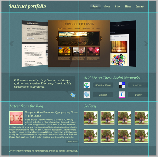
最终的作品

后记:
本篇的教程主要体现在2个方面,一个是中间的图片滑动栏很有特色,加了不常见的光泽效果以及3D效果。二是整个页面的颜色用的少,用的巧,很多元素的颜色都是通过修改不透明度来达到效果。这样,如果整个页面要更改色系的话,只需更改背景色和文字的颜色即可。网页的复用度比较高。

 浙公网安备 33010602011771号