


PS网页设计教程XVII——在Photoshop中设计创意组合网页
 本教程的特色有3个方面:1、云彩的制作,利用椭圆工具和相应的图层样式制作逼真的云彩效果;2、飘带的制作,本文中有很多飘带的制作;3、图表的制作,我认为是很有亮点的,改变了原来严肃刻板的布局,有点小清醒的感觉
作为编码者,美工基础是偏弱的。我们可以参考一些成熟的网页PS教程,提高自身的设计能力。套用一句话,“熟读唐诗三百首,不会作诗也会吟”。
本系列的教程来源于网上的PS教程,都是国外的,全英文的。本人尝试翻译这些优秀的教程。因为翻译能力有限,翻译的细节上还有待推敲,希望广大网友不吝赐教。
约定:
1、本文的软件是Photoshop CS5版本
2、原教程的截图是英文的,本人在重新制作的基础上,重新截了中文版的图
3、原文中有些操作没有给出参数。本人在反复测试的情况下测定了一些参数,以红色的文字显示。有些错误的参数,直接以红色文字显示正确的参数
例如:(90,22,231,77),表示矩形的左上角的坐标是(90,22),宽231,高77
例如:(90,22),表示矩形的左上角的坐标是(90,22),矩形的其他两个参数教程里已经指定
4、在教程的最后会附上本人的心得。有些是对教程中的一些步骤的优化等。
Step 0 – Start by setting-up the document
步骤0:设置文档
Open a new document: dimensions 1200×1640 pixels and resolution 72 pixels/inch.
新建文档:尺寸:1200px*1640px,分辨率:72px/英寸

To keep everything aligned we can use the 960s Grid System from here; it is not essential in this case, because we can use the Photoshop Guides (Ctrl+R to activate rules, View > New Guide to add the guide), but, how you can see in the previous tutorials, sometimes it can help.
为了对齐元素,我们在这儿可以用960网格布局系统;在这里是没有必要的,因为我们可以用PS的参考线(Ctrl + R激活标尺,视图 > 新建参考线去增加参考线),不过,你可以参考之前的教程,有时能很好的帮助我们
Step 1 – Background
步骤1:背景
We’re going to create the basic layers for the background. In this case I had a precise idea on how to separate the different blocks to create the layout, why? Well, my tutorial, my web designs, ever start from a sketch (or a wireframe), it is useful just to keep in mind what is the final aim; but it’s clear that during the design process we will probably add new elements.
我们要创建基本的背景层。在这种情况下,我在布局上精确的区分不同的块,为什么?好了,我的教程,我的网页设计,不断从草图(或线框)中来,它可以帮助记住每块的最终目的是什么,但很明显,在设计过程中,我们可能会添加新的元素。
So, in this case, we’ll create 5 containers, where we’ll add the content.
所以,在本教程中,我们要创建5个不同的区域,每个区域添加不同的内容
Add a first layer, it will be our background, with the color #ededed. Rasterize the layer (color #ededed) and add a subtle noise effect (Filter > Noise > Add Noise… Amount 0,5 – 0,8; check Gaussian and Monochromatic).
添加第一个图层,这会是我们的背景,颜色: #ededed。栅格化图层(颜色: #ededed),并添加一个细微的杂色效果(滤镜 > 杂色 > 添加杂色,数量:0.5-0.8;勾选高斯分布和单色)

Draw a rectangle on the top of the page (using the Rectangle Tool, color #cddcec) and, again, rasterize the shape and add a subtle noise effect (Filter > Noise > Add Noise… Amount 0,5 – 0,8; check Gaussian and Monochromatic). Add a Gradient Overlay (Soft Light, 54%, from black to white, Angle 90% and Scale 75%).
在页面的顶部画一个矩形(0,0,1200,128)(用矩形工具,颜色: #cddcec),再次,栅格化图层并添加一个细微的杂色(滤镜 > 杂色 > 添加杂色,数量:0.5-0.8;勾选高斯分布和单色)。添加一个渐变叠加(柔光,54%,从黑到白,角度90,缩放75%)

Add, using the Rectangle Tool (U), a new shape (color #608bb6, height around 400 pixels) for the middle container, set Blend Mode to Color Burn and Fill to 75% and, then add a white Stroke of 1 pixel (from Layer Style). Finally the rectangular shape for the credits (the footer), use the same tool and color of the middle container, but now set Blend to Linear Light and Opacity to 70%.
用矩形工具添加一个矩形(0,753,1200,400)(颜色: #608bb6,高度400px)作为中部区域,设置混合模式为颜色加深,填充为75%,然后添加一个1px的白色描边(从图层样式面板上)。最后,在底部添加一个矩形(0,1592,1200,48)显示字幕(页脚),用和中部区域同样的工具和颜色,只是设置混和模式为线性光(应该是线性加深),不透明度为70%
Below the final result.
下面是最终的结果

Step 2 – Background details
步骤2:背景细节
We want to give more character to our background!
Add a new layer (Ctr+Shift+N) and use the Single Row Marquee Tool to add a 1 pixel white line on the top od the canvas.
我们想给背景添加更多的符号
新建一个图层(Ctrl+Shift+N),用单行选框工具在画布的顶部添加一个1px的白色的线
建议:用直线工具画一条直线(0,0,1200,1)比较好

Now open a new document 12×1 pixels, unlock the background layer and hide it from the Layers Palette. Zoom to 3200%, add a new layer and using the Rectangular Marquee tool add two 1×1 pixel square, fill one with the color #fff and the other one with #000, as shown below. Then go to Edit > Define Pattern.
现在新建一个文档,12px*1px,解锁背景图层并在图层面板中隐藏它。放大至3200%,新建图层,并用矩形选框工具创建2个1px*1px的正方形,一个填充颜色: #ffffff,另一个填充颜色: #000000,如下图所示。然后点击:编辑 > 定义图案
建议:用铅笔工具比较合适

We have a new pattern that we’re going to use, go back to our main document. Create a new layer and (with the Rectangular Marquee Tool) draw a selection that covers the whole canvas, fill it with a random color, set Fill to 0% then add Pattern Overlay from Layer Style.
我们即将用我们新建的图案,回到我们的主文档。创建一个新的图层,命名为pattern(用矩形选框工具),画一个覆盖整个画布的选区,随便用一个颜色填充,设置填充为0%,然后添加一个图案叠加的图层样式


Now it’s time to create the clouds!
接下来是创建云
You can add 5 guides (84px – 186px – 600px – 1014px – 1118px) in order to limit the work area, then use the Ellipse Tool to add some shapes as shown to create the basic shapes. Select all the layers from the Layers Palette (Ctrl+click on layers) and then Ctr+G to group the shapes.
你需要添加5条参考线(84px – 186px – 600px – 1014px – 1118px)去划分各个工作区域,用椭圆工具按下图添加一些形状去创建基本形状。在图层面板上选择这些层(Ctrl+Click这些图层),然后按Ctrl+G把这些形状归并到一个组

Duplicate the group and convert the copy to a Smart Object – right click on the group in the layer palette, then Convert To A Smart Object – resterize it and add a subtle nois effect. Now you have to hide the excess part of the clouds using a layer mask: Ctrl+click on the “Top-background” layer thumbnail (in the Layer Palette), in order to create a selection which excludes the bottom of the clouds, then select the clouds’ layer and add a vector mask.
复制该组并把副本转换为智能对象——在图层面板上组上右键,然后选择转换为智能对象——栅格化图层并添加细微的杂色特效。现在,你必须使用一个图层蒙版隐藏超出部分的云:Ctrl +鼠标单击Top-background图层缩略图图(在“图层”调板中),创建一个选区,不包括底部的云彩,然后选择cloud层并添加图层蒙版。


Then apply the following style.
然后按照下图添加样式,在图层面板将pattern层移到最顶端

颜色叠加的颜色: #ededed

Now we draw a nice shadow for the clouds. Duplicate the clouds’ layer and positionate the copy just below the original layer, set the fill to 0% and apply the following style.
现在我们给云添加一个漂亮的阴影。复制cloud图层,然后把副本摆放到当前图层的下方(偏右一点的位置),设置填充为0%,然后按照下图添加样式
注:在添加样式之前,还要进行一部分操作,就是把复制云的下半部删除掉
选择云副本的层,然后用矩形选框工具创建如下的选区

按delete键,删除云的副本的下半部
然后填充为0%,并按照下图添加样式

渐变颜色编辑器:左侧的颜色: #4d76a4,右侧的不透明度为80%


At this point use the same techniques to draw other clouds.
在这一块上,使用相同的技术来画其他云。云的颜色叠加的颜色选择白颜色

Step 3 – Header details
Time to add the logo. Use the Pen Tool (color #79a7db) to design a billoboard (doubts on how to use the Pen Tool? Read this fantastic article written by Sebastiano), use the Line Tool to add the two white segments. Then add the following style to the billboard.
步骤3:头部区域的细节部分
添加网页的LOGO。用钢笔工具(颜色: #79a7db)去设计一个广告牌(疑惑如何使用钢笔工具?阅读SEBASTIANO写的美妙的文章),用直线工具添加两条白色的线段,粗细为4px,然后给广告牌添加如下的图层样式
投影的颜色: #79a7db


Apply the same Drop Shadow for the two white lines too.
给两条白色的直线添加相同的投影,距离改为2

Add the text using the Horizontal Type Tool (T), using the Ballpark Font, then add a Drop Shadow and a soft Gradient Overlay.
用文字工具添加一些文本,字体:Ballpark,并添加一些投影和柔和的渐变叠加的样式,投影和渐变叠加的颜色都是: #79a7db


After the logo we are going to draw a nice, and simple, robot character using Zoom, Pen Tool, Ellipse Tool and Rounded Rectangle Tool. There isn’t the need to explain step by step how to create the robot, take a look to the image below and, at a glance, you’ll unbderstand how to draw our “friend”.
在完成Logo后,我们使用缩放工具、钢笔工具、椭圆工具、圆角矩形工具绘制一个漂亮的、简单的、机器人符号。不需要解释一步一步如何创建机器人,一起来看看下面的图片,一看,你就会明白如何画好我们的friend。
Group all the shapes used to compose the robot and Add a Layer Mask, as previously done, to obtain the following result.
把这些形状归成一组,组成机器人,并添加一个图层蒙版,以前也做过,得到以下结果。
画这个机器人太复杂了。直接在网上找了一张安卓的图片替代这个机器人

Now we have to draw the bird and the badge. We use the Pen Tool, the Brush Tool an the Horizontal Type Tool. Take a look below to understand how to enhance our layout with a sweet and, I repeat, very simple illustration.
现在我们就来画鸟和徽章。我们使用钢笔工具,画笔工具、横排文字工具。看看下面一个小贴士,很简单的例子,以了解如何提高我们的布局。
注:鸟也不画了,直接在网上找
将鸟的图像添加到合适的位置

在鸟的左上侧用矩形工具添加一个矩形,颜色:#ebefbc

用添加锚点工具在矩形的左侧中间添加一个锚点

将新增的锚点往右侧拖动

给该形状添加如下的图层样式:


用直线工具在鸟和形状之间画一条白色的直线

用文字工具在浅黄色形状中添加文字follow us,字体:Ballpark

Step 4 – First container
步骤4:首内容区域
First of all create the box where we will insert the information of the team’s members. Use the Rectangle Tool to draw a 480×425 white box, add two grey lines as shown (Create Clipping mask to limite the segments within the white box), and add also a text (use Delicious Font).
首先要创建一个区域显示团队成员的信息。用矩形工具创建一个白色矩形(532,192),尺寸:480px*425px,如下图添加两条灰色(#eeeeee)的直线((532,200)和(532,606))(创建剪贴蒙版以使直线只显示在白色矩形的内部),并添加一段文本(字体:Delicious),并按照下图对白色矩形和文字添加样式:


With the help of the Guides and Horizontal Type Tool, add photos and information about the team’s member. In this case we use Lucida Sans.
在网格的帮助下,用文字工具,添加团队成员照片和信息。在这里,我们用字体:Lucida Sans
设计师姓名文字的字体设置如下:颜色: #1b77a8

身份文字的字体如下:颜色: #a8b9c9

说明信息的字体如下:颜色: #898989

按钮的颜色:#1b77a8
按钮上的文字字体:颜色: #ffffff


Draw a white “arrow” using the same technique seen for the “follow us” ribbon. Create a rectangular shape with the Rectangle Tool and then with the help of Guides, Add Anchor Point Tool and Direct Selection Tool transform it in a nice ribbon.
用和follow us飘带相同的技术画一个白色的arrow。在网格的帮助下,用矩形工具创建一个矩形,用添加锚点工具添加锚点,然后用直接选择工具把它变成一个漂亮的飘带

Add the shadow to the ribbon. Duplicate the layer just created (you can temporarily hide the main shape), set color to #000 and opacity to 5%. Right click on the shape and go to Free Trasform Path and activate swarp modes to obtain the following result.
给飘带添加投影。复制刚才创建的图层(你可以暂时隐藏主形状),设置颜色为 #000000,把不透明度设置为5%。在形状上右键选择自由变换路径并激活变形模式,调整成如下的样子


Use the Horizontal Type Tool to create a “- – - – - – - -” string, you can rasterize and trasform it to create the following effect .Also add a soft drop shadow.
用文字工具添加- – - – - – - -文本,你可以栅格化它并按照下面的效果变换,并添加一个柔软的投影

Finally add the text (using Delicious Font).
最后添加一些文字(字体:Delicious)

Now create three blocks with descriptions of services that the studio provides. In this section we use the awesome icon sets, created by Asher Abbasi for WeGraphics, Wapp vol. 2 and Wapp vol. 1.
Remember: in this case the guides are really useful to fill with icons and text the section.
现在创建3个块用来描述该工作室提供的服务。在这里,我们要使用一些图标集,Asher Abbasi制作的WeGraphics中的Wapp vol. 2和Wapp vol. 1
记住:在这儿,网格能在这儿帮助你摆放图标和文字

标题的字体:颜色: #10789b

段落文字的字体:颜色: #585858,文字右对齐

Add three “dots” (with a nice drop shadow) and enhance the text with a 1px white drop shadow as shown below.
添加三个dots(有着漂亮的投影),颜色: #5a8cc1,并且按下图对之前的文字添加1px的白色投影
点的投影,投影的颜色: #a3c6e6

文字的投影


We create also a nice menu, just below the white box, it should be clear how to realize this menu at this point. We add just a soft Inner Shadow to the “arrows.”
我们要创建漂亮的菜单,在白色的矩形的下方,为了清楚的知道如何实现该菜单,我们要对arrows添加内阴影的样式,并添加文字


Step 5 – The middle ribbon
步骤5:中间的飘带
The middle element of our design is an informative infographic that is introduced by a big ribbon that contains a slogan. In order to realize this ribbon we will create 5 custom shapes using, as usual, the Pen Tool (I remind, again, that if you are a beginner you can read Photoshop For Beginners: The pen tool to learn more about how to use this tool). Take a look below to understand what kind of shapes we need to draw (note: we will use #497287 for the main shapes and #798ea4 for the darker shapes).
中间的元素,我们的设计是一个内容丰富的信息图表区域,其引入的是一个大的飘带,其中包含一个标语。为了实现这一功能区,我们像往常一样使用钢笔工具创建5个自定形状,(我再次提醒的是,如果你是一个初学者,你可以阅读入门:Photoshop的钢笔工具,以了解更多有关如何使用这工具)。让我们一起来看看究竟需要绘制什么样的形状,(注:主要形状的颜色: #497287 和较深的形状的颜色: #798ea4)。
注:也可以用矩形工具加直接选择工具,来完成相似的形状,如下图,为了醒目,各自用了亮眼的颜色

再分别改颜色,主要形状的颜色: #497287,较深的形状的颜色: #798ea4

What about the style? Well, we apply the same style for the “front-shape,” as you can see below (the pattern, that we are going to use, is from Old Paper Patterns on WeGraphics).
样式设置为什么样?好的,我们将添加和front-shape一样的图层样式,就像下图一样(图案,我们打算用的是Old Paper Patterns on WeGraphics)
投影的颜色: #445055


图案叠加的图案用的是自定义的图案,效果也差不多
12*24的图案,左边和上边各一条线,颜色: #f0f0f0


For the two little triangles we apply the following style:
给2个三角形添加如下的样式:
左侧的三角形
投影的颜色: #445055


右侧的三角形
投影的颜色: #445055


Finnally add the slogan.
最后,添加标语

投影的颜色: #445055


Step 6 – The infographic
步骤6:信息图表
The idea of adding a little infographic borns from the need to synthesize the creative process of our fictionary design studio. Below you can see the finale result (obvious, it’s just a simplistic example of how you can describe a creative process behind the development of a project).
添加简约的信息图表的想法来自需要合成我们的创建过程的设计工厂。下面是你看到的最终结果(很显然,它只是一个简单的例子说明,你可以描述的一个创造性的过程在后面的过程中)

Start designing the two circles (hold down Shift to draw a perfect circumference, color #3d3d3d). Set the, for the left shape, Fill to 0%; for the right shape, set Blend Mode to vivid Light and Fill to 35%. Add the style as shown below (it is the same for both the shapes, Pattern Overlay fo the left shape apart).
在开始设计两个圆((240,840,275,275)和(572,837,275,275))(按住Shift键去画一个非常完美的圆,颜色: #3d3d3d)。设置,左侧的圆,填充为0%;右侧的圆,设置混合模式为亮光,填充为35%。按照下图设置图层样式(两个圆都设置一样的,再对左侧添加图案叠加)
投影的颜色: #445055

内发光的颜色: #aac1d1


再对左侧的添加图案叠加样式,图案是12*12,左上角8*8的黑色方块

Note that the left circle use a custom pattern, we can create this pattern adopting the same technique of the Step 2.
注意左侧的圆用了自定义的图案,我们可以用步骤2中的技术创建这个图案

Use Ellipse Tool (create the little white circle one time and then duplicate it to use again) and the Line Tool (Weight: 3px, color #ffffff) to design the graph on the left. Group all the shapes and the lines created, duplicate the group, convert it to smart object and then rasterize it. Now you can add the style to the layer.
用椭圆工具(创建小的白色的圆一次,然后复制需要的个数),和直线工具(粗细:3px,颜色: #ffffff),设计左侧的圆。把这些形状和直线归成一组,复制组,转换成智能对象并栅格化。现在,你可以添加图层样式
投影的颜色: #94acb5


Using the Pen Tool to draw some tags (using vibrant colors: #d82f4c, #edcd59, #4d85a2, #598b3b) and then name it using Horizontal Type Tool, you can apply a soft drop shadwo to both, tag and text.
接下来用钢笔工具画一些标签(用些鲜艳的颜色: #d82f4c, #edcd59, #4d85a2, #598b3b,实际上使用的颜色分别是#cbc71e,#5a8c45,#e1c325,#ef6d39,#ec354d,#4c849e),并用文字工具添加一些文字,你可以给标签和文字添加想用的柔和的投影样式
标签的图层样式:


文字的图层样式:


Within the right circle add other three circles, set Fill to 20%, add text (you can apply a soft drop shadow to the string) as shown.
在右侧的圆中添加另外3个圆(颜色: #092f46),设置填充为20%,添加文本(你可以给文本添加柔和的投影),如下图所示


Now we have to hide the excess parts of the “Design” and “Development” circles. As already seen we’ll use the Layer Mask.
Ctrl+click on the shape of the “Creativity” circle in the Layer Palette, then go to Select > Modify > Expand set the value to 3 pixels.
现在我们要隐藏Design和Development圆的超出部分。就像你们之前看到的,用的是图层蒙版
在图层面板上Ctrl+单击Creativity圆,然后点击:选择 > 修改 > 扩展,设置扩展量为3px


Ctrl+Shift+I to invert the selection and then apply layer mask to the shape named “Design.”
按Ctrl+Shift+I反向选择,然后对Design形状添加图层蒙板

Repeat the operation creating a new selection and expanding it as shown. You can use Ctrl+Shift+Click when you need to add two or more selections from vector mask thumbnail; in this case we create the selection by clicking on “Design” and “Creativity” shapes.
重复上述操作,创建一个新的选区和如下所示扩大它。当你需要从两个或两个以上的缩览图添加矢量蒙版选区,您可以使用Ctrl+ Shift +单击,通过点击Design和Creativity的形状,创建了复合的选区。

Ctrl+Shift+I to invert the selection and then apply layer mask to the shape named “Development.”
按Ctrl+Shift+I反向选择,然后对Development形状添加图层蒙板

Apply a soft Drop Shadow to the three circles to obtain the following result.
对三个圆添加柔和的投影,得到以下结果。3个圆的其他参数都一样,唯一的区别是角度不一样,每个圆都要仔细的调一调


Draw a new circle.
画一个漂亮的圆

Set Fill to 0% and add a white stroke (Size 3px).
设置填充为0%,并添加白色的描边(大小:3px)

Convert to Smart Object, rasterize it and add a drop shadow (the same drop shadow applied to the graph in this “Step”). Finally, complete the infographic adding other lines and tags as shown in the following image.
转换为智能对象,栅格化并添加投影(在这步添加和之前一样的投影)。最后,按照下图添加其他的标签和直线

Step 7 – Bottom container
步骤7:底部内容区域
You can reproduce this section using the same techniques of the Step 4.
你可以用步骤4中的技术重现本部分
这部分原教程说得简单,在这里详细的补充一下
用矩形工具创建一个白色矩形(186,1220,484,290);用直线工具,创建两条直线(186,1229,484,1)和(186,1501,484,1),颜色: #eeeeee;用文字工具添加一些文本,字体:Delicious。对文字和白色矩形添加投影样式


用矩形工具创建2个矩形(201,1252)和(442,1252),尺寸:202px*132px,并添加如下的描边样式,描边的颜色: #bedbed


分别在2个矩形的上方置入图像文件,然后在图层面板上对图像图层右键选择添加剪贴蒙版,使得图像只在矩形中显示出来

如下图,给图像添加说明文字
标题文字的字体:颜色: #1b77a8

副标题文字的字体:颜色: #a8b9c9

段落文字的字体:颜色: #898989


在右侧添加一些图标和文字,以及点,并添加相应的样式。
标题的字体:颜色: #10789b

段落文字的字体:颜色: #585858

添加2个点,颜色: #5a8cc1,并且按下图对之前的文字添加1px的白色投影
点的投影,投影的颜色: #a3c6e6

文字的投影


复制主内容区域的大的白色飘带,水平翻转,并修改相应的文字

复制主内容区域的右下角的3个飘带按钮,水平翻转,并修改相应的文字

Step 8 – Credits
步骤8:版权
Add a string with the credits.
添加版权信息

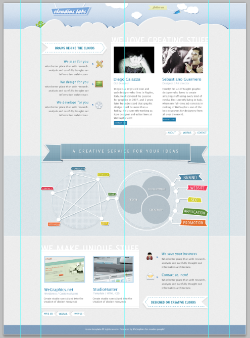
最终的结果:

后记:
本教程的特色有3个方面:
1、云彩的制作,利用椭圆工具和相应的图层样式制作逼真的云彩效果
2、飘带的制作,本文中有很多飘带的制作
3、图表的制作,我认为是很有亮点的,改变了原来严肃刻板的布局,有点小清醒的感觉

 浙公网安备 33010602011771号