[UWP]创建一个ProgressControl
1. 前言
博客园终于新增了UWP的分类,我来为这个分类贡献第一篇博客吧。
UWP有很多问题,先不说生态的事情,表单、验证、输入、设计等等一堆基本问题缠身。但我觉得最应该首先解决的绝对是Blend,那个随随便便就崩溃、报错、比Silverlight时代还差、不能用的Blend For Visal Studio。不过无论Blend怎么坏都不能让我写漂亮控件的心屈服,毕竟写了这么多年XAML,只靠Visual Studio勉勉强强还是可以写样式的,这篇文章介绍的控件就几乎全靠Visual Studio写了全部样式(其实VisalStudio的设计器也一直报错)。
在之前写的文章 创建一个进度按钮 中我实现了一个ProgressButton,它主要有以下几个功能:
- 有Ready、Started、Completed、Faulted四种状态;
- 从Ready状态切换到Started状态按钮会从方形变成圆形;
- 在Started状态下使用Ellipse配合StrokeDashArray显示进度;
- 完成后可切换到Completed状态;
- 出错后可切换到Faulted状态;
运行效果如下:

无论是实现过程还是结果都很有趣,但还是有几个问题:
- 没有Paused状态;
- Progress限定在0到1之间,其实应该参考ProgressBar可以Minimum和Maximum;
- 除了可以点击这点好像和Button关系不大,所以也不应该命名为-Button;
因为以上理由决定做个新的控件。
2. 改进的结果
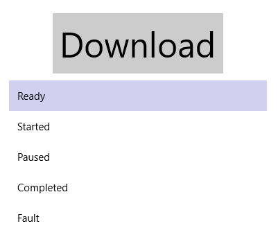
新控件名就叫ProgressControl---因为无奈真的想不到叫什么名字了。运行效果如下:
它有Ready、Started、Completed、Faulted和Paused五个状态。其中Paused即暂停状态,在Started状态点击控件将可进入Paused状态,并且显示CancelButton,这时候点击CancelButton将回到Ready状态;当然点击继续的图标就回到Started状态。
3. 实现
由于ProgressControl的Control Template已经十分复杂,所以将它拆分成两个部分:
- ProgressStateIndicator,主要用于显示各种状态,功能和以前的ProgressButton相似,还是直接继承自Button;
- CancellButton,外观上模仿progressStateIdicator,在Paused状态下显示;
- 懒得为它命名的Ellipse,用于在Started状态下显示进度;
ProgressControl由以上三部分组成,Ready状态(默认状态)下只显示ProgressStateIndicator,点击ProgressStateIndicator触发EventHandler和EventHandler事件并转换状态;Started状态下同时显示Ellipse;Paused状态下隐藏Ellipse并显示CancelButton。
3.1处理代码
和之前强调的一样,先完成代码部分再完成UI部分会比较高效。而且UI部分怎么呈现、怎么做动画都是它的事,代码部分完成后就可以甩手不管由得XAML去折腾了。
首先完成ProgressStateIndicator,继承Button,提供一个public ProgressState State { get; set; }属性,并在State改变时改变VisualState。它的功能仅此而已,之所以把它独立出来是因为清楚知道它的ControlTemplate比较复杂,如果不把它独立出来ProgressControl的ControlTemplate就复杂到没法维护了。代码如下:
[TemplateVisualState(GroupName = ProgressStatesGroupName, Name = ReadyStateName)]
[TemplateVisualState(GroupName = ProgressStatesGroupName, Name = StartedStateName)]
[TemplateVisualState(GroupName = ProgressStatesGroupName, Name = CompletedStateName)]
[TemplateVisualState(GroupName = ProgressStatesGroupName, Name = FaultedStateName)]
[TemplateVisualState(GroupName = ProgressStatesGroupName, Name = PausedStateName)]
public partial class ProgressStateIndicator : Button
{
    public ProgressStateIndicator()
    {
        this.DefaultStyleKey = typeof(ProgressStateIndicator);
    }

    /// <summary>
    /// 获取或设置State的值
    /// </summary>
    public ProgressState State
    {
        get { return (ProgressState)GetValue(StateProperty); }
        set { SetValue(StateProperty, value); }
    }

    /// <summary>
    /// 标识 State 依赖属性。
    /// </summary>
    public static readonly DependencyProperty StateProperty =
        DependencyProperty.Register("State", typeof(ProgressState), typeof(ProgressStateIndicator), new PropertyMetadata(ProgressState.Ready, OnStateChanged));

    private static void OnStateChanged(DependencyObject obj, DependencyPropertyChangedEventArgs args)
    {
        ProgressStateIndicator target = obj as ProgressStateIndicator;
        ProgressState oldValue = (ProgressState)args.OldValue;
        ProgressState newValue = (ProgressState)args.NewValue;
        if (oldValue != newValue)
            target.OnStateChanged(oldValue, newValue);
    }

    protected override void OnApplyTemplate()
    {
        base.OnApplyTemplate();
        UpdateVisualStates(false);
    }

    protected virtual void OnStateChanged(ProgressState oldValue, ProgressState newValue)
    {
        UpdateVisualStates(true);
    }

    private void UpdateVisualStates(bool useTransitions)
    {
        string progressState;
        switch (State)
        {
            case ProgressState.Ready:
                progressState = ReadyStateName;
                break;
            case ProgressState.Started:
                progressState = StartedStateName;
                break;
            case ProgressState.Completed:
                progressState = CompletedStateName;
                break;
            case ProgressState.Faulted:
                progressState = FaultedStateName;
                break;
            case ProgressState.Paused:
                progressState = PausedStateName;
                break;
            default:
                progressState = ReadyStateName;
                break;
        }
        VisualStateManager.GoToState(this, progressState, useTransitions);
    }
}
代码是很普通的模板化控件的做法,记住OnApplyTemplate()中的UpdateVisualStates(false)参数一定要是False。
接下来完成ProgressControl。ProgressControl继承RangeBase,只是为了可以使用它的Maximum、Minimum和Value三个属性。为了可以显示内容模仿ContentControl实现了Content属性,因为不是直接继承ContentControl,所以要为控件添加[ContentProperty(Name = nameof(Content))]Attribute。模仿ContentControl的部分代码可见 了解模板化控件(2):模仿ContentControl 。
ProgressCotrol也提供了public ProgressState State { get; set; }属性,这部分和ProgressStateIndicator基本一致。
最后是两个TemplatePart:ProgressStateIndicator和CancelButton。点击这两个控件触发状态改变的事件并改变VisualState:
protected override void OnApplyTemplate()
{
    base.OnApplyTemplate();
    _progressStateIndicator = GetTemplateChild(ProgressStateIndicatorName) as ProgressStateIndicator;
    if (_progressStateIndicator != null)
        _progressStateIndicator.Click += OnGoToNextState;

    _cancelButton = GetTemplateChild(CancelButtonName) as Button;

    if (_cancelButton != null)
        _cancelButton.Click += OnCancel;

    UpdateVisualStates(false);
}


private void OnGoToNextState(object sender, RoutedEventArgs e)
{
    switch (State)
    {
        case ProgressState.Ready:
            ChangeStateCore(ProgressState.Started);
            break;
        case ProgressState.Started:
            ChangeStateCore(ProgressState.Paused);
            break;
        case ProgressState.Completed:
            ChangeStateCore(ProgressState.Ready);
            break;
        case ProgressState.Faulted:
            ChangeStateCore(ProgressState.Ready);
            break;
        case ProgressState.Paused:
            ChangeStateCore(ProgressState.Started);
            break;
        default:
            throw new ArgumentOutOfRangeException();
    }
}

private void OnCancel(object sender, RoutedEventArgs e)
{
    if (ChangeStateCore(ProgressState.Ready))
        Cancelled?.Invoke(this, EventArgs.Empty);
}

private bool ChangeStateCore(ProgressState newstate)
{
    var args = new ProgressStateEventArgs(State, newstate);
    OnStateChanging(args);
    StateChanging?.Invoke(this, args);
    if (args.Cancel)
        return false;

    State = newstate;
    return true;
}
至于Value属性不需要任何处理,只是给UI提供可绑定的属性就够了。
3.2 处理UI
大部分UI部分用到的技术都在上一篇文章 创建一个进度按钮 介绍过了,这次只做了一些改进。
3.2.1 ContentControlStyle
<Style TargetType="ContentControl"
x:Key="ContentElementStyle">
<Setter Property="Foreground"
Value="White" />
<Setter Property="Template">
<Setter.Value>
<ControlTemplate TargetType="ContentControl">
<Grid Margin="0"
HorizontalAlignment="{TemplateBinding HorizontalAlignment}"
VerticalAlignment="{TemplateBinding VerticalAlignment}">
<control:DropShadowPanel OffsetX="0"
OffsetY="0"
BlurRadius="5"
ShadowOpacity="0.3"
VerticalContentAlignment="Stretch"
HorizontalContentAlignment="Stretch">
<Ellipse x:Name="CompletedRectangle"
Fill="{TemplateBinding Background}" />
</control:DropShadowPanel>
<FontIcon Glyph="{TemplateBinding Content}"
Foreground="{TemplateBinding Foreground}"
FontSize="{TemplateBinding FontSize}"
VerticalAlignment="Center"
HorizontalAlignment="Center"
x:Name="CompletedIcon" />
</Grid>
</ControlTemplate>
</Setter.Value>
</Setter>
</Style>
<Style TargetType="ContentControl"
x:Key="CompltedElementStyle"
BasedOn="{StaticResource ContentElementStyle}">
<Setter Property="Background"
Value="LightSeaGreen" />
<Setter Property="Content"
Value="" />
</Style>
<Style TargetType="ContentControl"
x:Key="FaultElementStyle"
BasedOn="{StaticResource ContentElementStyle}">
<Setter Property="Background"
Value="MediumVioletRed" />
<Setter Property="Content"
Value="" />
</Style>
<Style TargetType="ContentControl"
x:Key="PausedElementStyle"
BasedOn="{StaticResource ContentElementStyle}">
<Setter Property="Background"
Value="CornflowerBlue" />
<Setter Property="Content"
Value="" />
</Style>
<Style TargetType="ContentControl"
x:Key="CancelElementStyle"
BasedOn="{StaticResource ContentElementStyle}">
<Setter Property="Background"
Value="OrangeRed" />
<Setter Property="Content"
Value="" />
</Style>
之前的ProgressButton中ControlTemplate有些复杂,这次用于Started、Completed和Faulted等状态下显示的元素都使用样式并统一了它们的ContentTemplete,大大简化了ProgressStateIndicator的ControlTemplate。
3.2.2 AnimationSet
在Started到Paused之间有一个平移的过渡,为了使位移根据元素自身的宽度决定我写了个RelativeOffsetBehavior,里面用到了UWP Community Toolkit 的 AnimationSet :
if (AssociatedObject != null)
{
    var offsetX = (float)(AssociatedObject.ActualWidth * OffsetX);
    var offsetY = (float)(AssociatedObject.ActualHeight * OffsetY);
    var animationSet = AssociatedObject.Offset(offsetX, offsetY, duration: 0, easingType: EasingType.Default);
    animationSet?.Start();
}
3.2.3 Implicit Composition Animations
由于有些动画是重复的,例如显示进度的Ellipse从Ready到Started及从Paused到Started都是从Collapsed变到Visible,并且Opacity从0到1。为了减轻VisualTransition的负担,在VisualTransition中只改变Ellipse的Visibility,Opacity的动画使用了UWP Community Toolkit 的 Implicit Composition Animations :
<animations:Implicit.HideAnimations>
    <animations:ScalarAnimation Target="Opacity"
                                Duration="0:0:1"
                                To="0.0"/>
</animations:Implicit.HideAnimations>
<animations:Implicit.ShowAnimations>
    <animations:OpacityAnimation Duration="0:0:3"
                                 From="0"
                                 To="1.0" />
</animations:Implicit.ShowAnimations>
这段XML即当Ellipse的Visibility值改变时调用的动画。
4. 结语
ProgressControl已经很复杂了,只是这个控件XAML就多达800行,还有一些Behavior配合。如果可以使用Blend的话可能可以减少一些XAML,而且精力都放在XAML上,可能还有考虑不周的地方。
除了使用UWP Community Toolkit的部分基本上移植到WPF,而UWP Community Toolkit的部分应该也可以使用其它方法代替。
5. 参考
创建一个进度按钮
AnimationSet
Implicit Composition Animations
6. 源码
作者:dino.c
出处:http://www.cnblogs.com/dino623/
说明:欢迎转载并请标明来源和作者。如有错漏请指出,谢谢。

