


本文主要讲述如何在Silverlight2中开发一个自定义控件,我使用环境是VS2008 Silverlight2 Beta2。
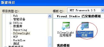
一:创建Silverlight2 类库项目,如下图:
然后我们添加一个控件类,该可以继承自Control类,也可以继承自其他类比如ContentControl,ItemControl。我们继承自ContentControl,代码如下:
using System;
using System.Net;
using System.Windows;
using System.Windows.Controls;
using System.Windows.Documents;
using System.Windows.Ink;
using System.Windows.Input;
using System.Windows.Media;
using System.Windows.Media.Animation;
using System.Windows.Shapes;

namespace CarySLCustomControlLib
{
    public class CarySLCustomControl : ContentControl
    {}
}
其实现在已经做好了一个最简单的自定义控件,我们给给他一个控件模板就可以了。在Page.xaml的Grid中添加如下代码:
<custom:CarySLCustomControl>
    <custom:CarySLCustomControl.Template>
     <ControlTemplate>
        <Grid x:Name="RootElement">
           <Rectangle x:Name="BodyElement" Width="200" Height="100"
                                  Fill="Lavender" Stroke="Purple" RadiusX="16" RadiusY="16" />
           <TextBlock Text="Cary Click" HorizontalAlignment="Center"VerticalAlignment="Center" />
       </Grid>
     </ControlTemplate>
    </custom:CarySLCustomControl.Template>
</custom:CarySLCustomControl>


效果如下图: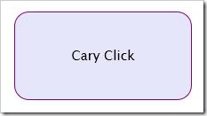

二:创建控件模板
下面我们为控件提供一个默认的控件模板,像类库项目中添加添加Generic.xaml文件,代码如下:
<ResourceDictionary
  xmlns="http://schemas.microsoft.com/winfx/2006/xaml/presentation"
  xmlns:x="http://schemas.microsoft.com/winfx/2006/xaml"
  xmlns:custom="clr-namespace:CarySLCustomControlLib;assembly=CarySLCustomControlLib"
       <Style TargetType="custom:CarySLCustomControl">
       <Setter Property="Template">
         <Setter.Value>
            <ControlTemplate TargetType="custom:CarySLCustomControl">
              <Grid x:Name="RootElement">
                <Rectangle x:Name="BodyElement" Width="200" Height="100"
                           Fill="LightCoral"  Stroke="Purple" RadiusX="16" RadiusY="16" />
                <TextBlock Text="Cary Click" HorizontalAlignment="Center"VerticalAlignment="Center" />
              </Grid>
            </ControlTemplate>
         </Setter.Value>
        </Setter>
    </Style>
</ResourceDictionary>


向我们的控件类CarySLCustomControl的构造函数中添加如下代码:
this.DefaultStyleKey = typeof(CarySLCustomControl);
在Page.xaml中我们只需要引用控件<custom:CarySLCustomControl/>,就可以达到上面一样的效果了。
三:模板绑定
我们在使用控件的时候都会做响应的属性设定,比如:<custom:CarySLCustomControl Width="500" Height="500" Background="LightGreen"/>
但是你现在做该设置是不会生效的,还仍然使用控件模板的设定,我们可以在控件模板中通过使用 {TemplateBinding ControlProperty} 的标识扩展句法来绑定到控件的属性来实现,使用ContentPresenter控件可以灵活的设置各个属性。修改后的Generic.xaml的代码如下:
<ResourceDictionary
xmlns="http://schemas.microsoft.com/winfx/2006/xaml/presentation"
xmlns:x="http://schemas.microsoft.com/winfx/2006/xaml"
xmlns:custom="clr-namespace:CarySLCustomControlLib;assembly=CarySLCustomControlLib"
<Style TargetType="custom:CarySLCustomControl">
<Setter Property="Width" Value="200" />
<Setter Property="Height" Value="100" />
<Setter Property="Background" Value="Lavender" />
<Setter Property="Template">
<Setter.Value>
<ControlTemplate TargetType="custom:CarySLCustomControl">
<Grid x:Name="RootElement">
<Rectangle x:Name="BodyElement" Width="{TemplateBinding Width}"
Height="{TemplateBinding Height}" Fill="{TemplateBinding Background}"
Stroke="Purple" RadiusX="16" RadiusY="16" />
<ContentPresenter Content="{TemplateBinding Content}"
HorizontalAlignment="Center" VerticalAlignment="Center"
FontSize="{TemplateBinding FontSize}" />
</Grid>
</ControlTemplate>
</Setter.Value>
</Setter>
</Style>
</ResourceDictionary>
Page.xaml中更改控件的属性如下:
  <custom:CarySLCustomControl Width="250" Height="150" Background="LightGreen">
     <custom:CarySLCustomControl.Content>
         <StackPanel Orientation="Horizontal" HorizontalAlignment="Center">
            <Ellipse Width="75" Height="75" Margin="10">
              <Ellipse.Fill>
                <RadialGradientBrush GradientOrigin="0.25,0.25">
                  <GradientStop Offset="0.25" Color="LightGray" />
                  <GradientStop Offset="1.0" Color="DarkGoldenrod" />
                </RadialGradientBrush>
              </Ellipse.Fill>
            </Ellipse>
            <TextBlock Text="Cary Click" VerticalAlignment="Center" />
    </StackPanel>
            </custom:CarySLCustomControl.Content>
</custom:CarySLCustomControl>
效果如下图: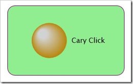

四:添加一个单击事件
WPF中支持向下和向下的事件路由,路由事件的路由可有效地向上遍历或向下遍历树,这要取决于该事件是隧道路由事件还是冒泡路由事件,而Silverlight中的路由事件只支持冒泡路由策略。下面我们为该控件添加一个单击事件,代码如下:
  public class CarySLCustomControl : ContentControl
  {
        public event RoutedEventHandler Click;

        public CarySLCustomControl()
        {
            this.DefaultStyleKey = typeof(CarySLCustomControl);
            this.MouseLeftButtonUp += new MouseButtonEventHandler(CarySLCustomControl_MouseLeftButtonUp);
        }

       void CarySLCustomControl_MouseLeftButtonUp(object sender, MouseButtonEventArgs e)
       {
        if (Click != null)
            Click(this, new RoutedEventArgs());
       }
}


现在我们就可以使用控件的单击事件了,Page.xaml中如下:
<custom:CarySLCustomControl Click="CarySLCustomControl_Click">
Page.xaml.cs中编写事件处理程序如下:
void CarySLCustomControl_Click(Object sender, RoutedEventArgs e) { System.Windows.Browser.HtmlPage.Window.Alert("Click!"); }
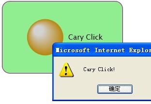
运行后如下图:
五:可视化状态
在Silverlight中微软引入一种新的模式来处理事件和用户进行交互,例如当鼠标经过控件时。控件可以从一种状态转换到另一种状态,我们下面就已从"normal" 状态到 "pressed" 状态来进行简单的说明。我们使用Silverlight中的Visual State Manager (VSM)来简化对可视化状态和可视化状态转换之间的处理。使用VisualState对象来定义不同的状态,VisualTransition对象定义状态间的转换。使用VisualStateManager类的静态方法GoToState来控制状态的装换。修改完成后的generic.xaml中的代码如下:
<ResourceDictionary
  xmlns="http://schemas.microsoft.com/winfx/2006/xaml/presentation"
  xmlns:x="http://schemas.microsoft.com/winfx/2006/xaml"
  xmlns:custom="clr-namespace:CarySLCustomControlLib;assembly=CarySLCustomControlLib"
  xmlns:vsm="clr-namespace:System.Windows;assembly=System.Windows">
    <Style TargetType="custom:CarySLCustomControl">
        <Setter Property="Width" Value="200" />
        <Setter Property="Height" Value="100" />
        <Setter Property="Background" Value="Lavender" />
        <Setter Property="Template">
        <Setter.Value>
           <ControlTemplate TargetType="custom:CarySLCustomControl">
             <Grid x:Name="RootElement">
               <vsm:VisualStateManager.VisualStateGroups>
               <vsm:VisualStateGroup x:Name="CommonStates">
               <vsm:VisualStateGroup.Transitions>
               <vsm:VisualTransition To="Normal" Duration="0:0:0.2"/>
               <vsm:VisualTransition To="MouseOver" Duration="0:0:0.2"/>
               </vsm:VisualStateGroup.Transitions>
               <vsm:VisualState x:Name="Normal" />
               <vsm:VisualState x:Name="MouseOver">
               <Storyboard>
                 <ColorAnimation Storyboard.TargetName="BodyElement"
                         Storyboard.TargetProperty="(Rectangle.Fill).(SolidColorBrush.Color)"
                         To="Pink" Duration="0" />
               </Storyboard>
               </vsm:VisualState>
               </vsm:VisualStateGroup>
               </vsm:VisualStateManager.VisualStateGroups>
               <Rectangle x:Name="BodyElement"
                    Width="{TemplateBinding Width}" Height="{TemplateBinding Height}"
                    Fill="{TemplateBinding Background}" Stroke="Purple" RadiusX="16" RadiusY="16" />
               <ContentPresenter Content="{TemplateBinding Content}" HorizontalAlignment="Center"
                    VerticalAlignment="Center" FontSize="{TemplateBinding FontSize}" />
             </Grid>
            </ControlTemplate>
        </Setter.Value>
        </Setter>
    </Style>
</ResourceDictionary>


在控件类CarySLCustomControl中添加如下代码:
public CarySLCustomControl()
{
      this.MouseEnter += new MouseEventHandler(CarySLCustomControl_MouseEnter);
      this.MouseLeave += new MouseEventHandler(CarySLCustomControl_MouseLeave);
}
 void CarySLCustomControl_MouseEnter(object sender, MouseEventArgs e)
 {
      VisualStateManager.GoToState(this, "MouseOver", true);
 }

 void CarySLCustomControl_MouseLeave(object sender, MouseEventArgs e)
{
       VisualStateManager.GoToState(this, "Normal", true);
 }
这样就可以了。到此一个最简单的控件就开发好了。

 浙公网安备 33010602011771号