

需求描述:移动端实现横跨页面半圆。(类似问题,实现4x4的正方形网格)
简化问题,我们可以理解为实现一个高度和宽度比为1:2的块。
需要解决问题:
1,高度和宽度按照一定比例。
2,外容器高度和宽度不确定。
3,尽量不使用图片和脚本替代。
4,兼容移动端。
编写html
<div class = "semicircle"></div>
思考一,使用height:100%,
body{
	margin:0;
	width: 100%;
	background: lightblue;
}

.semicircle {
	width: 100%;
	height: 100%;
	border-top:5px solid #fff;
	border-radius: 100%;
}
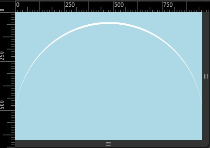
存在问题,height的百分比是根据父容器计算的,不是当前容器,根本满足不了我们的需求。效果如下:
父容器body的高度百分比为其子容器所填充的高度关联,即便设置body高度100%,由于子容器即semicircle所填充的实际高度为边界的5,无法将父容器“全部撑开”,因此无法通过设定父容器的高度为百分比指定宽高按照一定比例的容器。
思考二,设定padding-top或padding-bottom为100%
The percentage is calculated with respect to the width of the generated box's containing block [...] (source: w3.org, emphasis mine)
百分比宽度的计算与所生成盒子的包含块宽度有关。padding-top、padding-bottom的百分比是根据父容器的width(宽度)计算的,而不是height(高度)。其他比例实现对照表
aspect ratio  | padding-bottom value
--------------|----------------------
    16:9      |       56.25%
    4:3       |       75%
    3:2       |       66.66%
    8:5       |       62.5%
body{
    margin:0;
    width: 100%;
    background: lightblue;
}

.semicircle {
    width: 100%;
    height: 0;

    padding-bottom: 100%;
    border-top:5px solid #fff;
    border-radius: 100%;
}
思考三,使用vw单元
使用vw单元设定元素高度和宽度,vm的大小是通过viewport的宽度设定的,因此可以通过该方法保持容器按照一定比例显示。一单位的vw等于百分之一的viewport宽度,即100vw等于100%viewport宽度。
body{
    margin:0;
    width: 100%;
    background: lightblue;
}

.semicircle {
     width: 100vw;
      height:100vw;
    border-top:5px solid #fff;
    border-radius: 100%;
}
对照表
aspect ratio  |  multiply width by
-----------------------------------
     1:1      |         1
     1:3      |         3
     4:3      |        0.75
    16:9      |       0.5625
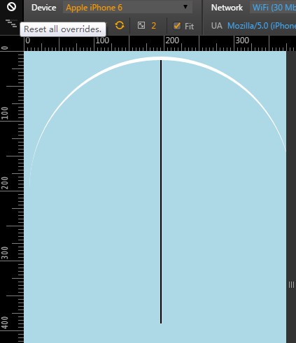
思考四,使用伪元素和inline-block布局
body {
    width: 100%;
    font-size: 0;
    text-align: center;
    background: lightblue;
}
.semicircle {
    border-top:5px solid #fff;
    border-radius: 100%;
}

.semicircle:before {
    content:"";
    display: inline-block;
    padding-bottom: 100%;
}
虽然代码有点复杂,但是灵活性强,可以实现更多类似的效果。
当需求改成实现一个横跨屏幕80%的宽度的半圆,我们只需要在.semicircle中添加属性width:80%;,顺便也把容器居中实现了。
该方法的原理很清晰:
参考思考一,无法通过高度100%来扩充外容器高度,那么可以通过伪元素,插入一个高度和宽度一致的元素,将容器撑开成一比一高度的容器。注意,该方法实现半圆,实际需要宽高为一比一的容器,即占用空间为上述方法的两倍。
设置:before元素边界,解析原理:
思考五,
使用图片,兼容低档次移动设备。
.semicircler img {
  width: 100%;
  background-repeat: no-repeat;
  background-size: 100% 100%;
  background-image: url(../img/autoresized-picture.jpg);
}
使用脚本,css更加简洁明了,目标清晰。
div.style.height=div.offsetWidth+"px";
对于实现2*2正方形网格
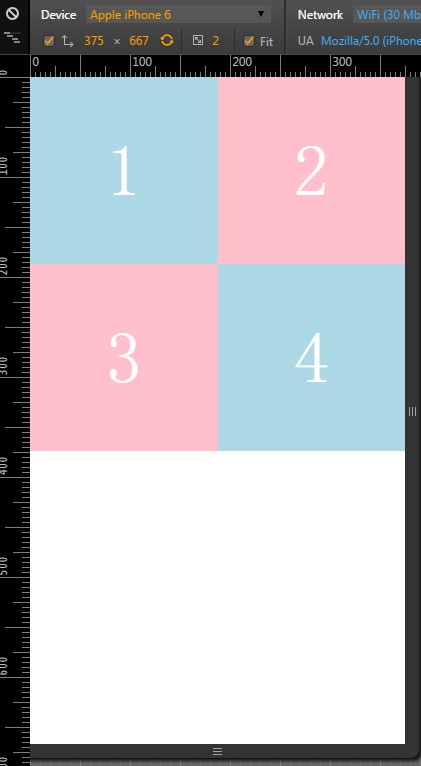
        /*------main code-------*/
        body {
          width: 100%;
          margin:0;
          text-align: center;
        }
        div{
          display: inline-block;
          width: 50%;
          background: lightblue;
          font-size: 12px;
          position: relative;
          vertical-align: middle;
        }

        div:before {
            content:"";
            display: inline-block;
            padding-bottom: 100%;
            vertical-align: middle;

        }

        /*------other code-------*/
        div:nth-child(2),div:nth-child(3){
            background: pink;
        }


        span {
            display: inline-block;
            vertical-align: middle;
            font-size: 6em;
            color: #fff;
        }

 浙公网安备 33010602011771号