
Bootstrap 学习(1)
简介
Bootstrap,来自 Twitter,是目前最受欢迎的前端框架。Bootstrap 是基于 HTML、CSS、JAVASCRIPT 的,它简洁灵活,使得 Web 开发更加快捷。
Bootstrap 包的内容
- 基本结构:Bootstrap 提供了一个带有网格系统、链接样式、背景的基本结构。这将在 Bootstrap 基本结构 部分详细讲解。
- CSS:Bootstrap 自带以下特性:全局的 CSS 设置、定义基本的 HTML 元素样式、可扩展的 class,以及一个先进的网格系统。这将在 Bootstrap CSS 部分详细讲解。
- 组件:Bootstrap 包含了十几个可重用的组件,用于创建图像、下拉菜单、导航、警告框、弹出框等等。这将在 布局组件 部分详细讲解。
- JavaScript 插件:Bootstrap 包含了十几个自定义的 jQuery 插件。您可以直接包含所有的插件,也可以逐个包含这些插件。这将在Bootstrap 插件 部分详细讲解。
- 定制:您可以定制 Bootstrap 的组件、LESS 变量和 jQuery 插件来得到您自己的版本。
下载 Bootstrap
您可以从 http://getbootstrap.com/ 上下载 Bootstrap 的最新版本。当您点击这个链接时,您将看到如下所示的网页:
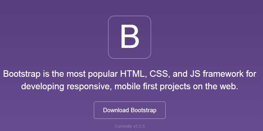
您会看到两个按钮:
- Download Bootstrap:下载 Bootstrap。点击该按钮,您可以下载 Bootstrap CSS、JavaScript 和字体的预编译的压缩版本。不包含文档和最初的源代码文件。
- Download Source:下载源代码。点击该按钮,您可以直接从 from 上得到最新的 Bootstrap LESS 和 JavaScript 源代码。
引入所需的js和css文件
<!-- 新 Bootstrap 核心 CSS 文件 -->
<link href="http://apps.bdimg.com/libs/bootstrap/3.3.0/css/bootstrap.min.css" rel="stylesheet">

<!-- 可选的Bootstrap主题文件(一般不使用) -->
<script src="http://apps.bdimg.com/libs/bootstrap/3.3.0/css/bootstrap-theme.min.css"></script>

<!-- jQuery文件。务必在bootstrap.min.js 之前引入 -->
<script src="http://apps.bdimg.com/libs/jquery/2.0.0/jquery.min.js"></script>

<!-- 最新的 Bootstrap 核心 JavaScript 文件 -->
<script src="http://apps.bdimg.com/libs/bootstrap/3.3.0/js/bootstrap.min.js"></script>
注意:Jquey的文件必须在bootstrap.min.js之前引入、
第一个例子,Hello World
<!DOCTYPE html>
<html>
<head>
   <title>在线尝试 Bootstrap 实例</title>
   <link href="http://libs.baidu.com/bootstrap/3.0.3/css/bootstrap.min.css" rel="stylesheet">
   <script src="http://libs.baidu.com/jquery/2.0.0/jquery.min.js"></script>
   <script src="http://libs.baidu.com/bootstrap/3.0.3/js/bootstrap.min.js"></script>
</head>
<body>

      <h1>Hello, world!</h1>

</body>
</html>
Bootstrap 浏览器/设备支持
Bootstrap 可以在最新的桌面系统和移动端浏览器中很好的工作。
旧的浏览器可能无法很好的支持。
下表为 Bootstrap 支持最新版本的浏览器和平台:
| ChromeChrome | FirefoxFirefox | IEIE | OperaOpera | SafariSafari | |
|---|---|---|---|---|---|
| Android | YES | YES | 不适用 | NO | 不适用 |
| iOS | YES | 不适用 | 不适用 | NO | YES |
| Mac OS X | YES | YES | 不适用 | YES | YES |
| Windows | YES | YES | YES* | YES | NO |
* Bootstrap 支持 Internet Explorer 8 及更高版本的 IE 浏览器。
Bootstrap 表格
Bootstrap 提供了一个清晰的创建表格的布局。下表列出了 Bootstrap 支持的一些表格元素:
| 标签 | 描述 |
|---|---|
| <table> | 为表格添加基础样式。 |
| <thead> | 表格标题行的容器元素(<tr>),用来标识表格列。 |
| <tbody> | 表格主体中的表格行的容器元素(<tr>)。 |
| <tr> | 一组出现在单行上的表格单元格的容器元素(<td> 或 <th>)。 |
| <td> | 默认的表格单元格。 |
| <th> | 特殊的表格单元格,用来标识列或行(取决于范围和位置)。必须在 <thead> 内使用。 |
| <caption> | 关于表格存储内容的描述或总结。 |
表格类
下表样式可用于表格中:
| 类 | 描述 |
|---|---|
| .table | 为任意 <table> 添加基本样式 (只有横向分隔线) |
| .table-striped | 在 <tbody> 内添加斑马线形式的条纹 ( IE8 不支持) |
| .table-bordered | 为所有表格的单元格添加边框 |
| .table-hover | 在 <tbody> 内的任一行启用鼠标悬停状态 |
| .table-condensed | 让表格更加紧凑 |
| 联合使用所有表格类 | |
<tr>, <th> 和 <td> 类
下表的类可用于表格的行或者单元格:
| 类 | 描述 |
|---|---|
| .active | 将悬停的颜色应用在行或者单元格上 |
| .success | 表示成功的操作 |
| .info | 表示信息变化的操作 |
| .warning | 表示一个警告的操作 |
| .danger | 表示一个危险的操作 |
基本的表格
如果您想要一个只带有内边距(padding)和水平分割的基本表,请添加 class .table,如下面实例所示:
<!DOCTYPE html>
<html>
<head>
   <title>Bootstrap 实例 - 基本的表格</title>
   <link href="/bootstrap/css/bootstrap.min.css" rel="stylesheet">
   <script src="/scripts/jquery.min.js"></script>
   <script src="/bootstrap/js/bootstrap.min.js"></script>
</head>
<body>

<table class="table">
   <caption>基本的表格布局</caption>
   <thead>
      <tr>
         <th>名称</th>
         <th>城市</th>
      </tr>
   </thead>
   <tbody>
      <tr>
         <td>Tanmay</td>
         <td>Bangalore</td>
      </tr>
      <tr>
         <td>Sachin</td>
         <td>Mumbai</td>
      </tr>
   </tbody>
</table>

</body>
</html>
结果如下

上下文类
下表中所列出的上下文类允许您改变表格行或单个单元格的背景颜色。
| 类类 | 描述描述描述 |
|---|---|
| .active | 对某一特定的行或单元格应用悬停颜色 |
| .success | 表示一个成功的或积极的动作 |
| .warning | 表示一个需要注意的警告 |
| .danger | 表示一个危险的或潜在的负面动作 |
这些类可被应用到 <tr>、<td> 或 <th>。
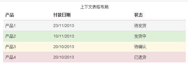
<!DOCTYPE html>
<html>
<head>
   <title>Bootstrap 实例 - 上下文类</title>
   <link href="/bootstrap/css/bootstrap.min.css" rel="stylesheet">
   <script src="/scripts/jquery.min.js"></script>
   <script src="/bootstrap/js/bootstrap.min.js"></script>
</head>
<body>

<table class="table">
   <caption>上下文表格布局</caption>
   <thead>
      <tr>
         <th>产品</th>
         <th>付款日期</th>
         <th>状态</th>
      </tr>
   </thead>
   <tbody>
      <tr class="active">
         <td>产品1</td>
         <td>23/11/2013</td>
         <td>待发货</td>
      </tr>
      <tr class="success">
         <td>产品2</td>
         <td>10/11/2013</td>
         <td>发货中</td>
      </tr>
      <tr  class="warning">
         <td>产品3</td>
         <td>20/10/2013</td>
         <td>待确认</td>
      </tr>
      <tr  class="danger">
         <td>产品4</td>
         <td>20/10/2013</td>
         <td>已退货</td>
      </tr>
   </tbody>
</table>

</body>
</html>
结果如下图所示:
响应式表格
通过把任意的 .table 包在 .table-responsive class 内,您可以让表格水平滚动以适应小型设备(小于 768px)。当在大于 768px 宽的大型设备上查看时,您将看不到任何的差别。
<!DOCTYPE html>
<html>
<head>
   <title>Bootstrap 实例 - 响应式表格</title>
   <link href="/bootstrap/css/bootstrap.min.css" rel="stylesheet">
   <script src="/scripts/jquery.min.js"></script>
   <script src="/bootstrap/js/bootstrap.min.js"></script>
</head>
<body>

<div class="table-responsive">
   <table class="table">
      <caption>响应式表格布局</caption>
      <thead>
         <tr>
            <th>产品</th>
            <th>付款日期</th>
            <th>状态</th>
         </tr>
      </thead>
      <tbody>
         <tr>
            <td>产品1</td>
            <td>23/11/2013</td>
            <td>待发货</td>
         </tr>
         <tr>
            <td>产品2</td>
            <td>10/11/2013</td>
            <td>发货中</td>
         </tr>
         <tr>
            <td>产品3</td>
            <td>20/10/2013</td>
            <td>待确认</td>
         </tr>
         <tr>
            <td>产品4</td>
            <td>20/10/2013</td>
            <td>已退货</td>
         </tr>
      </tbody>
   </table>
</div>

</body>
</html>
结果如下:

按钮、在页面插入代码可看:http://www.cnblogs.com/0201zcr/p/4902930.html
Bootstrap学习(3):http://www.cnblogs.com/0201zcr/p/4905234.html
致谢:感谢您的阅读!


 浙公网安备 33010602011771号