
一个可以配置阴影方向和颜色的类 CardView 控件 SCardView
一、控件简述
今天给大家推荐一个控件 SCardView ,看名字就很容易才出来它其实就是一个 CardView 。把它拿出来,是因为它解决了一些 CardView 无法实现的需求以及简化了 CardView 的使用。其实就是 CardView 的一个改良版。下面我们来介绍它:
1. 实现圆角阴影效果,并可以设置阴影的方向
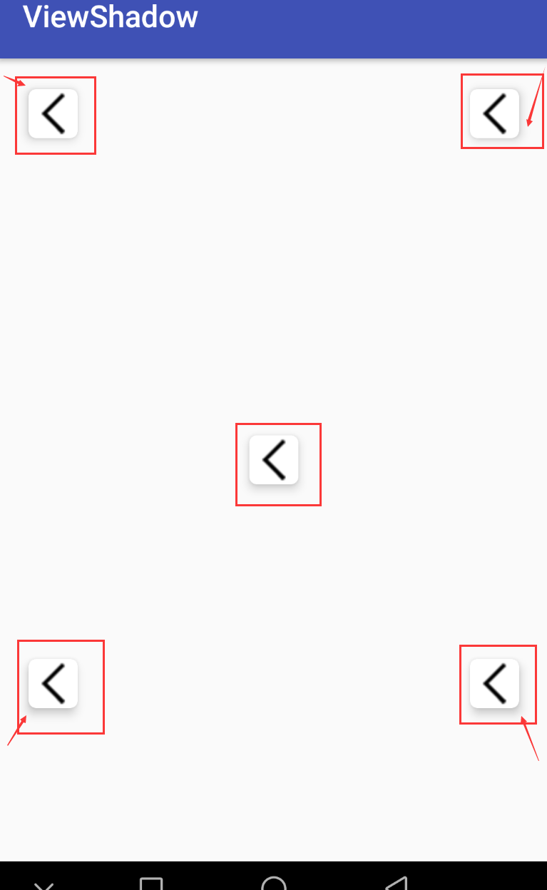
CardView 也可以实现圆角阴影效果,但是 CardView 的阴影方向是我们无法设置的。为什么强调阴影方向这个条件呢,因为 CardView 在 API 21 之后,阴影的显示效果在屏幕的各个位置是不一致的。如果你在屏幕中使用了多个 CardView ,但是 UI 美眉告诉你这几个CardView 的阴影不一样,太难看,需要统一,并且让测试提成了一个 BUG 。怎么解决,这就是SCardView 出现的来源。
看下 CardView 造成的阴影不一致的效果:
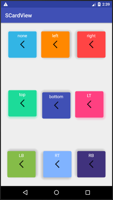
SCardView 通过 cardLightDirection 属性来配置光源的位置来控制阴影的显示,如下:
<com.meetsl.scardview.SCardView
        android:layout_width="@dimen/card_size"
        android:layout_height="@dimen/card_size"
        android:layout_centerHorizontal="true"
        android:layout_margin="20dp"
        app:cardBackgroundColor="@android:color/holo_orange_dark"
        app:cardCornerRadius="5dp"
        app:cardElevation="@dimen/cardview_elevation"
        app:cardLightDirection="left">  <!--光源位置在左侧,则阴影出现在反方向右侧 -->

        <TextView
            android:layout_width="wrap_content"
            android:layout_height="wrap_content"
            android:layout_gravity="center_horizontal"
            android:padding="5dp"
            android:text="left"
            android:textColor="@android:color/white"
            android:textSize="16sp" />

        <ImageView
            android:layout_width="wrap_content"
            android:layout_height="wrap_content"
            android:layout_gravity="center"
            android:src="@mipmap/home_back" />
    </com.meetsl.scardview.SCardView>
在 cardLightDirection 中提供四面八方的值,足够满足你的需求:
<attr name="cardLightDirection">
            <enum name="left" value="1" /> <!-- 设置光源位置为左侧,阴影在右侧 -->
            <enum name="right" value="2" /> <!-- 阴影在左侧-->
            <enum name="top" value="3" /> <!-- 阴影在下部-->
            <enum name="bottom" value="4" /> <!-- 阴影在上部 -->
            <enum name="LT" value="5" /> <!-- 阴影在右下角-->
            <enum name="RT" value="6" /> <!-- 阴影在左下角-->
            <enum name="LB" value="7" /> <!-- 阴影在右上角 -->
            <enum name="RB" value="8" /> <!-- 阴影在左上角 -->
            <enum name="none" value="9" /> <!-- 光源位置在正上方 -->
        </attr>
2. 给阴影设置颜色
看到一些比较漂亮的UI,阴影都有其自身的颜色,虽然不符合自然现象,但是好看啊。出了这样的设计图,除了和UI美眉要一张有阴影的背景图片,还可以通过 SCardView 来实现,来看下效果:
中间一行的第一个和第三个都设置有阴影,确实挺好看的。
3. 扔掉 CardView 对不同 Android 版本适配的过程
使用 CardView 开发,需要注意的一点是 CardView 在不同 API 的Android 手机上显示效果会有大小的差异。 CardView 提供了 cardUseCompatPadding 、cardPreventCornerOverlap 等属性来做版本的适配。具体怎么在开发中适配,自行搜索一下。如果不想考虑这些,那就直接使用 SCardView 。来看一下,照成差异的源码:
/**
     * CardView adds additional padding to draw shadows on platforms before Lollipop.
     * <p>
     * This may cause Cards to have different sizes between Lollipop and before Lollipop. If you
     * need to align CardView with other Views, you may need api version specific dimension
     * resources to account for the changes.
     * As an alternative, you can set this flag to <code>true</code> and CardView will add the same
     * padding values on platforms Lollipop and after.
     * <p>
     * Since setting this flag to true adds unnecessary gaps in the UI, default value is
     * <code>false</code>.
     *
     * @param useCompatPadding <code>true></code> if CardView should add padding for the shadows on
     *      platforms Lollipop and above.
     * @attr ref android.support.v7.cardview.R.styleable#CardView_cardUseCompatPadding
     */
    public void setUseCompatPadding(boolean useCompatPadding) {
        if (mCompatPadding != useCompatPadding) {
            mCompatPadding = useCompatPadding;
            IMPL.onCompatPaddingChanged(mCardViewDelegate);
        }
    }
差异造成的原因主要因为 Google开发者在实现 CardView 的阴影效果在 API 21之前和之后实现方式不一样,例如源码中所示:
static {
        if (Build.VERSION.SDK_INT >= 21) {
            IMPL = new CardViewApi21Impl();
        } else if (Build.VERSION.SDK_INT >= 17) {
            IMPL = new CardViewApi17Impl();
        } else {
            IMPL = new CardViewBaseImpl();
        }
        IMPL.initStatic();
    }
SCarView 直接去掉了 CardViewApi21Impl 这个实现方式,去掉适配了的麻烦,当然这样好像有点不太好,但是还有前面两个原因,还是值得的。这三点基本就说明了 SCardView 出现的缘由,觉得怎么样。如果可以就继续往下了解,看看如何在项目中使用它。
二、使用 SCardView
怎么使用 SCardView ,那这个就非常简单了。添加一个依赖,然后在布局中使用即可。
添加依赖:
implementation 'io.github.meetsl:SCardView:1.0'
Xml中使用:


<?xml version="1.0" encoding="utf-8"?>
<RelativeLayout xmlns:android="http://schemas.android.com/apk/res/android"
    xmlns:app="http://schemas.android.com/apk/res-auto"
    xmlns:tools="http://schemas.android.com/tools"
    android:layout_width="match_parent"
    android:layout_height="match_parent"
    tools:context=".MainActivity">

    <com.meetsl.scardview.SCardView
        android:layout_width="@dimen/card_size"
        android:layout_height="@dimen/card_size"
        android:layout_margin="20dp"
        android:onClick="jump"
        app:cardBackgroundColor="@android:color/holo_blue_light"
        app:cardShadowStartColor="#3733B5E5"
        app:cardShadowEndColor="#0333B5E5"
        app:cardCornerRadius="5dp"
        app:cardElevation="@dimen/cardview_elevation"
        app:cardLightDirection="none">

        <TextView
            android:layout_width="wrap_content"
            android:layout_height="wrap_content"
            android:layout_gravity="center_horizontal"
            android:padding="5dp"
            android:text="none"
            android:textColor="@android:color/white"
            android:textSize="16sp" />

        <ImageView
            android:layout_width="wrap_content"
            android:layout_height="wrap_content"
            android:layout_gravity="center"
            android:src="@mipmap/home_back" />
    </com.meetsl.scardview.SCardView>

    <com.meetsl.scardview.SCardView
        android:layout_width="@dimen/card_size"
        android:layout_height="@dimen/card_size"
        android:layout_centerHorizontal="true"
        android:layout_margin="20dp"
        app:cardBackgroundColor="@android:color/holo_orange_dark"
        app:cardCornerRadius="5dp"
        app:cardElevation="@dimen/cardview_elevation"
        app:cardLightDirection="left">

        <TextView
            android:layout_width="wrap_content"
            android:layout_height="wrap_content"
            android:layout_gravity="center_horizontal"
            android:padding="5dp"
            android:text="left"
            android:textColor="@android:color/white"
            android:textSize="16sp" />

        <ImageView
            android:layout_width="wrap_content"
            android:layout_height="wrap_content"
            android:layout_gravity="center"
            android:src="@mipmap/home_back" />
    </com.meetsl.scardview.SCardView>

    <com.meetsl.scardview.SCardView
        android:layout_width="@dimen/card_size"
        android:layout_height="@dimen/card_size"
        android:layout_alignParentRight="true"
        android:layout_margin="20dp"
        app:cardBackgroundColor="@android:color/holo_red_light"
        app:cardCornerRadius="5dp"
        app:cardElevation="@dimen/cardview_elevation"
        app:cardLightDirection="right">

        <TextView
            android:layout_width="wrap_content"
            android:layout_height="wrap_content"
            android:layout_gravity="center_horizontal"
            android:padding="5dp"
            android:text="right"
            android:textColor="@android:color/white"
            android:textSize="16sp" />

        <ImageView
            android:layout_width="wrap_content"
            android:layout_height="wrap_content"
            android:layout_gravity="center"
            android:src="@mipmap/home_back" />
    </com.meetsl.scardview.SCardView>

    <com.meetsl.scardview.SCardView
        android:layout_width="@dimen/card_size"
        android:layout_height="@dimen/card_size"
        android:layout_centerVertical="true"
        android:layout_margin="20dp"
        app:cardBackgroundColor="#1ADB99"
        app:cardShadowStartColor="#671ADB99"
        app:cardShadowEndColor="#041ADB99"
        app:cardCornerRadius="5dp"
        app:cardElevation="@dimen/cardview_elevation"
        app:cardLightDirection="top">

        <TextView
            android:layout_width="wrap_content"
            android:layout_height="wrap_content"
            android:layout_gravity="center_horizontal"
            android:padding="5dp"
            android:text="top"
            android:textColor="@android:color/white"
            android:textSize="16sp" />

        <ImageView
            android:layout_width="wrap_content"
            android:layout_height="wrap_content"
            android:layout_gravity="center"
            android:src="@mipmap/home_back" />
    </com.meetsl.scardview.SCardView>

    <com.meetsl.scardview.SCardView
        android:layout_width="@dimen/card_size"
        android:layout_height="@dimen/card_size"
        android:layout_centerInParent="true"
        android:layout_margin="20dp"
        app:cardBackgroundColor="@color/colorPrimary"
        app:cardCornerRadius="5dp"
        app:cardElevation="@dimen/cardview_elevation"
        app:cardLightDirection="bottom">

        <TextView
            android:layout_width="wrap_content"
            android:layout_height="wrap_content"
            android:layout_gravity="center_horizontal"
            android:padding="5dp"
            android:text="bottom"
            android:textColor="@android:color/white"
            android:textSize="16sp" />

        <ImageView
            android:layout_width="wrap_content"
            android:layout_height="wrap_content"
            android:layout_gravity="center"
            android:src="@mipmap/home_back" />
    </com.meetsl.scardview.SCardView>

    <com.meetsl.scardview.SCardView
        android:layout_width="@dimen/card_size"
        android:layout_height="@dimen/card_size"
        android:layout_alignParentRight="true"
        android:layout_centerVertical="true"
        android:layout_margin="20dp"
        app:cardBackgroundColor="@color/colorAccent"
        app:cardShadowStartColor="#57FF4081"
        app:cardShadowEndColor="#03FF4081"
        app:cardCornerRadius="5dp"
        app:cardElevation="@dimen/cardview_elevation"
        app:cardLightDirection="LT">

        <TextView
            android:layout_width="wrap_content"
            android:layout_height="wrap_content"
            android:layout_gravity="center_horizontal"
            android:padding="5dp"
            android:text="LT"
            android:textColor="@android:color/white"
            android:textSize="16sp" />

        <ImageView
            android:layout_width="wrap_content"
            android:layout_height="wrap_content"
            android:layout_gravity="center"
            android:src="@mipmap/home_back" />
    </com.meetsl.scardview.SCardView>

    <com.meetsl.scardview.SCardView
        android:layout_width="@dimen/card_size"
        android:layout_height="@dimen/card_size"
        android:layout_alignParentBottom="true"
        android:layout_margin="20dp"
        app:cardBackgroundColor="#85BC49"
        app:cardCornerRadius="5dp"
        app:cardElevation="@dimen/cardview_elevation"
        app:cardLightDirection="LB">

        <TextView
            android:layout_width="wrap_content"
            android:layout_height="wrap_content"
            android:layout_gravity="center_horizontal"
            android:padding="5dp"
            android:text="LB"
            android:textColor="@android:color/white"
            android:textSize="16sp" />

        <ImageView
            android:layout_width="wrap_content"
            android:layout_height="wrap_content"
            android:layout_gravity="center"
            android:src="@mipmap/home_back" />
    </com.meetsl.scardview.SCardView>

    <com.meetsl.scardview.SCardView
        android:layout_width="@dimen/card_size"
        android:layout_height="@dimen/card_size"
        android:layout_alignParentBottom="true"
        android:layout_centerHorizontal="true"
        android:layout_margin="20dp"
        app:cardBackgroundColor="#80B3FF"
        app:cardCornerRadius="5dp"
        app:cardElevation="@dimen/cardview_elevation"
        app:cardLightDirection="RT">

        <TextView
            android:layout_width="wrap_content"
            android:layout_height="wrap_content"
            android:layout_gravity="center_horizontal"
            android:padding="5dp"
            android:text="RT"
            android:textColor="@android:color/white"
            android:textSize="16sp" />

        <ImageView
            android:layout_width="wrap_content"
            android:layout_height="wrap_content"
            android:layout_gravity="center"
            android:src="@mipmap/home_back" />
    </com.meetsl.scardview.SCardView>

    <com.meetsl.scardview.SCardView
        android:layout_width="@dimen/card_size"
        android:layout_height="@dimen/card_size"
        android:layout_alignParentBottom="true"
        android:layout_alignParentRight="true"
        android:layout_margin="20dp"
        app:cardBackgroundColor="#40337D"
        app:cardCornerRadius="5dp"
        app:cardElevation="@dimen/cardview_elevation"
        app:cardLightDirection="RB">

        <TextView
            android:layout_width="wrap_content"
            android:layout_height="wrap_content"
            android:layout_gravity="center_horizontal"
            android:padding="5dp"
            android:text="RB"
            android:textColor="@android:color/white"
            android:textSize="16sp" />

        <ImageView
            android:layout_width="wrap_content"
            android:layout_height="wrap_content"
            android:layout_gravity="center"
            android:src="@mipmap/home_back" />
    </com.meetsl.scardview.SCardView>
</RelativeLayout>
效果图如下,有木有很漂亮:

---------- 更新:2018/10/9
三、控件新特性:边角控制
SCardView 添加了对边角的控制,可能满足某些需求,上图查看效果:
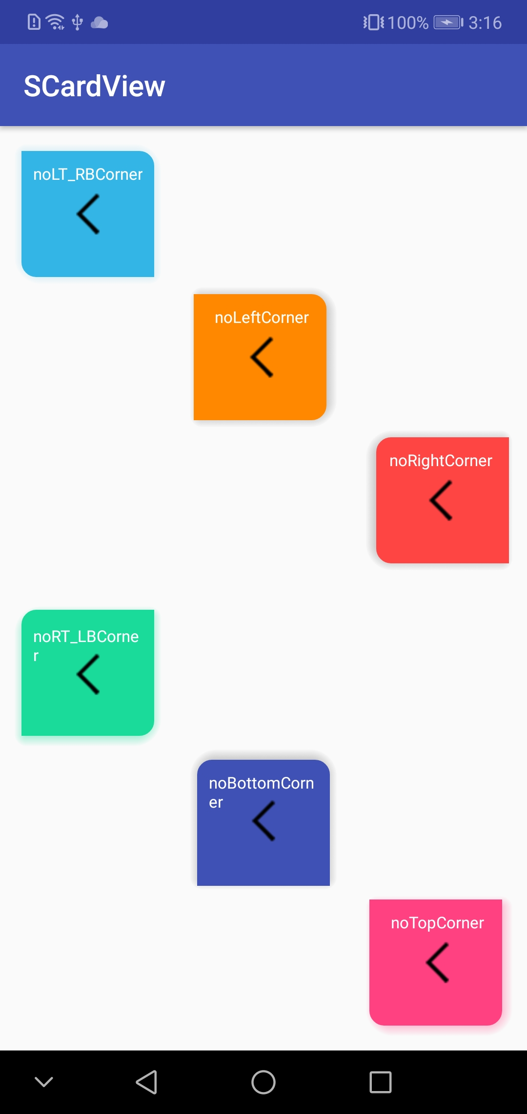
新特性是对边角添加了控制,就正如上图所示,一共添加了 6 种效果:
<attr name="cardCornerVisibility">
     <enum name="noLeftCorner" value="1" />
     <enum name="noRightCorner" value="2" />
     <enum name="noTopCorner" value="3" />
     <enum name="noBottomCorner" value="4" />
     <enum name="noLT_RBCorner" value="5" />
     <enum name="noRT_LBCorner" value="6" />
     <enum name="none" value="7" />
</attr>
这样的特性有吸引到你么!!!这个新特性是添加在 1.1 版本上的,要使用这个特性,添加依赖:
implementation 'io.github.meetsl:SCardView:1.1'
SCardView 源码放置在 GitHub 上 ,大家想看具体实现可以到这里查看:欢迎 Mark 收藏,后续会添加其他特性
https://github.com/meetsl/SCardView-master
---------- 更新 2019/9/12
implementation 'io.github.meetsl:SCardView:1.2'
1. 支持代码中动态设置阴影颜色
  /**
     * Updates the shadow color of the CardView
     *
     * @param startColor The new startColor to set for the card shadow
     * @param endColor The new endColor to set for the card shadow
     */
    fun setCardShadowColor(@ColorInt startColor: Int, @ColorInt endColor: Int)

    /**
     * update the both of background color and shadow color of the card view
     */
    fun setColors(@ColorInt backgroundColor: Int, @ColorInt shadowStartColor: Int, @ColorInt shadowEndColor: Int)