

Python画图主要用到matplotlib这个库。具体来说是pylab和pyplot这两个子库。这两个库可以满足基本的画图需求,而条形图,散点图等特殊图,下面再单独具体介绍。
首先给出pylab神器镇文:pylab.rcParams.update(params)。这个函数几乎可以调节图的一切属性,包括但不限于:坐标范围,axes标签字号大小,xtick,ytick标签字号,图线宽,legend字号等。
具体参数参看官方文档:http://matplotlib.org/users/customizing.html
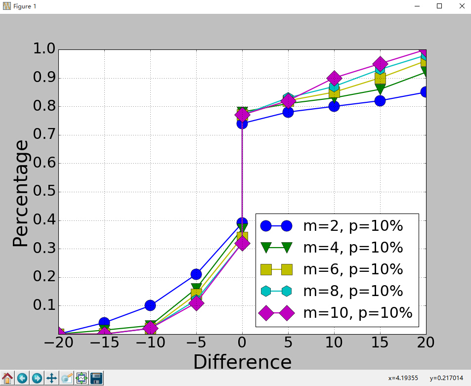
首先给出一个Python3画图的例子。
import matplotlib.pyplot as plt
import matplotlib.pylab as pylab
import scipy.io
import numpy as np
params={
    'axes.labelsize': '35',
    'xtick.labelsize':'27',
    'ytick.labelsize':'27',
    'lines.linewidth':2 ,
	'legend.fontsize': '27',
	'figure.figsize'   : '12, 9'    # set figure size
}
pylab.rcParams.update(params)            #set figure parameter
#line_styles=['ro-','b^-','gs-','ro--','b^--','gs--']  #set line style


#We give the coordinate date directly to give an example.
x1 = [-20,-15,-10,-5,0,0,5,10,15,20]
y1 = [0,0.04,0.1,0.21,0.39,0.74,0.78,0.80,0.82,0.85]
y2 = [0,0.014,0.03,0.16,0.37,0.78,0.81,0.83,0.86,0.92]
y3 = [0,0.001,0.02,0.14,0.34,0.77,0.82,0.85,0.90,0.96]
y4 = [0,0,0.02,0.12,0.32,0.77,0.83,0.87,0.93,0.98]
y5 = [0,0,0.02,0.11,0.32,0.77,0.82,0.90,0.95,1]


plt.plot(x1,y1,'bo-',label='m=2, p=10%',markersize=20) # in 'bo-', b is blue, o is O marker, - is solid line and so on
plt.plot(x1,y2,'gv-',label='m=4, p=10%',markersize=20)
plt.plot(x1,y3,'ys-',label='m=6, p=10%',markersize=20)
plt.plot(x1,y4,'ch-',label='m=8, p=10%',markersize=20)
plt.plot(x1,y5,'mD-',label='m=10, p=10%',markersize=20)


fig1 = plt.figure(1)
axes = plt.subplot(111)
#axes = plt.gca()
axes.set_yticks([0.1,0.2,0.3,0.4,0.5,0.6,0.7,0.8,0.9,1.0])
axes.grid(True)  # add grid

plt.legend(loc="lower right")  #set legend location
plt.ylabel('Percentage')   # set ystick label
plt.xlabel('Difference')  # set xstck label

plt.savefig('D:\\commonNeighbors_CDF_snapshots.eps',dpi = 1000,bbox_inches='tight')
plt.show()
显示效果如下:
代码没什么好说的,这里只说一下plt.subplot(111)这个函数。
plt.subplot(111)和plt.subplot(1,1,1)是等价的。意思是将区域分成1行1列,当前画的是第一个图(排序由行至列)。
plt.subplot(211)意思就是将区域分成2行1列,当前画的是第一个图(第一行,第一列)。以此类推,只要不超过10,逗号就可省去。
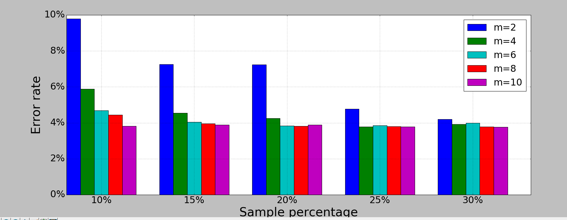
python画条形图。代码如下。
import scipy.io
import numpy as np
import matplotlib.pylab as pylab
import matplotlib.pyplot as plt
import matplotlib.ticker as mtick
params={
    'axes.labelsize': '35',
    'xtick.labelsize':'27',
    'ytick.labelsize':'27',
    'lines.linewidth':2 ,
    'legend.fontsize': '27',
    'figure.figsize'   : '24, 9'
}
pylab.rcParams.update(params)


y1 = [9.79,7.25,7.24,4.78,4.20]
y2 = [5.88,4.55,4.25,3.78,3.92]
y3 = [4.69,4.04,3.84,3.85,4.0]
y4 = [4.45,3.96,3.82,3.80,3.79]
y5 = [3.82,3.89,3.89,3.78,3.77]


ind = np.arange(5)                # the x locations for the groups
width = 0.15
plt.bar(ind,y1,width,color = 'blue',label = 'm=2')
plt.bar(ind+width,y2,width,color = 'g',label = 'm=4') # ind+width adjusts the left start location of the bar.
plt.bar(ind+2*width,y3,width,color = 'c',label = 'm=6')
plt.bar(ind+3*width,y4,width,color = 'r',label = 'm=8')
plt.bar(ind+4*width,y5,width,color = 'm',label = 'm=10')
plt.xticks(np.arange(5) + 2.5*width, ('10%','15%','20%','25%','30%'))

plt.xlabel('Sample percentage')
plt.ylabel('Error rate')

fmt = '%.0f%%' # Format you want the ticks, e.g. '40%'
xticks = mtick.FormatStrFormatter(fmt)
# Set the formatter
axes = plt.gca()   # get current axes
axes.yaxis.set_major_formatter(xticks) # set % format to ystick.
axes.grid(True)
plt.legend(loc="upper right")
plt.savefig('D:\\errorRate.eps', format='eps',dpi = 1000,bbox_inches='tight')

plt.show()
结果如下:
画散点图,主要是scatter这个函数,其他类似。
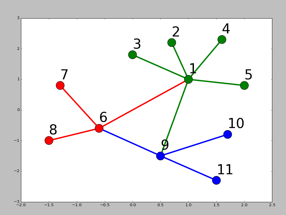
画网络图,要用到networkx这个库,下面给出一个实例:
import networkx as nx
import pylab as plt
g = nx.Graph()
g.add_edge(1,2,weight = 4)
g.add_edge(1,3,weight = 7)
g.add_edge(1,4,weight = 8)
g.add_edge(1,5,weight = 3)
g.add_edge(1,9,weight = 3)

g.add_edge(1,6,weight = 6)
g.add_edge(6,7,weight = 7)
g.add_edge(6,8,weight = 7)

g.add_edge(6,9,weight = 6)
g.add_edge(9,10,weight = 7)
g.add_edge(9,11,weight = 6)


fixed_pos = {1:(1,1),2:(0.7,2.2),3:(0,1.8),4:(1.6,2.3),5:(2,0.8),6:(-0.6,-0.6),7:(-1.3,0.8), 8:(-1.5,-1), 9:(0.5,-1.5), 10:(1.7,-0.8), 11:(1.5,-2.3)} #set fixed layout location


#pos=nx.spring_layout(g) # or you can use other layout set in the module
nx.draw_networkx_nodes(g,pos = fixed_pos,nodelist=[1,2,3,4,5],
node_color = 'g',node_size = 600)
nx.draw_networkx_edges(g,pos = fixed_pos,edgelist=[(1,2),(1,3),(1,4),(1,5),(1,9)],edge_color='g',width = [4.0,4.0,4.0,4.0,4.0],label = [1,2,3,4,5],node_size = 600)


nx.draw_networkx_nodes(g,pos = fixed_pos,nodelist=[6,7,8],
node_color = 'r',node_size = 600)
nx.draw_networkx_edges(g,pos = fixed_pos,edgelist=[(6,7),(6,8),(1,6)],width = [4.0,4.0,4.0],edge_color='r',node_size = 600)

nx.draw_networkx_nodes(g,pos = fixed_pos,nodelist=[9,10,11],
node_color = 'b',node_size = 600)
nx.draw_networkx_edges(g,pos = fixed_pos,edgelist=[(6,9),(9,10),(9,11)],width = [4.0,4.0,4.0],edge_color='b',node_size = 600)


plt.text(fixed_pos[1][0],fixed_pos[1][1]+0.2, s = '1',fontsize = 40)
plt.text(fixed_pos[2][0],fixed_pos[2][1]+0.2, s = '2',fontsize = 40)
plt.text(fixed_pos[3][0],fixed_pos[3][1]+0.2, s = '3',fontsize = 40)
plt.text(fixed_pos[4][0],fixed_pos[4][1]+0.2, s = '4',fontsize = 40)
plt.text(fixed_pos[5][0],fixed_pos[5][1]+0.2, s = '5',fontsize = 40)
plt.text(fixed_pos[6][0],fixed_pos[6][1]+0.2, s = '6',fontsize = 40)
plt.text(fixed_pos[7][0],fixed_pos[7][1]+0.2, s = '7',fontsize = 40)
plt.text(fixed_pos[8][0],fixed_pos[8][1]+0.2, s = '8',fontsize = 40)
plt.text(fixed_pos[9][0],fixed_pos[9][1]+0.2, s = '9',fontsize = 40)
plt.text(fixed_pos[10][0],fixed_pos[10][1]+0.2, s = '10',fontsize = 40)
plt.text(fixed_pos[11][0],fixed_pos[11][1]+0.2, s = '11',fontsize = 40)


plt.show()
结果如下:

 浙公网安备 33010602011771号