
css 关闭按钮实现
通过css的伪元素:before,:after以及transform: rotate(45deg);旋转来实现(支持IE9及其以上版本)
<div class="close"></div>
/*关闭图标*/

.close {
    position: absolute;
    right: -25px;
    top: -25px;
    width: 50px;
    height: 50px;
    background: silver;
    border-radius: 25px;
    box-shadow: 2px 2px 5px 0px black;
    cursor: pointer;
}

.close:hover {
    background: red;
}
.close:before {
    position: absolute;
    content: '';
    width: 30px;
    height: 10px;
    background: white;
    transform: rotate(45deg);
    top: 20px;
    left: 10px;
}
.close:after{
    content: '';
        position: absolute;
    width: 30px;
    height: 10px;
    background: white;
    transform: rotate(-45deg);
    top: 20px;
    left: 10px;
}
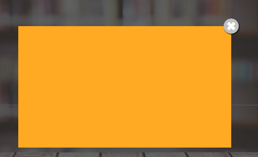
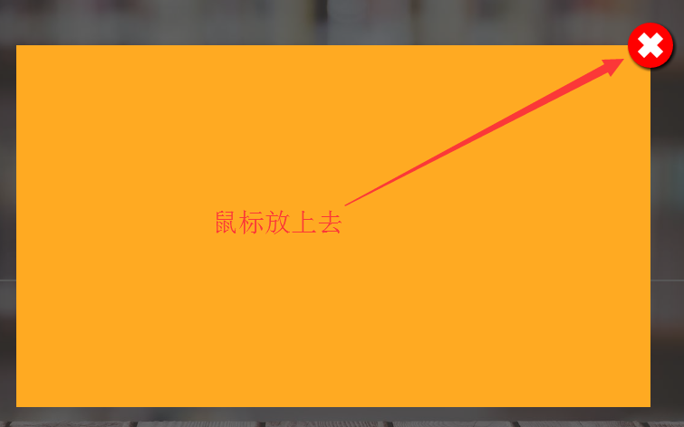
效果图:

 浙公网安备 33010602011771号