
Web开发疑难问题解决方案-(最近更新:2020-06-15)
这篇文章用来记录Web(包括PC和移动端)开发过程中遇到的一些疑难问题的解决方案。
- P1、 '1像素边框'问题
- P2、只读输入框在ios上的莫名表现
- P3、自适应高度的textarea
- P4、 CSS3实现翻牌特效
- P5.IOS 10 以上Safari手机浏览器禁止缩放
- P6 检测浏览器是否为IE
- P7 去掉input[type='number']后面浏览器默认的角标
-
P8 将
window.location.relaod作为setTimeout的回调函数 - P9 浏览器滚动元素确定
- P10 什么是Plain Object?如何判断对象是Plain Object
- P11 flex最后一行左对齐
- P12 请求按序展示(多个请求,如果一个前面的请求返回的话,不要覆盖后面的请求)
- P13 纯前端实现base64图片下载,兼容IE10+
- P14 body元素上background-gradient不生效
- P15 html5 drop事件触发需要在dragover事件中阻止浏览器默认行为
- P16 点击H5页面元素的时候出现阴影
- P17 img元素作为flex子项高度自适应问题
- P18 webpack4 dynamic import() code split webpackChunkName不生效的问题
-
P19 使用
html-webpack-plugin生成页面js排序问题 - P20 CSS3 transform not working
- P21 Ios input placeholder垂直居中
- P22 输入框只允许输入数字且需要调起全数字键盘问题
- P23 ios微信版本出现的问题,用户输入时,软键盘弹出。收起软键盘的时候,页面下部软键盘原来位置会变成一片空白区域,页面没有恢复原状。
- P24 flex布局中,nowrap不换行超出容器限制解决方案
- P25.解决使用FastClick导致ios input框唤起软键盘不灵敏问题
- P26 IOS下input的placeholder不垂直居中的问题
- P27、css/scss等文件中引入node_modules中的资源或者使用alia别名路径引入资源问题
P1、 '1像素边框'问题
在平时的开发过程中,经常会遇到UI给的设计稿中元素的边框为0.5px,这里的0.5px指的是CSS像素,对于设备像素比为2的屏幕来说,对应的物理像素就是1个像素,也就是说设计稿的本意是让我们实现真实的占据1个物理像素点的边框。由于直接设置对应CSS属性为0.5px在各平台和浏览器中兼容性很不好,网上给出了很多解决方案,这里仅列出最常用的被论证有效的解决方案。
1.根据设备像素比transform缩放,常借助伪元素
div {
    position: relative;
}
div::after {
    content: '';
    position: absolute;
    z-index: 999;
    width: 100%;
    height: 100%;
    top: 0;
    left: 0;
    border: 1px solid red;
    transform-origin: 0 0;
}
@media (-webkit-min-device-pixel-ratio:2),(min-device-pixel-ratio:2){
    div::after{
            width: 200%;
            height: 200%;
            -webkit-transform: scale(0.5);
            transform: scale(0.5);
            /*border-radius: $radius * 2;有圆角*/
    }
}
@media (-webkit-min-device-pixel-ratio:3),(min-device-pixel-ratio:3){
    div::after{
            width: 300%;
            height: 300%;
            -webkit-transform: scale(.33333);
            transform: scale(.33333);
            /*border-radius: $radius * 3;有圆角*/
    }
}
/**
 * @module 背景与边框
 * @description 为元素添加边框(包括1px边框)
 * @method border
 * @version 2.0.0
 * @param {String} $border-width 指定边框厚度(单位为px),默认值:1px,取值与`border-width`属性一致,不同方向代表边框位置 <2.0.0>
 * @param {String} $border-color 指定边框颜色 <2.0.0>
 * @param {String} $border-style 指定边框样式 <2.0.0>
 * @param {String} $radius 指定边框圆角半径,默认值:null <2.0.0>
 */
 @mixin border($border-width: 1px, $border-color: map-get($base, border-color), $border-style: solid, $radius: null,$opacity: null) {
    // 为边框位置提供定位参考
    position: relative;
    @if $border-width == null {
        $border-width: 0;
    }
    border-radius: $radius;
    &::after {
        // 用以解决边框layer遮盖内容
        pointer-events: none;
        position: absolute;
        z-index: 999;
        top: 0;
        left: 0;
        // fix当元素宽度出现小数时,边框可能显示不全的问题
        // overflow: hidden;
        content: "\0020";
        border-color: $border-color;
        border-style: $border-style;
        border-width: $border-width;
        @if $opacity != null {
            opacity: $opacity;
        }
        // 适配dpr进行缩放
        @media (-webkit-min-device-pixel-ratio:1),(min-device-pixel-ratio:1){
            width: 100%;
            height: 100%;
            @if $radius != null {
                border-radius: $radius;
            }
        }
        @media (-webkit-min-device-pixel-ratio:2),(min-device-pixel-ratio:2){
            width: 200%;
            height: 200%;
            -webkit-transform: scale(0.5);
            transform: scale(0.5);
            @if $radius != null {
                border-radius: $radius * 2;
            }
        }
        @media (-webkit-min-device-pixel-ratio:2),(min-device-pixel-ratio:3){
            width: 300%;
            height: 300%;
            -webkit-transform: scale(0.33333);
            transform: scale(0.33333);
            @if $radius != null {
                border-radius: $radius * 3;
            }
        }
        -webkit-transform-origin: (0,0);
        transform-origin:(0 0);
    }
}
div {
    position: relative;
    border: none;
}
div:after {
    content: '';
    position: absolute;
    left: 0;
    background: #000;
    widt
    h: 100%;
    height: 1px;
    transform: scaleY(0.5);/*以dpr = 2为例 */
    transform-origin: 0 0;
}
 // 给styled-compoent使用
/**
 * 支持1像素border
 */
export function border(
  borderWidth = '1px',
  borderColor = '#ccc',
  borderStyle = 'solid',
  radius,
  opacity
) {
  // 为边框位置提供定位参考
  return `position: relative;

  ${radius ? 'border-radius: ' + radius + ';' : ''}
  &::after {
      pointer-events: none;
      position: absolute;
      z-index: 999;
      top: 0;
      left: 0;
      content: "\\0020";
      border-color: ${borderColor};
      border-style: ${borderStyle};
      border-width: ${borderWidth};
      ${opacity ? 'opacity: ' + opacity + ';' : ''}
      @media (-webkit-min-device-pixel-ratio:1),(min-device-pixel-ratio:1){
          width: 100%;
          height: 100%;
          ${radius ? 'border-radius: ' + radius + ';' : ''}
      }
      @media (-webkit-min-device-pixel-ratio:2),(min-device-pixel-ratio:2){
          width: 200%;
          height: 200%;
          transform: scale(0.5);
          ${radius ? 'border-radius: ' + radius * 2 + ';' : ''}
      }
      @media (-webkit-min-device-pixel-ratio:3),(min-device-pixel-ratio:3){
          width: 300%;
          height: 300%;
          transform: scale(0.33333);
          ${radius ? 'border-radius: ' + radius * 3 + ';' : ''}
      }
      transform-origin:0 0;}`
}
参考:
怎么画一条0.5px的边(更新)
再谈Retina下1px的解决方案
P2、只读输入框在ios上的莫名表现

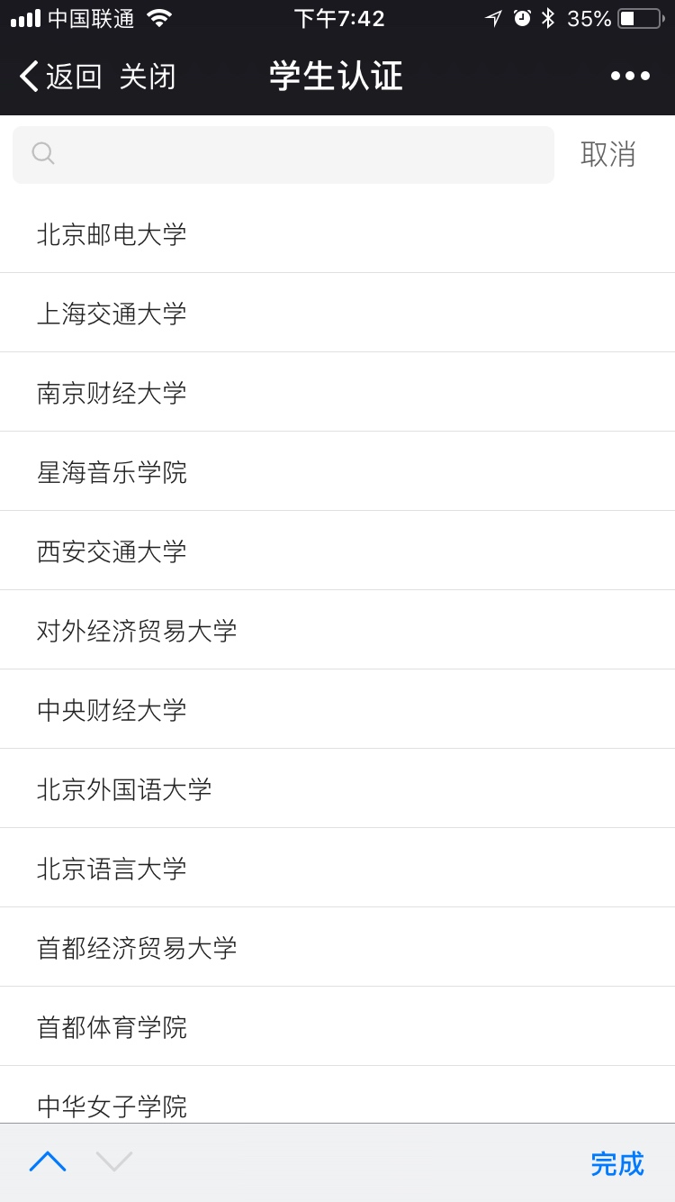
如上左图所示,学校选择输入框是一个只读输入框,整个输入框可点击,包括前面的标签和后面的箭头,点击输入框会隐藏当前页面结构,显示学校选择页面,使用iphone,当点击的区域是input标签区域时,下方会出现输入法的工具条,点击工具条左侧的箭头会弹出键盘,点击完成工具条会隐藏。
<input id="school" readOnly = "readOnly" type="text" placeholder="请选择学校(专科及以上)" />
解决方案
1.使用其他标签模拟一个readOnly输入框;
2.禁止该输入框touchstart或者touchend的默认事件,实践表明禁止click的默认事件不能解决上述问题
$('#school').on('touchend',(e) => {
    e.preventDefault();
    ...
});
P3、自适应高度的textarea
1.设置div标签的contenteditable属性为true,模拟一个输入框,这么做的缺点是不能完全模拟输入框的表现,如focus事件自动弹出键盘
2.使用"同步镜像"
html
<div class="reply-input js-reply-input">
    <pre class="reply-text-mirror js-reply-text-mirror"></pre>
    <textarea class="js-reply-text" placeholder="回复"></textarea>
</div>
css
.reply-input{
    position: relative;
    width: 82%;
    min-height: 92px;
    >textarea{
        position: absolute;
        top: 0;
        left: 0;
        width: 100%;
        height: 100%;
        resize: none;
        outline: none;
        border: 0;
    }
    >.reply-text-mirror{
        display: block;
        white-space: pre-wrap;
        word-wrap: break-word;
        visibility: hidden;
    }
    textarea,.reply-text-mirror{
        line-height: 20px;
        font-family: "Helvetica Neue", Helvetica, Arial, "PingFang SC", "Hiragino Sans GB", "Heiti SC", "Microsoft YaHei", "WenQuanYi Micro Hei", sans-serif;
        font-size: 14px;
        padding: 10px 6px 20px 9px;
        min-height: 92px;
        width: 100%;
        border-radius: 4px;
    }
}
javascript
const textarea = $('textarea');
textarea[0].oninput =function() {
    var text = textarea.val();
    mirror.text(text);
}
textarea绝对定位,高度与父元素高度相同100%,通过js操作把输入的字符实时同步到背后的镜像元素来撑高父元素。
P4、 CSS3实现翻牌特效
html
    <div id="js-card-Pop" class="m-card-Pop">
        <div class="front"></div>
        <div class="back"></div>
    </div>
css
.m-card-Pop{
    position: relative;

    .front{
        position:absolute;
        width: 100%;
        height: 100%;
        top:0;
        left:0;
        z-index: 2;
        backface-visibility: hidden;
    }
    .back{  //翻过来后这一边会朝上
        transform:rotateY(180deg) translateZ(1px) ;
        position:absolute;
        width:100%;
        height:100%;
        top:0;
        left:0;
        backface-visibility: hidden;
        color:#fff;
    }

}
.m-card-Pop-R{
    transition: 0.5s ease-in-out;
    transform-style: preserve-3d;
    transform: rotateY(180deg);
}
javascript
$('#js-card-Pop').addClass('m-card-Pop-R');
参考
https://zhuanlan.zhihu.com/p/27089238
P5.IOS 10 以上Safari手机浏览器禁止缩放
<meta name="viewport" content="width=device-width,initial-scale=1.0,maximum-scale=1.0,minimum-scale=1.0,user-scalable=no">
ios 10以上的Safari浏览器即使加上上述声明页面还是可以双指缩放或者双击缩放,https://developer.apple.com/library/content/releasenotes/General/WhatsNewInSafari/Articles/Safari_10_0.html,在微信和Chrome浏览器中表现正常。
网友给出的方法
禁止双指缩放
document.addEventListener('touchmove', function (event) {
  if (event.scale !== 1) { event.preventDefault(); }
}, false);
禁止双击缩放
var lastTouchEnd = 0;
document.addEventListener('touchend', function (event) {
  var now = (new Date()).getTime();
  if (now - lastTouchEnd <= 300) {
    event.preventDefault();
  }
  lastTouchEnd = now;
}, false);
这两种方法仅供参考,实践过程中可能与页面本身的事件冲突。
如果仅仅要求禁止双击缩放使用css属性touch-action: manipulation;也是可以的,同时会屏蔽点击事件的300ms延时.
参考
disable viewport zooming iOS 10+ safari?
P6 检测浏览器是否为IE
function isIE() { //ie?
 if (!!window.ActiveXObject || "ActiveXObject" in window)
  return true;
  else
  return false;
 }
P7 去掉input[type='number']后面浏览器默认的角标
input::-webkit-outer-spin-button,
input::-webkit-inner-spin-button {
  -webkit-appearance: none;
}
input[type="number"]{
  -moz-appearance: textfield;
}
P8 将window.location.relaod作为setTimeout的回调函数
setTimeout(window.location.reload, 250);
Chrome reports:
Uncaught TypeError: Illegal invocation
需要绑定正确的上下文
setTimeout(window.location.reload.bind(window.location), 250);
P9 浏览器滚动元素确定
scrollTop, scrollLeft, scrollWidth, scrollHeight 都是跟滚动相关的属性。设置 scrollTop 和 scrollLeft 还可以产生滚动。但是不同的浏览器或者Webkit以及不同版本对于页面滚动元素实现不一样,一些认为滚动元素是body,一些认为滚动元素是html,实现标准非常混乱,现在一般认为标准的实现应该是html元素,可能是浏览器厂商们也觉得现在的页面滚动元素太乱,一会儿body一会儿html,于是搞出来document.scrollingElement这么个东西。根据 MDN 的介绍:document 的 scrollingElement 是一个只读属性,始终指向页面滚动元素,但是只要版本较高的浏览器支持该属性。下面的获取方式能兼容大多数场景。
var rootElement = document.scrollingElement || document.body;
参考
Chrome 中 scrollingElement 的变化
P10 什么是Plain Object?如何判断对象是Plain Object
/**
 * Checks if `value` is a plain object, that is, an object created by the
 * `Object` constructor or one with a `[[Prototype]]` of `null`.
 */
function isPlainObject(value) {
  if (Object.prototype.toString.call(value) != "[object Object]") {
    return false
  }
  if (Object.getPrototypeOf(value) === null) {
    return true
  }
  let proto = value
  while (Object.getPrototypeOf(proto) !== null) {
    proto = Object.getPrototypeOf(proto)
  }
  return Object.getPrototypeOf(value) === proto
}

const obj1 = {}
const obj2 = new Object()
const obj3 = Object.create(null)
const obj4 = Object.create({})

function Foo() {
  this.a = 1
}

const obj5 = new Foo()

console.log(
  isPlainObject(obj1), // true
  isPlainObject(obj2), // true
  isPlainObject(obj3), // true
  isPlainObject(obj4), // false
  isPlainObject(obj5)  // false
)
P11 flex最后一行左对齐
"年少无知"的我曾经以为flex布局能够一统天下,无所不能,直到遇到了flex布局最后一行左对齐.
<div id="wrap">
  <div class="item"></div>
  <div class="item"></div>
  <div class="item"></div>
  <div class="item"></div>
  <div class="item"></div>
  <div class="item"></div>
  <div class="item"></div>
  <div class="item"></div>
  <div class="item"></div>
  <div class="item"></div>
  <div class="item"></div>
  <div class="item"></div>
  <div class="item"></div>
</div>
#wrap {
  display: flex;
  justify-content: space-around;
  flex-wrap: wrap;
}
.item {
  width: 200px;
  height: 100px;
  margin-bottom: 40px;
  background: blanchedalmond;
}
希望实现多列均匀分布的自适应布局,但是最后一行子项不够,导致不能对齐.
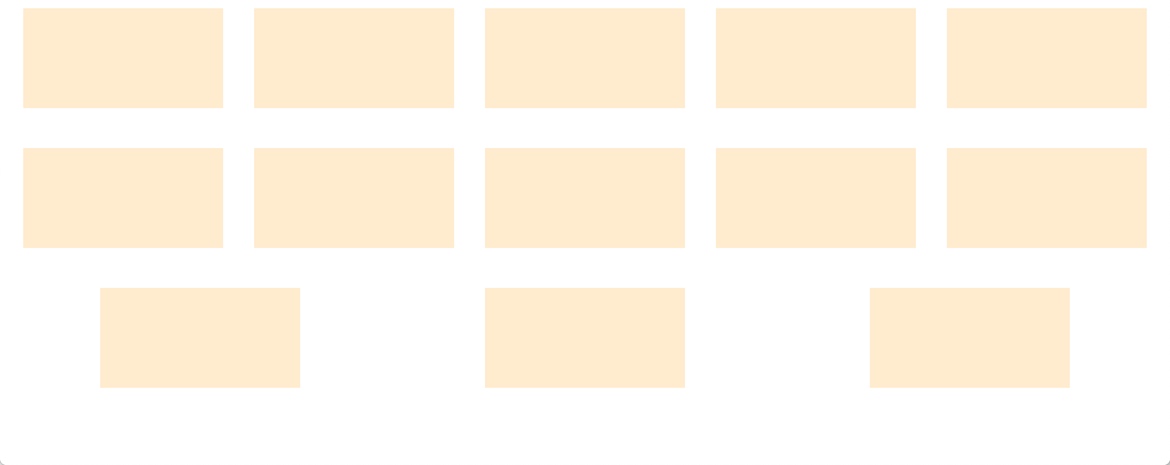
目前最好的解决方案都是多添加几个子项,但是由于是自适应的,我们并不知道需要添加多少个子项,通用的做法是添加"足够多"的子项,并且其对后面的布局影响越小越好,
<div id="wrap">
  <div class="item"></div>
  <div class="item"></div>
    ....
    ....
  <div class="item-shim"></div>
  <div class="item-shim"></div>
  <div class="item-shim"></div>
  <div class="item-shim"></div>
  <div class="item-shim"></div>
  <div class="item-shim"></div>
  <div class="item-shim"></div>
  <div class="item-shim"></div>
</div>
....
....
.item-shim {
  width: 200px; /*与item尺寸相同*/
  height: 0;
  /* visibility: hidden; */
}
参考
Flex-box: Align last row to grid
P12 请求按序展示(多个请求,如果一个前面的请求返回的话,不要覆盖后面的请求)
记录每一个请求的发起时间,然后每个请求回来后先判断当前展示在页面上的数据的发起时间,如果本次返回的结果的发起时间晚于当前显示的数据的发起时间,就替换,否则不替换。
(function(){
  var lastShowedResult = 0//当前显示的结果的请求时间,初始为0
  $('input').keyup(function(){
    var requestTime = +Date.now()//每次发请求时记录一下时间,转换成数字,注意在闭包里面
    $.get(url, function(data){
      if (requestTime > lastShowedResult) {//请求拿到后判断是否晚于当前正显示的内容的发起时间,如果是,则
        lastShowedResult = requestTime//替换当前显示结果的发起时间
        showResult(data)//替换页面上的内容
      }
    })
  })
})()

作者:谢然
链接:https://www.zhihu.com/question/49470022/answer/118129515
来源:知乎
著作权归作者所有。商业转载请联系作者获得授权,非商业转载请注明出处。
P13 纯前端实现base64图片下载,兼容IE10+
// 这里是获取到的图片base64编码,这里只是个例子哈,要自行编码图片替换这里才能测试看到效果
  const imgUrl = 'data:image/png;base64,...'
  // 如果浏览器支持msSaveOrOpenBlob方法(也就是使用IE浏览器的时候),那么调用该方法去下载图片
  // IE浏览器
  if (window.navigator.msSaveOrOpenBlob) {
    var bstr = atob(imgUrl.split(',')[1])
    var n = bstr.length
    var u8arr = new Uint8Array(n)
    while (n--) {
      u8arr[n] = bstr.charCodeAt(n)
    }
    var blob = new Blob([u8arr])
    window.navigator.msSaveOrOpenBlob(blob, 'chart-download' + '.' + 'png')
  } else {
    // 现代浏览器
    const a = document.createElement('a')
    a.href = imgUrl
    a.setAttribute('download', 'chart-download')
    a.click()
  }
P14 body元素上background-gradient不生效
body:before {
    content:"";
    position:fixed;
    left:0;
    top:0;
    right:0;
    bottom:0;
    z-index:-1;
    background:#D8D8D8;
    background: linear-gradient(to bottom, #D8D8D8, #585858) ;
}
P15 html5 drop事件触发需要在dragover事件中阻止浏览器默认行为
document.addEventListener("dragover", function(event) {
  // prevent default to allow drop
  event.preventDefault();
}, false);
document.addEventListener("drop", function(event) {
  // prevent default action (open as link for some elements)
  event.preventDefault();
}, false);
P16 点击H5页面元素的时候出现阴影
.class{
  -webkit-tap-highlight-color:transparent;
}
P17 img元素作为flex子项高度自适应问题
<div style="display:flex;">
  <img src="https://i.imgur.com/hHzrRsf.jpg" style="width:160px;">
</div>
<div style="display:flex;">
  <img src="https://i.imgur.com/hHzrRsf.jpg" style="width:100%;">
</div>
上述代码只设置了图片的宽度定宽或者为父元素的宽度,本意是高度自适应,保持宽高比,从而避免图片扭曲,但是在低版本的chrome浏览器包括Android浏览器中(chrome 78已修复),高度会是图片的原始高度
解决方案
 <div style="display:flex;">
    <img src="https://i.imgur.com/hHzrRsf.jpg" style="width:160px;align-self: center;">
</div>

低版本的chrome浏览器错误的将img的align-self解析成stretch
参考
Image height: auto doesn't work on chrome
P18 webpack4 dynamic import() code split webpackChunkName不生效的问题
首先必须配置webpack.config.js
{
  output: {
    chunkFilename: "[name].bundle.js"
  },
}
import(/* webpackChunkName: "byted-bridge-app-jssdk" */ "@bridge/byted-bridge-app-jssdk"),
如果使用babel保证.babalrc不能移除注释
{
 "comments": true
}
如果使用typescript,保证tsconfig
{
    module: "esnext",
    removeComments: false
}
参考
webpack dynamic import naming doesn't work
how can i use ts-loader and webpack3 dynamic imports to implement code-splitting
P19 使用html-webpack-plugin生成页面js排序问题
假设我们有如下的webpack配置
entry: {
  'demo': './src/demo.ts',
  'hysdk': './src/hysdk.ts'
},
plugins: [
    new HtmlWebpackPlugin()
]
默认情况下生成的js插入html文件的顺序如下
<script type="text/javascript" src="demo.bundle.js"></script>
<script type="text/javascript" src="hysdk.bundle.js"></script>
假设demo.bundle.js必须依赖hysdk.bundle.js才能执行,显然需要调整脚本顺序。有三种方法
1.修改配置
手动排
new HtmlWebpackPlugin({
  ...
  chunks: ['hysdk', 'demo'],
  chunksSortMode: 'manual'
})
自动排
  new HtmlWebpackPlugin({
        ...
        chunksSortMode: function (chunk1, chunk2) {
            var order = ['hysdk', 'demo'];
            var order1 = order.indexOf(chunk1.names[0]);
            var order2 = order.indexOf(chunk2.names[0]);
            return order1 - order2;
        }
    })
2.修改模板和配置
<!-- ./src/index.template.html -->
<html>
<body>
<script src="<%= htmlWebpackPlugin.files.chunks.hysdk.entry %>"></script>
<script src="<%= htmlWebpackPlugin.files.chunks.demo.entry %>"></script>
</body>
</html>
new HTMLWebpackPlugin({
  template: './src/index.template.html',
  inject: false,
}),
P20 CSS3 transform not working
transform在inline元素上不生效,设置display: inline-block就会生效
P21 Ios input placeholder垂直居中
&::placeholder {
    color: #999;
    line-height: normal;
}
P22 输入框只允许输入数字且需要调起全数字键盘问题
input type=number 时maxLength不会生效,且type=number的时候输入框聚焦的时候,andriod可以调起全数字键盘,ios不能调起全数字键盘,可以设置pattern="[0-9]*",这样可以调起全数字键盘,但是还有一个问题,type=number的时候,'e','+','-'等字符还是可以输入的,网上有方法是阻止非法字符的默认事件,如下。
 onKeyPress={event => {
    if (!/[\d]/.test(String.fromCharCode(event.keyCode))) {
       event.preventDefault()
       return false
    }
 }}
经验证上面的方法在andriod上是无效的,所以最终解决这个问题还是要设置type=tel
P23 ios微信版本出现的问题,用户输入时,软键盘弹出。收起软键盘的时候,页面下部软键盘原来位置会变成一片空白区域,页面没有恢复原状。
var n = document.querySelectorAll('input,textarea');
Array.prototype.forEach.call(n, function(dom) {
    var pageDom = 5;
    dom.onblur = function() {
        document.body.scrollTop = ++pageDom;
    };
});
实现原理:出现上述情况,手动下拉页面,页面会恢复正常。所以,在input的blur事件中监听软键盘收起,js模拟手动下拉。前提,body本身没有滚动。滚动距离要动态的,多个input时相同scrollTop会失败,相当于没有滚动.
参考:微信6.7.4版本,ios 键盘顶上去页面 收起键盘后页面不下去bug修复
P24 flex布局中,nowrap不换行超出容器限制解决方案
   <div class="main">
      <img
        src="https://sf6-ttcdn-tos.pstatp.com/obj/dump-v2-public/2019/06/12/4c5d98eb741089e3952ca73d269e7567.png"
      />
      <div>
        <h3>华贵大麦正青春定期寿险</h3>
        <p>
          华贵大麦正青春定期寿险——国内首款保费递增型长期险。旨在解决年轻人群面临的:有保险保障需求与消费能力不足痛点!让收入较低的年轻人提前获得长期的保障!
        </p>
      </div>
    </div>
  <style>
      .main {
        display: flex;
        width: 500px;
      }
      .main > img {
        width: 128px;
      }
      .main > div {
        flex: 1;
        /* overflow: hidden; */  解决方案一
        /* width: 0; */  解决方案二
      }
      .main > div > p {
        white-space: nowrap;
        overflow: hidden;
        text-overflow: ellipsis;
      }
    </style>
解决前

解决后
P25.解决使用FastClick导致ios input框唤起软键盘不灵敏问题
重写focus方法
/**
  * @param {EventTarget|Element} targetElement
  */
FastClick.prototype.focus = function(targetElement) {
  var length;
  // Issue #160: on iOS 7, some input elements (e.g. date datetime month) throw a vague TypeError on setSelectionRange. These elements don't have an integer value for the selectionStart and selectionEnd properties, but unfortunately that can't be used for detection because accessing the properties also throws a TypeError. Just check the type instead. Filed as Apple bug #15122724.
  if (deviceIsIOS && targetElement.setSelectionRange && targetElement.type.indexOf('date') !== 0 && targetElement.type !== 'time' && targetElement.type !== 'month' && targetElement.type !== 'email') {
      length = targetElement.value.length;
      targetElement.focus();// 加入这一句话
      targetElement.setSelectionRange(length, length);
  } else {
      targetElement.focus();
  }
};
P26 IOS下input的placeholder不垂直居中的问题
为 input 设置 lineHeight: 1;, 可以使 input 输入框内用户输入的文本垂直居中,但是在 IOS 的 Safari 浏览器中查看, placeholder 提示文字垂直方向靠上,解决此问题,可以为该 input 设置 lineHeight: normal;。
P27、css/scss等文件中引入node_modules中的资源或者使用alia别名路径引入资源问题
webpack alias
alias: {
    'assets': 'src/assets',
}
body {
  background: url('assets/bg.png'),
}
Module not found: Error: Can't resolve './assets/bg.png....
路径加上~前缀就不会报错了
body {
  background: url('~assets/bg.png'),
}
