python画图
正弦图像:
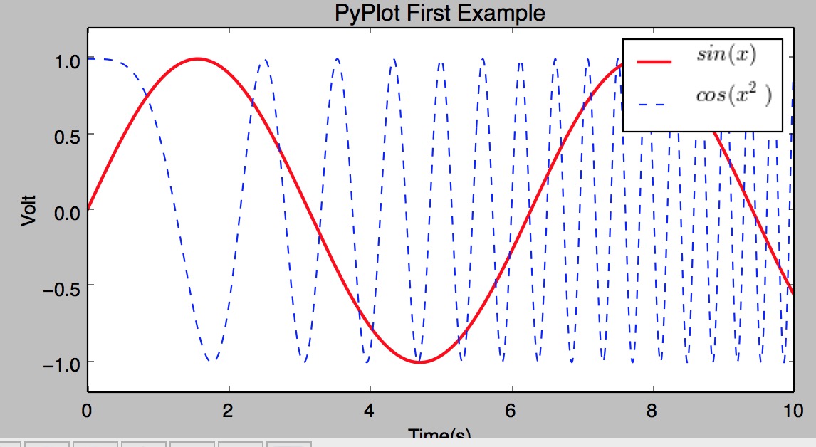
#coding:utf-8
import numpy as np
import matplotlib.pyplot as plt
x=np.linspace(0,10,1000)
y=np.sin(x)
z=np.cos(x**2)
#控制图形的长和宽单位为英寸,
# 调用figure创建一个绘图对象,并且使它成为当前的绘图对象。
plt.figure(figsize=(8,4))
#$可以让字体变得跟好看
#给所绘制的曲线一个名字,此名字在图示(legend)中显示。
# 只要在字符串前后添加"$"符号,matplotlib就会使用其内嵌的latex引擎绘制的数学公式。
#color : 指定曲线的颜色
#linewidth : 指定曲线的宽度
plt.plot(x,y,label="$sin(x)$",color="red",linewidth=2)
#b-- 曲线的颜色和线型
plt.plot(x,z,"b--",label="$cos(x^2)$")
#设置X轴的文字
plt.xlabel("Time(s)")
#设置Y轴的文字
plt.ylabel("Volt")
#设置图表的标题
plt.title("PyPlot First Example")
#设置Y轴的范围
plt.ylim(-1.2,1.2)
#显示图示
plt.legend()
#显示出我们创建的所有绘图对象。
plt.show()
配置
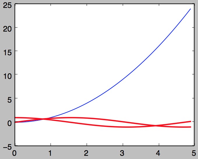
#coding:utf-8
import numpy as np
import matplotlib.pyplot as plt
x=np.arange(0,5,0.1)
## plot返回一个列表,通过line,获取其第一个元素
line,=plt.plot(x,x*x)
# 调用Line2D对象的set_*方法设置属性值 是否抗锯齿
line.set_antialiased(False)
# 同时绘制sin和cos两条曲线,lines是一个有两个Line2D对象的列表
lines = plt.plot(x, np.sin(x), x, np.cos(x))
## 调用setp函数同时配置多个Line2D对象的多个属性值
plt.setp(lines, color="r", linewidth=2.0)
plt.show()
绘制多轴图
subplot(numRows, numCols, plotNum)
import matplotlib.pyplot as plt
'''
subplot(numRows, numCols, plotNum)
numRows行 * numCols列个子区域
如果numRows,numCols和plotNum这三个数都小于10的话,可以把它们缩写为一个整数,例如subplot(323)和subplot(3,2,3)是相同的
'''
for idx, color in enumerate("rgbyck"):
    plt.subplot(330+idx+1, axisbg=color)
plt.show()
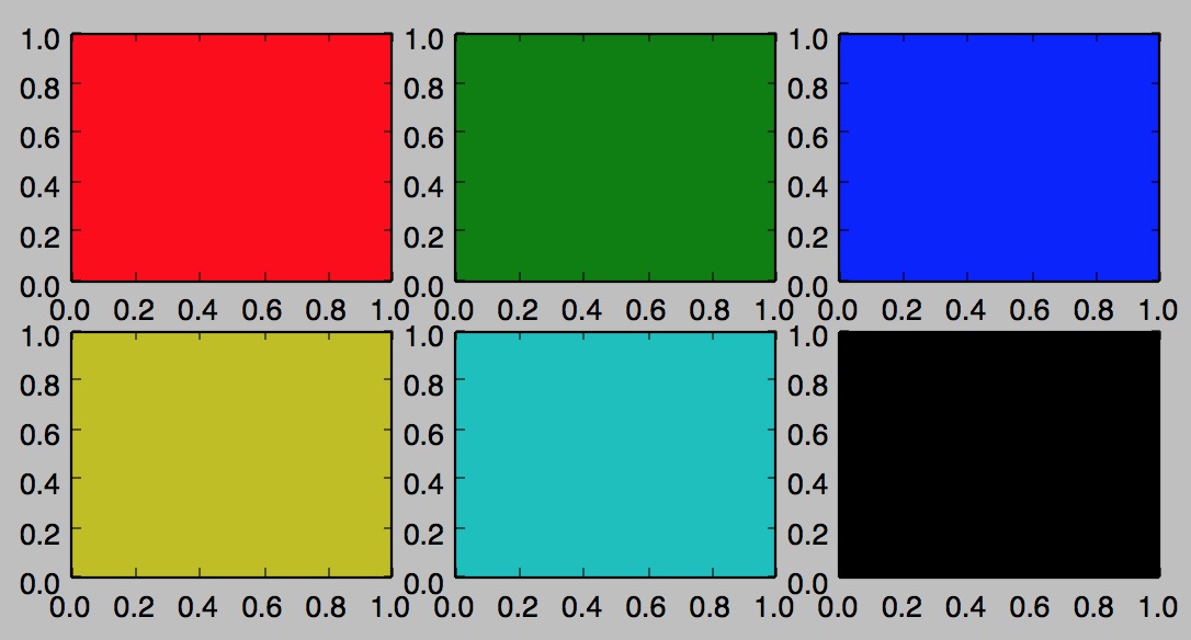
plt.subplot(221) # 第一行的左图
plt.subplot(222) # 第一行的右图
#第二行全占
plt.subplot(212) # 第二整行
plt.show()
配置文件
>>> import matplotlib
>>> matplotlib.get_configdir()
'/Users/similarface/.matplotlib'
刻度定义:
#coding:utf-8
import matplotlib.pyplot as pl
from matplotlib.ticker import MultipleLocator, FuncFormatter
import numpy as np
x = np.arange(0, 4*np.pi, 0.01)
y = np.sin(x)
pl.figure(figsize=(8,4))
pl.plot(x, y)
ax = pl.gca()

def pi_formatter(x, pos):
    """
    比较罗嗦地将数值转换为以pi/4为单位的刻度文本
    """
    m = np.round(x / (np.pi/4))
    n = 4
    if m%2==0: m, n = m/2, n/2
    if m%2==0: m, n = m/2, n/2
    if m == 0:
        return "0"
    if m == 1 and n == 1:
        return "$\pi$"
    if n == 1:
        return r"$%d \pi$" % m
    if m == 1:
        return r"$\frac{\pi}{%d}$" % n
    return r"$\frac{%d \pi}{%d}$" % (m,n)
# 设置两个坐标轴的范围
pl.ylim(-1.5,1.5)
pl.xlim(0, np.max(x))
# 设置图的底边距
pl.subplots_adjust(bottom = 0.15)
pl.grid() #开启网格
# 主刻度为pi/4
ax.xaxis.set_major_locator( MultipleLocator(np.pi/4) )
# 主刻度文本用pi_formatter函数计算
ax.xaxis.set_major_formatter( FuncFormatter( pi_formatter ) )
# 副刻度为pi/20
ax.xaxis.set_minor_locator( MultipleLocator(np.pi/20) )
# 设置刻度文本的大小
for tick in ax.xaxis.get_major_ticks():
    tick.label1.set_fontsize(16)
pl.show()

画点图
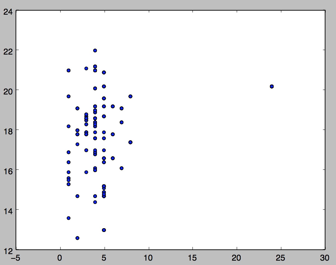
import matplotlib.pyplot as plt
from sklearn.datasets import load_boston
X1 = load_boston()['data'][:, [8]]
X2 = load_boston()['data'][:, [10]]
plt.scatter(X1,X2, marker = 'o')
plt.show()
画三维图
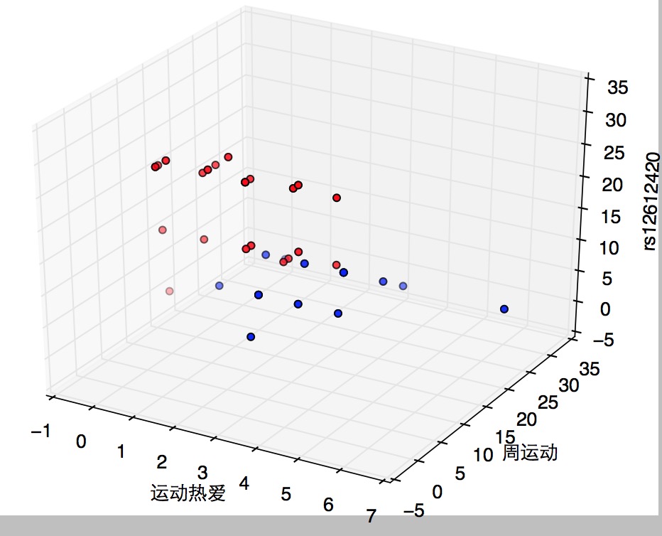
m=pd.read_csv(sportinte)
x,y,z = m['ydra'],m['zyd'],m['rs12612420']
ax=plt.subplot(111,projection='3d') #创建一个三维的绘图工程
ax.scatter(x[:],y[:],z[:],c='r')
#将数据点分成三部分画,在颜色上有区分度
plt.scatter(y,z, marker = 'o')
ax.set_zlabel('rs12612420') #坐标轴
ax.set_ylabel(u'周运动')
ax.set_xlabel(u'运动热爱')
plt.show()
#散点柱状图
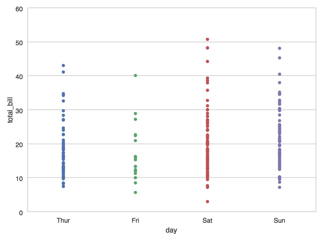
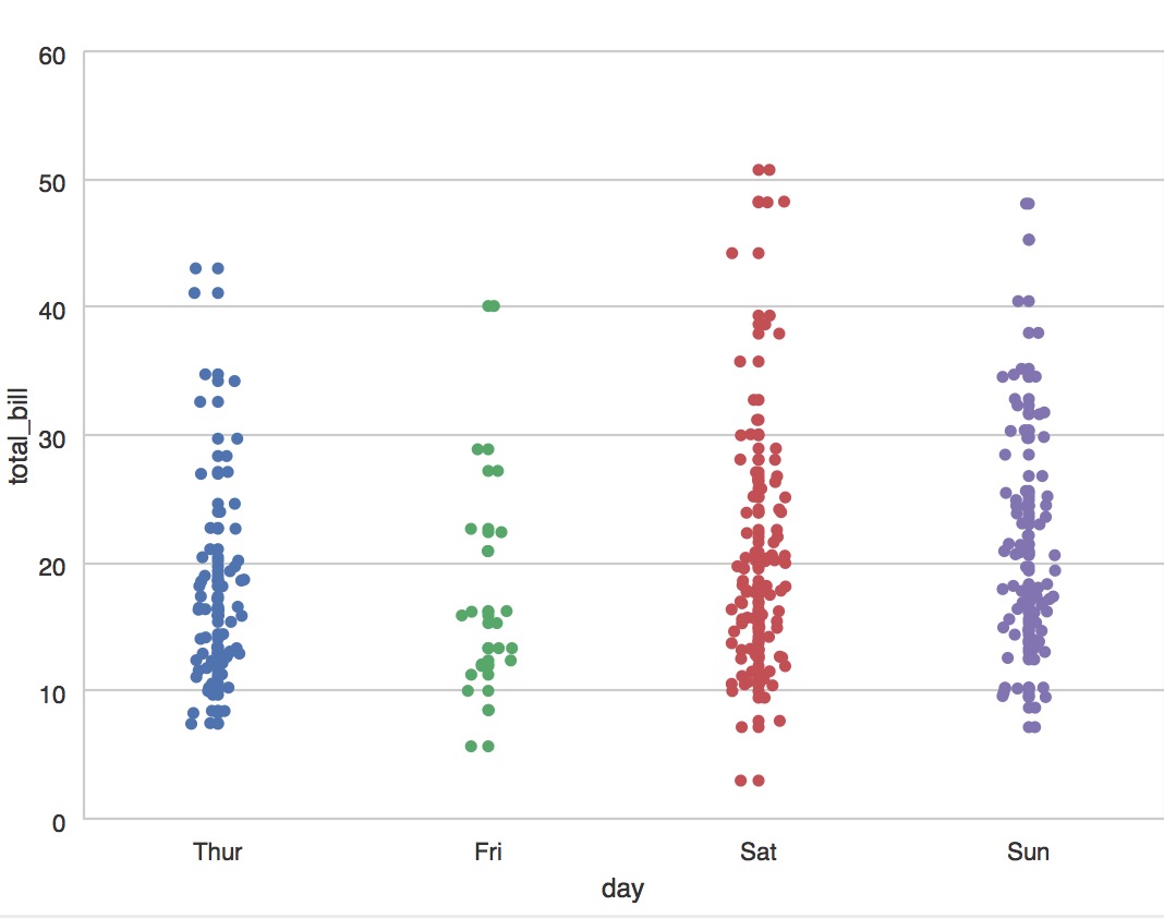
#coding:utf-8
import  numpy as np
#pip install seaborn
import seaborn as sns
sns.set(style="whitegrid", color_codes=True)
np.random.seed(sum(map(ord, "categorical")))
titanic = sns.load_dataset("titanic")
tips = sns.load_dataset("tips")
iris = sns.load_dataset("iris")
#在带状图中,散点图通常会重叠。这使得很难看到数据的完全分布
sns.stripplot(x="day", y="total_bill", data=tips)
sns.plt.show()
#加入随机抖动”来调整位置
sns.stripplot(x="day", y="total_bill", data=tips, jitter=True);
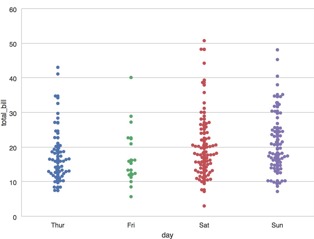
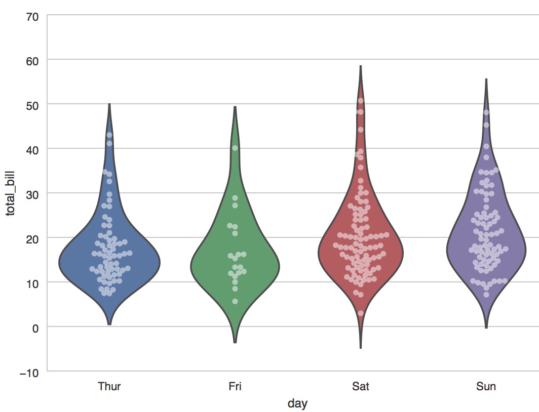
#避免重叠点
sns.swarmplot(x="day", y="total_bill", data=tips)
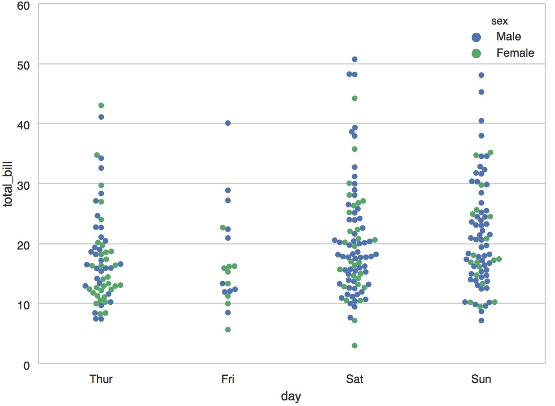
#加入说明label
sns.swarmplot(x="day", y="total_bill", hue="sex", data=tips);
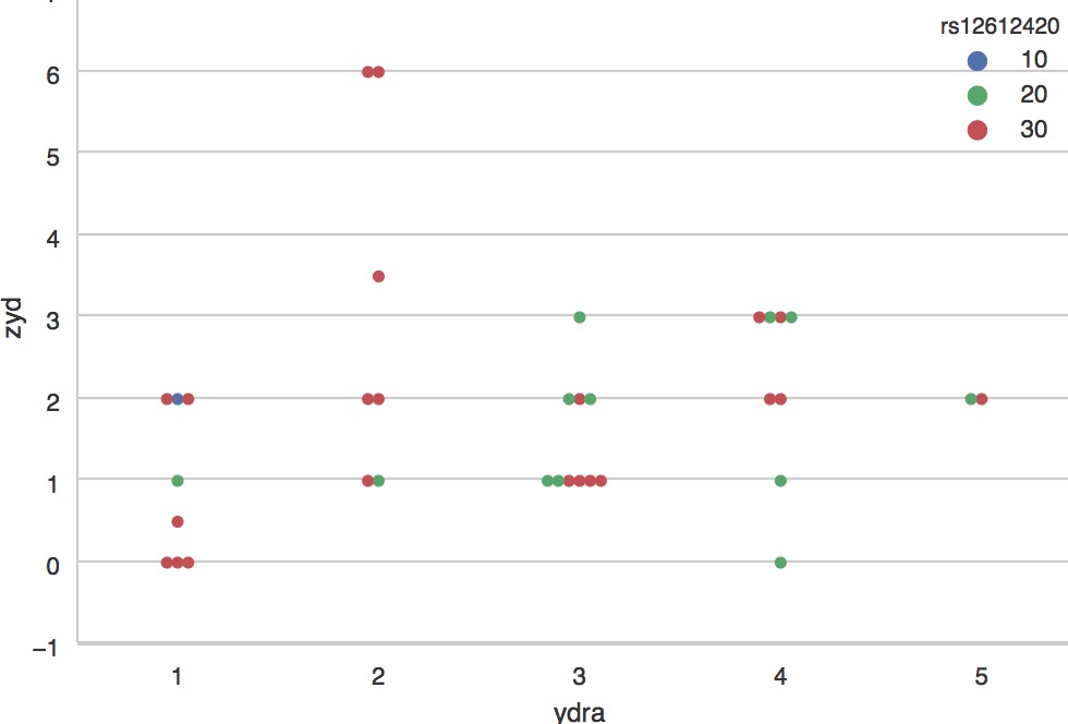
sportinte="/Users/similarface/Documents/sport耐力与爆发/sportinter.csv"
m=pd.read_csv(sportinte)
sns.swarmplot(x="ydra", y="zyd", hue="rs12612420", data=m);
sns.plt.show()
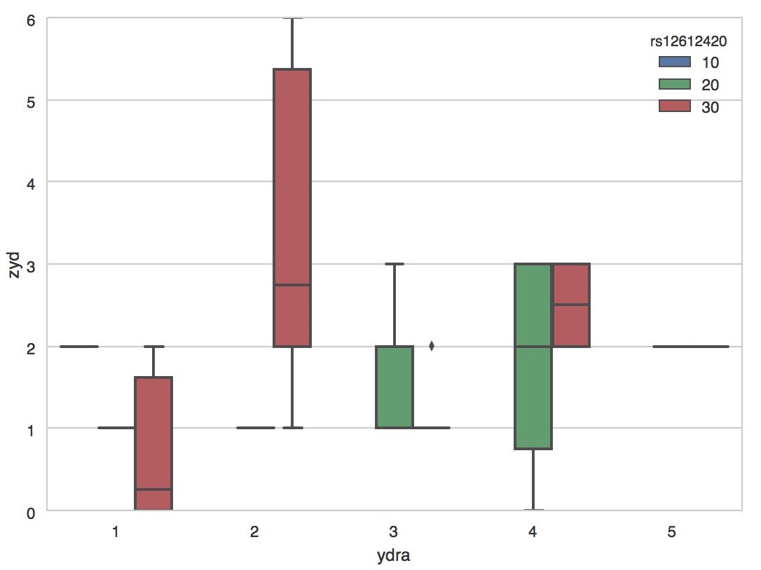
箱图
sportinte="/Users/similarface/Documents/sport耐力与爆发/sportinter.csv"
m=pd.read_csv(sportinte)
sns.boxplot(x="ydra", y="zyd", hue="rs12612420", data=m)
sns.plt.show()
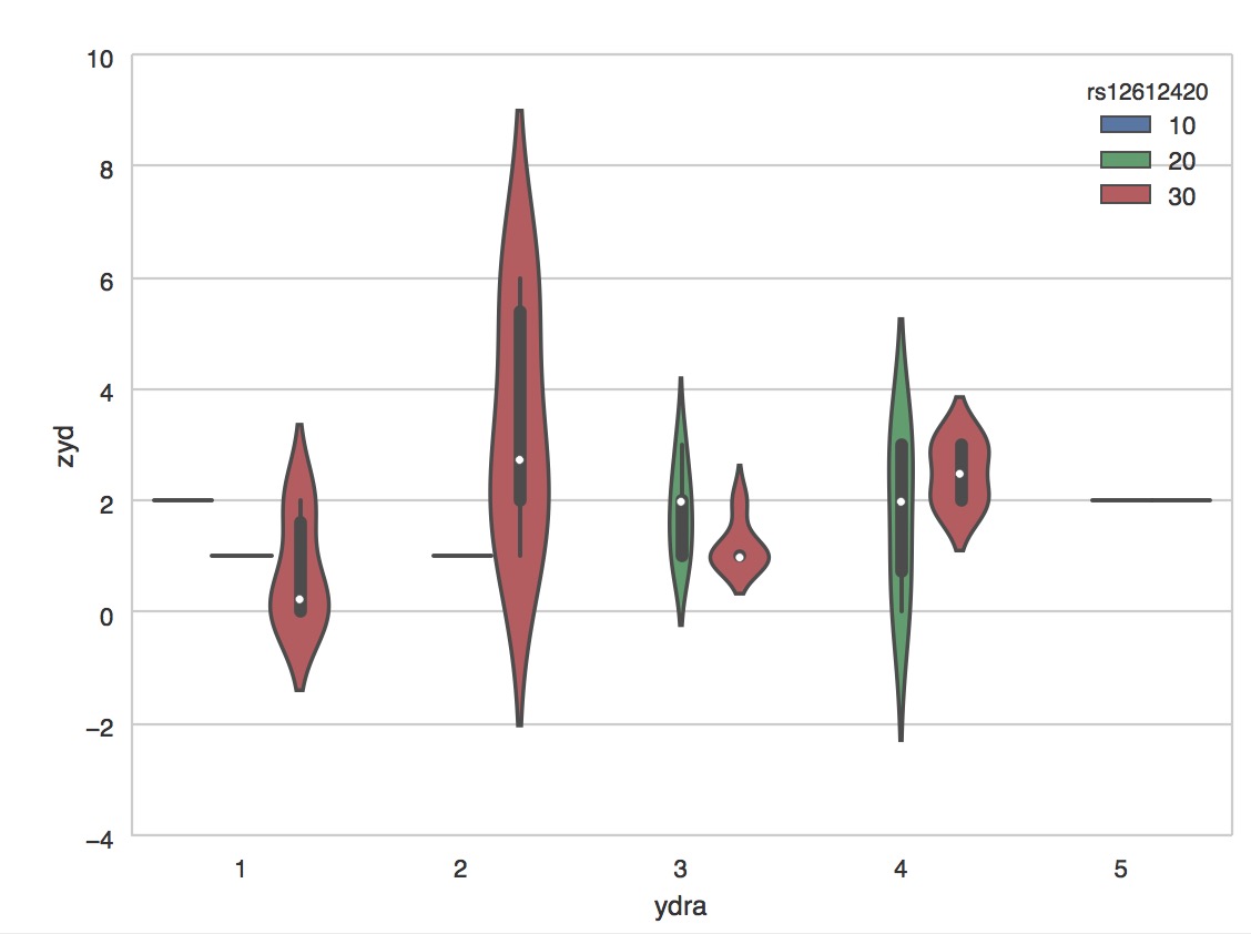
小提琴图
sportinte="/Users/similarface/Documents/sport耐力与爆发/sportinter.csv"
m=pd.read_csv(sportinte)
sns.violinplot(x="ydra", y="zyd", hue="rs12612420", data=m)
sns.plt.show()
sportinte="/Users/similarface/Documents/sport耐力与爆发/sportinter.csv"
m=pd.read_csv(sportinte)
sns.violinplot(x="ydra", y="zyd", hue="rs12612420", data=m,bw=.1, scale="count", scale_hue=False)
sns.plt.show()

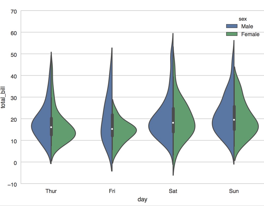
sns.violinplot(x="day", y="total_bill", hue="sex", data=tips, split=True);
sns.plt.show()
#加入每个观测值
sns.violinplot(x="day", y="total_bill", hue="sex", data=tips,
               split=True, inner="stick", palette="Set3");
#加入点柱状图和小提琴图
sns.violinplot(x="day", y="total_bill", data=tips, inner=None)
sns.swarmplot(x="day", y="total_bill", data=tips, color="w", alpha=.5);
柱状
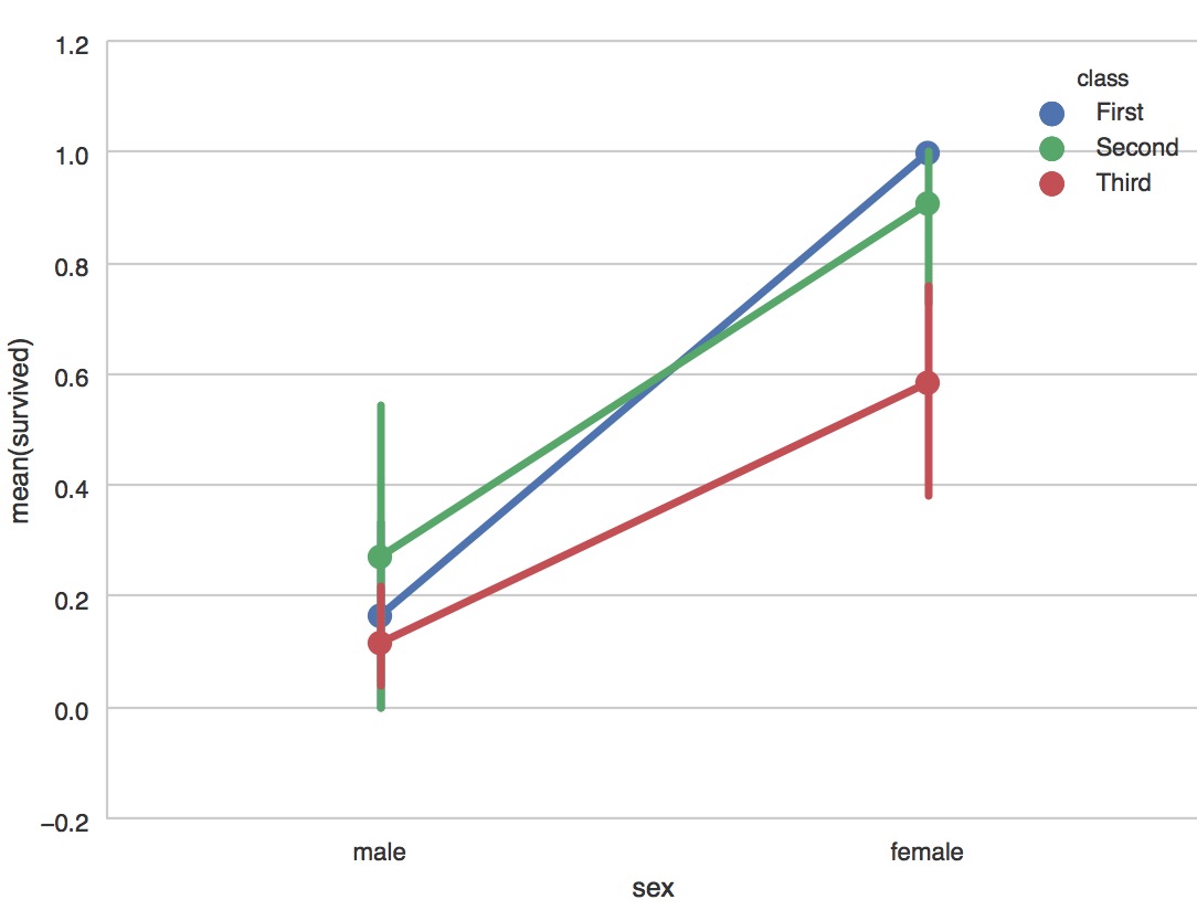
sns.barplot(x="sex", y="survived", hue="class", data=titanic);
sns.plt.show()

#count 计数图
sns.countplot(x="deck", data=titanic, palette="Greens_d");
sns.countplot(y="deck", hue="class", data=titanic, palette="Greens_d");
#泰坦尼克号获取与船舱等级
sns.pointplot(x="sex", y="survived", hue="class", data=titanic)
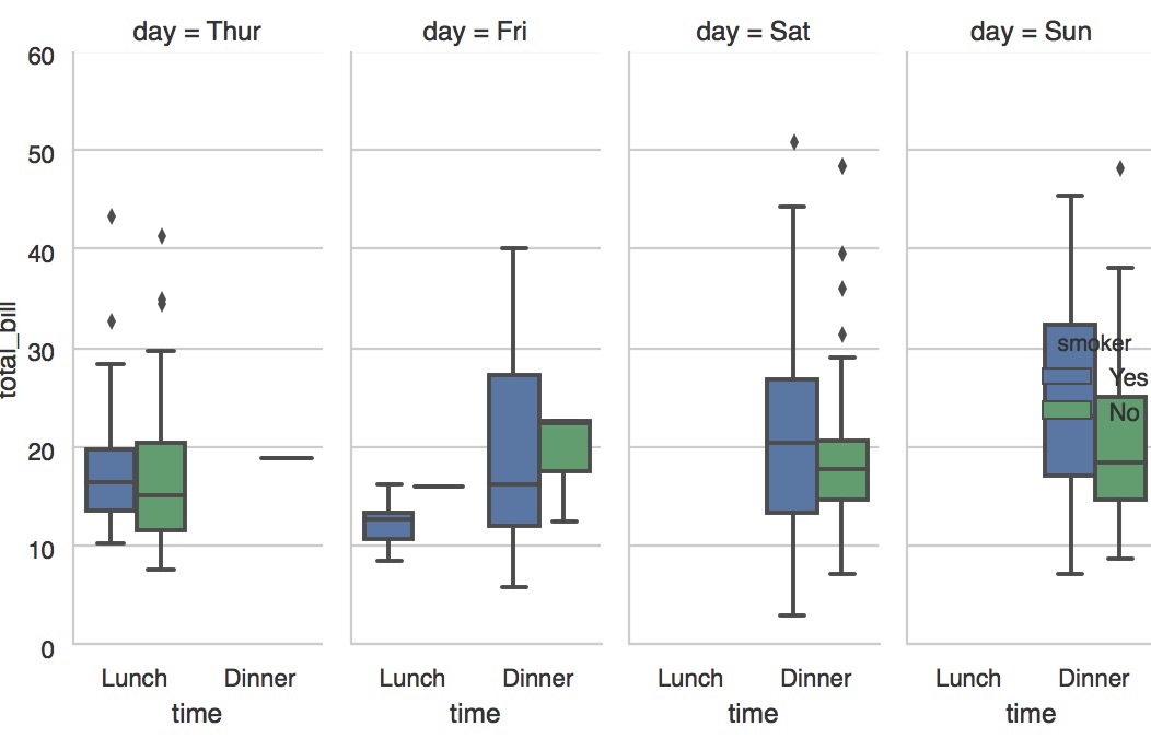
sns.factorplot(x="time", y="total_bill", hue="smoker", col="day", data=tips, kind="box", size=4, aspect=.5);
sns.plt.show()
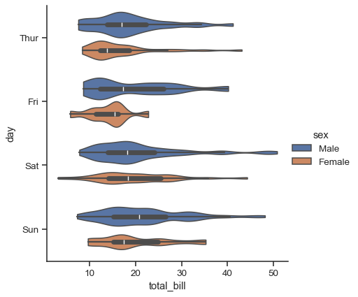
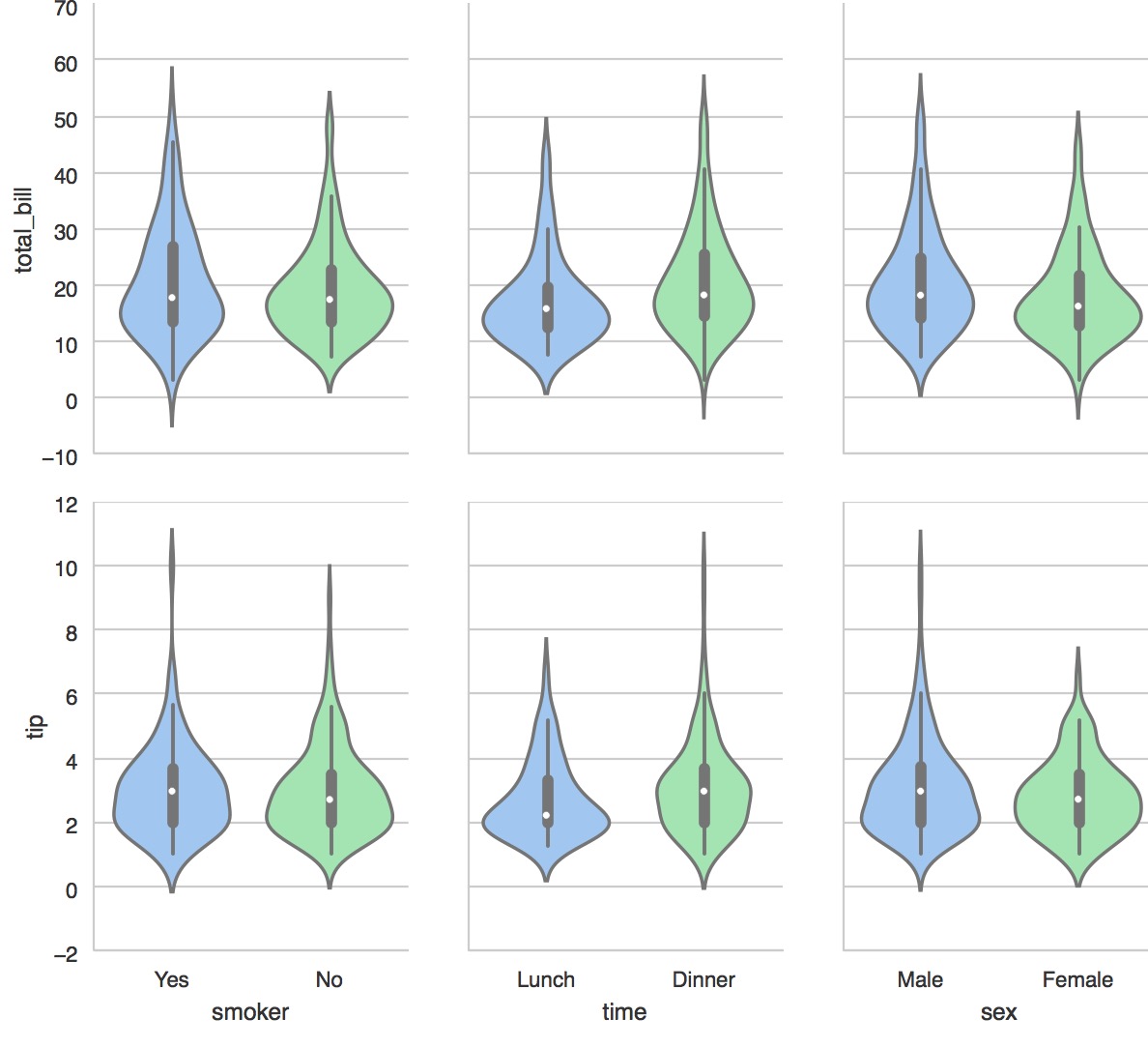
g = sns.PairGrid(tips,
                 x_vars=["smoker", "time", "sex"],
                 y_vars=["total_bill", "tip"],
                 aspect=.75, size=3.5)
g.map(sns.violinplot, palette="pastel");
sns.plt.show()
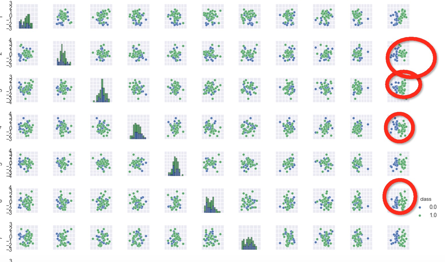
#当有很多因素的时候怎么去看这些是否有潜在关系
import matplotlib.pyplot as plt
import seaborn as sns
_ = sns.pairplot(df[:50], vars=[1,2,3,4,5,6,7,8,9,10,11], hue="class", size=1)
plt.show()
可以发现一些端倪
ref:http://seaborn.pydata.org/tutorial/categorical.html
画饼图:
#coding:utf-8
__author__ = 'similarface'
'''
耳垢项目
'''
import pandas as pd
import seaborn as sns
from scipy.stats import spearmanr
meat_to_phenotypes = {
  'Dry': 1,
  'Wet': 0,
  'Un': 2,
}

meat_to_genotype = {
  'TT': 2,
  'CT': 1,
  'CC': 0,
}
filepath="/Users/similarface/Documents/phenotypes/耳垢/ergou20170121.txt"
data=pd.read_csv(filepath,sep="\t")
data['phenotypesid'] = data['phenotypes'].map(meat_to_phenotypes)
data['genotypeid'] = data['genotype'].map(meat_to_genotype)
#######################################################################################
#均线图
#剔除不清楚
#####
# data=data[data.phenotypesid!=2]
# p=sns.pointplot(x="genotype", y='phenotypesid', data=data,markers="o")
# p.axes.set_title(u"均线图[湿耳0干耳1]")
#####
#######################################################################################


#######################################################################################
#####
#联结图
# p=sns.jointplot(x="genotypeid", y="phenotypesid", data=data,stat_func=spearmanr)
#####
#######################################################################################


#######################################################################################
#####
# data=data[data.phenotypesid!=2]
# sns.countplot(x="genotype", hue="phenotypes", data=data)
#p.axes.set_title(u"柱状图[湿耳0干耳1]")
#####
#######################################################################################

#sns.plt.show()

#######################################################################################
#####
import matplotlib.pyplot as plt

#
data=data[data.phenotypesid!=2]
plt.subplot(221)
g=data.groupby(['phenotypes'])
label_list=g.count().index
plt.pie(g.count()['genotype'],labels=label_list,autopct="%1.1f%%")
plt.title(u"问卷统计饼图(不含Unkown)")


datag=data[data.genotype=='TT']
g=datag.groupby(['phenotypes'])
label_list=g.count().index
plt.subplot(222)
plt.pie(g.count()['genotype'],labels=label_list,autopct="%1.1f%%")
plt.title(u"耳垢TT")


datag=data[data.genotype=='CT']
g=datag.groupby(['phenotypes'])
label_list=g.count().index
plt.subplot(223)
plt.pie(g.count()['genotype'],labels=label_list,autopct="%1.1f%%")
plt.title(u"耳垢CT")


datag=data[data.genotype!='TT']
g=datag.groupby(['phenotypes'])
label_list=g.count().index
plt.subplot(224)
plt.pie(g.count()['genotype'],labels=label_list,autopct="%1.1f%%")
plt.title(u"耳垢!=TT")

plt.show()
#####
#######################################################################################

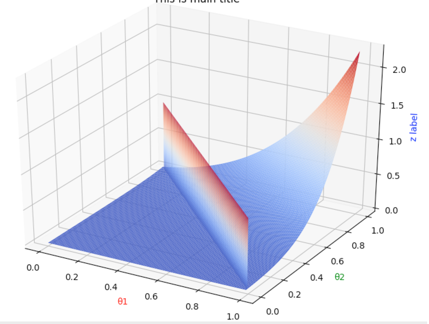
#coding:utf-8
__author__ = 'similarface'
import matplotlib.pyplot as plt
from mpl_toolkits.mplot3d import Axes3D
import numpy as np

def fun(x,y):
    #return np.power(x,2)+np.power(y,2)
    return 2*(x*0.8+y*0.1)*(x*0.2+y*0.9)*(x*0.3+y*0.7)*(x*0.3+y*0.7)*(x*0.4+y*0.7)*(x*0.4+y*0.7)

def fun2(xx,yy):
    return xx

fig1=plt.figure()
ax=Axes3D(fig1)
X=np.arange(0,1,0.01)
Y=np.arange(0,1,0.01)

XX=np.arange(0,1,0.01)
YY=np.arange(1,0,-0.01)

ZZ=np.arange(0,1,0.01)

ZZ,ZZ=np.meshgrid(ZZ,ZZ)

#ZZ=fun2(XX,YY)
X,Y=np.meshgrid(X,Y)
Z=fun(X,Y)
plt.title("This is main title")
ax.plot_surface(X, Y, Z, rstride=1, cstride=1, cmap=plt.cm.coolwarm)

ax.plot_surface(XX, YY, ZZ, rstride=1, cstride=1, cmap=plt.cm.coolwarm)

ax.set_xlabel(u'θ1', color='r')
ax.set_ylabel(u'θ2', color='g')
ax.set_zlabel('z label', color='b')
plt.show()