CSS之千变万化的Div
厂址:http://www.cnblogs.com/yunfeifei/p/4671930.html
一、div和css3在一起
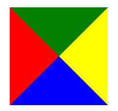
.box1 {
        width: 100px;
        height: 100px;
        border: 20px solid #333;
        border-left-color:red;
        border-right-color:yellow;
        border-bottom-color:blue;
        border-top-color:green;
    }
效果:
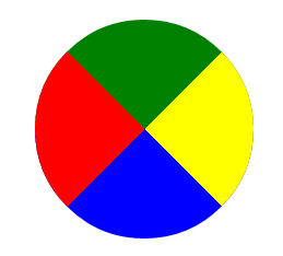
.content {
        margin:200px;
        width: 100px;
        height: 100px;
        border: 20px solid #333;
        border-left-color:red;
        border-right-color:yellow;
        border-bottom-color:blue;
        border-top-color:green;
        border-radius:50%;
    }
效果:

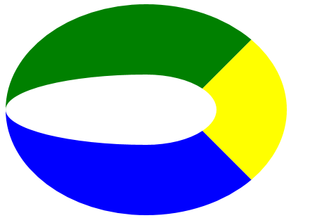
.content {
        margin:200px;
        width: 100px;
        height: 100px;
        border: 20px solid #333;
        border-left-color:transparent;
        border-right-color:yellow;
        border-bottom-color:blue;
        border-top-color:green;
        border-radius:50%;
    }
效果: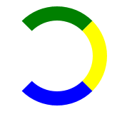
.content {
        margin:200px;
        width: 0px;
        height: 0px;
        border: 100px solid #333;
        border-left-color:red;
        border-right-color:yellow;
        border-bottom-color:blue;
        border-top-color:green;
    }
效果:
    .content {
        margin:200px;
        width: 0px;
        height: 0px;
        border: 100px solid #333;
        border-left-color:red;
        border-right-color:yellow;
        border-bottom-color:blue;
        border-top-color:green;
        border-radius:50%;
    }
效果:
二、div + css3图形进阶
.content {
        margin:200px;
        width: 0px;
        height: 0px;
        border: 100px solid #333;
        border-left-color:red;
        border-right-color:yellow;
        border-bottom-color:blue;
        border-top-color:green;
        border-radius:50% 0 0 0;
    }
效果:
.content {
        margin:200px;
        width: 200px;
        height: 0px;
        border: 100px solid #333;
        border-left-color:red;
        border-right-color:yellow;
        border-bottom-color:blue;
        border-top-color:green;
        border-radius:50%;
    }
效果:
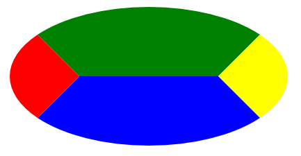
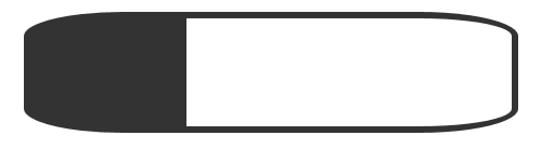
.content {
        margin:200px;
        width: 300px;
        height: 100px;
        border: 100px solid #333;
        border-left-width:0;
        border-left-color:red;
        border-right-color:yellow;
        border-bottom-color:blue;
        border-top-color:green;
        border-radius:50%;
    }
效果:
.content {
        margin:200px;
        width: 300px;
        height: 100px;
        border: 6px solid #333;
        border-left-width:150px;
        border-radius:20%;
    }
效果:
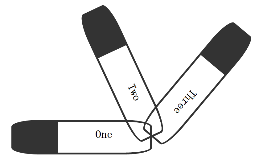
三、css3的2D变形
<style>
    .content {
        position:absolute;
        margin:200px;
        width: 300px;
        height: 100px;
        border: 6px solid #333;
        border-left-width:150px;
        border-radius:20%;
        font-weight:bold;
        text-align:center;
        font-size:36px;
        line-height:80px;
    }
    .content:nth-child(1){
        transform:rotate(0deg);
    }
    .content:nth-child(2){
        transform:rotate(65deg);
    }
    .content:nth-child(3){
        transform:rotate(130deg);
    }
</style>
<body>
    <div class="content">One</div>
    <div class="content">Two</div>
    <div class="content">Three</div>
</body>
效果:

我们可以通过transform-origin来改变旋转的原点,后面可以又两个值,是left,top,right,bottom中的一个,如果只给了一个值,如top,则会以顶边的中心进行旋转,如下是以右边的中心transform-origin:right;旋转得到的图形:
下面,关于形变的还有一个比较重要的属性就是skew,他就是对div做平行转换,如:我们对X方向做转换,效果如下:
<style>
    .content {
        position:absolute;
        margin:500px;
        width: 300px;
        height: 100px;
        border: 6px solid #333;
        font-weight:bold;
        text-align:center;
        font-size:36px;
        line-height:80px;
        transform-origin:right;
    }
    .content:nth-child(1){
        transform:skew(30deg, 0deg);
    }
</style>
<body>
    <div class="content">One</div>
</body>
效果: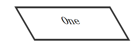
四、总结
通过对div的border、border-radius、border-color、border-widht、width、height等属性进行设置,我们可以得到很多不同的图形,然后再加上对图像进行平移、放大、缩小、旋转等操作
此随笔或为自己所写、或为转载于网络。仅用于个人收集及备忘。