

前言
Android中layout_weight这个属性对于经常捣鼓UI的我们来说,肯定不会陌生。但是我们在真正使用这个属性时,经常会出现一些莫名奇妙的布局效果;如果仅仅知其然而不知其所以然,一些意外的布局效果一定让我们颇为头疼。在本文中,将对layout_weight这个属性详细剖析。
正文
从代码讲起:
<LinearLayout xmlns:android="http://schemas.android.com/apk/res/android"
    android:layout_width="match_parent"
    android:layout_height="match_parent"
    android:orientation="vertical">
    <Button
        android:layout_width="match_parent"
        android:layout_height="wrap_content"
        android:text="button1"
        />
    <Button
        android:layout_width="match_parent"
        android:layout_height="wrap_content"
        android:text="button2"
        />
    <Button
        android:layout_width="match_parent"
        android:layout_height="wrap_content"
        android:text="button3"
        />
</LinearLayout>
效果图如下:

我们可以发现这三个button并没有将整个屏幕占据,而是根据内容适配大小。
我们在button2里面添加一个属性 android:layout_weight="1" ,发现布局变成这样了:
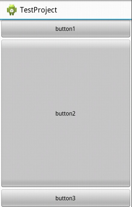
我们发现这次屏幕被三个button占据了,而且第一个和第三个button还是保持与内容适配大小,而第二个button而占据了剩余屏幕空间。
我们对上面的情况进行讲解:
1、我们只有在button2使用了layout_weight属性,并赋值为1;但是button1和button2并没有使用这个属性,根据API可以知道,他们的layout_weight属性等于0。
2、LinearLayout如果显式包含layout_weight属性时,会measure两次;第一次将正常计算三个button的宽高,第二次将结合layout_weight的值分配剩余的空间。
通俗点来总结:Android系统先按照你设置的3个Button高度Layout_height=wrap_content,给你分配好他们3个的高度,然后会把剩下来的屏幕空间全部赋给Button2,因为只有他的权重值是1,这也是为什么Button2占了那么大的一块空间。
这么讲解大概大家也对layout_weight属性有了比较清晰的认识了吧。
再来看看下面的代码:
<LinearLayout xmlns:android="http://schemas.android.com/apk/res/android"
    android:layout_width="match_parent"
    android:layout_height="match_parent"
    android:orientation="horizontal">
    <TextView
        android:layout_width="wrap_content"
        android:layout_height="wrap_content"
        android:layout_weight="1"
        android:text="1"
        android:background="#ff0000"
        />
    <TextView
        android:layout_width="wrap_content"
        android:layout_height="wrap_content"
        android:layout_weight="2"
        android:text="2"
        android:background="#00ff00"
        />
    <TextView
        android:layout_width="wrap_content"
        android:layout_height="wrap_content"
        android:layout_weight="3"
        android:text="3"
        android:background="#0000ff"
        />
</LinearLayout>
在我们对这三个TextView的layout_width都设置为wrap_content时,我们会得到以下布局:

这个布局很符合我们上面的分析:
系统先给3个TextView分配他们的宽度值wrap_content(宽度足以包含他们的内容1,2,3即可),然后会把剩下来的屏幕空间按照1:2:3的比列分配给3个textview,所以就出现了上面的图像。
如果我们将上面三个TextView的layout_width都设置为match_parent,分别给三个TextView设置他们的Layout_weight为1、2、2的话,会出现一个相反的布局效果:

我们大概可以分辨出,他们所占的宽的比例为3:1:1。这样就出现一个另外一个效果:weight权重越大,控件所占的空间越小。
所以网上就有人这么总结:
在layout_width设置为match_parent的时候,layout_weight所代表的是你的控件要优先尽可能的大,但这个大是有限度的,即match_parent。
在layout_width设置为wrap_content的时候,layout_weight所代表的是你的控件要优先尽可能的小,但这个大是有限度的,即wrap_content。
这是对于这种仅仅记住怎么用而不是为什么这么用的做法,作为一个有追求有理想的程序员是不会苟同的,因为说不定哪天,咱们又忘了口诀,所以我们要从原理上理解为啥是这个样子的。
依照上面的理解,这个现象的出现在于layout_width="fill_parent"这个原因导致的;开始下面的分析:
1、系统先给3个TextView分配他们所要的宽度match_parent,也就指定了每一个TextView都是填满他的父控件,这里就是整个屏幕的宽度。
2、由于如果包含layout_width这个属性,LinearLayout将会进行第二次measure,此时将会根据权重分配剩余的空间,在这里剩余空间=1个parent_width-3个parent_width=-2个parent_width (parent_width指的是屏幕宽度 )。
3、第一个TextView的实际所占宽度=parent_width(match_parent的宽度) + 1/5(他所占剩余空间的权重比列) * 剩余空间大小(-2 parent_width)=3/5parent_width
同理第二个TextView的实际所占宽度=parent_width + 2/5*(-2parent_width)=1/5parent_width;
第三个TextView的实际所占宽度=parent_width + 2/5*(-2parent_width)=1/5parent_width;
由此我们就可以知道为什么是按3:1:1的这个比例显示了。
如果我们将Layout_weight为1、2、3呢?第三个TextView直接消失了有木有!

我们可以按照上面的方法算一次就得出答案了:
1、系统先给3个TextView分配他们所要的宽度match_parent,也就指定了每一个TextView都是填满他的父控件,这里就是整个屏幕的宽度。
2、由于如果包含layout_width这个属性,LinearLayout将会进行第二次measure,此时将会根据权重分配剩余的空间,在这里剩余空间=1个parent_width-3个parent_width=-2个parent_width (parent_width指的是屏幕宽度 )。
3、第一个TextView的实际所占宽度=parent_width(match_parent的宽度) + 1/6(他所占剩余空间的权重比列) * 剩余空间大小(-2 parent_width)=2/3parent_width
同理第二个TextView的实际所占宽度=parent_width + 2/6*(-2parent_width)=1/3parent_width;
第三个TextView的实际所占宽度=parent_width + 3/6*(-2parent_width)=0parent_width;
所以三个TextView的显示比例应该为2:1:0,第三个TextView就消失了,因为根据计算,都没有空间可以分配给他了。
看到这里大家都清楚了解了这个计算原理,相信对于设计UI布局有所帮助,对于match_parent和wrap_content混合使用的UI布局也可以通过这个方法进行计算设计。
接下来顺带着也给大家说另外一个跟Layout_weight相关的属性:weightSum
顾名思义,就是制定权重的总值,如果不指定weightSum,系统会将各个Layout_weight的值相加得出的总数作为权重总值,当然我们也可以在这里显式指定,这里也方便我们布局所用,我就在下面举一个关于weightSum属性的应用:
参见这样一个效果,一个总是占据一半屏幕的Button

其实XML代码很简单:
<LinearLayout xmlns:android="http://schemas.android.com/apk/res/android"
    android:layout_width="match_parent"
    android:layout_height="match_parent"
    android:gravity="center"
    android:weightSum="2"
    android:orientation="horizontal">
    <Button
        android:layout_width="0dp"
        android:layout_height="wrap_content"
        android:layout_weight="1"
        android:text="button"
        />
</LinearLayout>
开发文档中对layout_weight属性的有如下描述:定义weight总和的最大值。如果未指定该值,以所有子视图的layout_weight属性的累加值作为总和的最大值。一个典型的案例是:通过指定子视图的layout_weight属性为0.5,并设置LinearLayout的weightSum属性为1.0,实现子视图占据可用宽度的50。
从上面的xml中我们可以知道我们设置了weightSum为2,而对于button设置了layout_width为0且layout_weight为1(也就是weightSum的一半),我们就可以得出上面一个效果,使得Button保持占据屏幕的一半,而不用通过硬编码去实现。
代码比较简单,这里就不上demo了哈。
作者:enjoy风铃
出处:http://www.cnblogs.com/net168/
本文版权归作者和博客园共有,欢迎转载,但未经作者同意必须保留此段声明,且在文章页面明显位置给出原文连接,否则下次不给你转载了

 浙公网安备 33010602011771号