Brain Network visulation in EEG 脑电网络可视化
Source: NeuroBytes
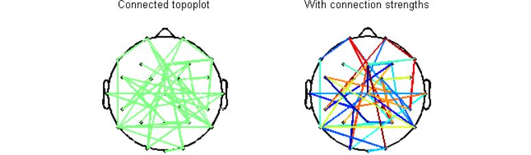
In my previous post, I wrote about the Phase Locking Value statistic that can be used to quantify neural synchrony between two electrodes and how it can be a proxy for connectivity. Once you have quantified changes in connectivity using such measures (others include cross spectrum, coherence), it is good to visualize your results. The connected topoplot function (available here) is just the right thing for the job.
Below is a visual summary of what the script can do. In this figure, I have randomly connected ~10% of all possible channel pairs. It is possible to either specify or skip connection strengths. Detailed help and demo are available with the script.
Now, an illustration from real data. You can use the PLV statistic to isolate stimulus-induced transient networks in your EEG data. Below is typically how your results would look like – a network within a time window along with an associated connectivity pattern for the network.
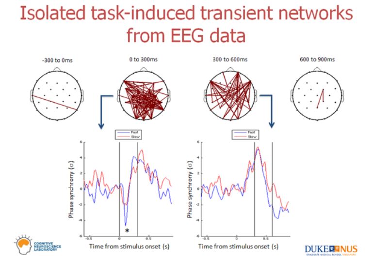
In the above example, the subjects viewed a stimulus at time 0 and there are two prominent transient networks that could be isolated – one within the first 300 ms of viewing the stimulus and second between 300 and 600 ms of viewing the stimulus. Plots below the connected topoplots are an average PLV time course of the whole network that is visualized. Therefore, in the first 300 ms, the isolated network de-synchronizes and between 300 ms and 600 ms, (a different) isolated network synchronizes.
Good luck with your analyses! You can always drop me a line at
– praneeth ‘at’ mit.edu