


响应式布局:Flexbox应用总结
距离上篇文章《布局神器:Flexbox》的发表已有一周时间,转眼这周又到了周五(O(∩_∩)O~~);
习惯性在周五对自己的一周工作进行下总结,记录下这周值得被纪念的工作事件,无论是好的,亦或坏的;
本周继续是响应式网页的开发,手机浏览器,以及微信页面的开发,所以,我就有了大量的实践机会;
于是,本周就将之前的百分比响应式布局,转向基于FLEX的响应式布局。
纸上得来终觉浅,绝知此事要躬行。
实际应用中发现还有很多细节要格外注意:
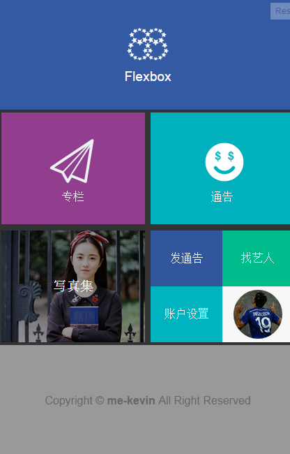
下面就以今天写的Demo作为示例来说明:
1# flex是display的属性值,目前还处于草稿状态中,所以在书写的时候,需要加上各个浏览器的私有前缀,即-webkit、-moz、-ms、-o等.
所以display:flex 应该要写成:
    display: -webkit-flex;
    display: -moz-flex;
    display: -ms-flex;
    display: flex;
那么类似于justify-content:space-around;这样的次级属性要不要加前缀呢?
在chrome调试时,不用加前缀不影响其表达效果;但是,真的网页上线之后,真正用手机去打开时,不加前缀的语句都没能有效显示效果;
所以,涉及到flex的标签属性,务必记得加上前缀,尤其是-webkit-;
Demo
.main-center,.main-subcenter,.subForm{
	display: -webkit-flex;
        display: -moz-flex;
        display: -ms-flex;
	display: flex;
	-webkit-justify-content:space-around;
	justify-content:space-around;
	-webkit-align-items:flex-end;
	align-items:flex-end;
	-webkit-flex-wrap:wrap;
	flex-wrap:wrap;
}
---------------------------- 重要更新(2014/4/13) ------------------------------
经测试,单纯地用display:flex方式实现的页面无法兼容安卓版本较低的浏览器,经过紧急抢救,现在已经解决问题。
线上页面地址:星巴巴-手机版
向后兼容解决方案:
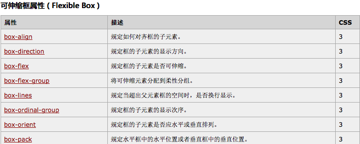
“display:box;”或者“box-{*}”属性,是2009年版本的Flexbox。
“display:flexbox;”或者“flex()”函数,是2011年版本的Flexbox。
“display:flex;”和“flex-{*}”属性,是现在HTML5定稿后的规范。
具体flexbox的属性可查看国内飘零雾雨整理的
有区分新版和旧版的flexbox属性
Flexbox新旧语法不冲突,可参考 混用实现最佳浏览器兼容demo
资料参考:详解CSS3弹性盒模型(Flexbox)
另:含有box前缀的属性换行起来很麻烦,建议,此处的换行用:float:left/right取代。
<!DOCTYPE html>
<html lang="en">
<head>
  <meta charset="utf-8"/>
  <title>Centering an Element on the Page</title>
  <style type="text/css">
      html {
  height: 100%;
}

body {
  display: -webkit-box;  /* 老版本语法: Safari,  iOS, Android browser, older WebKit browsers.  */
  display: -moz-box;    /* 老版本语法: Firefox (buggy) */
  display: -ms-flexbox;  /* 混合版本语法: IE 10 */
  display: -webkit-flex;  /* 新版本语法: Chrome 21+ */
  display: flex;       /* 新版本语法: Opera 12.1, Firefox 22+ */

  /*垂直居中*/
  /*老版本语法*/
  -webkit-box-align: center;
  -moz-box-align: center;
  /*混合版本语法*/
  -ms-flex-align: center;
  /*新版本语法*/
  -webkit-align-items: center;
  align-items: center;

  /*水平居中*/
  /*老版本语法*/
  -webkit-box-pack: center;
  -moz-box-pack: center;
  /*混合版本语法*/
  -ms-flex-pack: center;
  /*新版本语法*/
  -webkit-justify-content: center;
  justify-content: center;

  margin: 0;
  height: 100%;
  width: 100% /* needed for Firefox */
}
/*实现文本垂直居中*/
h1 {
  display: -webkit-box;
  display: -moz-box;
  display: -ms-flexbox;
  display: -webkit-flex;
  display: flex;

  -webkit-box-align: center;
  -moz-box-align: center;
  -ms-flex-align: center;
  -webkit-align-items: center;
  align-items: center;
  height: 10rem;
}

  </style>
</head>
<body>
  <h1>OMG, I’m centered</h1>
</body>
</html>
2# 很多常见的 flex 相关的属性都被应用于父元素,而不是单个的子元素。

HTML结构:
<div class="container">
<img src="http://www.xing88.com/Areas/Mobile/Content/Article/Index/message.svg" />
<a href="#">专栏</a>
</div>
此时,无需再用单独定义img,a来使其显示在div中间,只要在父div里面添加如下css代码即可:
    display: flex;
    justify-content: center;
    /*水平居中*/
    align-items: center;
     /*垂直居中*/
    flex-direction: column;
    /*同级的a,以及img 按【列】排序*/
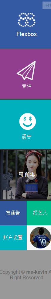
3#通过设置 min-width 和 flex-wrap:wrap 可以轻松控制网页在不同屏幕尺寸下的显示方式:
通过给主要模块添加以下样式:
    .flex-ele{
     -webkit-flex-wrap:wrap;
     flex-wrap:wrap;
     min-width:180px;
   }
在屏幕尺寸缩小到180px的时候,显示效果如下:
4#Flex 对齐方式
justify-content: space-between;

space-between 最大化分布了容器内部的元素。不管是两个 flex-item 还是十几个,这都是成立的。
justify-content: space-around;它很容易让人联想到“已经被用烂了的margin: 0”。Flex-item 默认会被均匀的分布,但是每一个都会在其给定的空间内居中显示
该条内容系引用,内容来源:http://zhuanlan.zhihu.com/FrontendMagazine/19955794
5# Flex 容器的每个直接子元素被称为一个“flex-item”。然而,子元素里面的所有元素不会继承任何特殊的样式,并且可以添加任何你想要的 CSS。
因为每个子元素是一个 flex-item,你会发现自己通过将元素包裹在一个 div 或者其它的元素中,“保护”里面的内容。使该元素成为 flex-child,而不是它里面的内容;
6# “Block”,“inline”,“float” 和 “text-align” 在 flex-item 的环境下无意义;
默认情况,所有的 flex-item 会按照 flex 容器的顶部和左侧对齐
HTML代码:
<!DOCTYPE html>
<html lang="en">
<head>
    <meta charset="UTF-8">
    <meta content="width=device-width, initial-scale=1.0, maximum-scale=1.0, user-scalable=0" name="viewport">
    <meta content="yes" name="apple-mobile-web-app-capable">
    <meta content="black" name="apple-mobile-web-app-status-bar-style">
    <title>winPhone</title>
</head>


<body>

<div class="main">

<div class="header common">
    <div class="logo"></div>
	<div class="title">Flexbox</div>
</div>

<div class="main-center">
<div class="item left common">
<img src="http://www.xing88.com/Areas/Mobile/Content/Article/Index/message.svg" />
	<a href="#">专栏</a>
</div>
<div class="item right common">
    <img src="http://www.xing88.com/Areas/Mobile/Content/Article/Index/moneyface.svg" />
<a href="#">通告</a>
</div>
</div>

<div class="main-subcenter">

<div class="item left subleftMain">
    <a href="#" class="sunTitle">写真集</a>
</div>
<div class="item right subForm" >
<div class="subitem sub-left-top">
	<a href="#">发通告</a>
</div>
<div class="subitem sub-right-top">
	<a href="#">找艺人</a>
</div>
<div class="subitem sub-left-bottom">
	<a href="#">账户设置</a>
</div>
<div class="subitem sub-right-bottom">
<a href="#"><img src="http://www.xing88.com/pic/Avater//Big/159.png"></a>
</div>
</div>

</div>

<div class="footer common">
<span>Copyright © <strong>me-kevin</strong>
 All Right Reserved</span>
</div>

</div>

</body>
</html>
CSS代码:
/*
*mIndex.css
*2015/4/7
*built by @kevin
 */

*{
	margin:0;
	padding: 0;
}

li{
	list-style: none;
}

a{
	color:#fff;
	text-decoration: none;
}
.clearfix:after{
	content: '.';
	display: block;
	height: 0;
	clear: both;
	visibility: hidden;
}

.clearfix{
	*zoom:1;
}

body{
	background-color: #333;
	font-family: 'Helvetica Neue',Helvetica,Arial,sans-serif;
	font-size: 100%;
}

.header,.footer{
	position: relative;
	width: 100%;
	height:160px;
	background-color: #345AA3;
	color:#fff;
	font-size: 100%;
	text-align: center;
      -webkit-flex-direction: column;
      flex-direction: column;
}

.main-center .left, .main-center .right {
    -webkit-flex-direction: column;
    flex-direction: column;
}

.header img{
	width: 64px;
}


.logo {
width: 60px;
height: 60px;
background: url(http://www.xing88.com/Areas/Mobile/Content/Article/Index/logonoword2x.png);
background-size: 60px 60px;
background-repeat: no-repeat;
background-position: center center;
}

.title {
margin-top: 6px;
font-size: 120%;
}

.main-center img {
    width:80px;
}

.messageNo {
	font-size: 150%;
}

.footer{
	background-color: #999;
	color: #666;
	font-size: 100%;
}

.main-center,.main-subcenter,.subForm{
	display: -webkit-flex;
      display: -moz-flex;
      display: -ms-flex;
	display: flex;
	-webkit-justify-content:space-around;
	justify-content:space-around;
	-webkit-align-items:flex-end;
	align-items:flex-end;
	-webkit-flex-wrap:wrap;
	flex-wrap:wrap;
}

.common {
    display: -webkit-flex;
    display: -moz-flex;
    display: -ms-flex;
  display: flex;
  -webkit-justify-content: center;
    justify-content: center;
    -webkit-align-items: center;
    align-items: center;

}

.item{
	width:48%;
	margin:1% 0;
	color:#fff;
	min-height: 160px;
}

.left{
	background-color: #913E8E;
}

.right{
	background-color: #00B1BD;
}

.userface{
	width: 120px;
}


.subitem{
	width: 50%;
	height: 80px;
	background-color: #333;
	display: -webkit-flex;
       display: -moz-flex;
      display: -ms-flex;
	display: flex;
	-webkit-justify-content: center;
      justify-content: center;
      -webkit-align-items: center;
      align-items: center;
}

.sub-left-top{
	background-color: #31569C;
}

.sub-right-top{
    background-color: #00BB8C;
}

.sub-left-bottom{
	background-color:#00B4BF;

}

.subleftMain {
    background: url(http://www.xing88.com/Areas/Mobile/Content/Home/rgBg.jpg) no-repeat top center;
    background-size: cover;
}


.sunTitle {
display:inline-block;
width: 100%;
text-align: center;
background-color: rgba(0,0,0,0.4);
height: 160px;
line-height: 160px;
font-size: 120%;
text-shadow: 0 0 0 rgba(0,0,0,0.3);
}

.sub-right-bottom{
	background-color: #f7f7f7;
}

.sub-right-bottom img{
	margin-top: 5px;
	width:70px;
	height: 70px;
	border-radius: 35px;
}

 浙公网安备 33010602011771号