


炫酷的CSS3发光搜索表单,附演示和源码
昨天在国外的论坛上逛的时候,看到一篇帖子是求助如何利用CSS3实现发光效果的,网友回复中有一个推荐了一款CSS3发光搜索表单,利用CSS3的动画属性,设置0%和100%时的颜色样式,让其渐变,再配合有明显对比的背景,就能模拟出发光的效果了,我把那个CSS3发光表单下载了下来,先来看一下效果图:
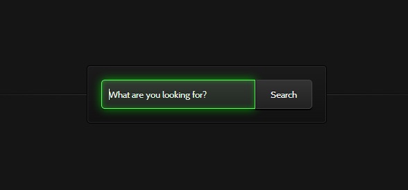
图上的搜索框在被激活的时候会出现闪闪发光的特效。
我们可以在这里查看CSS3发光搜索表单的DEMO演示。
下面我们来一起看看源代码。
HTML代码非常简单,一个文本框和一个提交按钮:
<form action="" method="">
        <input type="search" placeholder="What are you looking for?">
        <button>Search</button>
</form>
然后重点就是CSS3代码了,首先是对搜索框和搜索按钮的样式进行初始化,为了配合背景能出现发光的效果,我们使用了glow动画,我们对它们的样式作了如下设置:
.webdesigntuts-workshop {
    background: #151515;
    height: 100%;
    position: absolute;
    text-align: center;
    width: 100%;
}

.webdesigntuts-workshop:before,
.webdesigntuts-workshop:after {
    content: '';
    display: block;
    height: 1px;
    left: 50%;
    margin: 0 0 0 -400px;
    position: absolute;
    width: 800px;
}

.webdesigntuts-workshop:before {
    background: #444;
    background: -webkit-linear-gradient(left, #151515, #444, #151515);
    background: -moz-linear-gradient(left, #151515, #444, #151515);
    background: -o-linear-gradient(left, #151515, #444, #151515);
    background: -ms-linear-gradient(left, #151515, #444, #151515);
    background: linear-gradient(left, #151515, #444, #151515);
    top: 192px;
}

.webdesigntuts-workshop:after {
    background: #000;
    background: -webkit-linear-gradient(left, #151515, #000, #151515);
    background: -moz-linear-gradient(left, #151515, #000, #151515);
    background: -o-linear-gradient(left, #151515, #000, #151515);
    background: -ms-linear-gradient(left, #151515, #000, #151515);
    background: linear-gradient(left, #151515, #000, #151515);
    top: 191px;
}

.webdesigntuts-workshop form {
    background: #111;
    background: -webkit-linear-gradient(#1b1b1b, #111);
    background: -moz-linear-gradient(#1b1b1b, #111);
    background: -o-linear-gradient(#1b1b1b, #111);
    background: -ms-linear-gradient(#1b1b1b, #111);
    background: linear-gradient(#1b1b1b, #111);
    border: 1px solid #000;
    border-radius: 5px;
    box-shadow: inset 0 0 0 1px #272727;
    display: inline-block;
    font-size: 0px;
    margin: 150px auto 0;
    padding: 20px;
    position: relative;
    z-index: 1;
}

.webdesigntuts-workshop input {
    background: #222;
    background: -webkit-linear-gradient(#333, #222);
    background: -moz-linear-gradient(#333, #222);
    background: -o-linear-gradient(#333, #222);
    background: -ms-linear-gradient(#333, #222);
    background: linear-gradient(#333, #222);
    border: 1px solid #444;
    border-radius: 5px 0 0 5px;
    box-shadow: 0 2px 0 #000;
    color: #888;
    display: block;
    float: left;
    font-family: 'Cabin', helvetica, arial, sans-serif;
    font-size: 13px;
    font-weight: 400;
    height: 40px;
    margin: 0;
    padding: 0 10px;
    text-shadow: 0 -1px 0 #000;
    width: 200px;
}

.ie .webdesigntuts-workshop input {
    line-height: 40px;
}

.webdesigntuts-workshop input::-webkit-input-placeholder {
   color: #888;
}

.webdesigntuts-workshop input:-moz-placeholder {
   color: #888;
}

.webdesigntuts-workshop input:focus {
    -webkit-animation: glow 800ms ease-out infinite alternate;
    -moz-animation: glow 800ms ease-out infinite alternate;
    -o-animation: glow 800ms ease-out infinite alternate;
    -ms-animation: glow 800ms ease-out infinite alternate;
    animation: glow 800ms ease-out infinite alternate;
    background: #222922;
    background: -webkit-linear-gradient(#333933, #222922);
    background: -moz-linear-gradient(#333933, #222922);
    background: -o-linear-gradient(#333933, #222922);
    background: -ms-linear-gradient(#333933, #222922);
    background: linear-gradient(#333933, #222922);
    border-color: #393;
    box-shadow: 0 0 5px rgba(0,255,0,.2), inset 0 0 5px rgba(0,255,0,.1), 0 2px 0 #000;
    color: #efe;
    outline: none;
}

.webdesigntuts-workshop input:focus::-webkit-input-placeholder {
    color: #efe;
}

.webdesigntuts-workshop input:focus:-moz-placeholder {
    color: #efe;
}

.webdesigntuts-workshop button {
    background: #222;
    background: -webkit-linear-gradient(#333, #222);
    background: -moz-linear-gradient(#333, #222);
    background: -o-linear-gradient(#333, #222);
    background: -ms-linear-gradient(#333, #222);
    background: linear-gradient(#333, #222);
    -webkit-box-sizing: content-box;
    -moz-box-sizing: content-box;
    -o-box-sizing: content-box;
    -ms-box-sizing: content-box;
    box-sizing: content-box;
    border: 1px solid #444;
    border-left-color: #000;
    border-radius: 0 5px 5px 0;
    box-shadow: 0 2px 0 #000;
    color: #fff;
    display: block;
    float: left;
    font-family: 'Cabin', helvetica, arial, sans-serif;
    font-size: 13px;
    font-weight: 400;
    height: 40px;
    line-height: 40px;
    margin: 0;
    padding: 0;
    position: relative;
    text-shadow: 0 -1px 0 #000;
    width: 80px;
}

.webdesigntuts-workshop button:hover,
.webdesigntuts-workshop button:focus {
    background: #292929;
    background: -webkit-linear-gradient(#393939, #292929);
    background: -moz-linear-gradient(#393939, #292929);
    background: -o-linear-gradient(#393939, #292929);
    background: -ms-linear-gradient(#393939, #292929);
    background: linear-gradient(#393939, #292929);
    color: #5f5;
    outline: none;
}

.webdesigntuts-workshop button:active {
    background: #292929;
    background: -webkit-linear-gradient(#393939, #292929);
    background: -moz-linear-gradient(#393939, #292929);
    background: -o-linear-gradient(#393939, #292929);
    background: -ms-linear-gradient(#393939, #292929);
    background: linear-gradient(#393939, #292929);
    box-shadow: 0 1px 0 #000, inset 1px 0 1px #222;
    top: 1px;
}
下面是我们定义的glow动画,为了适应不同内核的浏览器,我们分别对其做了如下设置:
@-webkit-keyframes glow {
    0% {
        border-color: #393;
        box-shadow: 0 0 5px rgba(0,255,0,.2), inset 0 0 5px rgba(0,255,0,.1), 0 2px 0 #000;
    }
    100% {
        border-color: #6f6;
        box-shadow: 0 0 20px rgba(0,255,0,.6), inset 0 0 10px rgba(0,255,0,.4), 0 2px 0 #000;
    }
}

@-moz-keyframes glow {
    0% {
        border-color: #393;
        box-shadow: 0 0 5px rgba(0,255,0,.2), inset 0 0 5px rgba(0,255,0,.1), 0 2px 0 #000;
    }
    100% {
        border-color: #6f6;
        box-shadow: 0 0 20px rgba(0,255,0,.6), inset 0 0 10px rgba(0,255,0,.4), 0 2px 0 #000;
    }
}

@-o-keyframes glow {
    0% {
        border-color: #393;
        box-shadow: 0 0 5px rgba(0,255,0,.2), inset 0 0 5px rgba(0,255,0,.1), 0 2px 0 #000;
    }
    100% {
        border-color: #6f6;
        box-shadow: 0 0 20px rgba(0,255,0,.6), inset 0 0 10px rgba(0,255,0,.4), 0 2px 0 #000;
    }
}

@-ms-keyframes glow {
    0% {
        border-color: #393;
        box-shadow: 0 0 5px rgba(0,255,0,.2), inset 0 0 5px rgba(0,255,0,.1), 0 2px 0 #000;
    }
    100% {
        border-color: #6f6;
        box-shadow: 0 0 20px rgba(0,255,0,.6), inset 0 0 10px rgba(0,255,0,.4), 0 2px 0 #000;
    }
}

@keyframes glow {
    0% {
        border-color: #393;
        box-shadow: 0 0 5px rgba(0,255,0,.2), inset 0 0 5px rgba(0,255,0,.1), 0 2px 0 #000;
    }
    100% {
        border-color: #6f6;
        box-shadow: 0 0 20px rgba(0,255,0,.6), inset 0 0 10px rgba(0,255,0,.4), 0 2px 0 #000;
    }
}
最后我们将这个效果的源码打包一份供大家参考学习。下载地址>>


 浙公网安备 33010602011771号